Application Builder

Labels
AJAX(112) App Studio(7) Apple(1) Application Builder(245) Application Factory(207) ASP.NET(95) ASP.NET 3.5(45) ASP.NET Code Generator(72) ASP.NET Membership(28) Azure(18) Barcode(2) Barcodes(3) BLOB(18) Business Rules(1) Business Rules/Logic(140) BYOD(13) Caching(2) Calendar(5) Charts(29) Cloud(14) Cloud On Time(2) Cloud On Time for Windows 7(2) Code Generator(54) Collaboration(11) command line(1) Conflict Detection(1) Content Management System(12) COT Tools for Excel(26) CRUD(1) Custom Actions(1) Data Aquarium Framework(122) Data Sheet(9) Data Sources(22) Database Lookups(50) Deployment(22) Designer(177) Device(1) DotNetNuke(12) EASE(20) Email(6) Features(101) Firebird(1) Form Builder(14) Globalization and Localization(6) How To(1) Hypermedia(2) Inline Editing(1) Installation(5) JavaScript(20) Kiosk(1) Low Code(3) Mac(1) Many-To-Many(4) Maps(6) Master/Detail(36) Microservices(4) Mobile(63) Mode Builder(3) Model Builder(3) MySQL(10) Native Apps(5) News(18) OAuth(9) OAuth Scopes(1) OAuth2(13) Offline(20) Offline Apps(4) Offline Sync(5) Oracle(11) PKCE(2) Postgre SQL(1) PostgreSQL(2) PWA(2) QR codes(2) Rapid Application Development(5) Reading Pane(2) Release Notes(183) Reports(48) REST(29) RESTful(29) RESTful Workshop(15) RFID tags(1) SaaS(7) Security(81) SharePoint(12) SPA(6) SQL Anywhere(3) SQL Server(26) SSO(1) Stored Procedure(4) Teamwork(15) Tips and Tricks(87) Tools for Excel(2) Touch UI(93) Transactions(5) Tutorials(183) Universal Windows Platform(3) User Interface(338) Video Tutorial(37) Web 2.0(100) Web App Generator(101) Web Application Generator(607) Web Form Builder(40) Web.Config(9) Workflow(28)
Archive
Blog
Application Builder
Sunday, April 15, 2018PrintSubscribe
Data Field Tag: Overview

The data field Tags property is a space-separated list of values used by the client library to automatically add enhanced functionality at run-time. The table below shows available values and their related function.

Value Function
action-call
action-call-disabled
Will render a Call action to activate the device’s dialer application to make a call to the field value. The “disabled” tag will disable the automatic Call action.
action-email
action-email-disabled
Will render an Email action to open the device’s emailing application to send an email to the field value. The “disabled” tag will disable the automatic Email action.
action-url
action-url-disabled
Will render a Link action to treat the field value as a URL. The “disabled” tag will disable the automatic URL action.
calendar-date The primary date field to be used for Calendar presentation style.
calendar-end The “end” date field to determine date range in Calendar presentation style. In forms, will also configure the calendar input to automatically jump to this field from the “calendar-date” field and only allow date values in the future relative to the “calendar-date” field to be selected.
calendar-color The value field that will assign colors to each record.
calendar-text The field will be used as the primary displayed text in an event in Calendar presentation style.
calendar-disabled Will disable calendar presentation style processing for this field.
calendar-input-disabled Will disable calendar input control for this field in Touch UI.
calendar-input-data-none Will disable automatic query of record counts displayed in the calendar input control.
calendar-input-future Only allows selecting date values in the future.
created-coords When a new record is created, the geolocation will be requested from the browser and saved into the field in the form “[latitude],[longitude]” (without brackets or quotation marks).
created-latitude When a new record is created, the latitude will be requested from the browser and saved into the field.
created-longitude When a new record is created, the longitude will be requested from the browser and saved into the field.
data-sheet-freeze The data field will be “frozen” when in second generation data sheet view. The user can still unfreeze the column by activating “Unfreeze” option in the column header dropdown.
focus-auto Opening the form in edit mode will focus this field first.
header-image-original If the field is a BLOB, will render image as header in full quality.
header-text The value of this field (in grid1) will be displayed as the header in Touch UI forms.

hierarchy-parent

The foreign key data field will be used as the parent when creating and rendering a hierarchy in second generation data sheet view. Examples include: ManagerID, ReportsTo.
import-duplicate-test When importing records, the process will search for records with matching values in fields with this tag. If it exists, it will skip this record.
import-duplicate-accept When importing records, the process will search for records with matching values in fields with this tag. If it exists, it will update the existing record.
lookup-auto-advance Advances to the next field when the user makes a selection in the lookup control.
lookup-details-hidden Will hide the lookup details arrow from the user to prevent direct access to the lookup record.
lookup-distinct Searches for "distinct" values in the lookup controller.
lookup-null-value-none Hides "null" value in Drop Down List, Radio Button List, and ListBox.
map-latitude
map-longitude
map-address
map-state
map-city
map-region
map-postalcode
map-zipcode
map-zip
map-country
Use both “map-latitude” and “map-longitude”, or at minimum “map-address” and “map-city” in order to enable Map presentation style in Touch UI.
map-none Will disable map processing for this data field.
modified-coords When a record is modified, the geolocation will be requested from the browser and saved into the field in the form “[latitude],[longitude]” (without brackets or quotation marks).
modified-latitude When a record is modified, the latitude will be requested from the browser and saved into the field.
modified-longitude When a record is modified, the longitude will be requested from the browser and saved into the field.
smart-dates-disabled Disables smart dates feature for this field.
view-selector-none Disables view selector tabs on the lookup view.

Tags are also used to configure the Chart presentation style. All chart tags start with the keyword “pivotX”, with X being the ID of the pivot. Learn more about how to format chart tags.

These keywords must be combined with dashes “-” to form a tag. Note that keywords with “X” require an integer value replacing the X. If not specified, the default value is 0.

Note that keywords can be split into multiple tags. For example, specifying “pivot1-row1-area” will be equivalent to “pivot1-row1 pivot1-area”. Do not specify duplicate keywords for the same pivot.

Some keywords support specifying a string value. This keyword must be the last keyword of the tag. Format these keywords like the following:

pivot1-title:"This is the title"

The table below enumerates the available keywords.

Keyword Function
pivotX The integer value X determines the pivot ID that the properties will be applied to.
rowX The data field will be used as a row. The index of the row is X.
colX The data field will be used as a column. The index of the column is X.
valX The data field will be used as a value. The index of the value is X.
area
areastacked
bar
barstacked
candlestick
column
columnstacked
candlestick
donut
geo
map
line
pie
pie3d
scatter
table
This keyword determines the chart type. If this keyword is not specified on at least one tag referencing pivot X, then the pivot will not be rendered as a chart.
small
medium
large
Determines the default size for the chart in the user interface.
topX Only the top X number of rows or columns will be kept. The rest will be hidden.
other When used in combination with “topX”, the hidden rows or columns will be collapsed into an “Other” row or column.
date This keyword, used on a DateTime data field, will compose multiple pivots with different configurations. The pivots tested are: year, year/quarter, year/month, year/month/weekofyear, year/month/day. The pivot with the number of rows closest to 25 will be selected for use.
sum
min
max
avg
count
These keywords will determine the value that will be used when calculating cells.
timeofday
second
minute
halfhour
hour
day
dayofweek
weekofmonth
week
weekofyear
twoweek
month
quarter
year
These keywords determine the date bucket mode. The DateTime value will be parsed and use the relevant part of the date.
all Lookup data fields will select all distinct values from the database and ensure that all possible lookup values will be present in the row or column. DateTime data fields will make sure that each bucket between the first and last row or column will be present.
hideblank The “blank” row or column will be hidden.
sortasc
sortdesc
sortascbyval
sortdescbyval
Use the “sort” keyword to determine the sorting order for values of this row or column. Specify “sortasc” or “sortdesc” to sort the row or column alphabetically or numerically. Specify “sortascbyval” or “sortdescbyval” to sort the rows or columns numerically by the value itself.
maximize The chart will take the full allocated space in the view. Axis labels and titles will be displayed inside the chart area.
crosshair Crosshairs will be enabled for the supported graphs.
title
haxistitle
vaxistitle
Specify a string value to set the relevant title text.
format Specifies an ICU Decimal format string.  Supported .NET-compatible formats are “c”, “C”, “d”, “D”, “e”, “E”, “f”, “F”, “n”, “N”, “p”, “P”, “x”, “X”. 
haxisformat
vaxisformat
Controls how the horizontal or vertical axis labels are formatted. Supported values are “none”, “decimal”, “scientific”, “percent”, “currency”, “short”, “long”.
region Specify a string value to set the region mode for “geo” chart.
displaymode Specify a string value to set the display mode for “geo” chart.
resolution Specify a string value to set the resolution for “geo” chart.
curve Enables curvature in the “line” chart.
explorer Enables zooming and panning in the “line” chart.
maptype Specify a string value to set the Map Type in “map” chart type.
enablescrollwheel Enables the scroll wheel for zooming in “map” chart type.
usemaptypecontrol Enables the Map Type control in “map” chart type.
pointshape Specify a string value to set the point shape.
pointsize Specify a value to set the point size.
orientation Specify a string value for the orientation of the chart.
animation Enables the loading animation.
grandtotal Will show a “Grand Total” row and column for the pivot. Not suggested to be used in conjunction with a chart.
Wednesday, March 7, 2018PrintSubscribe
App Factory vs App Factory (Advanced)

When users create a new project in the app generator using release 8.6.6.0 and later, the project type will now be App Factory.

App Factory projects will create an ASP.NET-hosted web site project, deployable to any server running Microsoft Internet Information Services (IIS).

These projects contain both a REST API web server and stream HTML, CSS, and JavaScript to web browsers, to support user interaction through a publicly accessible web site. App Factory projects also function as a REST API server for native Mobile Apps.

Developers can also enable App Factory integration with DotNetNuke and SharePoint.

App Factory project folder directory root contains metadata files required by the app generator, as well as the Visual Studio solution file. An “app” folder contains the generated code required to run the server.

Project structure of App Factory projects.

Note that projects created before release 8.7.0.0 will use the “WebSite” folder name instead.

The app folder contains a set of resources required for the application to function. The App_Code folder contains the application framework. Upon running the application, the code in that folder is automatically compiled and executed.

All styling is stored under ~/css folder. All client-side scripts are stored under ~/js folder. Standard styling and script files are read by the framework, joined together, and streamed to the client (native app or web browser). The “_ignore.txt” file located in the two directories enumerates which non-standard files and directories are included in the output.

App folder of App Factory projects.

App Factory (Advanced)

An additional checkbox is now present on the New Project screen – “Implement application framework as class library (for experienced users only).”

Implement application framework as class library.

When this option is enabled, the application framework code is placed in a separate class library project, named after the project’s namespace.

Folder structure of App Factory (Advanced) projects.

The developer must have an instance of Visual Studio 2010, 2012, 2013, 2015, or 2017 installed on the development computer in order for the application to run. At compile-time, the Microsoft Visual Studio compiler must compile and package the application source code stored in the namespace folder into a *.dll file under the app folder. Only then will hosting software (Microsoft IIS) will be able to run the application.

App Factory (Advanced) projects store standard CSS and JS files under the class library. Upon compilation, these files are saved as embedded resources and read from the class manifest.

Custom CSS files can be placed under a “css” folder under the “app” directory. Custom JS files can be placed under the “js” folder under the “app” directory. The framework will read any files in those directories and not excluded by the “_ignore.txt” file, and stream them with every page request.

Pros of App Factory (Advanced)

  • Application source code is stored in a re-usable class library.
  • Hosting provider or customer is unable to view or edit the application source code.
  • Developer can only modify code during debugging if solution platform is switched to x86.

Cons of App Factory (Advanced)

  • Microsoft Visual Studio is required.
  • Application takes longer to generate and compile.
  • Developer cannot modify code files while application is running.

Old Project Types

A number of project types have been deprecated or disabled:

  1. Web Site Factory – renamed to App Factory.
  2. Web App Factory – renamed to App Factory (Advanced).
  3. Mobile Factory – a variant of Web Site Factory with Classic disabled. Deprecated. Use App Factory with User Interface set to “Touch UI” instead.
  4. DotNetNuke Factory – a variant of Web App Factory designed to work as a DNN module in DNN 7 and below. Deprecated. Use App Factory with DotNetNuke Connector instead.
  5. SharePoint Factory – a variant of Web App Factory designed to work as a SharePoint extension in SP 2010. Deprecated. Use App Factory with SharePoint Add-in instead.
Friday, January 19, 2018PrintSubscribe
Dark Theme and Client/Server Configuration

Code On Time release 8.6.12.0 introduces the new Theme Engine with support for custom themes. The new engine comes with new “Dark” theme. Now developers can choose from 70 color combinations provided by 2 themes and 35 accents.

We have also renamed Settings/ Web Server Configuration section Settings / Client & Server.

We have extended the client framework with the foundation for “inline editing” in grids/cards/list. Keep reading to find more.

Dark Theme

An example of  Dark theme with Construction accent.
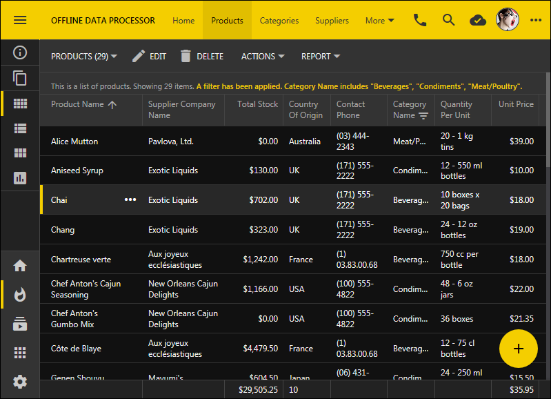
An example of  Dark theme with Construction accent in app with Touch UI.

This is an app with Dark theme in Vantage accent.
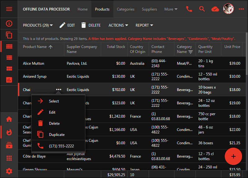
This is an app with Dark theme in Vantage accent. The app was created with Code On Time app generator.

Here is a bootstrap-based page in an app with Dark theme and Aquarium accent. We have implemented new “software breakpoints” for bootstrap content to enable correct rendering of bootstrap content in modal pages and the upcoming split screens. The menu is not displayed on the toolbar if every page with icon is referenced in the Tab Bar at the bottom of the screen.
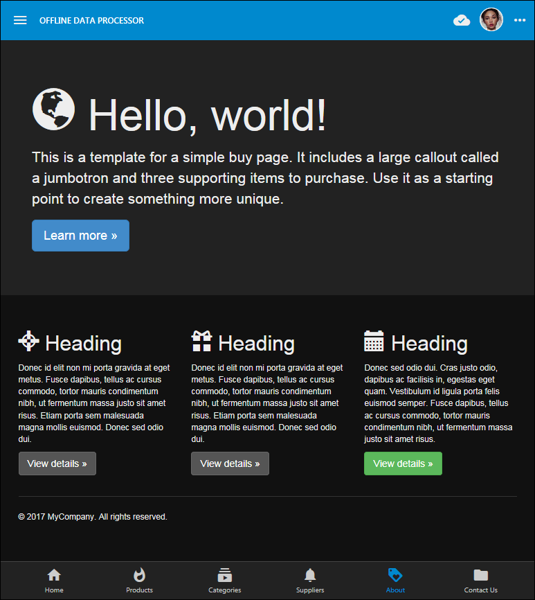
Here is a bootstrap-based page in an app with Dark theme and Aquarium accent.  The app is implemented with Touch UI.

Client & Server

Project configuration section in Settings previously called Web Server Configuration is now called Client & Server.
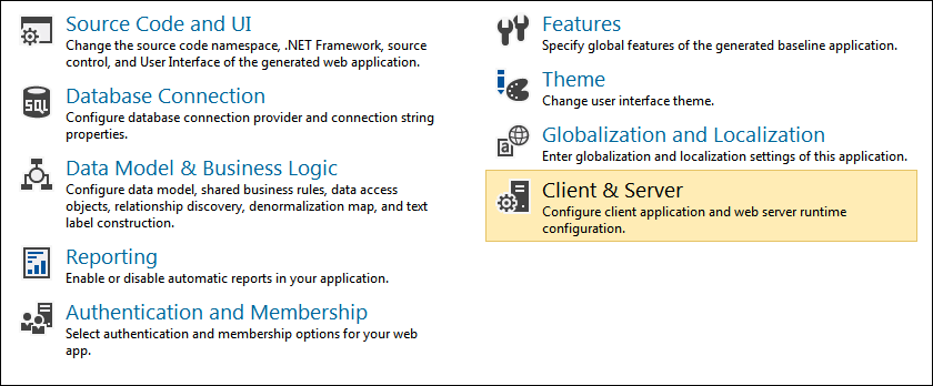
image

Client & Server section allows selecting the front end for your app. The default option is the Web Browser. This option is already familiar to developer using Code On Time. The app generator will start the default web browser of the operating system.
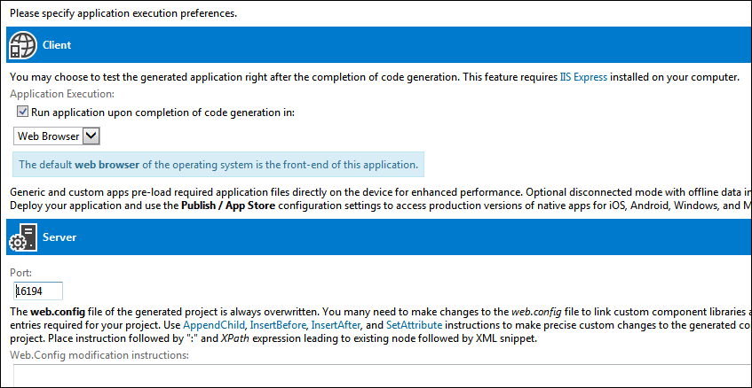
image

Two additional options Generic App and Custom App will start a native app either based on Chromium Embedded Framework (all versions of Windows with API compatible with Windows 7) or Universal Windows Platform (Windows 10 and above).

image

The native custom or generic app will install JavaScript, CSS, HTML, Fonts, and Images of your application on the device by downloading them from the server. IIS Express is the server that developers work with to test their applications.

Entire application framework is installed on the device in the native mode. Native app loads local pages in a platform-specific web view. Local pages will request data from the remote server (IIS Express in development mode). The main advantage of native apps is faster load time and ability to interact with the device.

We are launching a new product called Offline Sync Add-On that will enable native app to work in a completely disconnected or “offline” mode. It will perform preemptive downloading of data on the device. No changes to the server-side application will be requires. Any app created with Code On Time and deployed to a server will work in a completely offline mode with the help of the add-on.

The rollout of native apps will begin with Generic App for Windows 7 and Universal Windows Platform.

Custom apps for the same platform will become available in February of 2018. Offline Sync Add-On is expected to become available in the same time frame.

Generic and Custom apps for iOS will become available in March 2018, which will be followed by Android and MacOS.

Release Summary

The following features and enhancements are included in the release:

  • Theme engine has been extended to support multiple themes with accents. The new theme called Dark is introduced. It can be combined with any of the 35 accents.
  • Data fields with HyperlinkFormatString are displays as links in forms. TouchUI
  • SQL business rules use the connection string name specified in the data controller if any.
  • Bootstrap responsiveness is now based on "software" breakpoints calculated for each page in Touch UI.
  • Bootstrap responsiveness is fixed app-min-lg in Classic UI.
  • Method dataView.tagged() does not assign tag cache if there are no tags defined
  • Any view tagged as history-search-none will not retain values in filter, quick find, advanced search and will also forget selected view if different from the default.
  • The following configuration of ~touch-settings.json will disable the search history globally in the lookups.
    {
      "history": {
        "lookup": {
          "search": false
        }
      }
    }
    
  • Section on the project settings Web Server Configuration has been renamed to Client & Server. It allows configuring the front-end on the development that will be used to preview the app. Supported options “Browser”, “Generic”, and “Custom” apps.
  • Running an app created with Unlimited Edition in debug mode of Visual Studio will automatically link “debugging” versions of the JavaScript libraries.
  • Client library now includes uniqcode.js to allow better parsing of text with non-Latin characters.
  • Removed the code related to the legacy transaction management in the server-side framework. It will be replaced with the new code to support ODP (Offline Data Processor).
  • Menu strip is not displayed in the toolbar if all menu items have icons and the Tab Bar is visible. Touch UI
  • Menu strip is not displayed in the toolbar if all menu items have icons and the all icons are visible at the bottom of the sidebar. TouchUI
  • Touch devices with small form factor do not reduce density of summary views anymore.
  • Added "beforeusercontextshow.app" event to add user context menu items in sidebar, menu bar, user dropdown. Touch UI
  • Fixed issue with Web App Factory projects not finding "Template.xslt" file.
  • Password character is now rendered as "black circle" character. Touch UI
  • Tooltip for Boolean values in grids displays values as Yes and No. Touch UI
  • Added CSS minification to theme stylesheet generator. Touch UI
  • Removed the limits on the width of app name in the toolbar when sidebar is minimized. Touch UI
  • View Selector on action bar has the same color as actions and groups. Touch UI
  • Switching between Charts and [ViewStyle+Aggregates] correctly resets the page height. Touch UI
  • Method $app.touch.resetPageHeight will reset the height of the current page. Touch UI
  • Fixed security issue with anonymous access to controller XML in apps with HTML implementation.

Inline Editing

The most frequently requested feature that we hear about from customers is the ability to edit data inline. The direct insertion of inputs in grid/list/cards view styles is complicated by the fact that these styles are displaying data inside of “A” tag. Our internal discussions have led to a conclusion that inline input will be integrated in the future rewrite of these view styles, further delaying availability.

Luckily our independent effort on Universal Input and Surveys allowed us to architect the method of inline editing in Touch UI apps compatible both with touch devices and device with keyboard/mouse input. The foundational components are already in place and will work with the current “link-based” implementation of grid/list/cards.

The complete integration of Inline Editing in the Touch UI in expected in a couple of weeks!!!

Continue to Light and Dark