The “area” chart type is useful for showing change in a value over time. For example, it can show how the number of orders in the Northwind database changes by the order date. To use “area” chart type, add the keyword “area” to any “pivot-” tag, and make sure that it is separated with hyphens (-).
| Data Field | Tag |
| OrderDate | pivot1-row1-date-area |
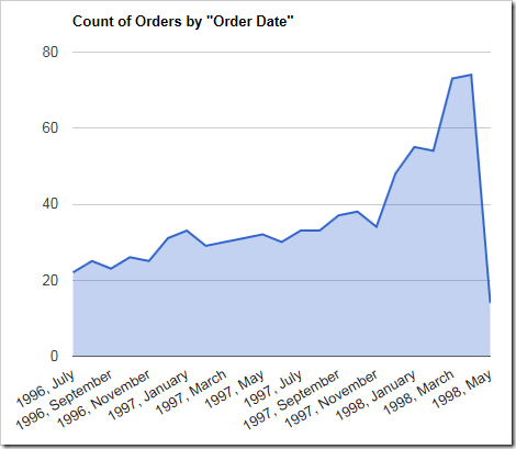
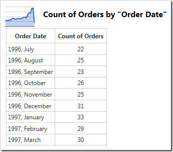
The data for the chart can be seen below.
Note that the chart above uses “-date” keyword. This keyword will direct the server to try several pivots with varying date group sizes and select the best fitting chart. An alternative definition to define a chart that looks exactly like the one above would look like the following:
| Data Field | Tag |
| OrderDate | pivot1-row1-year-area pivot1-row2-month |
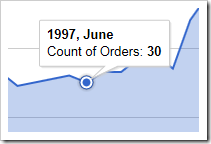
Discrete points can be clicked on to reveal the row, column, and value for that data point.
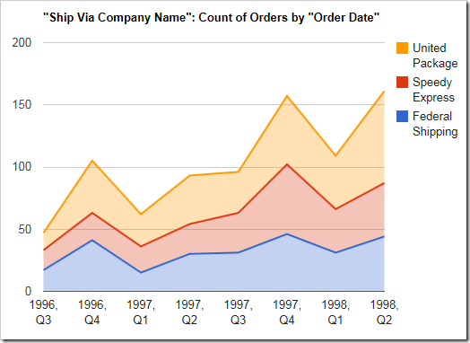
This chart type is also effective for showing multiple values on the same chart. The example chart below shows the frequency of orders made with each shipper over time. It uses order date for the rows, and the shipper company name (ShipVia) as the columns.
| Data Field | Tag |
| OrderDate | pivot1-row1-year-area pivot1-row2-quarter |
| ShipVia | pivot1-col1 |
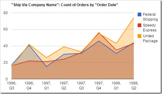
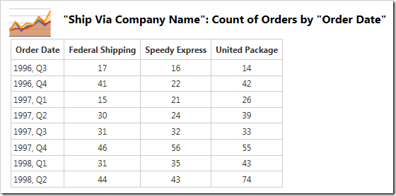
The data for the graph above can be seen here:
By default, the values are shown independently. You can choose to stack the values cumulatively by using the “areastacked” tag instead.
| Data Field | Tag |
| OrderDate | pivot1-row1-year-areastacked pivot1-row2-quarter |
| ShipVia | pivot1-col1 |
