The “column” chart type renders multiple vertical columns for each row of data. This chart type has many use cases, such as comparing values grouped by lookup values, or showing change over time. The example below shows the number of orders received over time in the Northwind sample app.
To use “column” chart type, add the keyword “column” to any “pivot-” tag, and make sure that it is separated with hyphens (-).
| Data Field | Tag |
| EmployeeID | pivot1-row1-column |
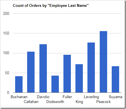
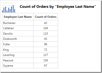
The data for the graph is displayed below.
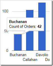
Hovering over or clicking on a column will reveal the data.
If multiple values are specified for each row of data, a column will be rendered for each value in a different color.
| Data Field | Tag |
| EmployeeID | pivot1-row1-column |
| ShipVia | pivot1-col1 |
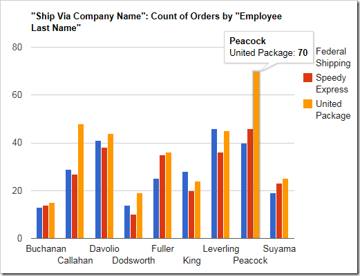
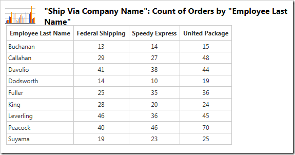
Multiple values for each row can be seen in the data below.
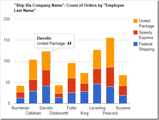
Each row can also be displayed as a single column and stack the values on that column by using the “columnstacked” chart type.
| Data Field | Tag |
| EmployeeID | pivot1-row1-columnstacked |
| ShipVia | pivot1-col1 |
