SQL Server

Labels
AJAX(112) App Studio(8) Apple(1) Application Builder(245) Application Factory(207) ASP.NET(95) ASP.NET 3.5(45) ASP.NET Code Generator(72) ASP.NET Membership(28) Azure(18) Barcode(2) Barcodes(3) BLOB(18) Business Rules(1) Business Rules/Logic(140) BYOD(13) Caching(2) Calendar(5) Charts(29) Cloud(14) Cloud On Time(2) Cloud On Time for Windows 7(2) Code Generator(54) Collaboration(11) command line(1) Conflict Detection(1) Content Management System(12) COT Tools for Excel(26) CRUD(1) Custom Actions(1) Data Aquarium Framework(122) Data Sheet(9) Data Sources(22) Database Lookups(50) Deployment(22) Designer(177) Device(1) DotNetNuke(12) EASE(20) Email(6) Features(101) Firebird(1) Form Builder(14) Globalization and Localization(6) How To(1) Hypermedia(2) Inline Editing(1) Installation(5) JavaScript(20) Kiosk(1) Low Code(3) Mac(1) Many-To-Many(4) Maps(6) Master/Detail(36) Microservices(4) Mobile(63) Mode Builder(3) Model Builder(3) MySQL(10) Native Apps(5) News(18) OAuth(9) OAuth Scopes(1) OAuth2(13) Offline(20) Offline Apps(4) Offline Sync(5) Oracle(11) PKCE(2) Postgre SQL(1) PostgreSQL(2) PWA(2) QR codes(2) Rapid Application Development(5) Reading Pane(2) Release Notes(184) Reports(48) REST(29) RESTful(29) RESTful Workshop(15) RFID tags(1) SaaS(7) Security(81) SharePoint(12) SPA(6) SQL Anywhere(3) SQL Server(26) SSO(1) Stored Procedure(4) Teamwork(15) Tips and Tricks(87) Tools for Excel(2) Touch UI(93) Transactions(5) Tutorials(183) Universal Windows Platform(3) User Interface(338) Video Tutorial(37) Web 2.0(100) Web App Generator(101) Web Application Generator(607) Web Form Builder(40) Web.Config(9) Workflow(28)
Archive
Blog
SQL Server
Friday, October 27, 2017PrintSubscribe
User Roles in SQL Business Rules

Code On Time release 8.6.8.0 introduces ability to test user roles in SQL Business Rules and fixes several remaining issues related to the recent change to the folder structure of projects in the preparation to the Native App generation.

Testing Roles in SQL Business Rules

Developers can now access parameter @BusinessRules_UserRoles in the code of SQL Business Rules and test user roles for conditional processing.

For example, create a Transact-SQL business rule in Products data controller may look as follows:

if @UnitPrice > 30 AND CHARINDEX('Administrators', @BusinessRules_UserRoles) = 0
    set @Result_Error = 'Only admin can set a high price!'

Set Command Name of the rule to Insert|Update and Phase to Before. Run the app, login with a non-administrative account, and try to update a product with a price higher than $30.

SQL business rules tests user Roles to prevent data input in an app created with Code On Time app generator.

Use the corresponding “contains” function and parameter marker in front of “BusinessRules_UserRoles” when working with the database engines other than Microsoft SQL Server.

Bug Fixes

The following fixes are also included in the project.

  • Project Builder removes resources under bin folder.
  • Web App Factory marks js, css files as content.
  • File  ~/js/_ignore.txt is now marked as embeddedResource to allow compiler to build Visual Basic projects.
  • Removed "ToUniversalTime" in value converter to fix datetime shifting issue in ASPX apps.
Wednesday, September 21, 2016PrintSubscribe
Speeding Up Quick Find

The Quick Find feature is available by default in all data views of an application. This feature allows searching every field available in the grid all at once.

Quick Find can be triggered by pressing on the Search icon in the top right corner of the data view, or by typing when a full screen data view is in focus.

Activating the Quick Find by pressing the Search icon.

Type in a value and hit “Enter” key on the keyboard to begin the search.

Typing in a value to the Quick Find input box.

When the search is complete, the search query will be displayed in the view header and the results will be displayed in the grid.

When Quick Find is triggered, the query is displayed in the header and the results below.

Each word separated by a space will search for results containing both words. Words separated by commas will search for results containing either word. Results can be negated by adding a dash (-) before the word. Exact phrases can be wrapped in “double quotes”. The example below executes the following search:

“Camembert Pierrot”, tea –grandma

The search returns records that contain the phrase “Camembert Pierrot” exactly, or records that contain “tea” and do not contain “grandma”.

Two results are returned.

However, while using Quick Find is perfect for small to medium size tables or views with a small number of columns, it can cause a substantial performance hit when the grid contains many different columns, and there is a large number of records in the table. Each column must be searched for that particular combination of keywords. While it is still possible to use Advanced Search in order to query specific columns, it does not beat the convenience offered by Quick Find.

In order to avoid the performance hit caused by searching every column, it is possible to reduce the Quick Find search scope to an inclusive or exclusive set of fields in the grid.

Excluding Specific Fields Using “$quickfinddisabled”

The quickest way to add performance is to add the tag “$quickfinddisabled” to the Search Options property of the data field. This will exclude the column from the search.

Let’s remove the QuantityPerUnit data field from the Quick Find query of Products page in the sample Northwind project.

Start the Project Designer. Switch to the Project Explorer tab. Double-click on “Products / Views / grid1 / QuantityPerUnit” data field.

Editing the QuantityPerUnit data field of grid1 View of Products controller.

Make the following change:

Property Value
Search Options $quickfinddisabled

Press OK to save. On the toolbar, press Browse.

Navigate to the Products page and execute a Quick Find search. Notice that Quantity Per Unit will now be ignored when using Quick Find.

Quick Find will no longer use Quantity Per Unit field in the filter.

Including Specific Fields Using “$quickfind”

It is also possible to only include specific fields by using the “$quickfind” tag. Let’s reduce the Quick Find scope on Products page to only ProductName and CategoryName fields.

Switch back to the Project Designer. Make sure to clear any “$quickfinddisabled” tags, as these are exclusive.

Double-click on “Products / Views / grid1 / ProductName” data field node.

Editing ProductName data field in grid1 view of Products controller.

Make the following change:

Property Value
Search Options $quickfind

Press OK to save the data field.

The next data field to modify is CategoryName. However, this data field is being used as the Alias for CategoryID data field, and has not been added to grid1 view. We will need to add CategoryName data field to grid1 in order to modify the behavior. This data field will not be rendered twice.

Drag the field “Products / Fields / CategoryName” onto “Products / Views / grid1” view to instantiate a data field for CategoryName field.

Dragging CategoryName field onto grid1 view.  The CategoryName data field has been added to grid1.

Next, change the configuration for CategoryName data field.

Property Value
Search Options $quickfind

Press OK to save. On the toolbar, press Browse. Navigate to Products page and search for “tea”. Notice that Supplier Company Name is not searched - results do not include those with Supplier of “Grandma Kelly’s Homestead”.

The Quick Find query has excluded all fields that were not tagged with "$quickfind".

Tuesday, March 3, 2015PrintSubscribe
Introduction to Charts

Every Code On Time web app comes with multiple ways of displaying your data. One way to visualize your data is with charts. See an example of charts on the Orders page of Northwind sample below.
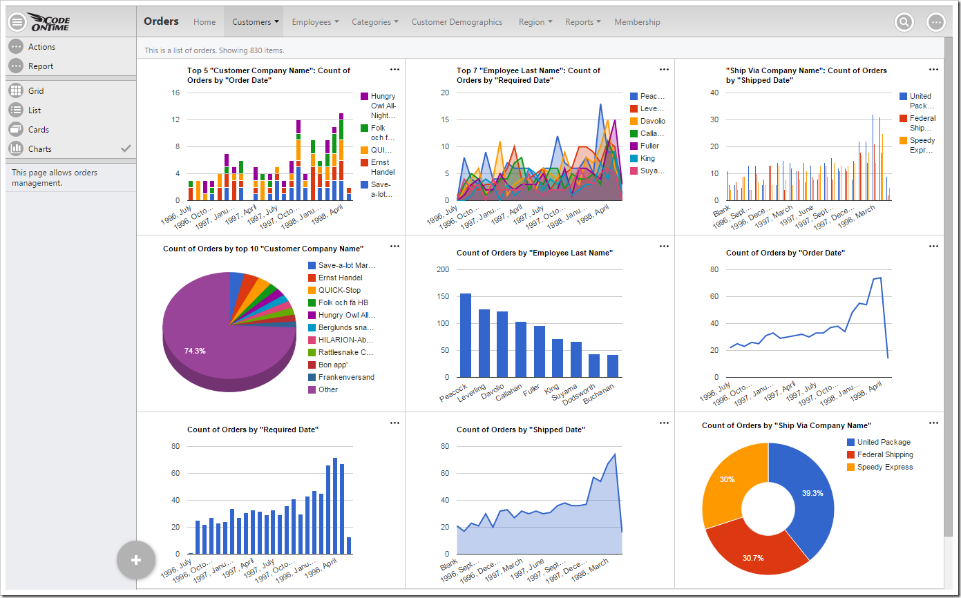
Default data insight charts displayed for orders page of a Northwind sample app.

When a user activates the Charts presentation style, any developer-defined charts will be displayed. If none have been defined, then the application will automatically construct charts based on the data fields present in that view.

Activating Charts Presentation

Charts can be activated by clicking on the “Charts” presentation style option in the sidebar on the left hand side of the screen.
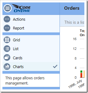
Selecting the Charts data presentation style from the sidebar.

If the device you are using is narrow or the sidebar has been disabled, you can click on the context menu button “…” in the top right corner of the screen to bring up the context menu.

Selecting the three dot context menu button in the top right corner of the screen.

Then, click on the name of the view to bring up view options.
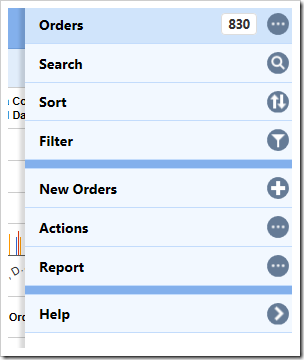
Activating the view settings by clicking on the view name from the context menu.

Select the “Charts” data presentation style, and the view will refresh and display charts to the user.
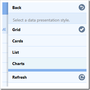
Selecting the charts data presentation style from the view options menu.

Responsive Design

Charts offer a responsive design that will scale to fit any device, regardless of the device’s screen size. You can get a comprehensive snapshot of your data from your phone, tablet, or desktop computer. The largest screen sizes will display three columns of charts.
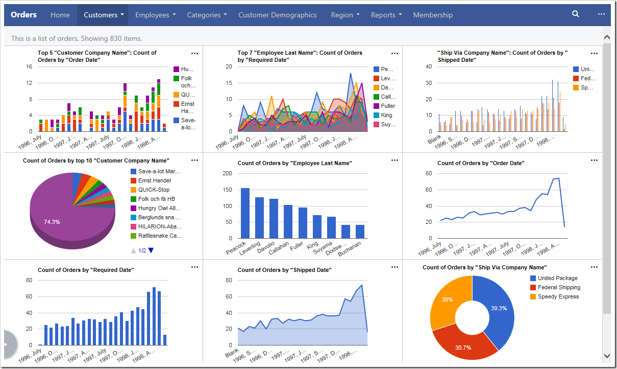
The largest screens and devices will show three columns of charts.

If the window is shrunk to a moderate size or the device is a tablet, two columns of charts will be shown instead.
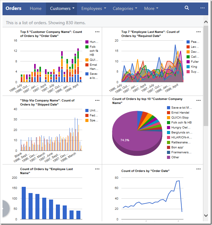
Only two columns of charts will be shown when the device is of medium size.

Smaller devices will display one chart at a time.
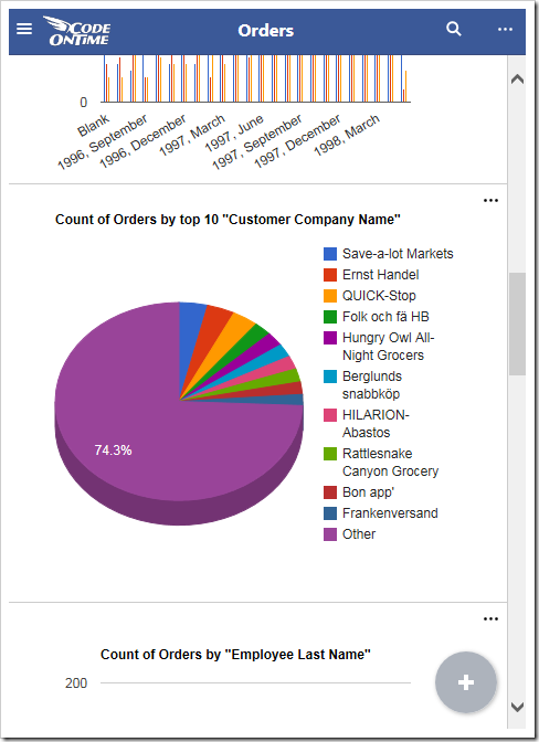
Smaller devices show one chart at a a time.

If the device or window has a short height (or if your phone is rotated horizontally), then the charts will be shrunk vertically in order to fit at least one chart at a time on the screen.
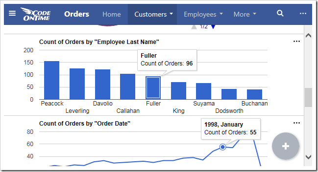
Charts will shrink vertically to fit the screen size.

Sizing Charts

Charts can also be individually resized. Each chart is set to “Small” by default. This will render three columns on large screens, two columns on medium screens, and one column on small screens. If only one chart is present for the view, then that chart will always be maximum size available for the device.

The user can change the size of each chart by clicking on the three dot context menu “…” in the top right corner of the chart. Large devices will have access to “Small”, “Medium” and “Large” sizes.
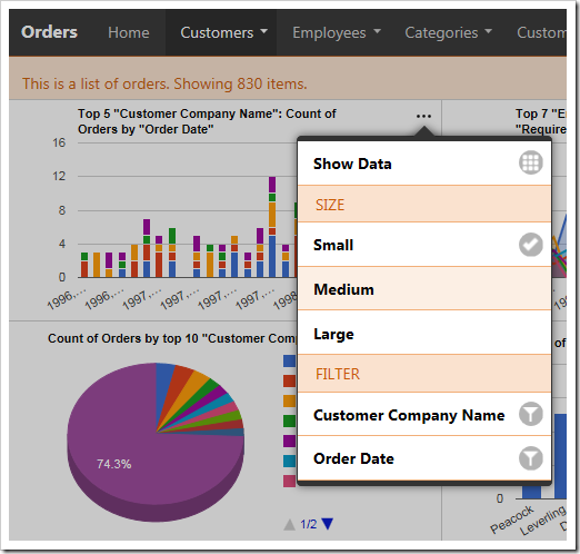
User can define the size for the chart from the context menu

Select “Large” to display a chart at full width and height of the screen. “Large” charts will scale down to “Medium” size on moderately sized devices, and to “Small” if the device cannot fit medium charts.
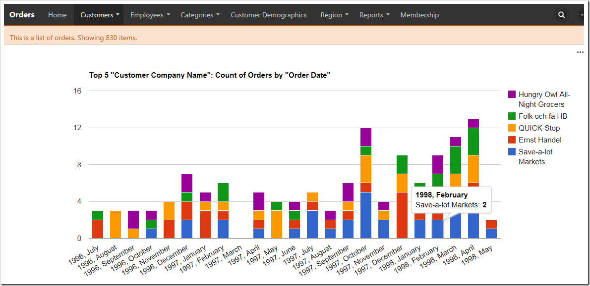
Large charts take the full height and width of the screen.

“Medium” chart size uses two thirds of the width and height a large screen, leaving space for one small chart in each dimension.
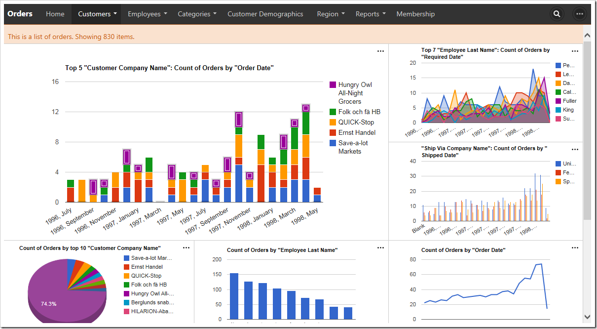
Medium size charts will take 2/3s of the height and width of the screen.

Medium charts on a medium size device will take the full width and two thirds of the height, leaving room for one chart above or below.
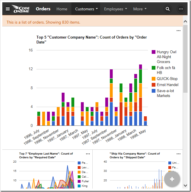
Medium size charts on a medium size device will take the full width and 2/3s of the height.

Default chart sizes can also be specified by the developer at design time.

Filtering with Charts

Any filters applied to the data view will be used by the charts. Quick filter options are available for the relevant fields in the context menu of each chart.
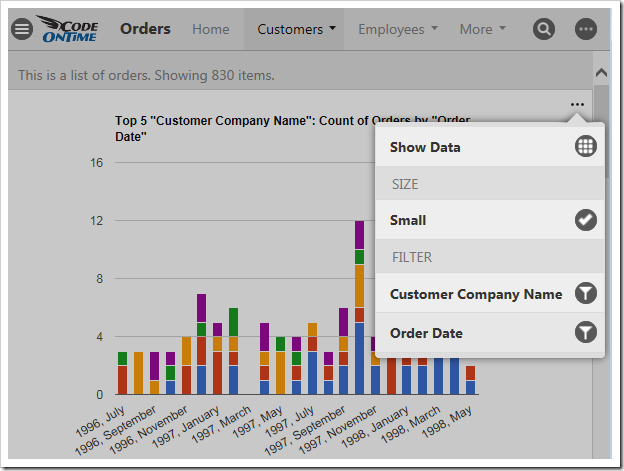
Quick filtering options are available based on the fields that are present in the chart.

Clicking on the name of a field will open the filter panel for that field.
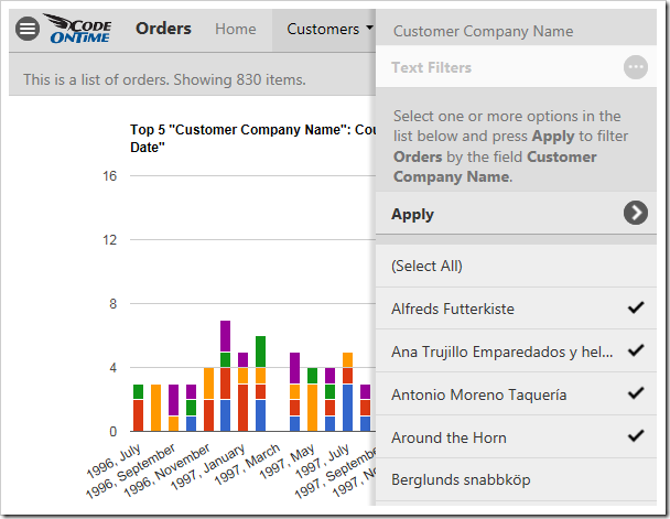
The filter panel for Customer Company Name has been opened.

Select several options from the panel and press “Apply” to filter. The charts will refresh with the new, filtered data.
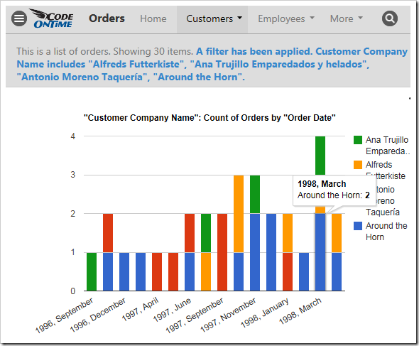
An Orders chart that is filtered by the customer.

Child data views also derive the filter from the selected master record. The screen below shows charts giving insight to the orders from the customer “Save-a-lot Market” – Davolio seems to be the preferred employee.
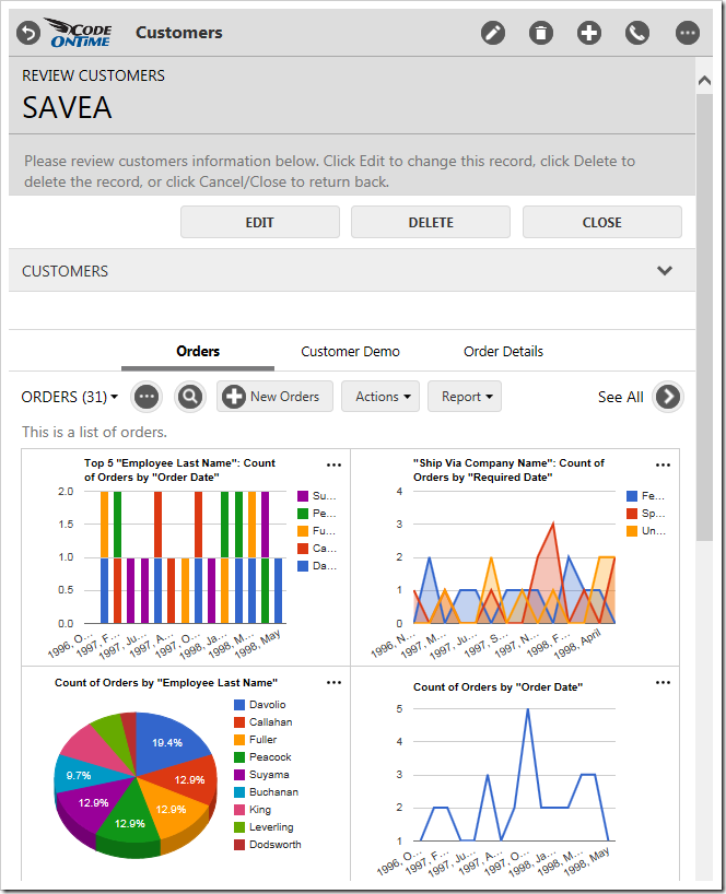
Charts for orders that are specific to a customer that has been selected as the master record.

Viewing the Data Behind the Chart

Users also have the option to view the pivoted data that the chart is based on in a table. Click on the three dot context menu “…” in the top right corner of a chart. Select “Show Data” option.
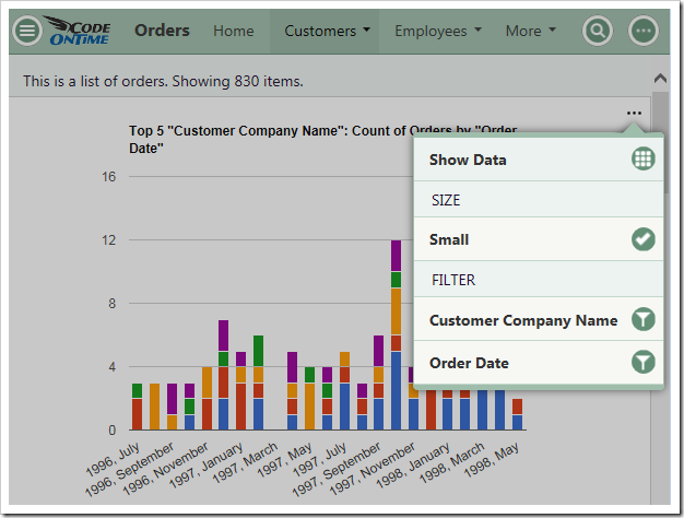
The 'Show Data' option in the context menu of a chart.

The chart will be replaced by a table that shows the data. A miniature chart preview will be shown in the top left corner.
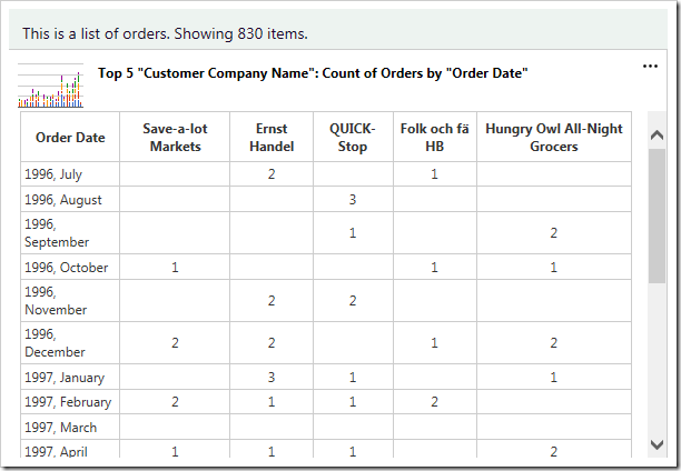
The data for the chart is displayed in a table.

Clicking on the mini chart in the top left hand corner will restore the chart. The user can also use the “Show Chart” option in the context menu.
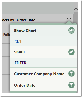
The 'Show Chart' option will restore the chart.