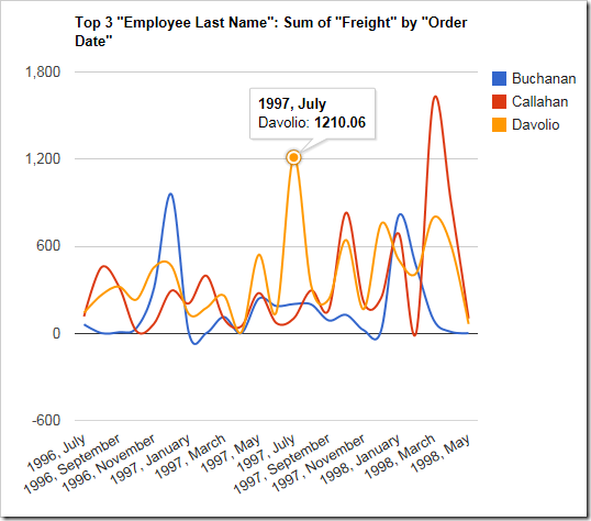
Line and area charts allow the user to click on a data point to see the value. The chart below shows how the tooltip appears.
| Data Field | Tag |
| EmployeeID | pivot1-col1-top3 |
| OrderDate | pivot1-row1-line-curve-date |
| Freight | pivot1-val1-sum |

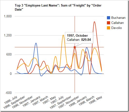
However, it can be difficult to gauge where the actual value is on the horizontal and vertical axes. Using the “crosshair” keyword in the tag will enable a horizontal and vertical line that makes it easier for the user to see the value in relation to the chart. The color of the crosshair also shows which value is selected.
| Data Field | Tag |
| EmployeeID | pivot1-col1-top3 |
| OrderDate | pivot1-row1-line-curve-date-crosshair |
| Freight | pivot1-val1-sum |

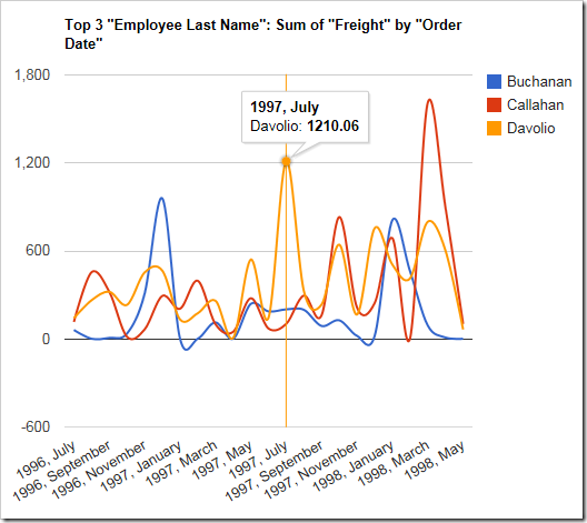
The “crosshair” keyword will by default enable a line for both the horizontal and vertical axis. The “crosshair” property can also use the value “horizontal” or “vertical” to limit the line to the respective axis.
| Data Field | Tag |
| EmployeeID | pivot1-col1-top3 |
| OrderDate | pivot1-row1-line-curve-date pivot1-crosshair:"vertical" |
| Freight | pivot1-val1-sum |
