Blog: Posts from June, 2012

Labels
AJAX(112) App Studio(7) Apple(1) Application Builder(245) Application Factory(207) ASP.NET(95) ASP.NET 3.5(45) ASP.NET Code Generator(72) ASP.NET Membership(28) Azure(18) Barcode(2) Barcodes(3) BLOB(18) Business Rules(1) Business Rules/Logic(140) BYOD(13) Caching(2) Calendar(5) Charts(29) Cloud(14) Cloud On Time(2) Cloud On Time for Windows 7(2) Code Generator(54) Collaboration(11) command line(1) Conflict Detection(1) Content Management System(12) COT Tools for Excel(26) CRUD(1) Custom Actions(1) Data Aquarium Framework(122) Data Sheet(9) Data Sources(22) Database Lookups(50) Deployment(22) Designer(177) Device(1) DotNetNuke(12) EASE(20) Email(6) Features(101) Firebird(1) Form Builder(14) Globalization and Localization(6) How To(1) Hypermedia(2) Inline Editing(1) Installation(5) JavaScript(20) Kiosk(1) Low Code(3) Mac(1) Many-To-Many(4) Maps(6) Master/Detail(36) Microservices(4) Mobile(63) Mode Builder(3) Model Builder(3) MySQL(10) Native Apps(5) News(18) OAuth(9) OAuth Scopes(1) OAuth2(13) Offline(20) Offline Apps(4) Offline Sync(5) Oracle(11) PKCE(2) Postgre SQL(1) PostgreSQL(2) PWA(2) QR codes(2) Rapid Application Development(5) Reading Pane(2) Release Notes(183) Reports(48) REST(29) RESTful(29) RESTful Workshop(15) RFID tags(1) SaaS(7) Security(81) SharePoint(12) SPA(6) SQL Anywhere(3) SQL Server(26) SSO(1) Stored Procedure(4) Teamwork(15) Tips and Tricks(87) Tools for Excel(2) Touch UI(93) Transactions(5) Tutorials(183) Universal Windows Platform(3) User Interface(338) Video Tutorial(37) Web 2.0(100) Web App Generator(101) Web Application Generator(607) Web Form Builder(40) Web.Config(9) Workflow(28)
Archive
Blog
Posts from June, 2012
Friday, June 1, 2012PrintSubscribe
Feature: Data Lookup Styles

Data lookup fields, also known as picklists, are an integral part of any database application. Code On Time web applications support a variety of data lookup styles that can be configured for any field.

Auto Complete

Auto Complete lookup item style allows the user to type in values in the field, and a list of matching lookup items will be displayed. If the entered text does not match to any items in the list, then the input field will revert to the original value.
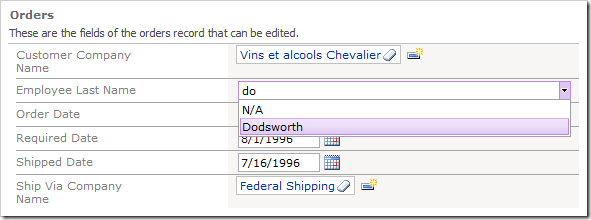
Autocomplete lookup items style.

Check Box

Check Box allows the user to enable or disable a property.
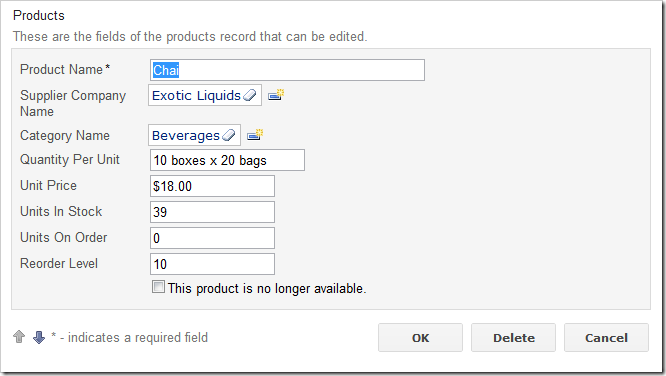
Checkbox lookup items style.

Check Box List

Check Box List allows the user to make multiple selections. The field values will be saved as a comma separated list. You can also create many-to-many fields.
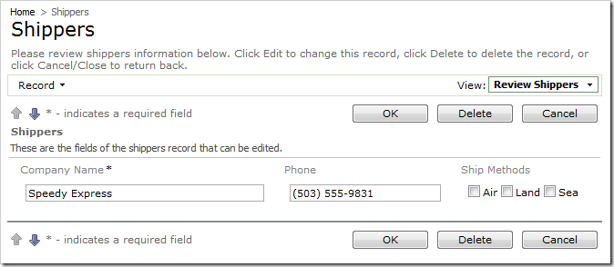
Check Box List lookup items style.

Drop Down List

The Drop Down List allows the user to select an item from a list.
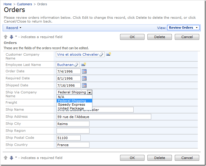
Drop Down List lookup items style.

List Box

The List Box displays several items at one time.
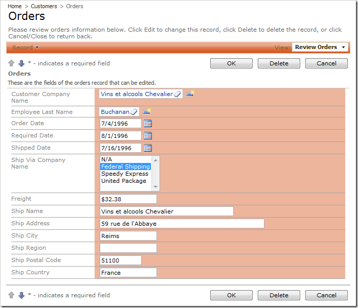
List Box lookup items style.

Lookup

The default style is Lookup. It is presented as a link inside a textbox. The Eraser icon to the right of the link will clear the field. The New Record icon to the right of the textbox allows the user to create new lookup items.
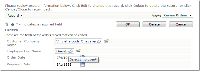
Lookup items style.

When you click on the link, a lookup window will open. The lookup is a full featured Code On Time grid view, with sorting, adaptive filtering, Quick Find, and Advanced Search available for use to help you find data quickly.
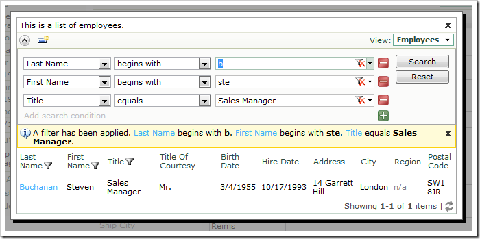
Lookup modal window with advanced search query.

Radio Button List

Radio Button List is another lookup style that allows the user to select an item from a short list.
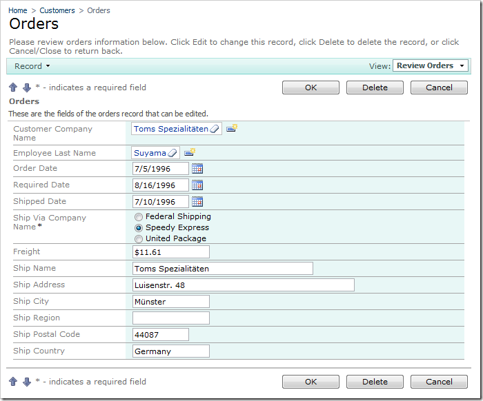
Radio Button List lookup items style.

Friday, June 1, 2012PrintSubscribe
Configuring a Lookup Window

All foreign key fields are assigned the Lookup item style by default. In edit mode, lookups are rendered as a link within a textbox. The next screenshot shows Customer Company Name and Employee Last Name lookups.

Employee Last Name Lookup field rendered as a link within a textbox.

If you click on the link, the lookup modal window will open.

Lookup Modal Window for Employee Last Name.

The lookup is a full featured Code On Time grid, with sorting, adaptive filtering, Quick Find, and Advanced Search available for use in order to help you find the right lookup item.

Sorting, filtering, Quick Find, Advanced Search are available in the lookup grid.

When you click on an item in the grid, that item will be inserted into the field. You can use the Eraser icon to the right of the Lookup link to clear the field.

Click on the Eraser icon to the right of the Lookup link to clear the field.

When the field is cleared, the text (select) will be displayed.

An empty lookup field will display a link to activate the lookup.

You can click on the New Record icon to the right of the textbox to create a new lookup item in a modal create form.

Click on the New Record icon to the right of the textbox to create a new lookup item.

Friday, June 1, 2012PrintSubscribe
Configuring a List Box

The List Box can be used to display a scrollable list of options. Only one option can be selected at a time.

The Supplier Company Name field on the Products edit form is configured with Lookup item style.

Supplier Company Name field on the Products edit form with Lookup item style.

Let’s change the lookup style of the field into a List Box.

Start the Project Designer. In the Explorer, switch to the Controllers tab, and double-click on Products / Fields / SupplierID field node.

SupplierID field in the Products controller in Project Explorer.

Change the following properties:

Property New Value
Items Style List Box
Data Value Field SupplierID
Data Text Field CompanyName

Press OK to save the field, and select Browse on the tool bar.

When the web application opens in your default web browser, navigate to the Products page and edit a record. The SupplierID field will have List Box item style. The list box displays five rows by default.

Supplier Company Name field with List Box items style.

You can change the number of rows displayed on the form. At the top of the Designer window, switch to the Data Fields tab. Change all data fields:

Property New Value
Rows 10

Change all SupplierID data fields 'Row' property to '10'.

On the tool bar, click on Browse. The Supplier Company Name list box now shows more options.

Supplier Company Name list box displaying 10 rows.