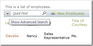
The Quick Find box is used to perform quick searches of the data. If a more specific query needs to be composed, the Search Bar is a readily available option. The Search Bar can be activated by clicking on the Chevron icon  on the action bar next to Quick Find.
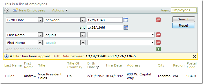
The Search Bar will open under the action bar. By default, the first three visible data fields are available for filtering.
Developers can preconfigure the search bar to display specific fields and available filtering operations when the action bar is activated for the first time. The search bar may be displayed on start without retrieving the first page of data in page data views and lookup fields.
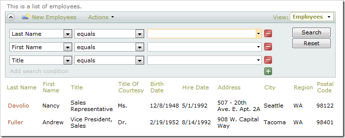
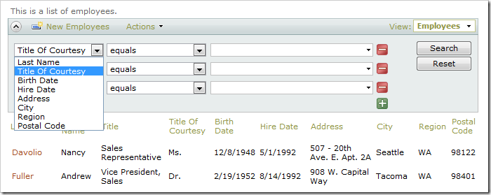
The first dropdown allows you to select a filter field. Visible and hidden data fields are available for selection.
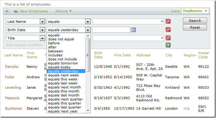
The second dropdown specifies the filter operation on the field. The type of the field determines which operations are available. The filter operations are configurable.
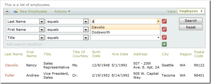
Enter your filtering parameters in the textbox. The textbox has autocomplete capabilities.
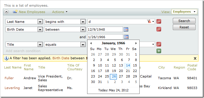
If the filter parameters are dates, then a date picker is available.
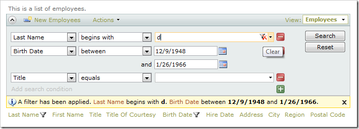
You can clear a filter by clicking the Clear Filter icon on the right side of the input field.
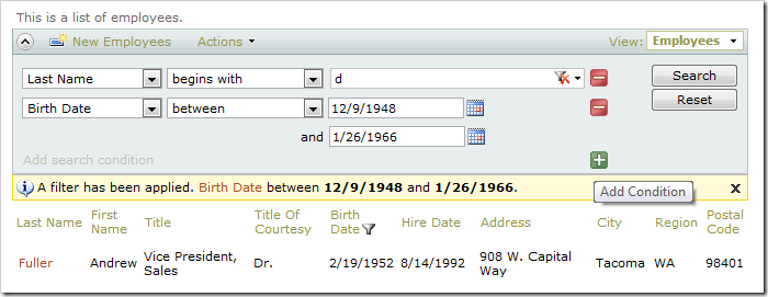
You can add additional filters by clicking on the Plus icon or on the link Add search condition at the bottom of the search bar. Remove a filter by clicking on the Minus icon
  to the right of the filter.
The Reset button on the right side will reset the filter parameters in the search bar to match the current filter in the grid view.
You can close the Search Bar and bring back Quick Find by clicking on the Chevron icon  on the left side of the action bar.
