Blog: Posts from April, 2021

Labels
AJAX(112) App Studio(7) Apple(1) Application Builder(245) Application Factory(207) ASP.NET(95) ASP.NET 3.5(45) ASP.NET Code Generator(72) ASP.NET Membership(28) Azure(18) Barcode(2) Barcodes(3) BLOB(18) Business Rules(1) Business Rules/Logic(140) BYOD(13) Caching(2) Calendar(5) Charts(29) Cloud(14) Cloud On Time(2) Cloud On Time for Windows 7(2) Code Generator(54) Collaboration(11) command line(1) Conflict Detection(1) Content Management System(12) COT Tools for Excel(26) CRUD(1) Custom Actions(1) Data Aquarium Framework(122) Data Sheet(9) Data Sources(22) Database Lookups(50) Deployment(22) Designer(177) Device(1) DotNetNuke(12) EASE(20) Email(6) Features(101) Firebird(1) Form Builder(14) Globalization and Localization(6) How To(1) Hypermedia(2) Inline Editing(1) Installation(5) JavaScript(20) Kiosk(1) Low Code(3) Mac(1) Many-To-Many(4) Maps(6) Master/Detail(36) Microservices(4) Mobile(63) Mode Builder(3) Model Builder(3) MySQL(10) Native Apps(5) News(18) OAuth(9) OAuth Scopes(1) OAuth2(13) Offline(20) Offline Apps(4) Offline Sync(5) Oracle(11) PKCE(2) Postgre SQL(1) PostgreSQL(2) PWA(2) QR codes(2) Rapid Application Development(5) Reading Pane(2) Release Notes(183) Reports(48) REST(29) RESTful(29) RESTful Workshop(15) RFID tags(1) SaaS(7) Security(81) SharePoint(12) SPA(6) SQL Anywhere(3) SQL Server(26) SSO(1) Stored Procedure(4) Teamwork(15) Tips and Tricks(87) Tools for Excel(2) Touch UI(93) Transactions(5) Tutorials(183) Universal Windows Platform(3) User Interface(338) Video Tutorial(37) Web 2.0(100) Web App Generator(101) Web Application Generator(607) Web Form Builder(40) Web.Config(9) Workflow(28)
Archive
Blog
Posts from April, 2021
Wednesday, April 7, 2021PrintSubscribe
UI State Storage & Cleanup

The state of the user interface in the apps built with Touch UI is maintained on the client. Authenticated users find the search criteria, filters, sort expressions, view styles, theme choice, and many other traces of their interactions with the app to be persisted between sessions. This makes it easy to pick up where you left off on the same device even when the browser window is closed and opened again. The app framework uses the local storage of the web view for this purpose. Each identity used to sign into the app will have its own UI state.

Touch UI can be configured to keep the user interface state in the session storage of the web view instead. The user interface state will persist while the browser window is open. App users start with the clean slate when the session is started in the new window.

Set the option ui.state.storage to session in ~/touch-settings.json configuration file to enable this behavior of the UI.


User identities and avatars are still persisted in the local storage to avoid having the user to sign in while moving between the app pages and browsing sessions. So are the global choices such as the theme and the presence of the sidebar.

Another related option allows controlling whether the user interface state is cleared when the user logs in or logs out. Option ui.state.clear is set to never by default. Developers may choose to clear the user-specific application state on the client upon logout. Value always will force the app to clear the UI state both on login and logout.

If the app is expected to be used on the shared devices, then setting the UI state storage to session and having it cleared always will eliminate any potential data exposure that can be exploited by the individuals with the physical access to the device. Recommend the end users to sign out and to close the browser or app when not in use.

Cloud On Time app executes the front end of the applications created with Code On Time from the locally stored HTML pages. Neither localStorage nor the sessionStorage objects are available in the web view. The entire set of local data specific to the user is removed from the device when the user signs out.

Touch UI application in the screenshot is running as the Progressive Web App and behaves just like the app in the web browser. It will retain the minimized sidebar, the data filter, and the reading pane mode when restarted by the user if the options ui.state.storage and ui.state.clear are not specified in the application configuration.


Tuesday, March 30, 2021PrintSubscribe
Grids, Label Icons, Collapsible Menus

 Code On Time release 8.9.16.0 introduces the significant enhancements to Touch UI.

Vertical grid lines are now displayed in the grid view style be default. Developers can selectively hide the vertical lines in the grids and the horizontal lines in both forms and grids.


Label icons are now supported. Tag the data field with the label-icon- tag and include the icon name in it. The icon will be displayed next to the field value instead of the text label. For example, the tag label-icon-work-outline will assign the material icon work_outline to the Title data field in the screenshot.


The vertical navigation menu rendered in the sidebar will display the icons assigned to the page. The vertical rendering of the navigation menu in the sidebar and sliding panels feature the collapse/expand buttons next to the menu items with the children. Only the node of the current page is expanded by default to conserve the vertical space. 


The app toolbar displays the text of the left most "icon" button if there is no button bar in the form. This provides a mode of presentation on small form factor found in modern mobile operating systems.


Command New Row is now implemented. It will activate the inline editing mode and scroll the view to the very bottom while placing the input focus on the "new row" template marked with the "plus" icon.


The 3rd party icon web fonts can be now configured in the app.


The following features are introduced along with the numerous bug fixes:

  • (Touch UI) Fully-functional animated main menu is displayed in the sidebar and context panels with the ability to expand/collapse items while maintaining the vertically scrolling of the panel.
  • (Touch UI) Option ui.menu.autoExpand controls the state of the navigation menu. The default value is current causing the current menu node to display in the expanded state while the remaining items with the children are collapsed. Set the value to "all" to force all items to expand. Set the value to false to prevent the current menu node from being expanded.
  • (Charts) Fetching of calendar data will not cause an exception when the data view has changed and is not available at the time of the attempt to fetch.
  • (Touch UI) Optimized the fitting of buttons in the form toolbar for speed and precision.
  • (Reading Pane) Button with the "Close" icon is displayed on the left side of the reading pane detail toolbar to allow quick closing to the detail pane.
  • (Touch UI) The toolbar of the sidebar is hidden if the settings button is disabled and the menu is positioned in the sidebar when it is fully expanded.
  • (Touch UI) Page name is displayed in the accent color on toolbar when the menu location is in the sidebar.  The color changes to neutral when the reading pane detail is visible.
  • (Touch UI) Menu items show the icons when the location of the menu is in the sidebar. Primary page icons are not displayed in the toolbar of the sidebar when the sidebar is fully expanded since the menu items are visible.
  • (Touch UI) Compact styling of the context values of the current master record when rendered in the sidebar.
  • (Calendar) Calendar events visually reflect the end time of the event instead of displaying the event with the fixed height.
  • (Framework) Client-side business rules returning a deferred object will not perform a duplicate invocation of the method. The flow of execution will continue if the deferred object is resolved.
  • (Touch UI) Fixed incorrect bottom border color of the app name in the context panel.
  • (Touch UI) The leading header text is now displayed in the sliding panels if header is the first item in the context.
  • (Touch UI) Field labels are now displayed with the font size of 12 in all display densities for a consistent presentation in grid/list/cards/panels/sidebars.
  • (Touch UI) Fixed incorrect position of "dropped" chevron in the lookups.
  • (Touch UI) Focused item outline remains visible in list box/radio button list, and checkbox list when the input is focused.
  • (Touch UI) Setting ui.form.lines.horizontal set to false and the tag form-lines-horizontal-none will hide the horizontal lines in the forms.
  • (Touch UI) Setting ui.form.lines.input set to true and the tag form-lines-input will show an solid outline around the text inputs.
  • (Touch UI) Frozen part of the grid row with the averages will display with the same background color as the rest of the grid.
  • (Touch UI) Fixed incorrect "new row" execution under certain conditions in the summary views.
  • (Touch UI) Eliminated the erratic horizontal scrolling when the item in the list box, radio button list, and check box list with the large number of items.
  • (Touch UI) Placeholder "Optional" is displayed in the nullable field values when the horizontal lines are hidden in the forms.
  • (Universal Input) Keyboard navigation in radio button list, list box, and check box list is handling the focus transition correctly when Left and Right buttons are pressed on the keyboard.
  • (Touch UI) Tag gird-lines-horzontal-none applied to a data view on the page will hide the horizonal lines in the grid presentation style.
  • (Touch UI) Option ui.grid.lines.horizontal will hide the horizontal lines in the data grids globally if set to false.
  • (Touch UI) Selection of the main menu item on the toolbar will switch the "selected" state to it while the selected URL is being loaded.
  • (Touch UI) Click on the app toolbar menu options will immediately switch the selection in the menu as the page loads to provide a faster selection feedback.
  • (Touch UI) Simplified the horizontal scrolling in the grid.
  • (Inline Editor) Refreshing of the data view will cause the editor frame to display if the item is in the view.
  • (Inline Editing) Command New Row works in infinite and summary data views. The last "Row Template" is selected in response to this command to enable inline input of the new row.
  • (Touch UI) Page header main icon is consistently aligned with the top of the header in any state of the page.
  • (Reading Pane) The reading pane detail is displayed with a fade-in animation if there is no content in the detail area.
  • (Touch UI) Tags h1-h6 used to present the field values in grid/list/cards have the font size of 1 element.
  • (Touch UI) Sort order icon in the grid header will toggle the sort order if clicked with a mouse pointer.
  • (Touch UI) Apps button will display the navigation menu panel on the left side of the screen if the reading pane is enabled.
  • (Touch UI) Grid views are resized on the legacy pages with multiple container/data views when the page is resized.
  • (Touch UI) The app toolbar will display the text of the left most "icon" button if there is no button bar in the form. This provides a mode of presentation on small form factor  found in modern mobile operating systems.
  • (Inline Edior) Notification bar is instantly hidden when the inline editor is activated on the field
  • (Touch UI) Aggregate values are displayed with the label in the grid.
  • (Touch UI) Aggerate bar uses the new cell separator between the values.
  • (Touch UI) Tap/click on the tab bar with the navigation icons will switch the focus to provide a fast visual response after navigation has been initiated.
  • (Inline Editor) The focus frame shows above the horizontal scrollbar when the new row is entered in the summary view.
  • (Touch UI) Collapsible container body hides the overflow content.
  • (Touch UI) External URLs are opened in the modal pages if the reading master or derail, or if another modal page is active.
  • (Touch UI) Zooming to fullscreen of a modal content page does not raise an exception.
  • (Rich Text) Does not create nested paragraphs when the cursor is positioned at the end of the paragraph. Instead a new sibling paragraph is created to ensure a clean document structure.
  • (Rich Text)  Consistently inserts BR element across all platforms when Shift+Enter is pressed.
  • (Touch UI) Enabled ability to configure multiple icon fonts in the app.
  • (Touch UI) Tab bar at the bottom of the app senses the notch on the iOS devices and displays the tabs with the padding above the swipe bar.
  • (Touch UI) Fixed incorrect positioning of checkbox slider with the footer text.
  • (Touch UI) Geolocation map displayed in the forms is rendered in the DPI of the device for the maximum qualify of presentation.
  • (Touch UI) Collapsed categories are not expanded when automatic form focus is set in the form.
  • (Touch UI) Input focus forces the collapsed category to initialize the layout when the field in the collapsed category needs to be activated.
  • (Touch UI ) Added more font size variations for the prompt to click/tap the blob for upload.
  • (Touch UI) The toggle for the categories is not selectable anymore.
Labels: Release Notes
Tuesday, March 30, 2021PrintSubscribe
Icons, Icons, Icons

 Material Icons and 3rd Party Icon Fonts

Touch UI gets its good looks from the Material Icons library designed by Google. Apps based on Touch UI feel at home on the Android devices and Chromebooks. They look crisp and professional on iOS, Mac, and Windows.

Touch UI apps support several build-in icon styles and can be extended to use the 3rd party icon collections. 

There are four different styles of icons that help your app to stand out - filled, outlined, rounded, and sharp. The default style filled can be changed by setting the value to ui.theme.icons property in ~/touch-settings.json configuration file. 


The built-in icons come from the web fonts stored under the ~/fonts folder of your application. 

Configuring 3rd Party Icon Fonts

Touch UI makes it easy to integrate additional icon libraries in the application. The following configuration in the ~/touch-settings.json file will set the built-in icon font to the outlined style and link the icon collections called Font Awesome and Material Design Icons. The former offers the popular set of free and commercial icons. The latter is the community-driven effort not affiliated with Google, but bearing a similar name.
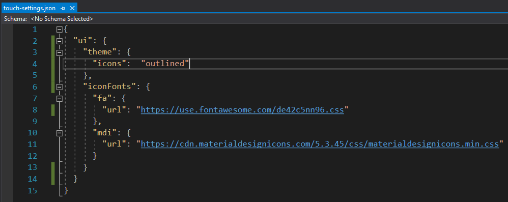

Please note that the Font Awesome URL is provided for illustrative purposes only. The vendor requires registration via email. Sign up and you will receive an email with the JavaScript snippet that will hook the web font to your pages. Use the script filename in the ui.iconFonts.fa.url property but keep the “*.css” extension as shown above.

The prefixes “fa” and “mdi” are not accidental. Review the documentation of the web font provider and take a notice of the prefix used in the example. Use the same prefix when registering the font in your app. It is the industry standard to prefix the icon names with the same sequence of characters. The cascading style sheets linked to the app will have the corresponding definitions with the references to the icon font family. 

Touch UI will create dynamic CSS rules at runtime to make the 3rd party icons match the width and height of the built-in icons. Specify a numeric “size” property for the prefix defined in ui.theme.iconFonts if the icons appear to be larger or smaller than the standard icons of Touch UI. The default size of the icons is 24 pixels.

Using Icons in the Application


Let’s apply the standard icon shopping_cart  to the editForm1 view in the Products data controller. Open your app in the Project Designer, find the view, and enter material-icon-shopping-cart in the Tags property.


This will enhance your form with the corresponding icon in the header. The icon is over-imposed on the larger self visible partially in the background for an added artistic touch.


Clear the tag on the view editForm1 and enter the fa-shopping-basket to activate the shopping basket icon from the Font Awesome library.


Here is what happens if you tag the editForm1 view with the mdi-basket and engage the Material Design Icons library.


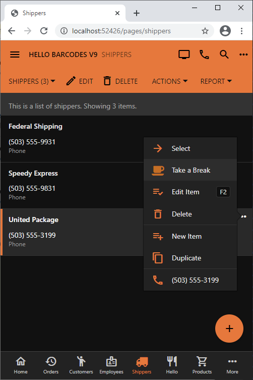
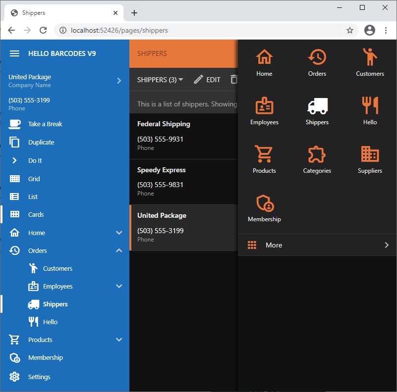
Assign icons to actions and pages by entering the icon name in their Icon / Custom Style property. For example, icons fa-truck and fa-coffee are assigned to the Shippers page and custom action Take a Break in the screenshots. The icons will show on the sidebar, in the navigation tabs, and in the menu options.
Embedding Icon Fonts in Apps

If you plan to run your app in the native mode or prefer not to have the external dependencies, then consider embedding the stylesheets and fonts directly in the app folders. 

Run the app in the web browser and bring up its Web Inspector. Disable caching on the Network tab and refresh the page. You will find the external references to the CSS stylesheets and the web fonts listed in the traffic. Save them in a dedicated folder under ~/css directory of your app. 

Next remove the “url” property from the prefix under ui.iconFonts in ~/touch-settings.json. Keep the prefix even if it is empty. Run the app and make sure that only the local references appear in the network traffic of the browser. The CSS files will be loaded automatically, but you may need to manipulate the relative references to the web fonts in the CSS files if icons do not show up.

Continue to Navigation Menu