Apps created with Touch UI have three options for the placement for the navigation menu. By default the top-level items of the navigation hierarchy are displayed as tabs in the toolbar. Menu items with children will have a dropdown menu. The spill-over items are moved under “More” menu item created automatically as needed.
Developers may choose to move the menu to the sidebar displayed on the left side of the app. The space in the sidebar is at the premium and the complex menus will be collapsed with the current node expanded. The sublevels of the menu can be individually expanded and collapsed. The same collapsible menu is also displayed when the Apps button is pressed. It is also visible in the hamburger menu and on the small screens.
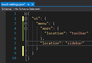
Enter the following in ~/touch-settings.json to move the menu to the sidebar and to relocate the Apps button next to the user profile icon on the toolbar.
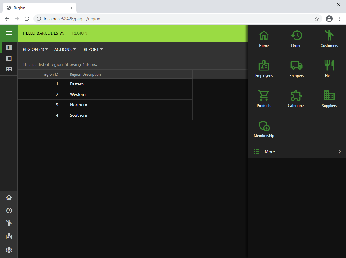
The Apps button is the icon represented with 3 x 3 solid squares or circles. You will find it in the sidebar, on the toolbar, or in the hamburger menu of your app. Its purpose is to provide quick access to the most important pages of the app and to the full navigation menu.
Assign a dedicated icon to a page by entering the icon name in the
Icon / Custom Style property of the page in the Project Designer .The extensive
Material Icons library is included with the framework. The name of the icon can be entered with the
material-icon- prefix (e.g.
material-icon-emoji-people).The icons will be displayed in the sidebar, in the context menu options, and in the drop down menus of the app toolbar. The top-level items will not have the icons in the menu with the default placement.
Up to five icons are visible in the mini sidebar and the full set is presented in the context panel activated with the Apps button. The More option in the context panel will show the complete navigation menu.
If at least two pages have a dedicated icon, then the app will display the tabs at the bottom of the screen when the sidebar is hidden. The spill-over icons will migrate to the More tab.
The hamburger menu will display the full navigation menu.
Developers may opt to hide the navigation menu from the toolbar and the sidebar by setting ui.menu.location to none in ~/touch-settings.json for a minimalist look and feel. The navigation menu will still be available through the Apps button and the hamburger menu.
The state of nodes in the navigation menu with the vertical layout is controlled by ui.menu.autoExpand property. The default value is current, which will expand one level of the menu node representing the current page. Setting this option to false will keep the current node collapsed. The all value will have all items fully expanded when the navigation menu is rendered vertically.
Touch UI completely automates the navigation menu presentation while letting the developer focus on what’s important.