Blog

Labels
AJAX(112) App Studio(7) Apple(1) Application Builder(245) Application Factory(207) ASP.NET(95) ASP.NET 3.5(45) ASP.NET Code Generator(72) ASP.NET Membership(28) Azure(18) Barcode(2) Barcodes(3) BLOB(18) Business Rules(1) Business Rules/Logic(140) BYOD(13) Caching(2) Calendar(5) Charts(29) Cloud(14) Cloud On Time(2) Cloud On Time for Windows 7(2) Code Generator(54) Collaboration(11) command line(1) Conflict Detection(1) Content Management System(12) COT Tools for Excel(26) CRUD(1) Custom Actions(1) Data Aquarium Framework(122) Data Sheet(9) Data Sources(22) Database Lookups(50) Deployment(22) Designer(177) Device(1) DotNetNuke(12) EASE(20) Email(6) Features(101) Firebird(1) Form Builder(14) Globalization and Localization(6) How To(1) Hypermedia(2) Inline Editing(1) Installation(5) JavaScript(20) Kiosk(1) Low Code(3) Mac(1) Many-To-Many(4) Maps(6) Master/Detail(36) Microservices(4) Mobile(63) Mode Builder(3) Model Builder(3) MySQL(10) Native Apps(5) News(18) OAuth(9) OAuth Scopes(1) OAuth2(13) Offline(20) Offline Apps(4) Offline Sync(5) Oracle(11) PKCE(2) Postgre SQL(1) PostgreSQL(2) PWA(2) QR codes(2) Rapid Application Development(5) Reading Pane(2) Release Notes(183) Reports(48) REST(29) RESTful(29) RESTful Workshop(15) RFID tags(1) SaaS(7) Security(81) SharePoint(12) SPA(6) SQL Anywhere(3) SQL Server(26) SSO(1) Stored Procedure(4) Teamwork(15) Tips and Tricks(87) Tools for Excel(2) Touch UI(93) Transactions(5) Tutorials(183) Universal Windows Platform(3) User Interface(338) Video Tutorial(37) Web 2.0(100) Web App Generator(101) Web Application Generator(607) Web Form Builder(40) Web.Config(9) Workflow(28)
Archive
Blog
Thursday, October 6, 2016PrintSubscribe
Dealing with Duplicates in Lookups

Fields configured with Lookup, Auto Complete, and Drop Down List item styles allow the user to type in a value and display a list of results. The text displayed in the results is configured via the Data Text Field property. Users can quickly enter a search term and find the field value they are looking for using lookups.

However, it is possible that the text displayed in the results can be non-unique. For example, there may be multiple customers with the same name, but from different locations. How can the user determine which value to select?

If multiple fields are borrowed from the lookup controller, the user interface will display these borrowed values in order to help the user determine the correct option. The example below shows duplicate customers displayed in a lookup of type “DropDownList”.

Duplicate customers will show the city and country of the customer in the drop down list.

Let’s borrow the City and Country fields from the Customers table into Orders form in the sample Northwind project.

Start the app generator, click on the project name, and press “Model”. Select “Orders” model from the list.

Editing the Orders data model.

Check the box next to “City” and “Country” columns in the Customers table.

Including City and Country fields in the Orders model.

Press “Save” to save the model. Then, press “Finish”, and confirm the popup to refresh the project. Then, press “Generate” to regenerate the app.

Navigate to the Orders page, and create a new record. Notice that the two new fields are displayed as read-only in the form. Enter a duplicate customer name, and the City and Country will be displayed next to the duplicate values.

Duplicate customers will show the city and country of the customer in the lookup results.

Selecting one of the customers will populate the Company Name in the lookup input, and copy the City and Country in the following borrowed fields.

Selecting a customer in New Orders form will copy the City and Country values.

This feature is automatically enabled when duplicate values are detected. The fields defined in the Copy property of the lookup field will be used. If duplicates are a common occurrence on a particular lookup, it is recommended to use a different display value, or create a calculated field in the lookup controller that can be specified as the Data Text Field. The full lookup grid can also be viewed by activating the arrow icon next to the field.

Friday, September 30, 2016PrintSubscribe
Displaying Field Values in Category Descriptions

Data fields displayed in forms of applications created with Code On Time are organized in categories. By default, all data fields are rendered top down in a single category. It is possible to use categories to enable the rendering of data fields in multiple columns, tabs, a wizard, or a combination thereof.

Each category is rendered with a bar at the top displaying the header text. When the user presses on the bar, the category will collapse or reveal itself. The categories’ Description property is displayed underneath the collapsible bar. Data fields belonging to the category are rendered in row containers, with the label on the left side, and the input control on the right side.

The Employees page with a multi category layout in two tabs. Field values are displayed in the category description.

Let’s configure the Employees page of the Northwind sample project into multiple categories, and customize the descriptions for each category. We will display the field values in the category descriptions in order to provide context to the user.

Start the Project Designer. In the Project Explorer, switch to the Controllers tab. Double-click on “Employees / Views / editForm1 / c1 – Employees” category node.

Editing c1 category of editForm1 view of Employees controller.

Make the following changes.

Property Value
Header Text Person
Description View the personal information.
Tab Employee

Press OK to save. Next, create a new category by right-clicking “Employees / Views / editForm1” and press New Category.

Creating a new category in 'editForm1' view of Employees controller.

Configure as follows and press OK to save the category.

Property Value
Header Text Hire Info
Description The hiring info is displayed below.
New Column Yes
Tab Employee

Create another category with the following properties. Notice the use of field names wrapped in curly brackets. The text will be updated at runtime with the field values.

Property Value
Header Text Address Info
Description The address of {FirstName} {LastName} is displayed below.
Tab Address

Finally, use drag & drop to reposition the data fields in the correct categories, as shown in the picture below.

The data fields have been repositioned in the correct categories.

On the toolbar, press Browse to generate the application. When the application comes up in your browser, navigate to the Employees page and select a record. Notice that the data fields have been rendered in two tabs, with the first tab displaying two columns. Each category displays the specified category description.

Two tabs are rendered in editForm1 of Employees page, with two columns in the first tab.

Switching to the second tab will display the “Address Info” category. Notice that the fields in curly brackets have been replaced with the field values.

The second tab displays field values in the category description.

Note that the same functionality is available in Desktop user interface.

The Desktop user interface also displays field values in the category description.

In custom form templates, category descriptions can be added by inserting a row container, with a description control inside. Field values can be displayed by using a “field” control marked as read-only.

<div data-container="collapsible" data-header-text="Address Info">
    <div data-container="row">
        <div data-control="description">
            Where does 
            <span data-control="field" data-field="FirstName" data-read-only="true"></span>
            <span data-control="field" data-field="LastName" data-read-only="true"></span>
            live ?
        </div>
    </div>
    ...
</div>
Monday, September 26, 2016PrintSubscribe
Conditional Visibility in View Templates

Conditional visibility on data fields and categories allows hiding or showing page elements based on field values. View templates give the ability to define custom presentations. When a custom template is defined for the view, the client library is not able to determine which page elements should be displayed or hidden based on the conditional visibility expressions. As such, the creator of view templates must mark up the template in order to bind these expressions with the correct elements.

When the template has been correctly defined, data fields, categories, and even custom page elements will be able to displayed or hidden depending on field values. For example, a large label is displayed in the sample below when the order has been shipped past the required date.

Warning displayed in New Order form conditionally.

Let’s use the create form for Orders in the Northwind sample database.

Arranging Data Fields into Categories

First, let’s rearrange the data fields into multiple categories, in order to control visibility of each category, instead of each individual data field. The user will only be able to enter shipping information if a shipped date is assigned.

Start the Project Designer. In the Project Explorer, switch to the Controllers tab. Right-click on “Orders / createForm1” view node, and press New Category.
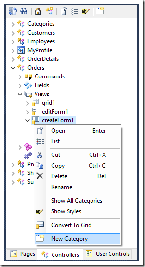
Creating a new category for "createForm1" view of Orders controller.

Define the following settings:

Property Value
Header Text Ship Info
Visible When
$row.ShippedDate != null

Press OK to save the category. Next, drag data fields ShipVia, Freight, ShipName, ShipAddress, ShipCity, ShipRegion, ShipPostalCode, and ShipCountry into the new category.
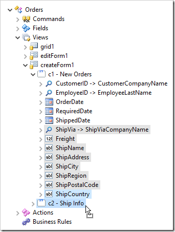
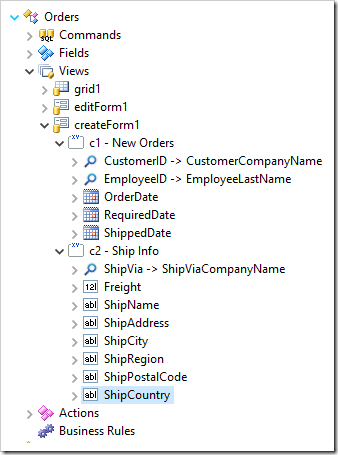
Dragging shipping fields onto the second category in Orders.     Data fields have been separated into two categories in "createForm1" view of Orders controller.

Adding Data Field Visibility

Users should not be able to set the shipped date until the order date has been set. Let’s add a data field conditional visibility expression to ShippedDate data field.

Double-click on “Orders / Views / createForm1 / c1 – New Orders / ShippedDate” data field node.
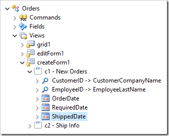
Selecting ShippedDate data field in Orders controller.

Make the following change:

Property Value
Visible When
$row.OrderDate != null

Press OK to save the data field.

Adding the View Template

Let’s add a custom view template for editForm1 of Orders controller.

On the toolbar, press Develop to open the project in Visual Studio. In the Solution Explorer, right-click on the “WebSite” node and press “Add / New Folder”.
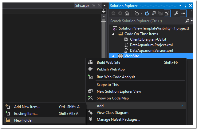
Adding a new folder to the project

Give this new folder the name “Views”. Next, right-click on the folder and press “Add / HTML Page”.
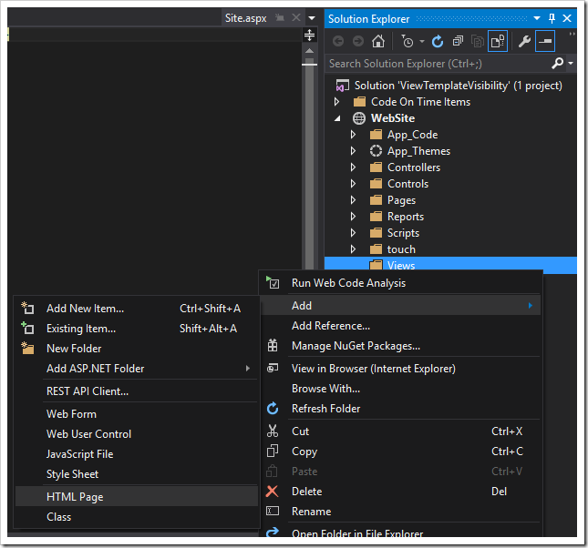
Adding a new HTML page to the Views folder.

Give this page the name “Orders.createForm1.html”. Replace the contents of the file with the following:

<div data-container="collapsible" data-header-text="New Order">
    <div data-container="row">
        <div data-control="description">Enter new order information below.</div>
    </div>
    <div data-container="row">
        <div data-control="label" data-field="CustomerID">CustomerID</div>
        <div data-control="field" data-field="CustomerID">CustomerID</div>
    </div>
    <div data-container="row">
        <div data-control="label" data-field="EmployeeID">EmployeeID</div>
        <div data-control="field" data-field="EmployeeID">EmployeeID</div>
    </div>
    <div data-container="row">
        <div data-control="label" data-field="OrderDate">OrderDate</div>
        <div data-control="field" data-field="OrderDate">OrderDate</div>
    </div>
    <div data-container="row">
        <div data-control="label" data-field="RequiredDate">RequiredDate</div>
        <div data-control="field" data-field="RequiredDate">RequiredDate</div>
    </div>
    <div data-container="row" data-visibility="f:ShippedDate">
        <div data-control="label" data-field="ShippedDate">ShippedDate</div>
        <div data-control="field" data-field="ShippedDate">ShippedDate</div>
    </div>
    <div data-container="row" data-visible-when="$row.RequiredDate < $row.ShippedDate">
        <h3 style="color:red">WARNING: THIS ORDER HAS BEEN SHIPPED LATE</h3>
    </div>
</div>
<div data-container="collapsible" data-header-text="Ship Info" data-visibility="c:c2">
    <div data-container="row">
        <div data-control="description">Enter shipping information below.</div>
    </div>
    <div data-container="row">
        <div data-control="label" data-field="ShipVia">ShipVia</div>
        <div data-control="field" data-field="ShipVia">ShipVia</div>
    </div>
    <div data-container="row">
        <div data-control="label" data-field="Freight">Freight</div>
        <div data-control="field" data-field="Freight">Freight</div>
    </div>
    <div data-container="row">
        <div data-control="label" data-field="ShipName">ShipName</div>
        <div data-control="field" data-field="ShipName">ShipName</div>
    </div>
    <div data-container="row">
        <div data-control="label" data-field="ShipAddress">ShipAddress</div>
        <div data-control="field" data-field="ShipAddress">ShipAddress</div>
    </div>
    <div data-container="row">
        <div data-control="label" data-field="ShipCity">ShipCity</div>
        <div data-control="field" data-field="ShipCity">ShipCity</div>
    </div>
    <div data-container="row">
        <div data-control="label" data-field="ShipRegion">ShipRegion</div>
        <div data-control="field" data-field="ShipRegion">ShipRegion</div>
    </div>
    <div data-container="row">
        <div data-control="label" data-field="ShipPostalCode">ShipPostalCode</div>
        <div data-control="field" data-field="ShipPostalCode">ShipPostalCode</div>
    </div>
    <div data-container="row">
        <div data-control="label" data-field="ShipCountry">ShipCountry</div>
        <div data-control="field" data-field="ShipCountry">ShipCountry</div>
    </div>
</div>

Notice that there are three highlighted pieces in the sample above.

The yellow highlight shows how to apply data field-level visibility to an element by using the attribute “data-visibility”, and setting the value to “f:” followed by the name of the field. This will inherit the visibility from the field “ShippedDate”.

The green highlight shows how to apply category-level visibility to an element. Use the attribute “data-visibility”, and set the value to “c:” followed by the category ID. The example will inherit visibility from the category “c2”.

The orange highlight shows how to use custom JavaScript expressions to set visibility. Use the attribute “data-visible-when”, and set the value to your JavaScript visibility expression.

Switch back to the browser, navigate to the Orders page, and create a new order. Notice that the OrderDate data field, custom header, and shipping category are hidden.
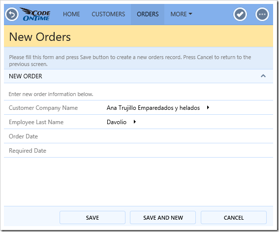
When Order Date is not set, ShippedDate and ship info are hidden.

Enter a value for Order Date. Notice that the Shipped Date data field will appear.
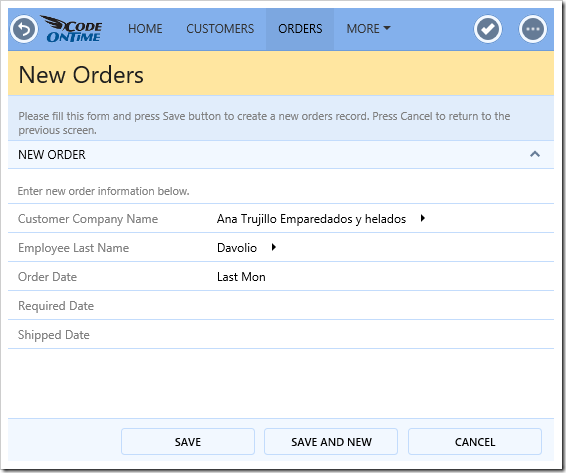
The ShippedDate data field appears when OrderDate is set.

Enter a value for Shipped Date. The Ship Info category will appear.
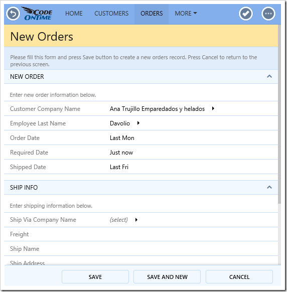
Ship Info category appears when Shipped Date is set.

If the Shipped Date is after the Required Date, the warning text will appear.
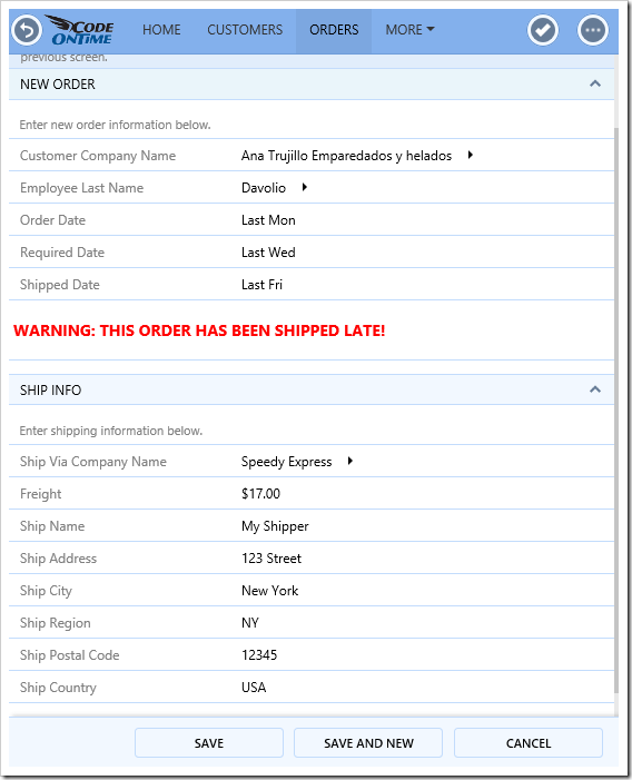
A warning appears when the Shipped Date is after the Required Date.