Data fields displayed in forms of applications created with Code On Time are organized in categories. By default, all data fields are rendered top down in a single category. It is possible to use categories to enable the rendering of data fields in multiple columns, tabs, a wizard, or a combination thereof.
Each category is rendered with a bar at the top displaying the header text. When the user presses on the bar, the category will collapse or reveal itself. The categories’ Description property is displayed underneath the collapsible bar. Data fields belonging to the category are rendered in row containers, with the label on the left side, and the input control on the right side.
Let’s configure the Employees page of the Northwind sample project into multiple categories, and customize the descriptions for each category. We will display the field values in the category descriptions in order to provide context to the user.
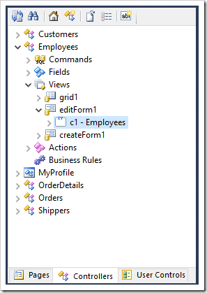
Start the Project Designer. In the Project Explorer, switch to the Controllers tab. Double-click on “Employees / Views / editForm1 / c1 – Employees” category node.
Make the following changes.
| Property | Value |
| Header Text | Person |
| Description | View the personal information. |
| Tab | Employee |
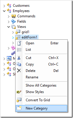
Press OK to save. Next, create a new category by right-clicking “Employees / Views / editForm1” and press New Category.
Configure as follows and press OK to save the category.
| Property | Value |
| Header Text | Hire Info |
| Description | The hiring info is displayed below. |
| New Column | Yes |
| Tab | Employee |
Create another category with the following properties. Notice the use of field names wrapped in curly brackets. The text will be updated at runtime with the field values.
| Property | Value |
| Header Text | Address Info |
| Description | The address of {FirstName} {LastName} is displayed below. |
| Tab | Address |
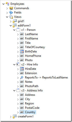
Finally, use drag & drop to reposition the data fields in the correct categories, as shown in the picture below.
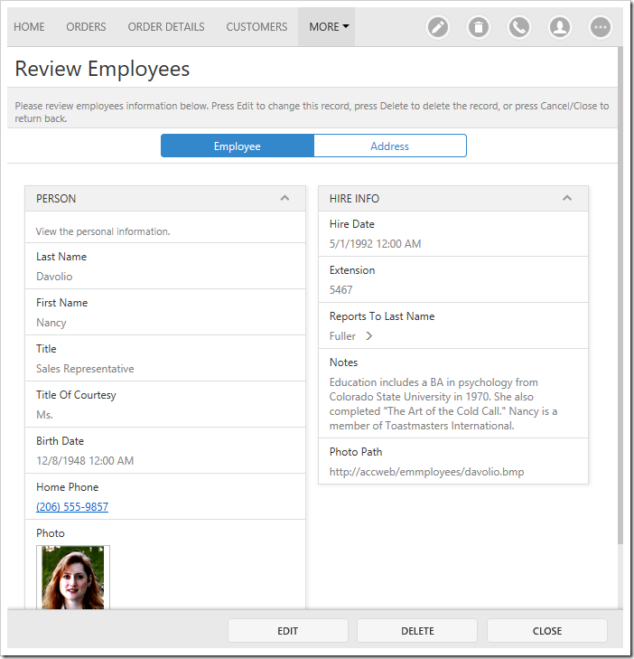
On the toolbar, press Browse to generate the application. When the application comes up in your browser, navigate to the Employees page and select a record. Notice that the data fields have been rendered in two tabs, with the first tab displaying two columns. Each category displays the specified category description.
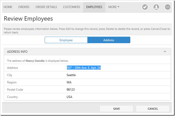
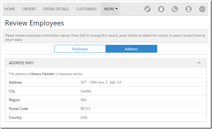
Switching to the second tab will display the “Address Info” category. Notice that the fields in curly brackets have been replaced with the field values.
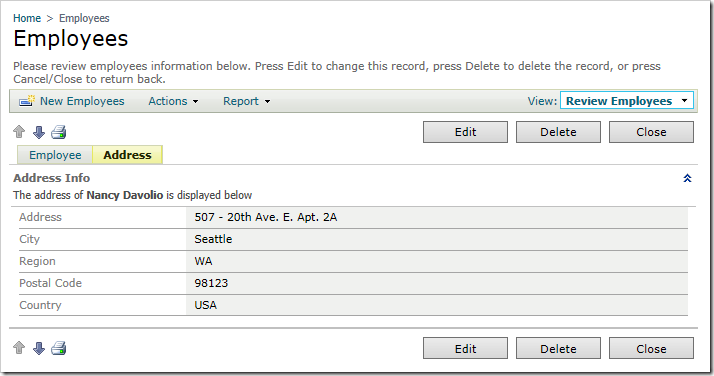
Note that the same functionality is available in Desktop user interface.
In custom form templates, category descriptions can be added by inserting a row container, with a description control inside. Field values can be displayed by using a “field” control marked as read-only.
<div data-container="collapsible" data-header-text="Address Info">
    <div data-container="row">
        <div data-control="description">
            Where does
            <span data-control="field" data-field="FirstName" data-read-only="true"></span>
            <span data-control="field" data-field="LastName" data-read-only="true"></span>
            live ?
        </div>
    </div>
    ...
</div>
