Web Application Generator

Labels
AJAX(112) App Studio(7) Apple(1) Application Builder(245) Application Factory(207) ASP.NET(95) ASP.NET 3.5(45) ASP.NET Code Generator(72) ASP.NET Membership(28) Azure(18) Barcode(2) Barcodes(3) BLOB(18) Business Rules(1) Business Rules/Logic(140) BYOD(13) Caching(2) Calendar(5) Charts(29) Cloud(14) Cloud On Time(2) Cloud On Time for Windows 7(2) Code Generator(54) Collaboration(11) command line(1) Conflict Detection(1) Content Management System(12) COT Tools for Excel(26) CRUD(1) Custom Actions(1) Data Aquarium Framework(122) Data Sheet(9) Data Sources(22) Database Lookups(50) Deployment(22) Designer(177) Device(1) DotNetNuke(12) EASE(20) Email(6) Features(101) Firebird(1) Form Builder(14) Globalization and Localization(6) How To(1) Hypermedia(2) Inline Editing(1) Installation(5) JavaScript(20) Kiosk(1) Low Code(3) Mac(1) Many-To-Many(4) Maps(6) Master/Detail(36) Microservices(4) Mobile(63) Mode Builder(3) Model Builder(3) MySQL(10) Native Apps(5) News(18) OAuth(9) OAuth Scopes(1) OAuth2(13) Offline(20) Offline Apps(4) Offline Sync(5) Oracle(11) PKCE(2) Postgre SQL(1) PostgreSQL(2) PWA(2) QR codes(2) Rapid Application Development(5) Reading Pane(2) Release Notes(183) Reports(48) REST(29) RESTful(29) RESTful Workshop(15) RFID tags(1) SaaS(7) Security(81) SharePoint(12) SPA(6) SQL Anywhere(3) SQL Server(26) SSO(1) Stored Procedure(4) Teamwork(15) Tips and Tricks(87) Tools for Excel(2) Touch UI(93) Transactions(5) Tutorials(183) Universal Windows Platform(3) User Interface(338) Video Tutorial(37) Web 2.0(100) Web App Generator(101) Web Application Generator(607) Web Form Builder(40) Web.Config(9) Workflow(28)
Archive
Blog
Web Application Generator
Tuesday, March 31, 2015PrintSubscribe
Reducing the Number of Rows with “Top” and “Other” in Charts

Suppose that a chart is made for the Orders page in the sample Northwind app. This chart will show the count of orders made by each customer, sorted in descending order. The tag configuration is listed below.

Data Field Tag
CustomerID pivot1-row1-column-sortbyvalue

The result of the tag can be seen in the screenshot.
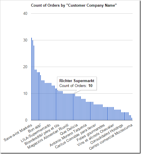
An Orders chart showing the number of orders made by each customer

The data for the chart can be seen below.
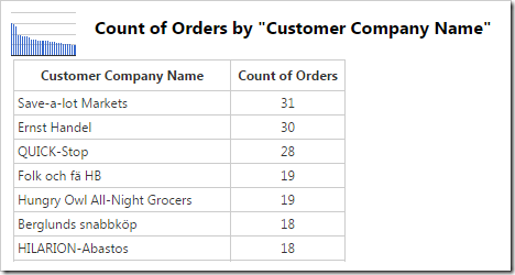
The data for an Orders chart showing the number of orders made by each customer

With such a large number of rows, it becomes difficult to read the row values. In order to fix this problem, restrict the number of rows by using the “topX” keyword, with the X value being equal to the max number of rows displayed.

Data Field Tag
CustomerID pivot1-row1-column-sortbyvalue-top5

The new chart now displays the column for only 5 customers.
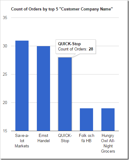
An orders chart showing the number of orders made by the top 5 customers.

The data reveals that only 5 rows are present.
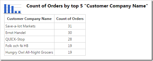
The data for a chart showing the top 5 customers.

However, it may be desirable to group the rest of the values into a single “Other” column, in order to show the relative size of the top 5 compared to the rest of the data. This can be done with the “other” keyword in combination with “topX” keyword.

Data Field Tag
CustomerID pivot1-row1-column-sortbyvalue-top5-other

The chart showing the “Other” column is displayed below.
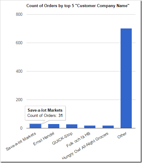
A chart showing the top 5 customers, with the rest of the orders grouped into "Other" column.

The data reveals the sixth row combines the values of the hidden rows.
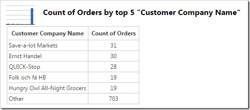
The chart data shows that the last row grouped the values from the hidden rows.

Tuesday, March 10, 2015PrintSubscribe
Maximizing Charts

Several sample charts are displayed below. Note that the axis values, legend, title, and any labels are placed outside of the chart. The chart itself floats in the center of the cell in the view.

Several example charts from Orders which have all elements outside the graph area with the chart floating in the center of the cell.

It is possible to expand each chart so that they fill the entire available area. All elements of the chart will be place inside the axes in order to full utilize all available screen size. The legend will be placed at the top of the graph, axis labels are placed inside the axes, and the title is also located inside the graph area.

In order to specify a chart to use this expanded mode, add the keyword “maximize” for every pivot defined in the view.

Data Field Tag
CustomerID pivot3-col1-top5-sortdescbyvalue pivot3-maximize
EmployeeID pivot2-row1-bar pivot2-maximize
OrderDate pivot1-row1-date-line pivot3-row1-date-all-columnstacked pivot4-row1-date pivot1-maximize
ShipVia pivot4-col1-areastacked pivot4-maximize

The charts will now maximize the available space.

The new charts have maximized the available space, and all elements are placed inside the chart.

Tuesday, March 10, 2015PrintSubscribe
Enabling Animation In Charts

Charts in web apps created with Code On Time generator do not show any animations by default. The charts simply appear.

Line chart that loads with no animation.

It may be desirable to add an animation when the chart is loaded. This animation can be added by specifying the “animation” keyword to the chart tag definition.

Data Field Tag
EmployeeID pivot1-col1-top3 pivot1-animation
OrderDate pivot1-row1-line-curve-date
Freight pivot1-val1-sum

The new chart will now be animated on load.

Line chart that loads with animation.