Web Application Generator

Labels
AJAX(112) App Studio(7) Apple(1) Application Builder(245) Application Factory(207) ASP.NET(95) ASP.NET 3.5(45) ASP.NET Code Generator(72) ASP.NET Membership(28) Azure(18) Barcode(2) Barcodes(3) BLOB(18) Business Rules(1) Business Rules/Logic(140) BYOD(13) Caching(2) Calendar(5) Charts(29) Cloud(14) Cloud On Time(2) Cloud On Time for Windows 7(2) Code Generator(54) Collaboration(11) command line(1) Conflict Detection(1) Content Management System(12) COT Tools for Excel(26) CRUD(1) Custom Actions(1) Data Aquarium Framework(122) Data Sheet(9) Data Sources(22) Database Lookups(50) Deployment(22) Designer(177) Device(1) DotNetNuke(12) EASE(20) Email(6) Features(101) Firebird(1) Form Builder(14) Globalization and Localization(6) How To(1) Hypermedia(2) Inline Editing(1) Installation(5) JavaScript(20) Kiosk(1) Low Code(3) Mac(1) Many-To-Many(4) Maps(6) Master/Detail(36) Microservices(4) Mobile(63) Mode Builder(3) Model Builder(3) MySQL(10) Native Apps(5) News(18) OAuth(9) OAuth Scopes(1) OAuth2(13) Offline(20) Offline Apps(4) Offline Sync(5) Oracle(11) PKCE(2) Postgre SQL(1) PostgreSQL(2) PWA(2) QR codes(2) Rapid Application Development(5) Reading Pane(2) Release Notes(183) Reports(48) REST(29) RESTful(29) RESTful Workshop(15) RFID tags(1) SaaS(7) Security(81) SharePoint(12) SPA(6) SQL Anywhere(3) SQL Server(26) SSO(1) Stored Procedure(4) Teamwork(15) Tips and Tricks(87) Tools for Excel(2) Touch UI(93) Transactions(5) Tutorials(183) Universal Windows Platform(3) User Interface(338) Video Tutorial(37) Web 2.0(100) Web App Generator(101) Web Application Generator(607) Web Form Builder(40) Web.Config(9) Workflow(28)
Archive
Blog
Web Application Generator
Friday, January 23, 2015PrintSubscribe
Responsive Grids, Lists, and Cards

A challenge of figuring the best presentation style for your data on a variety of devices is non-existent in apps created with Code On Time.  Data views always provide at least three responsive view styles to end users. Application automatically elects the best presentation style if developers do not provide a default option. Mobile devices will present data as responsive lists while desktop devices will switch to responsive grids.  If “image” or multi-line text fields are detected, then desktop presentation will be switched to “responsive list” instead.

Responsive List

The screen shot demonstrates a responsive list in action. Every data field is visible. The data fields and their content overflow to the next line as needed. Multi-line text fields start a new paragraph in the list item.

Responsive list in a Touch UI application created with Code On Time.

This presentation style is perfect when large amounts of information needs to be displayed.

A wider screen will fit more items, since data fields are redistributed along the entire available width.

Responsive list with a sidebar in a Touch UI application created with Code On Time.

Responsive Cards

An alternative responsive compact presentation of list items is called “Cards”. Only a subset of data fields is included in a card by default. Fields that do not fit will become invisible. The content of a field does not overflow to the next line.

Responsive Cards view in a Touch UI application created with Code On Time. 

List items are “cards” of the same height. Wider screen will break the flow of cards into two or three columns if possible.

This presentation style maximizes the amount of information available to the user without scrolling.

Multi-column cards in  a Touch UI applicaiton created with Code On Time.

Responsive Grid

The spreadsheet style presentation of data is convenient when field values require comparison. Responsive grid displays field values aligned horizontally in each row. Better yet, the grid will dynamically measure the available width, relative width of individual fields, and their importance. Then it will hide the “less important” fields to provide the best presentation possible given the width of the device.

Responsive grid view in a Touch UI application created with Code On Time.

Wider screen will reveal more data columns.

Responsive grid view with a sidebar in a Touch UI application created with Code On Time.

Developers can control how individuals data fields are displayed in each view style through tags using Project Designer.

Changing tags of data fields in Project Explorer of Code On Time app generator.

Application users switch between view styles either by choosing the desired option on the sidebar or through the context menu options. Sidebar may not be available for some screen orientations and sizes.

Context menu is available on all devices. User activates context menu by touching or clicking on the context menu button. Next user selects the very first option in panel that shows the name of the current view.

Activating context menu in Touch UI app created with Code On Time.   Activating view options in Touch UI app created with Code On Time.

Available presentation styles will be displayed. User touches or clicks on the options and the view style will change after the panel has closed.

Choosing desired view style in Touch UI app created with Code On Time.   Responsive list view style in a Touch UI app created with Code On Time.

Developers can tag the data view on a page to display a specific view style by default using Project Designer.

Changing tags of data view on a page in Project Explorer of Code On Time app generator.

Thursday, January 15, 2015PrintSubscribe
Brand New Advanced Search, Deep Search, Right-Click to Filter

Code On Time release 8.0.12.0 introduces a collection of new features designed to improve productivity of end users.

The highlights of this release are:

  • Brand New Advanced Search implementation in Touch UI. Users can search for data by entering groups of conditions. Each group uses one of the four matching methods – “Match All”, “Match Any”, “Do Not Match All”, “Do Not Match Any”. Unlimited number of groups can be created. Data views will keep track of up to 30 recent searches. End users can execute and edit previous searches.
     
  • Deep Search is a new capability available in Touch UI. It is now possible to find master records via the content of the details. For example, users can find customers that have orders placed by employee Fuller and shipped to London. Application automatically detects master-detail relationships on the pages and allows specifying detail fields in advanced search groups or in the scope of quick find.
     
  • Right-Click to Filter is now supported in lists and grids of Touch UI applications. Users can right-click any visible value and immediately apply “Equal”, “Does Not Equal” and several other filtering options.  This feature is supported by Touch UI applications on desktop computers equipped with a mouse.
     
  • Empty/Not Empty and dedicated Less/Greater Than and Less/Greater Than Or Equal are now supported in Desktop UI and Touch UI. The first two new filters allow located records that match the corresponding criteria. Previous implementations supported only the last variation of typical comparisons.
     
  • Data Pivoting is now integrated in the application framework. The new implementation includes support for a  high performance universal server-side data pivoting driven by tags. This feature is the foundation of the upcoming brand new charting support that will be introduced first in Touch UI. The same pivoting capability will also be used for sidebar filtering options similar to those found on popular shopping web sites. This pivoting capability will also be used in the Calendar view style that will become available first in the Touch UI.

Take a look at the screen shots of the new user interface features.

The search button on the toolbar now activates either Quick Find search box  or Advanced Search screen. The default option is Quick Find. If  a data view is configured to “Search on Start” than Advanced Search is always engaged when a data page is loaded.

The search button on the toolbar now activates either Quick Find search box  or Advanced Search screen.

The new Quick Find box has a drop down arrow next to the search icon on the left and advanced search button on the right.

The new Quick Find box has a drop down arrow next to the search icon on the left and advanced search button on the right.

The drop down arrow activates a list of child data views on the page that are directly connected to the data view in focus. User has expanded the scope of search to include master data view Customers  and child data views Orders and Order Details. Inclusion of child data views will engage deep search capability.

The drop down arrow activates a list of child data views on the page that are directly connected to the data view in focus. User has expanded the scope of search to include master data view Customers  and child data views Orders and Order Details. Inclusion of child data views will engage deep search capability.

If a user clicks on the button on the right side of the Quick Find search box on the toolbar than advanced search screen slides down from the top of the browser window.

If a user clicks on the button on the right side of the Quick Find search box on the toolbar than advanced search screen slides down from the top of the browser window.

Four data matching methods are supported.

Four data matching methods are supported.

Groups can be deleted and duplicated as needed.

Groups can be deleted and duplicated as needed.

Right-click on the data values will display a context menu.

Right-click on the data values will display a context menu.

An example of “deep search” conditions.

An example of 'deep search' conditions.

The result of the “deep search”.

The result of the 'deep search' via child data records.

The history of searches on Advanced Search screen.

The history of searches on Advanced Search screen.

Searching from recent history on Advanced Search page.

Searching from recent history on Advanced Search page.

The complete list of enhancements and bug fixes is presented below:

  • A new implementation of advanced search for Touch UI with multiple matching groups, history of recent searches and favorite searches.
     
  • Deep search is supported in Touch UI.
     
  • Right-click to filter is now available in Touch UI.
     
  • Data Pivoting is supported in GetPage method.
     
  • Ensured that SQL Server database with one custom schema and the rest of the tables in "dbo" will generate a correct initial menu.
     
  • Renamed __resultset to resultset__ to ensure wider compatibility with database engines.
     
  • Fixed DateTime UTC formatting issue when printing reports.
     
  • Method $app.find first tries to find a data view by ID and then tries to find it by controller name.
     
  • User-level properties are now application and user-specific in Touch UI apps.
     
  • Implemented InitBusinessRules to enable IDataEninge.ExecuteReader to work with business rules.
     
  • Data type TimeStamp will not break applications.

We are finally ready to publish various new tutorials that were in work for the past few months. This year you will see tutorials demonstrating development of single page apps with jQuery Mobile and Bootstrap. A new tutorial will explain how to build the Order Form sample with Touch UI.

In about two weeks we will release another with supported for data visualization in Touch UI and numerous other enhancements including BLOB uploading in Touch UI.

Thursday, December 4, 2014PrintSubscribe
Calculated Fields, Visible When, Read Only When in Touch UI

Code On Time release 80.11.0 further narrows the gap between the features of Desktop and Touch UI. The key features frequently requested by developers are ability to calculate field values with business rules and conditional visibility of fields and categories. Fields also need to be marked as read-only when certain conditions are met.

Touch UI now introduces an enhanced implementation of these features. We have also increased performance of core features in Desktop UI.

Both Desktop and Touch applications can now take advantage of simplified configuration for calculated fields. Developers can now set Causes Calculate property of a data field to true to trigger Calculate command whenever the field value has changed.

Both Desktop and Touch UI now implement and enhanced processing of dates to ensure that dates are correctly displayed across time zones. Dates are now passed in JSON format with additional processing of time zones both on the server and on the client.

Azure SDK 2.5 is supported in this release.

jQuery Mobile 1.4.5 is supported in this release.

Touch UI applications support multiple columns of input fields in forms with tabs.
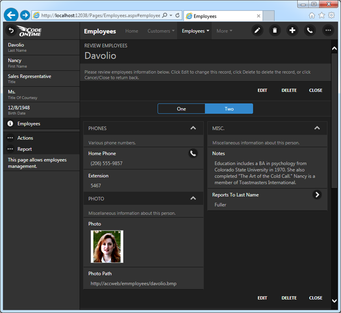
Multi-column tabbed form in a Touch UI app created with Code On Time.

Touch UI applications have new options in application settings.

Initial List Mode can be set to be displayed Summary Views on all pages instead of See All mode. This view displays a traditional action bar above the subset of rows visible to the user.
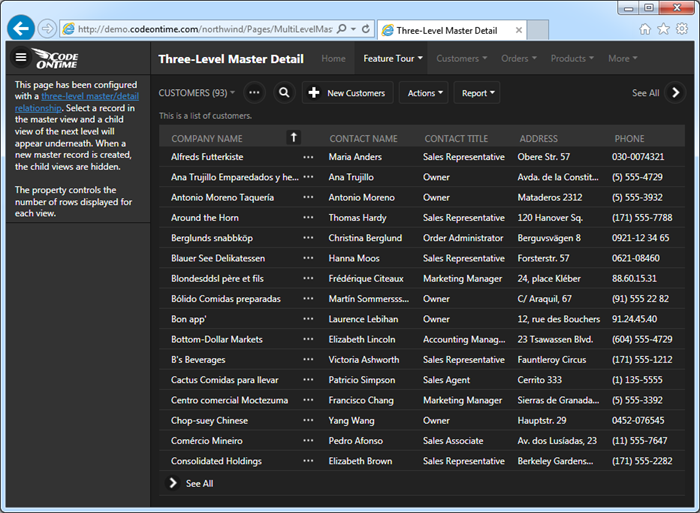
Standalone summary view of customers with action bar in a Touch UI app created with Code On Time.

Button Shapes option allows to turn off the outline of buttons for a cleaner look.
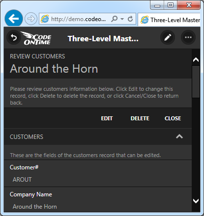
Form buttons without outlines (button shapes are 'off') in a Touch UI app created with Code On Time.

A thin outline is the default option for buttons in forms.
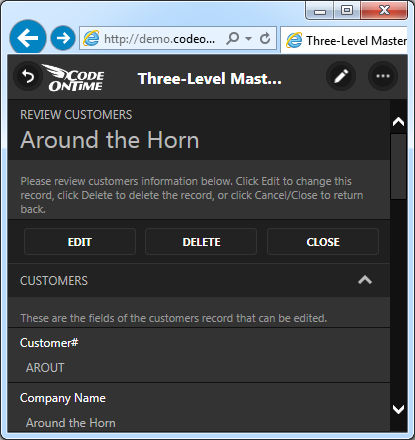
Form buttons with outlines (button shapes are 'on') in a Touch UI app created with Code On Time.

We have removed icons from the form buttons for a cleaner look.

Lists and grids now promote an action in See All mode.  Promoted action is the first “positive” action available to the user.
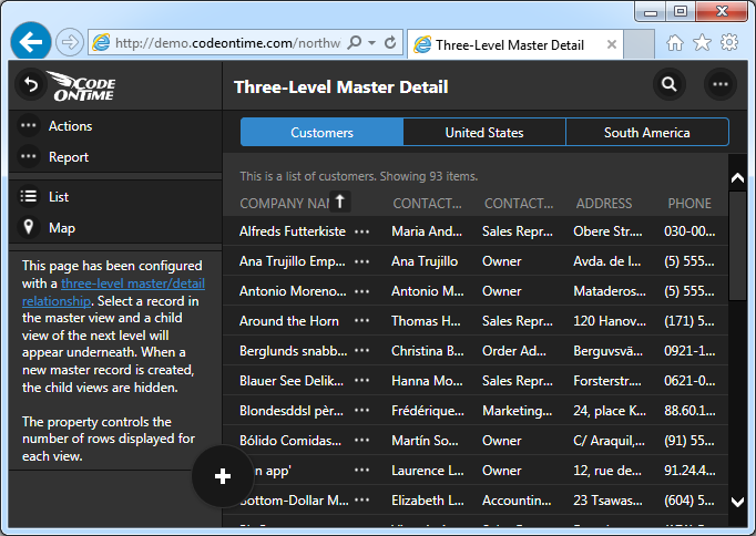
Promoted "New" action displayed at the bottom of the screen on the border of sidebar and responsive grid of customers in a Touch UI app created with Code On Time.

Promoted "New" action displayed at the bottom of the screen on the right side of the responsive grid of customers in a Touch UI app created with Code On Time.

Summary views now display view selectors on the left side of the action bar buttons. Button “…” located right next to a view selector provides access to the context menu of a data view.
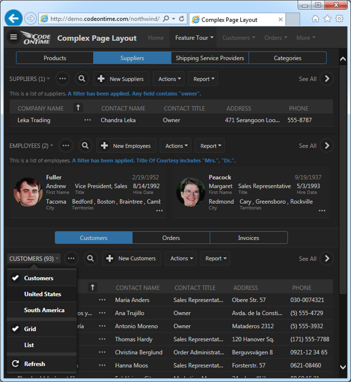
View selector shows avaialble views view styles in popup menu in a Touch UI app created with Code On Time.

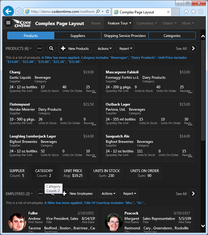
Summary view also display aggregates. We are working on displaying aggregates in See All mode.
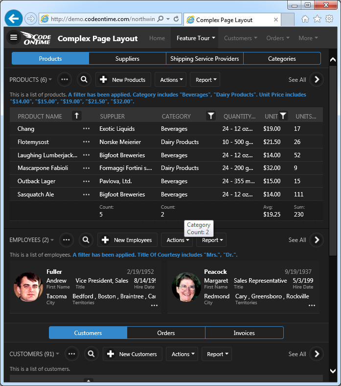
Aggregates displayed at the bottom of the product responsive grid in a Touch UI app created with Code On Time.

Here is the same view of Products display in “List” style with aggregates listed below it.
Aggregates displayed at the bottom of the product list in a Touch UI app created with Code On Time.

Next release is expected to go out before the end of the year with the following features in Touch UI:

  • Blob Uploading.
  • Enhanced Advanced Search.
  • Support for many-to-many fields in search screens.
  • Hyperlink fields will be displayed in context menus.