A challenge of figuring the best presentation style for your data on a variety of devices is non-existent in apps created with Code On Time. Data views always provide at least three responsive view styles to end users. Application automatically elects the best presentation style if developers do not provide a default option. Mobile devices will present data as responsive lists while desktop devices will switch to responsive grids. If “image” or multi-line text fields are detected, then desktop presentation will be switched to “responsive list” instead.
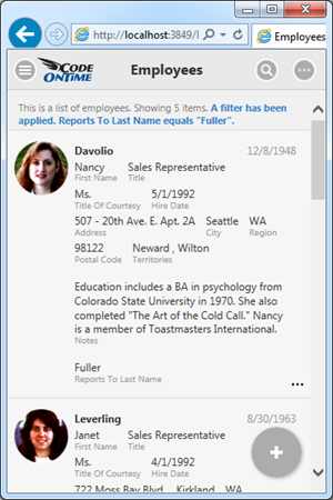
Responsive List
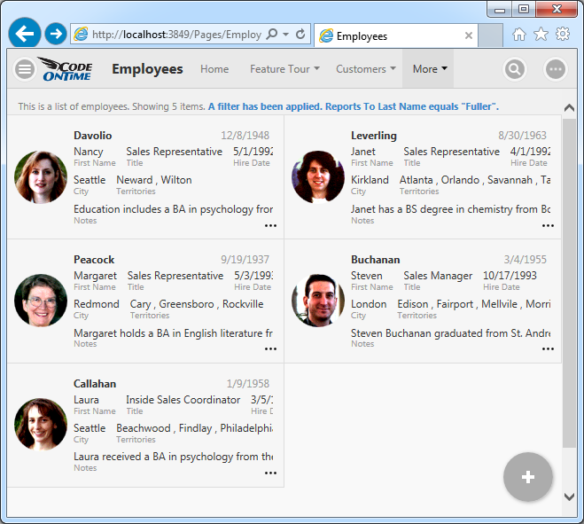
The screen shot demonstrates a responsive list in action. Every data field is visible. The data fields and their content overflow to the next line as needed. Multi-line text fields start a new paragraph in the list item.
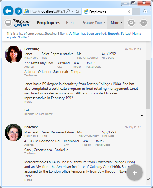
This presentation style is perfect when large amounts of information needs to be displayed.
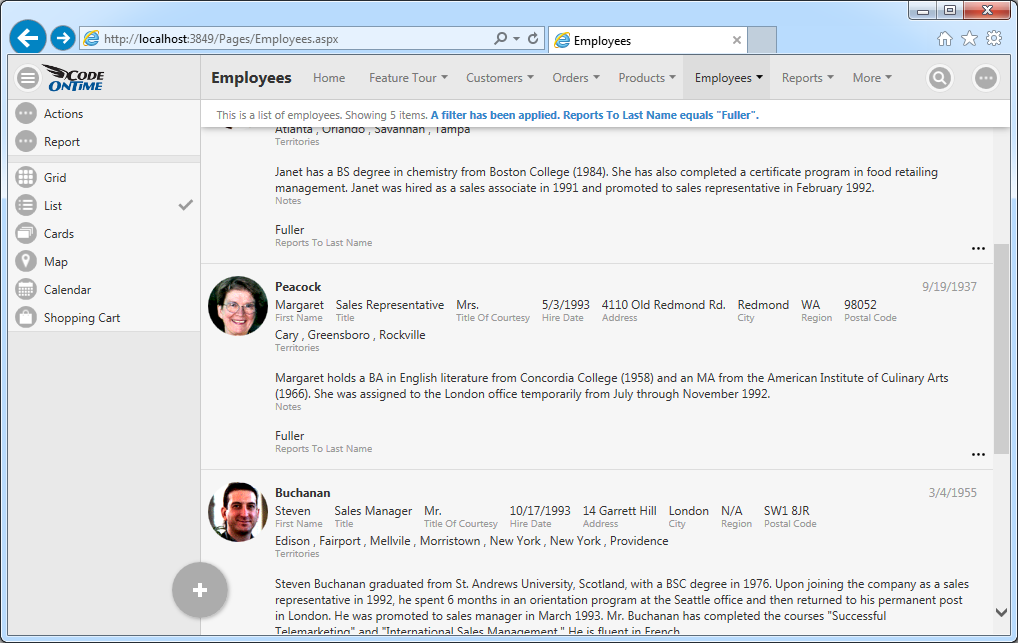
A wider screen will fit more items, since data fields are redistributed along the entire available width.
Responsive Cards
An alternative responsive compact presentation of list items is called “Cards”. Only a subset of data fields is included in a card by default. Fields that do not fit will become invisible. The content of a field does not overflow to the next line.
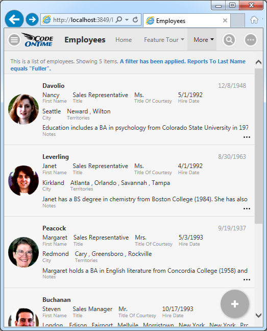
List items are “cards” of the same height. Wider screen will break the flow of cards into two or three columns if possible.
This presentation style maximizes the amount of information available to the user without scrolling.
Responsive Grid
The spreadsheet style presentation of data is convenient when field values require comparison. Responsive grid displays field values aligned horizontally in each row. Better yet, the grid will dynamically measure the available width, relative width of individual fields, and their importance. Then it will hide the “less important” fields to provide the best presentation possible given the width of the device.
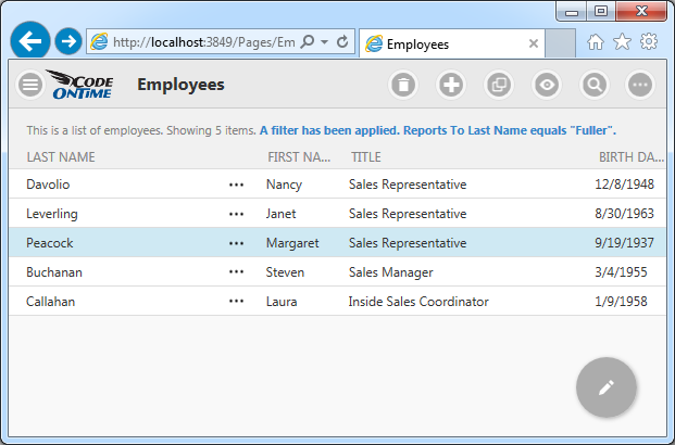
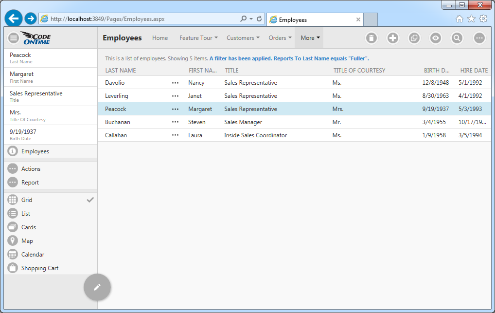
Wider screen will reveal more data columns.
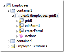
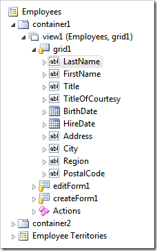
Developers can control how individuals data fields are displayed in each view style through tags using Project Designer.
Application users switch between view styles either by choosing the desired option on the sidebar or through the context menu options. Sidebar may not be available for some screen orientations and sizes.
Context menu is available on all devices. User activates context menu by touching or clicking on the context menu button. Next user selects the very first option in panel that shows the name of the current view.
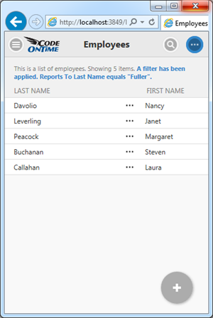
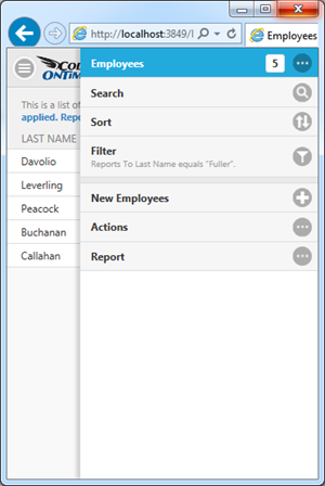
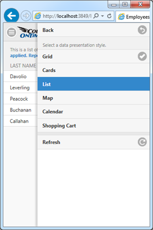
Available presentation styles will be displayed. User touches or clicks on the options and the view style will change after the panel has closed.
Developers can tag the data view on a page to display a specific view style by default using Project Designer.
