Web App Generator

Labels
AJAX(112) App Studio(9) Apple(1) Application Builder(245) Application Factory(207) ASP.NET(95) ASP.NET 3.5(45) ASP.NET Code Generator(72) ASP.NET Membership(28) Azure(18) Barcode(2) Barcodes(3) BLOB(18) Business Rules(1) Business Rules/Logic(140) BYOD(13) Caching(2) Calendar(5) Charts(29) Cloud(14) Cloud On Time(2) Cloud On Time for Windows 7(2) Code Generator(54) Collaboration(11) command line(1) Conflict Detection(1) Content Management System(12) COT Tools for Excel(26) CRUD(1) Custom Actions(1) Data Aquarium Framework(122) Data Sheet(9) Data Sources(22) Database Lookups(50) Deployment(22) Designer(178) Device(1) DotNetNuke(12) EASE(20) Email(6) Features(101) Firebird(1) Form Builder(14) Globalization and Localization(6) How To(1) Hypermedia(2) Inline Editing(1) Installation(5) JavaScript(20) Kiosk(1) Low Code(3) Mac(1) Many-To-Many(4) Maps(6) Master/Detail(36) Microservices(4) Mobile(63) Mode Builder(3) Model Builder(3) MySQL(10) Native Apps(5) News(18) OAuth(9) OAuth Scopes(1) OAuth2(13) Offline(20) Offline Apps(4) Offline Sync(5) Oracle(11) PKCE(2) Postgre SQL(1) PostgreSQL(2) PWA(2) QR codes(2) Rapid Application Development(5) Reading Pane(2) Release Notes(184) Reports(48) REST(29) RESTful(29) RESTful Workshop(15) RFID tags(1) SaaS(7) Security(81) SharePoint(12) SPA(6) SQL Anywhere(3) SQL Server(26) SSO(1) Stored Procedure(4) Teamwork(15) Tips and Tricks(87) Tools for Excel(3) Touch UI(93) Transactions(5) Tutorials(183) Universal Windows Platform(3) User Interface(338) Video Tutorial(37) Web 2.0(100) Web App Generator(101) Web Application Generator(607) Web Form Builder(40) Web.Config(9) Workflow(28)
Archive
Blog
Web App Generator
Monday, June 4, 2012PrintSubscribe
Data Lookup Capabilities

Code On Time web applications offer rich data lookup capabilities.

Fields with an Items Style of Lookup render as link within a textbox. The Eraser icon to the right of the link will clear the field. The New Record icon to the right of the textbox will create a new lookup item.

Data lookup field rendered as a link within a textbox.

When the link is clicked on, a lookup window will open. Users can perform Quick Find or use Advanced Search Bar.

Data lookup windows allows sorting, adaptive filtering, quick find, and advanced search bar.

A lookup field can be configured as an Auto Complete text box. When a user types in a value, the list of lookup items will be filtered. If an item is selected, it is inserted in the field. If no item is selected, the field value will revert.

Auto Complete data lookup fields will filter according to the parameter entered by the user.

Both Lookup and Auto Complete styles do not prefetch data items when the form view is loaded.

A lookup field can also be configured as a Check Box List. The values can come from a static list or a many-to-many table.

Data Lookups can be configured as a Check Box List so that the user can select multiple values.

Data lookup fields can be rendered as a Radio Button List.

Data lookup rendered as a radio button list.

Consult the following list of properties when configuring a lookup field.

Property Description
Items Style Select the type of Items Style for the lookup. The options include: Auto Complete, Check Box, Check Box List, Drop Down List, List Box, Lookup, Radio Button List, User ID Lookup, User Name Lookup.
Items Data Controller Select the controller data source.
Items Data View Select the data view that will be displayed for the lookup.
Data Value Field Select the value that the field will save to the database.
Data Text Field Select the text that the field will display to the end user.
New Data View If the user is allowed to create new lookup items, this will specify the data view that will be used. A blank value will hide the New Record icon.
Copy You can copy field values from the selected lookup item into the current record.
Search On Start Enabling this property will open the lookup in search mode.
Activate If Blank Enabling this property will open the lookup if the field is blank when a user opens the form.
Lookup Window Description Specify the text that will be displayed above the lookup.
Page Size Specify how many lookup items will be displayed at one time in the lookup modal window.
Search By First Letter Allows you to search for a lookup item by the first letter.
Wednesday, May 30, 2012PrintSubscribe
Data Views: Search On Start

By default, grid and data sheet views will open the first page of records.

Suppliers grid view showing the first page of suppliers.

If the number of records is small, then it works great. If the number of records is very large, then it is pointless to display the first page before the users specify what they are looking for. The data view can be configured to not request any records and have Advanced Search Bar open by default.

Start the Project Designer. Double-click on Region / Suppliers / container1 / view1 data view node.

'View1' on Suppliers page of Project Explorer.

Change the following property:

Property New Value
Search On Start True

Press OK to save the data view, and click on Browse to generate the web application.

When the web page opens in the browser, navigate to the Suppliers page. The data view will open in search mode.

Suppliers grid view opened in search mode with Advanced Seearch Bar displayed and no records requested.

You can pull the first page of data by pressing the Search button without specifying any search parameters. If you enter parameters, then the matching records will show up.

Pressing 'Search' on the search bar will request the first page of records.

If the search bar is disabled, then the Quick Find will be available to enter the initial search criteria.

Search On Start allows users to enter criteria in the Quick Find if Advanced Search Bar is unavailable.

Wednesday, May 30, 2012PrintSubscribe
Controlling Data Field Search Modes

The Advanced Search Bar allows the user to combine specific search parameters in order to find data. When the search bar is first opened, the first three data fields in the grid view are displayed.
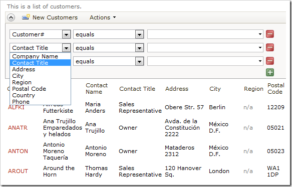
Customers advanced search bar with default Search Mode settings.

The end user can change the filter field using the field name dropdown. By default, all data fields that exist in the grid view are searchable. The user can be forced to enter a value in some search fields, while other fields may be suggested as additional options when the search bar opens for the first time. Users can also be prevented from searching by specific fields.

Start the Project Designer. Right-click on Customers / container1 / view1 / grid1 view node, and click Show All Data Fields option.
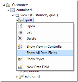
Show all data fields for grid1 view of Customers controller.

Make the following changes to the list of data fields:

Field Name Search
CompanyName Required
ContactName Forbidden
ContactTitle Forbidden
Address Suggested
City Suggested

Save the data fields, and select Browse on the tool bar to regenerate the web application.

When the browser window opens, navigate to the Customers page and open the advanced search bar. The data fields with Search Mode of “Required” or “Suggested” will be displayed initially.
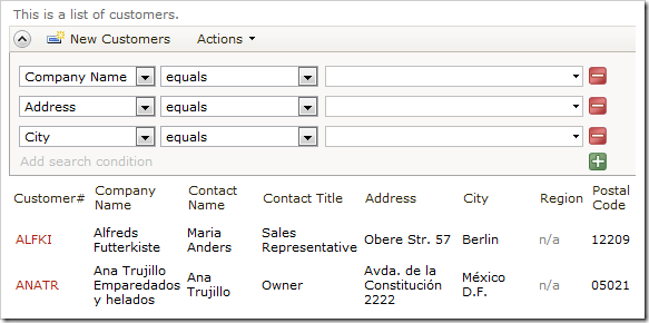
Advanced search bar of Customers grid displaying required and suggested fields.

The first field is required, and cannot be changed.
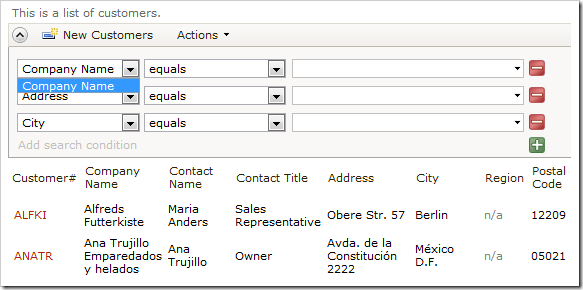
The required field cannot be changed.

If a search is performed without entering a parameter into required Company Name field, the user will be informed that the field is required.
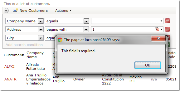
Search performed without entering a parameter into the required field will give a prompt to the end user.

Fields marked as “Forbidden” are not displayed on the list of fields available for search.
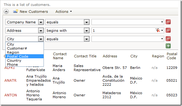
Forbidden fields are not displayed on the list of fields.