Code On Time web applications offer rich data lookup capabilities.
Fields with an Items Style of Lookup render as link within a textbox. The Eraser icon to the right of the link will clear the field. The New Record icon to the right of the textbox will create a new lookup item.
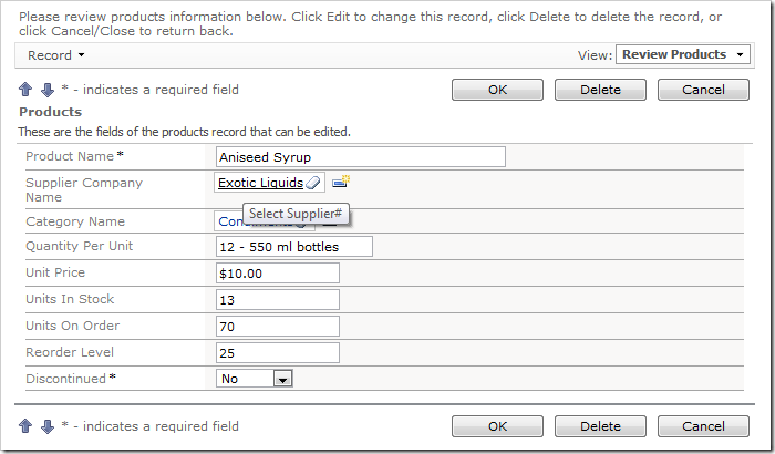
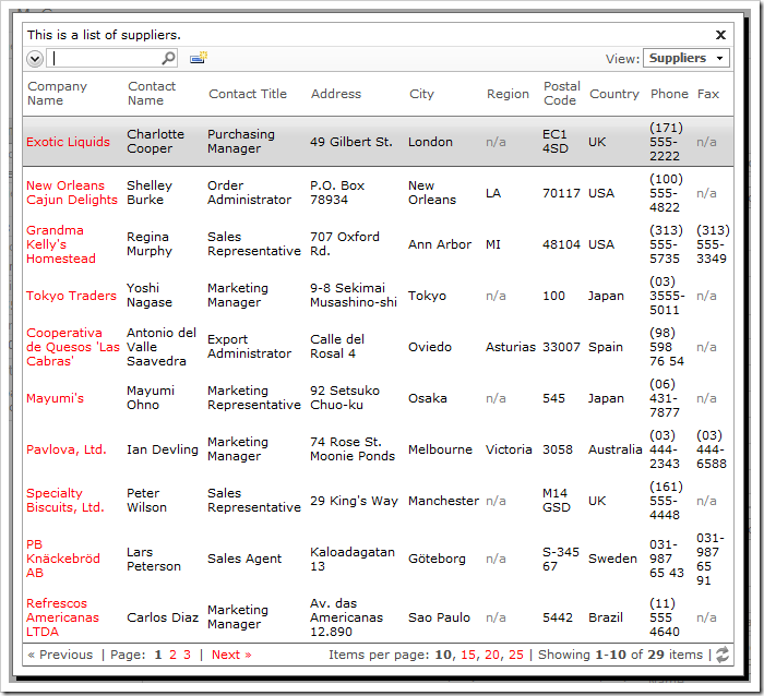
When the link is clicked on, a lookup window will open. Users can perform Quick Find or use Advanced Search Bar.
A lookup field can be configured as an Auto Complete text box. When a user types in a value, the list of lookup items will be filtered. If an item is selected, it is inserted in the field. If no item is selected, the field value will revert.
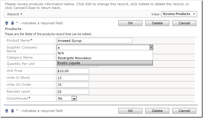
Both Lookup and Auto Complete styles do not prefetch data items when the form view is loaded.
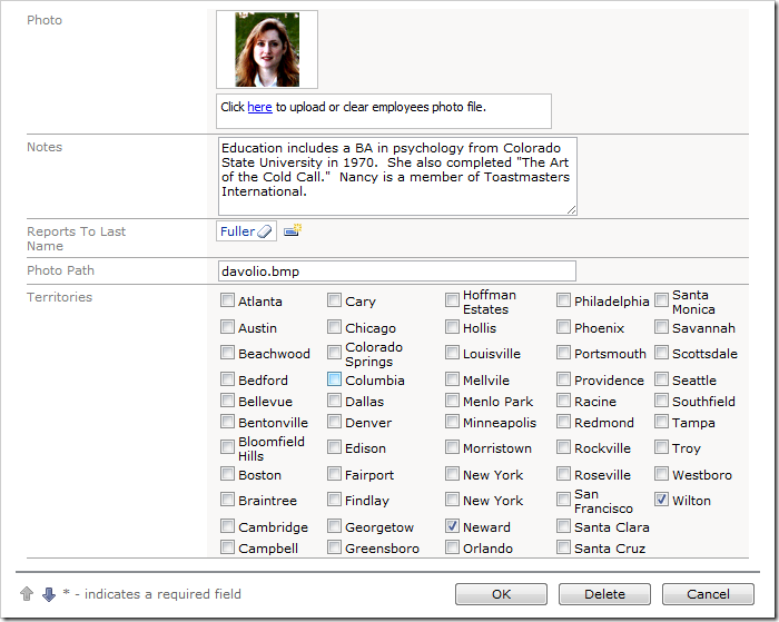
A lookup field can also be configured as a Check Box List. The values can come from a static list or a many-to-many table.
Data lookup fields can be rendered as a Radio Button List.
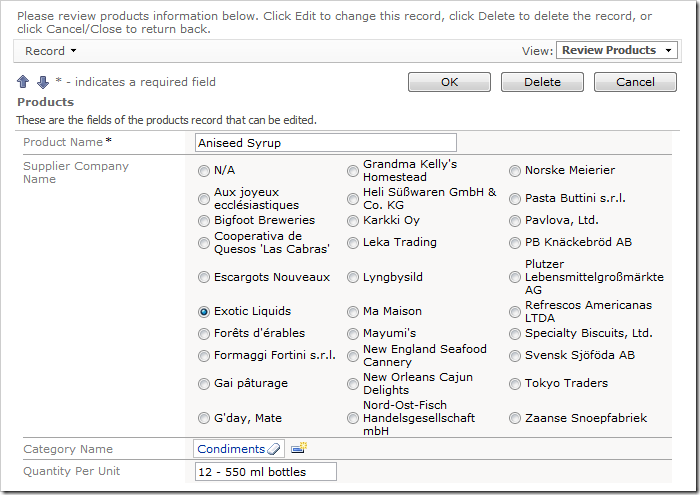
Consult the following list of properties when configuring a lookup field.
| Property | Description |
| Items Style | Select the type of Items Style for the lookup. The options include: Auto Complete, Check Box, Check Box List, Drop Down List, List Box, Lookup, Radio Button List, User ID Lookup, User Name Lookup. |
| Items Data Controller | Select the controller data source. |
| Items Data View | Select the data view that will be displayed for the lookup. |
| Data Value Field | Select the value that the field will save to the database. |
| Data Text Field | Select the text that the field will display to the end user. |
| New Data View | If the user is allowed to create new lookup items, this will specify the data view that will be used. A blank value will hide the New Record icon. |
| Copy | You can copy field values from the selected lookup item into the current record. |
| Search On Start | Enabling this property will open the lookup in search mode. |
| Activate If Blank | Enabling this property will open the lookup if the field is blank when a user opens the form. |
| Lookup Window Description | Specify the text that will be displayed above the lookup. |
| Page Size | Specify how many lookup items will be displayed at one time in the lookup modal window. |
| Search By First Letter | Allows you to search for a lookup item by the first letter. |