User Interface

Labels
AJAX(112) App Studio(7) Apple(1) Application Builder(245) Application Factory(207) ASP.NET(95) ASP.NET 3.5(45) ASP.NET Code Generator(72) ASP.NET Membership(28) Azure(18) Barcode(2) Barcodes(3) BLOB(18) Business Rules(1) Business Rules/Logic(140) BYOD(13) Caching(2) Calendar(5) Charts(29) Cloud(14) Cloud On Time(2) Cloud On Time for Windows 7(2) Code Generator(54) Collaboration(11) command line(1) Conflict Detection(1) Content Management System(12) COT Tools for Excel(26) CRUD(1) Custom Actions(1) Data Aquarium Framework(122) Data Sheet(9) Data Sources(22) Database Lookups(50) Deployment(22) Designer(177) Device(1) DotNetNuke(12) EASE(20) Email(6) Features(101) Firebird(1) Form Builder(14) Globalization and Localization(6) How To(1) Hypermedia(2) Inline Editing(1) Installation(5) JavaScript(20) Kiosk(1) Low Code(3) Mac(1) Many-To-Many(4) Maps(6) Master/Detail(36) Microservices(4) Mobile(63) Mode Builder(3) Model Builder(3) MySQL(10) Native Apps(5) News(18) OAuth(9) OAuth Scopes(1) OAuth2(13) Offline(20) Offline Apps(4) Offline Sync(5) Oracle(11) PKCE(2) Postgre SQL(1) PostgreSQL(2) PWA(2) QR codes(2) Rapid Application Development(5) Reading Pane(2) Release Notes(183) Reports(48) REST(29) RESTful(29) RESTful Workshop(15) RFID tags(1) SaaS(7) Security(81) SharePoint(12) SPA(6) SQL Anywhere(3) SQL Server(26) SSO(1) Stored Procedure(4) Teamwork(15) Tips and Tricks(87) Tools for Excel(2) Touch UI(93) Transactions(5) Tutorials(183) Universal Windows Platform(3) User Interface(338) Video Tutorial(37) Web 2.0(100) Web App Generator(101) Web Application Generator(607) Web Form Builder(40) Web.Config(9) Workflow(28)
Archive
Blog
User Interface
Monday, February 6, 2017PrintSubscribe
Icons in Touch UI

Starting with release 8.5.12.0, over 4,000 icons are available for use in apps created with Touch UI. Icons can be applied to a page, view, or action to help the user in navigation and data manipulation.
 
By default, every application comes integrated with 1,650 icons from the Material icons library, provided for re-use by Google under the Apache License Version 2.0. There are 260 Halfling glyphicons (included with Bootstrap 3.0 under MIT License integrated as well. Additional icon libraries Font Awesome (730) and Ionicons (1,466) can be included using the method described in the last section of this article.
 
The picture below shows the page “Customers”. The page has been assigned the icon “material-icon-group”, and that icon is displayed as selected in the Quick Launch area of the sidebar. The Customers edit form has been assigned the same icon, displayed in the header of the view. The “New Orders” action has icon “material-icon-add-shopping-cart” applied, and the “New Customers” action has “material-icon-group-add” icon.
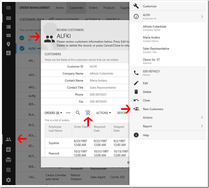
 
Icons used in Touch UI apps.

Page Icons

Learn how to assign icons to pages. These icons will be displayed in related menus. Up to five page icons will be added to the Quick Launch area of the sidebar.
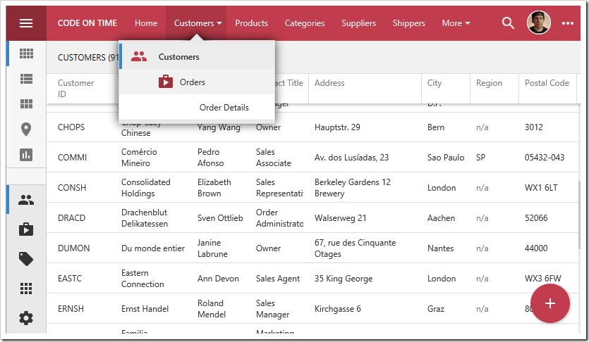
 
Adding icons to pages will push them to the Quick Launch bar of the sidebar.
 
The “Apps” menu will display a grid of all page icons.
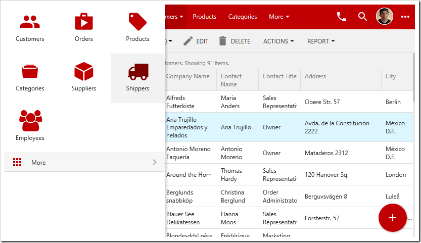
 
The "Apps" menu shows a grid of pages.

View Icons

Icons can be assigned to views in order to better communicate the purpose of a particular form.
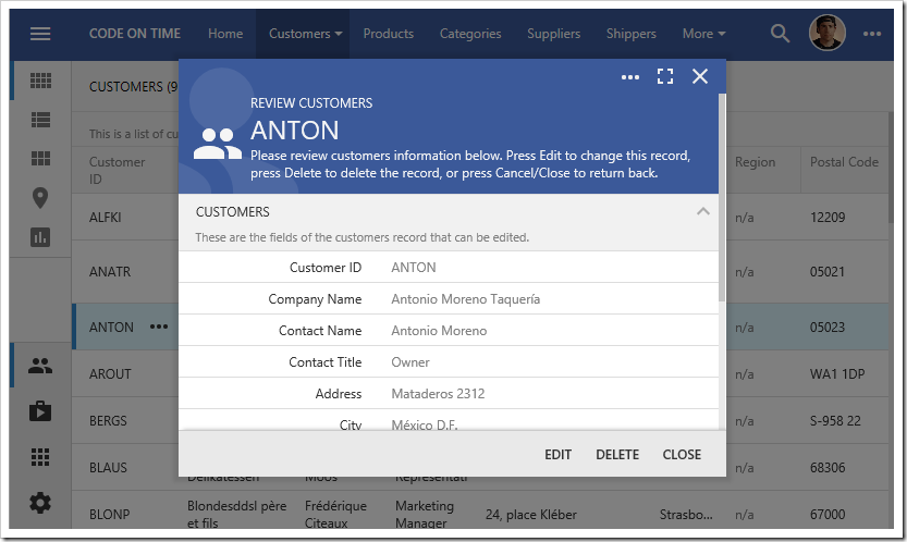
 
The Customers modal form shows an icon in the header.

Action Icons

Adding relevant icons to actions helps the user locate and understand the purpose of that action.
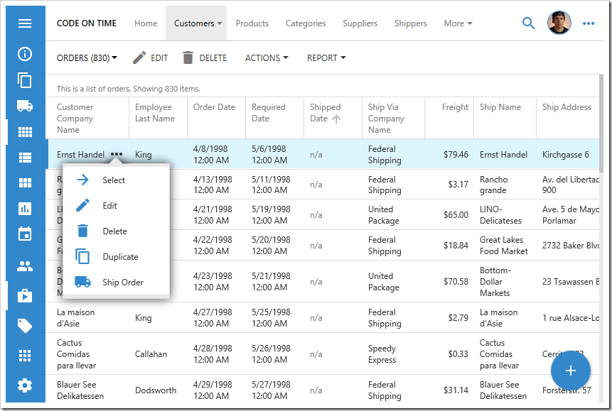
 
The "Ship Order" button, with assigned icon, is displayed in the context menu and sidebar.

Additional Icons

Only Material Icons and Halfling Glyphicons are included in Touch UI apps in order to reduce the size of the generated project and required download size for every client. Offline applications will have access to these icons. If more icons are needed, Font Awesome and Ionicons library icons can be included. If additional icons are desired, please open a support ticket for your request.
 
Let’s include icons  from these two libraries. In the Project Designer, press Open to open the project folder in File Explorer. Navigate to “~/WebSite/touch” folder. Right-click and press “New | Text Document”.
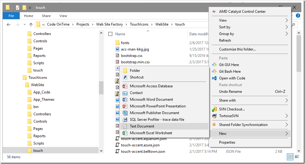
 
Creating a new text document in "~/WebSite/touch" folder.
Name the file “custom-icons.css”. Double-click the file to open in your default text editor. Replace the contents with the following:
/*Font Awesome icons*/
@import url('https://maxcdn.bootstrapcdn.com/font-awesome/4.7.0/css/font-awesome.min.css');
/*Ionicons*/
@import url('http://code.ionicframework.com/ionicons/2.0.1/css/ionicons.min.css');
Save the file and close the text editor.
 
Let’s use our new icons on some pages. Switch back to the Project Designer. Make the following assignments:
 
Page Icon
Home glyphicon-globe
Order Details fa-barcode
Categories ion-filing
Suppliers ion-cube
Shippers fa-truck
Employees fa-users

On the toolbar, press Browse. The new icons will be used on the sidebar and dropdown menus.
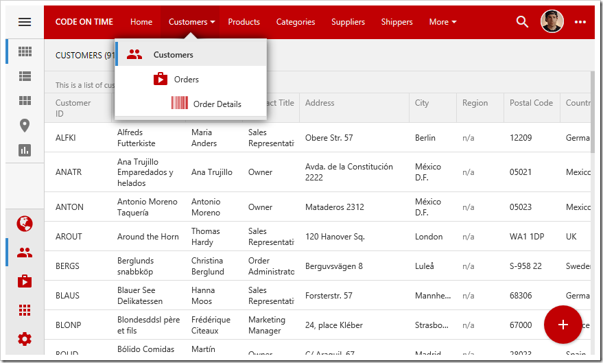
The new Font Awesome and Ionicons icons are used in the sidebar and context menus.

The icons will be visible in the site menu as well.
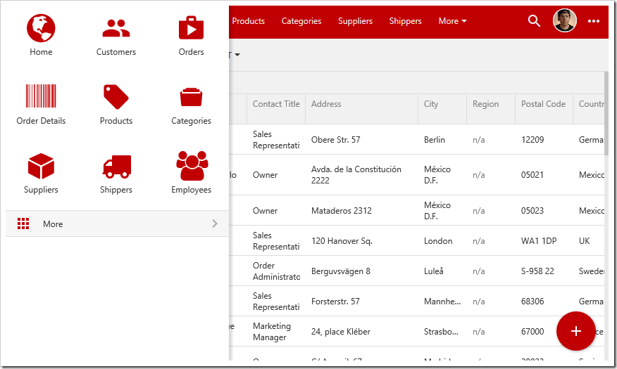
 
The new Font Awesome and Ionicons icons are used in the site menu.
Sunday, February 5, 2017PrintSubscribe
Action Icons

Adding relevant icons to actions helps the user locate and understand the purpose of that action.

Custom icons on actions.

Let’s add an action to Orders page of the sample Northwind app that will mark an order as shipped. This action will have a custom icon.

Switch back to the Project Designer. In the Project Explorer, right-click on “Orders / Actions / ag2 (Form)” and press New Action.

Adding a new action to Orders controller.

Icons can be defined by specifying the icon library and the icon name. Spaces are replaced with dashes.

Apply the following properties to the new action.

Property Value
Command Name Custom
Command Argument ShipOrder
When Client Script $row.ShippedDate == null
Icon / Custom Style material-icon-local-shipping

Press OK to save the new action.

Let’s add the action to the grid as well. Right-click on the new action, and press Copy.

Copying the action.

Right-click on “Orders / Actions / ag1 (Grid” and press Paste.

Pasting an action onto action group "ag1".

On the toolbar, press Browse and navigate to the Orders page. Press the three dot menu next to any record. The “Ship Order” action will now be present in the context menu, with the specified icon. The action is also available on the sidebar.

The "Ship Order" action shows a custom icon.

Opening the form will display the action at the bottom of the form. Icons are not displayed on the form action bar. Activating the context menu will display the icon next to the “Ship Order” action.

Custom icon is displayed next to the form action in the context menu.

Sunday, February 5, 2017PrintSubscribe
View Icons

Icons can be assigned to views in order to better communicate the purpose of a particular form at a glance.

Customers edit form with a custom icon.

By default, view headers will display the view label, description, and the first field value. The background will be a solid color.

Standard customers form with no icon.

Scrolling down will move the header text to the toolbar.

Scrolling down in a modal will move the header text to the toolbar.

Let’s assign an icon to the views of Customers controller in the Northwind sample app.

Switch back to the Project Designer. In the Project Explorer, switch to the Controllers tab. Double-click on “Customers / Views / editForm1”.

Editing the "editForm1" view of Customers controller.

Icons can be defined by specifying the icon library and the icon name. Spaces are replaced with dashes.

Assign an icon to the view in the Tags property, and press OK to save.

Property Value
Tags material-icon-group

Double-click on “Customers / Views / createForm1”. Assign an icon to this view as well.

Property Value
Tags material-icon-group-add

On the toolbar, press Browse. Navigate to the Customers page, and select a customer. The header will display the new icon on the left side. The background will show a large greyed out version of the same icon.

The Customers editForm1 view with a custom icon

Scrolling down will reveal a smaller version of the icon.

The icon is also displayed in the modal toolbar.

Close the form, and press the New icon. The create form will display the assigned icon as well. The picture below shows the create form on a smaller device or window.

The view header shows the custom icon on smaller screens.

Continue to Page Icons