Icons can be assigned to views in order to better communicate the purpose of a particular form at a glance.

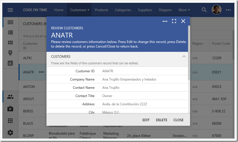
By default, view headers will display the view label, description, and the first field value. The background will be a solid color.

Scrolling down will move the header text to the toolbar.

Let’s assign an icon to the views of Customers controller in the Northwind sample app.
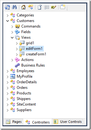
Switch back to the Project Designer. In the Project Explorer, switch to the Controllers tab. Double-click on “Customers / Views / editForm1”.

Icons can be defined by specifying the icon library and the icon name. Spaces are replaced with dashes.
Assign an icon to the view in the Tags property, and press OK to save.
| Property | Value |
| Tags | material-icon-group |
Double-click on “Customers / Views / createForm1”. Assign an icon to this view as well.
| Property | Value |
| Tags | material-icon-group-add |
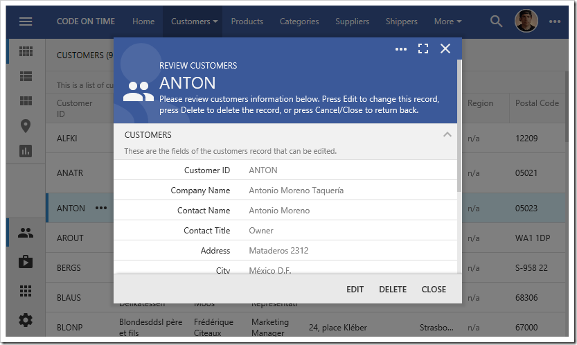
On the toolbar, press Browse. Navigate to the Customers page, and select a customer. The header will display the new icon on the left side. The background will show a large greyed out version of the same icon.

Scrolling down will reveal a smaller version of the icon.

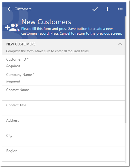
Close the form, and press the New icon. The create form will display the assigned icon as well. The picture below shows the create form on a smaller device or window.
