Release Notes

Labels
AJAX(112) App Studio(8) Apple(1) Application Builder(245) Application Factory(207) ASP.NET(95) ASP.NET 3.5(45) ASP.NET Code Generator(72) ASP.NET Membership(28) Azure(18) Barcode(2) Barcodes(3) BLOB(18) Business Rules(1) Business Rules/Logic(140) BYOD(13) Caching(2) Calendar(5) Charts(29) Cloud(14) Cloud On Time(2) Cloud On Time for Windows 7(2) Code Generator(54) Collaboration(11) command line(1) Conflict Detection(1) Content Management System(12) COT Tools for Excel(26) CRUD(1) Custom Actions(1) Data Aquarium Framework(122) Data Sheet(9) Data Sources(22) Database Lookups(50) Deployment(22) Designer(177) Device(1) DotNetNuke(12) EASE(20) Email(6) Features(101) Firebird(1) Form Builder(14) Globalization and Localization(6) How To(1) Hypermedia(2) Inline Editing(1) Installation(5) JavaScript(20) Kiosk(1) Low Code(3) Mac(1) Many-To-Many(4) Maps(6) Master/Detail(36) Microservices(4) Mobile(63) Mode Builder(3) Model Builder(3) MySQL(10) Native Apps(5) News(18) OAuth(9) OAuth Scopes(1) OAuth2(13) Offline(20) Offline Apps(4) Offline Sync(5) Oracle(11) PKCE(2) Postgre SQL(1) PostgreSQL(2) PWA(2) QR codes(2) Rapid Application Development(5) Reading Pane(2) Release Notes(184) Reports(48) REST(29) RESTful(29) RESTful Workshop(15) RFID tags(1) SaaS(7) Security(81) SharePoint(12) SPA(6) SQL Anywhere(3) SQL Server(26) SSO(1) Stored Procedure(4) Teamwork(15) Tips and Tricks(87) Tools for Excel(2) Touch UI(93) Transactions(5) Tutorials(183) Universal Windows Platform(3) User Interface(338) Video Tutorial(37) Web 2.0(100) Web App Generator(101) Web Application Generator(607) Web Form Builder(40) Web.Config(9) Workflow(28)
Archive
Blog
Release Notes
Tuesday, December 15, 2015PrintSubscribe
Getting Started with Model Builder

Code On Time release 8.5.6.0 introduces Model Builder – a new way to build the app you want.

In the past, applications created with Code On Time created a baseline for every entity in the database, and tried to estimate the best configuration for every page, controller, and application component. A frequent complaint about the previous versions about the app generator is the lack of ability to control this automatic process. In response to these complaints, we have included a new feature, designed to give Code On Time users more control over the application development process.

The Model Builder allows developers to design a data model for each and every database entity used by the app generator. They can pick and choose fields to include in the model, define or create foreign key relationships, and even import fields from several levels away easily. Names and labels can be easily changed, formatting can be applied globally, and sorting and filtering can be applied to form a business entity.

The Model Builder is now the first step for the creation of any Code On Time premium database app.

See an example of the default data model for Order Details table of Northwind database.
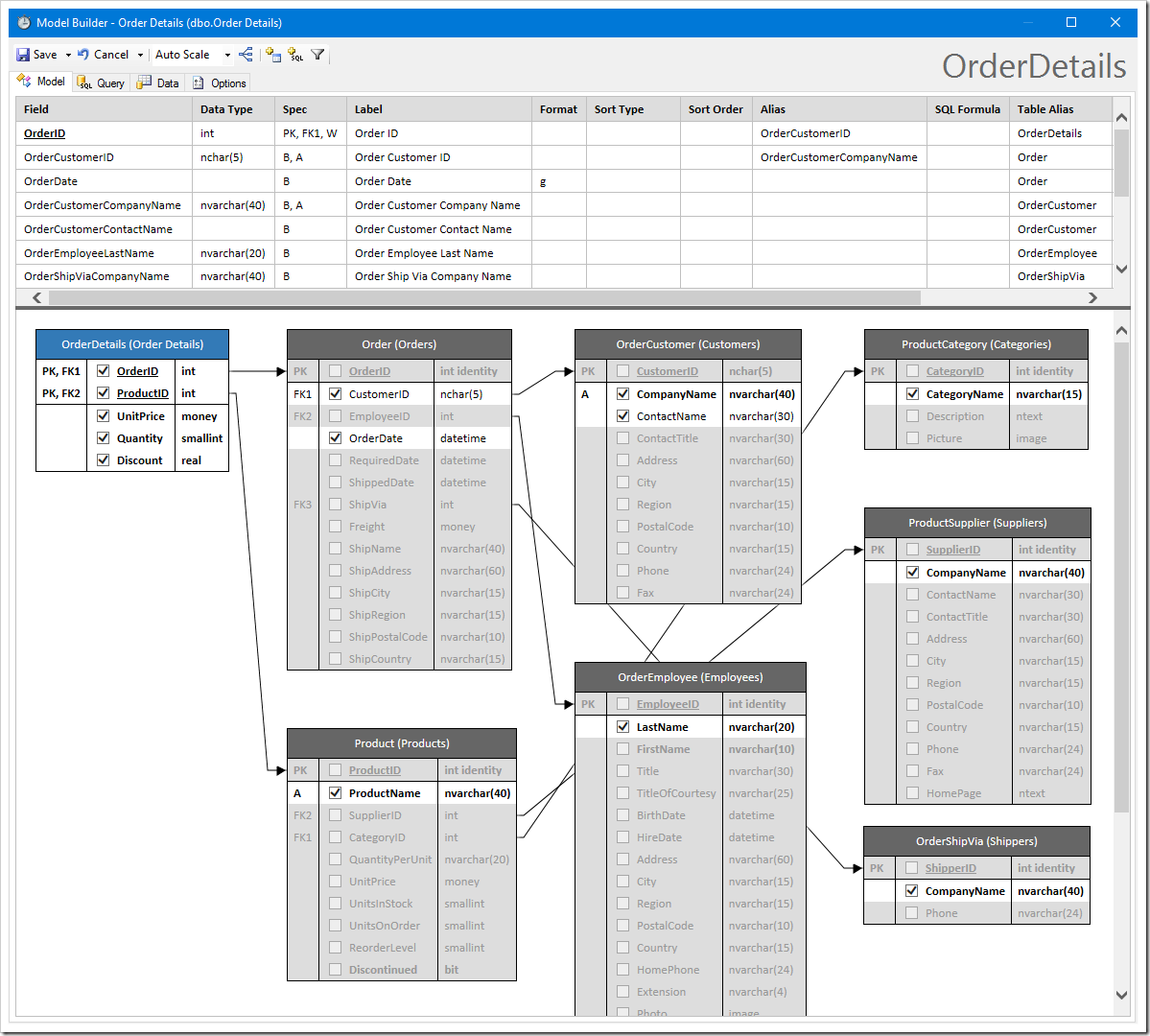
example of the default data model for Order Details table of Northwind database

In addition to Model Builder, the following noteworthy bug fixes and improvements have been added to release 8.5.6.0:

  • Support for Visual Studio 2015
  • Support for Azure 2.7 and 2.8
  • Support for .NET 4.6
  • CodeMirror integration in Model Builder and Project Designer
  • Charts in Touch UI now support color tags. Specify a list of colors, like so: "pivot1-row1-colors:'red, green, blue'".
  • Added tag “calendar-mini-disabled” to disable the mini calendar on the sidebar
  • Controller XML files ending with “.baseline.xml” in the Controllers folder will be used as a baseline controller, ignoring the data model.
  • Fixed scaling problem on high DPI devices.
  • Touch UI inputs now show a single line below the input.
  • Neutral cultures are now included in the list supported by app generator
  • Boolean fields will show check glyphicon in Touch UI when in read-only mode
  • Many more minor bug fixes

Working with the Model Builder

After entering the database connection string, a list of database entities will be listed. Select an entity to start building a data model.
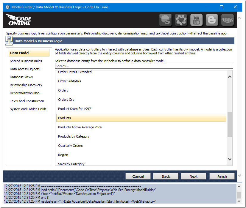
List of database objects listed that can be used to create data models.

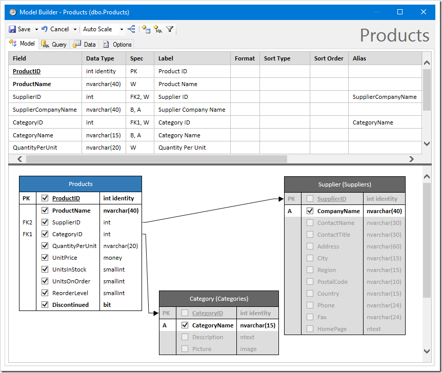
The Model Builder will open.

The default data model for Products table.

Adding additional fields to the data model is simple. Check the box next to a column to include the field.
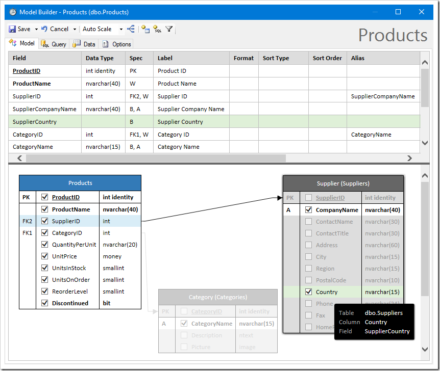
Including "Country" field in the data model.

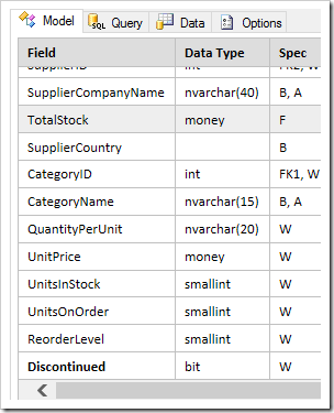
Fields defined with a custom SQL formula are also simple to add. Click the “Add Formula Field” button on the toolbar to get started.

Adding a custom SQL formula field to the data model.

Enter a name for the field in the first textbox. Enter the formula in the text area.
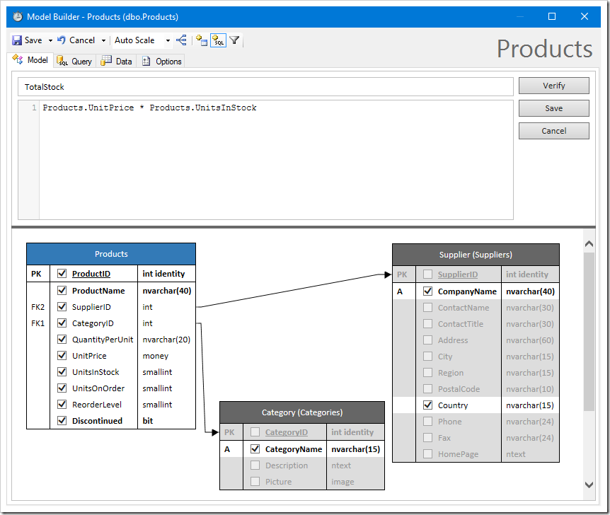
Adding a custom SQL formula field to the data model.

Use “Ctrl+Space” to see a list of columns. Fields can also be dragged from the diagram to be added to the formula.
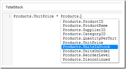
Auto complete option in the SQL formula field.

Reorder fields in the model by dragging the Field column to the correct position.
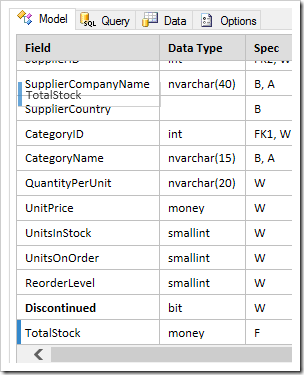
Reordering fields via drag and drop.     Reordering fields via drag and drop.

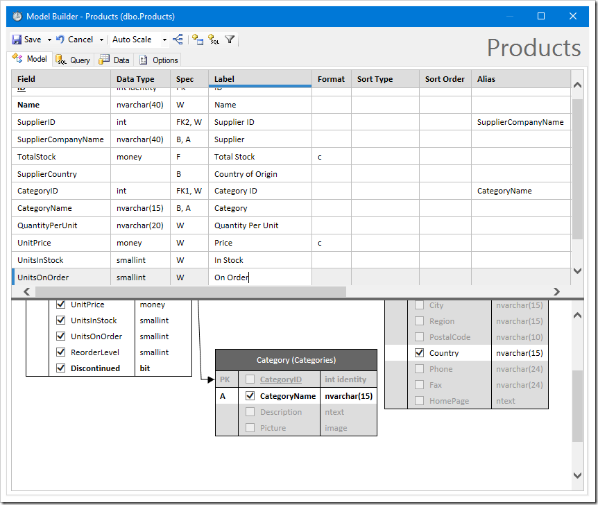
Field labels and options can be changed by clicking in the cell. The following shortcuts can be used to quickly and easily navigate between the different cells:

  • If mouse cursor shows text, click to change
  • F2 to Select All/End
  • Left/Right moves between cells in row
  • Tab/Shift+Tab to move between cells
  • Up/Down to move up down
  • Enter/Shift+Enter to move up down
  • Esc once will restore original if changed, Esc twice will exit edit mode
  • Ctrl+Enter will save, stay editing

Changing labels in the data model.

Sorting can be added to the data model by entering the Sort Type and Sort Order.
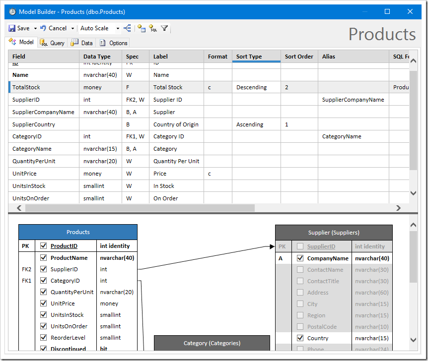
Changing sorting in the data model.

The Query tab shows the command for the data model.
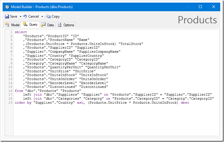
The Query tab shows the command for the data model.

The Data tab shows the output of the command. By default, Raw Data mode is on. This will show all primary and foreign key fields, and show native value formatting from the database.
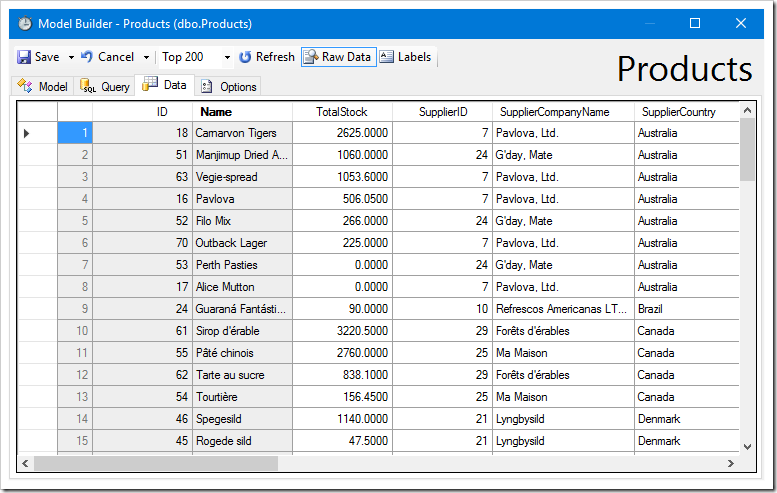
The Data tab shows sample output of the data model's command.

Disabling Raw Data will hide primary and foreign keys, and apply formatting.
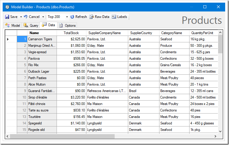
Disabling Raw Data mode will hide keys, and apply formatting.

The Labels button will replace field names with labels.
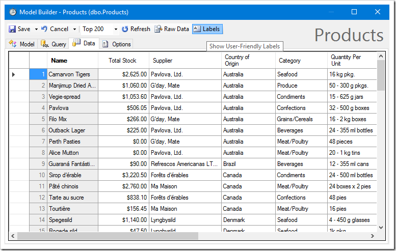
Enabling "Labels" button will replace field names with labels.

Click Save to persist the new data model. Proceed to generate the application. A page has been added, showing a grid of products, as defined by the data model.
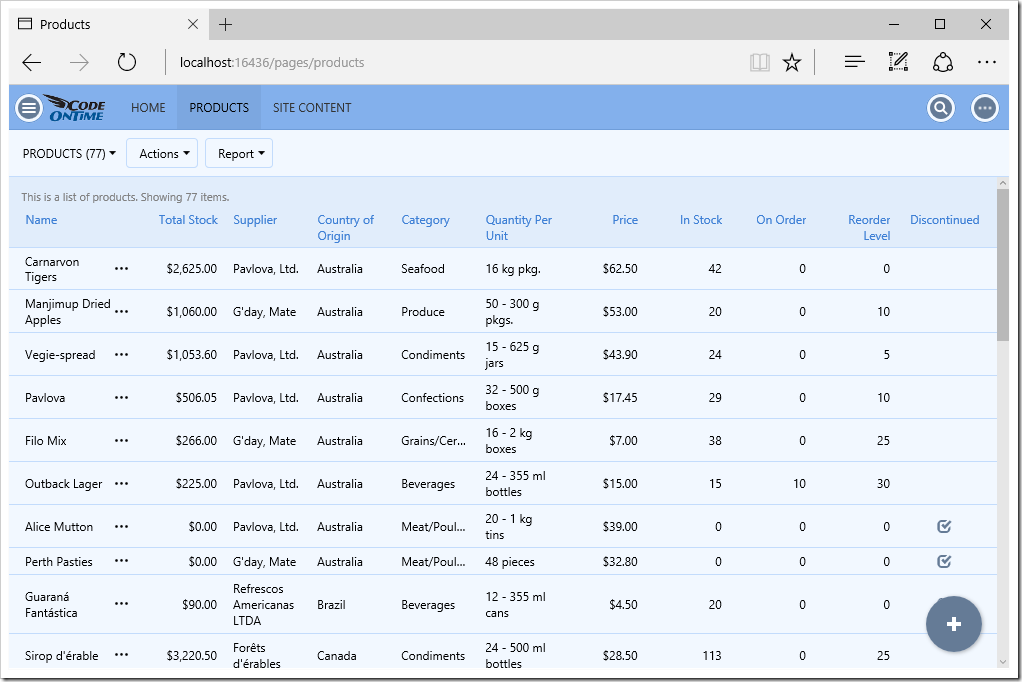
A list of products, as defined by the data model.

The user can also switch to list view.
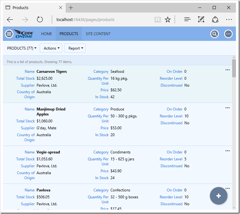
A list of products, as defined by the data model.

Automatic charts have also been created.
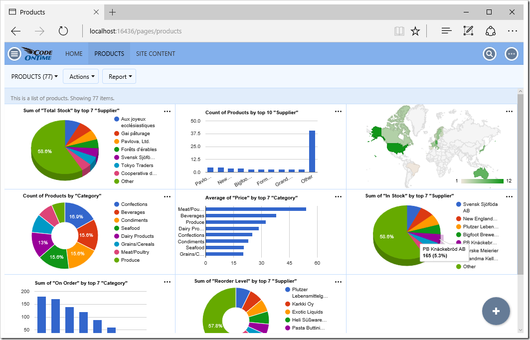
Charts automatically created for Products.

You can edit existing products or create new ones. Notice, however, that the Supplier ID and Category ID have not been configured as lookups.
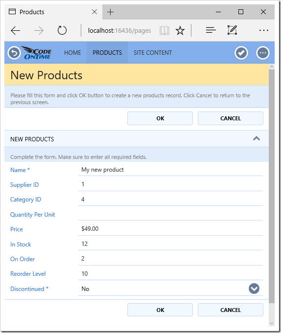
Products edit form, with Suppliers and Categories not defined as data models.

Let’s add Categories and Suppliers data models. Go back to the generator and create a data model for Categories. Notice that these two tables that are referred to are already suggested.
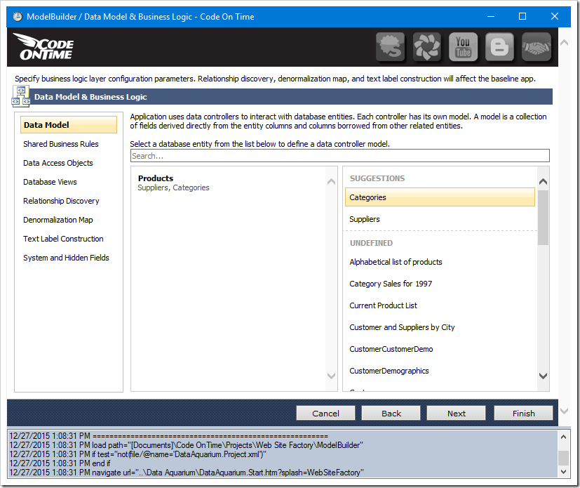
Creating data models for suggested database entities.

Create the data model for Categories.
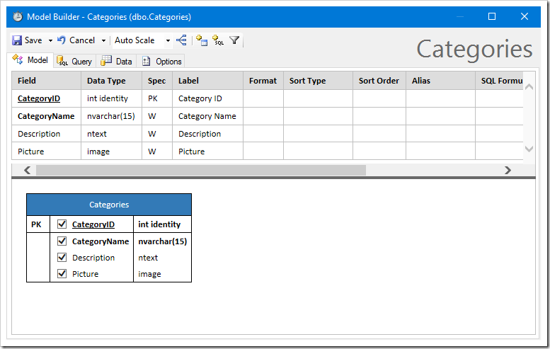
Creating data model for categories.

Create a data model for Suppliers. Be sure to sort by CompanyName and disable the HomePage field.
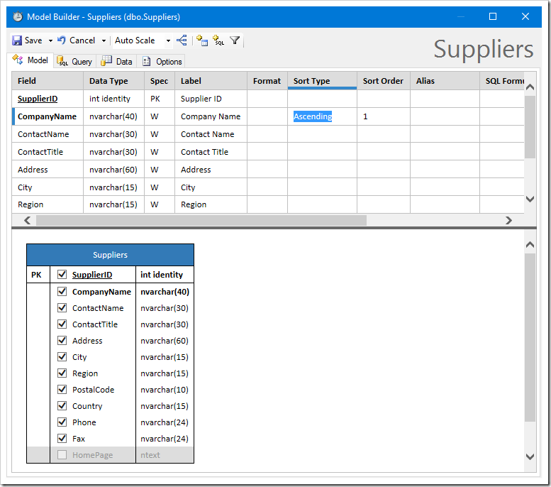
New data model for Suppliers, sorted by CompanyName and HomePage field disabled.

Regenerate the project. Be sure to refresh when prompted. Notice that Supplier and Category are now rendered as lookups.
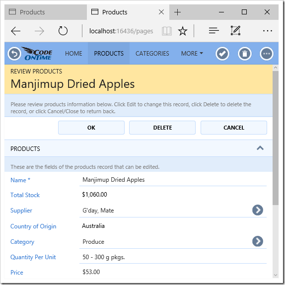
Products edit form with Supplier and Category models defined.

Activating the Supplier lookup will open a list of suppliers.
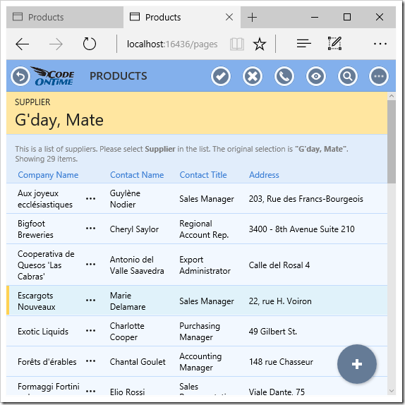
Supplier lookup

Activating the Categories lookup will show a list of categories to select.
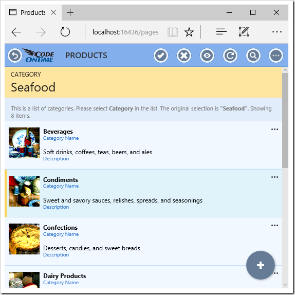
Categories lookup.

Let’s create a second data model for Products, that only shows products from North America. There are two ways of creating a copy of a data model – saving a copy of an existing model, or creating a new model, listed under “Defined” section.
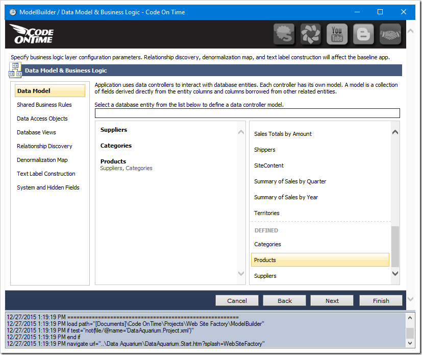
Creating a data model for an entity with an existing data model.

Let’s create a copy. Open the Products data model, and change the name to “NorthAmericanProducts” by typing in the name in the top-right corner.
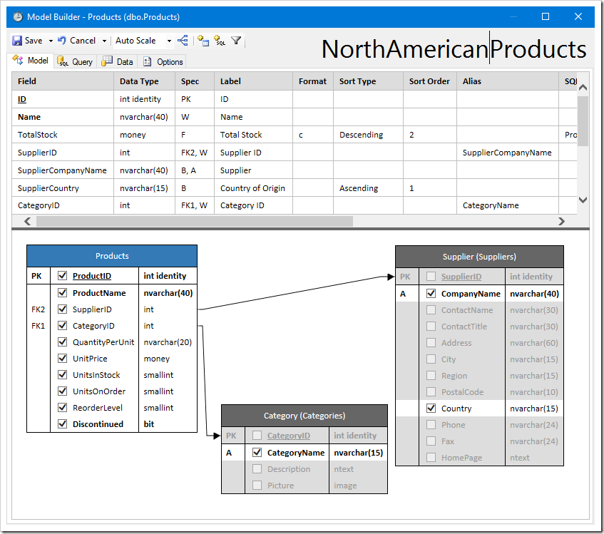
Changing the name of the model to "NorthAmericanProducts".

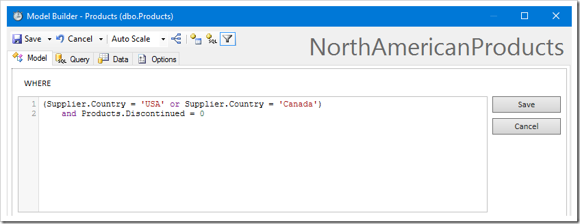
Let’s add a filter to the new model. Click the “Add Filter…” button on the toolbar.

Adding a filter to the model.

Enter the filter in the text area.

Entering a filter.

In addition, sort the ProductName in descending order.
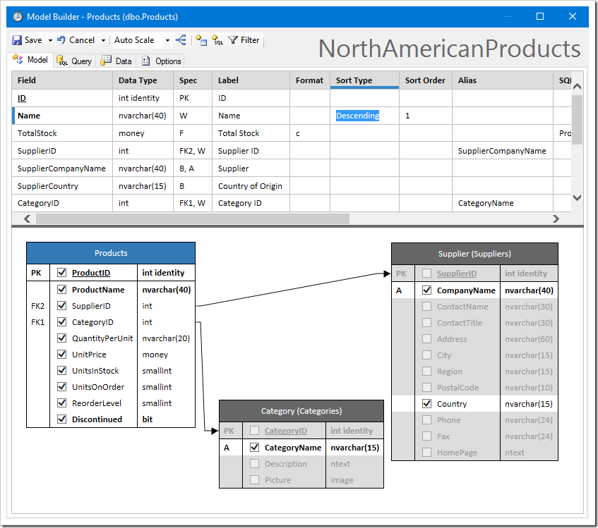
Sorting the model by ProductName in descending order.

The Query tab will show the new command.
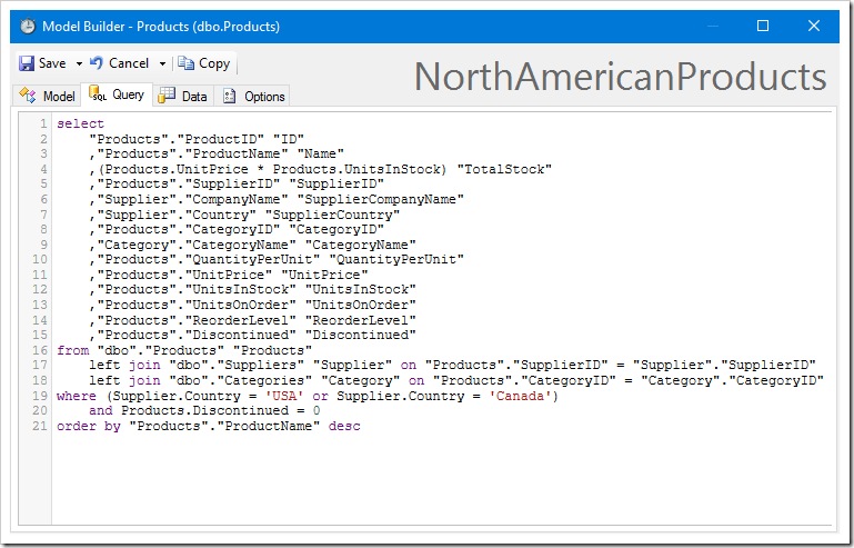
The new command of the data model.

The Data tab shows that the sorting and filtering was a success.
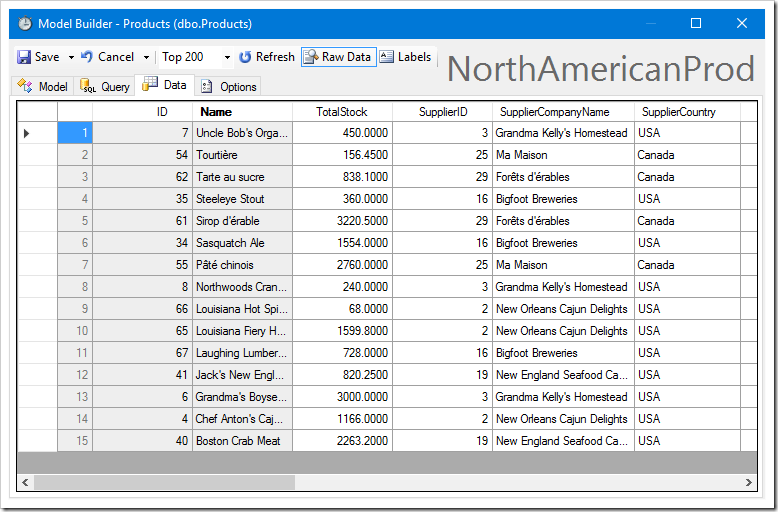
The Data tab showing the output of the command.

To save the data model as a copy, activate the dropdown next to “Save”, and press “Save a Copy”.
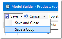
image

Proceed to generate the application. Notice that another page has been added to the sitemap. This page is a Single Page Application created to handle products from North America.
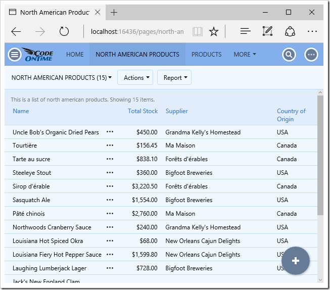
The new page shows products from North America.

Virtual Connections

One of the most powerful aspects of the Model Builder is the ability to define virtual primary and foreign keys. Let’s create a data model using the view Alphabetical List Of Products.
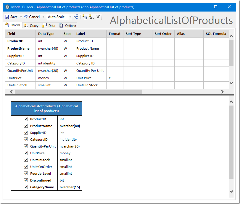
Creating a data model for "Alphabetical List of Products".

The application framework is unable to perform any CRUD operations on a business entity until a primary key is defined. Let’s create a virtual primary key by right-clicking ProductID and pressing Set Primary Key.
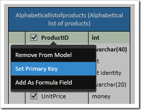
Setting the virtual primary key of the Alphabeticallistofproducts data model.

The spec “VPK” will be added to the first column of the diagram.
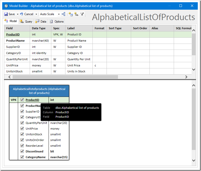
The ProductID field has been specified as the primary key of the model.

Notice that because Alphabetical List Of Products is a view, foreign keys are not known, and values from these foreign key relationships cannot be included until a virtual foreign key is defined.

On the toolbar, click the “Add Table” button.

Adding a table to the diagram.

The field list at the top of the Model tab will be replaced with a list of database objects.
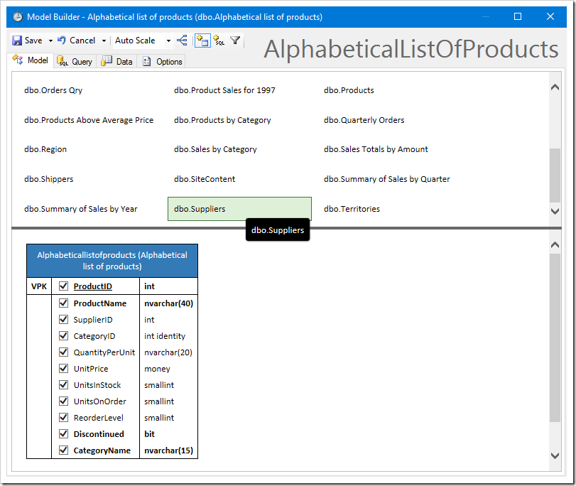
Adding a table from the list of available tables.

Drag the “dbo.Suppliers” table onto the diagram. Rename the alias of Suppliers to “Supplier” by clicking on the header of the new table in the diagram.
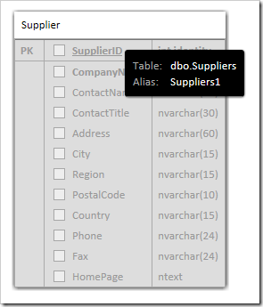
Renaming the new table to "Supplier".

Then, drag the “SupplierID” field from Alphabeticallistofproducts onto SupplierID column of Suppliers table to form a virtual foreign key. You can now check fields from the Suppliers table to include in the data model.
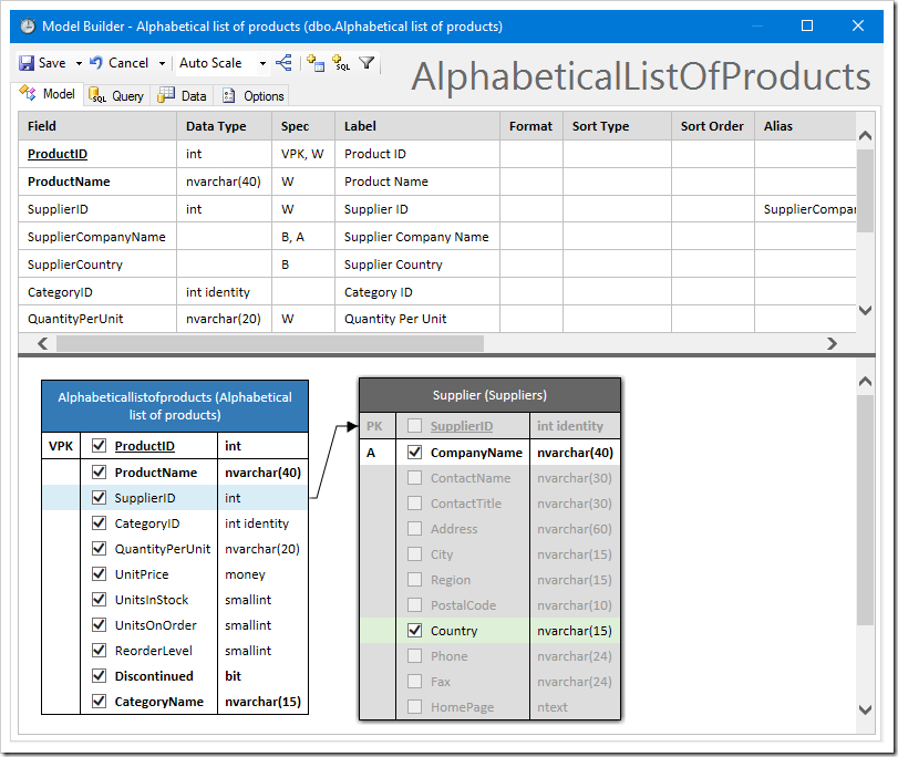
Including fields of Suppliers table into Alphabeticallistofproducts data model.

Sort this data model by entering “Descending” in the Sort Type of ProductName.
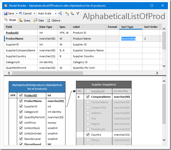
Sorting by ProductName.

The final result will show the inclusion of Supplier fields in the grid.
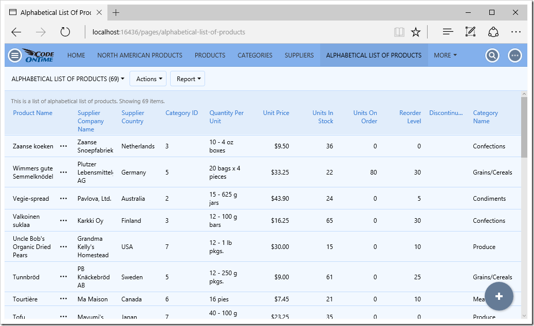
The new SPA for Alphabeticallistofproducts.

Sunday, September 6, 2015PrintSubscribe
Calendar View, Mini-Calendar, Multi-Select, Responsive Grid with Auto-Balancing, Hyperlinks, Multi-Column Sorting

We wanted to share with you that Iron Speed, Inc. has discontinued operations. Diligent developers have surely tried Iron Speed Designer and for various reason have turned to Code On Time instead. Read our comment about Iron Speed to learn more. We are charging ahead - expect to be amazed!

Calendar view style

Code On Time update 8.5.5.0 introduces a brand new view style into the already potent mix of visualization methods available to end users of Touch UI. View style Calendar brings a whole new level of interactions with data. Drag & drop is fully supported with numerous enhancements planned ahead. Take a look at the Calendar and other view style supported right now.

Calendar view style in Touch UI

The following tags allowing controlling otherwise fully automatic display of Calendar view style:

  • calendar-date will mark a particular data field as start date or “general” date of event. An event is a database row with a date column.
  • calendar-end specifies the “end” date of the calendar event. Mark a field as “end” date to allow “resizable” events.
  • calendar-text specifies the field value displayed on the event
  • calendar-color specifies option “color” source for the events. For example, an order event can be presented with a different color for each employee associated with it. 24 standard colors are supported.
  • calendar-disabled excludes “date” field from being displayed on the calendar.

Mini-Calendar

A permanent sidekick called mini-calendar is display on the sidebar whenever at least one data field is available to the user. Mini-calendar filters data in all data views and serves as a navigator in Calendar view.

Mini-calendar filters data displayed in Charts view style in the app with Touch UI

Other highlights include responsive grid with auto-balancing, multi-column sorting, and support for Hyperlink Format String property in Touch UI.

Multi-Select

Ability to select multiple rows is now fully supported in Touch UI in Grid, List, and Cards view styles. End user can select up to a 1000 items at once.

Multi-select in the grid view style in the app with Touch UI

Responsive Grid with Auto-Balancing

The responsive Grid view style has been redesigned and now support auto-balancing of data.  Notice that the data is densely distributed on the screen. Built-in screen-size breakpoints automatically reduce the number of fields visible to the user .

Responsive grid view style with auto-balancing in the app with Touch UI

Application framework uses these breakpoints:

  • tn (tiny) – 480px
  • xs (extra small)  - 768px
  • sm (small) – 992px
  • md (medium) – 1199px
  • lg (large) – 1440px
  • xl (extra larget) – anything larger than 1440px

If you want to ensure that a particular data field is display on a tiny screen in Grid view style than tag it as “tn-grid”. The framework will automatically take core of the remaining fields.

Hyperlink Format String

Touch UI now supports hyperlink format strings. Field will be displayed as underline if a hyperlink is present. Context menu will display items for every field with a hyperlink even if it is not visible in the current view style.

Hyperlinks in the app with Touch UI

Multi-Column Sorting

End users are now able to perform sorting on multiple columns.

Multi-column sorting in an app with Touch UI

Other Enhancements

The release also introduces numerous enhancements to both Touch and Desktop UI.

  • High performance reading of many-to-many fields. Framework performs a single database request per many-to-many field to retrieve junction table rows that match the rows of the data page that will be returned to the client. (Desktop and Touch)
     
  • Authorized roles can be assigned to individual data views in SPA applications (Desktop and Touch).
     
  • Import processor assigns the same default values to all imported rows (Desktop and Touch)
     
  • Aggregates are now calculated on result sets based on stored procedures and web services. (Desktop and Touch)
     

  • SQL Business rules allow clearing "Modified" property of field values as follows
      set @FieldName_Modified = 0

    Application framework will not use the field in update/insert/delete operation.
     

  • Single Page Applications allow anonymous calls to data controllers.
     

  • Relationship Explorer links now use shortcuts for data controller URL parameters _commandName and _commandArgument. The new syntax uses _command and _argument.
     
  • HTML page implementation is now also supported in Relationship Explorer links.
     
  • “Borrowed” blob fields are correctly displaying a thumbnail in Touch and Desktop UI
     
  • Touch UI allows right-click of items in all view style with ability to perform quick filtering.
     
  • Paging is now supported in “Summary” presentation in Touch UI.
     
  • Touch UI memorizes tab selection for the last 10 objects on any given page.
     
  • DACL correctly processes parameters @BusinessRules_, @Url_, and @Session_.
     
  • Fixed issue with Oracle Session State throwing "Value does not fall within the expected range".
     

Coming Next

We are bring a controller-level Data Model in the Project Designer. You will be able to set up your own tables, columns, and relationships instead of relying on the app generator to do so. This will give complete GUI-based control over the command and fields in the application baseline.

Also Expect a mini-calendar to become a part of Desktop UI. This handy feature work similar to its counterpart in Touch UI.

Mini-calendar in the upcoming revision of Desktop UI

Monday, June 1, 2015PrintSubscribe
Responsive Grids, User Identity, and Preview of “Live” Content Editing

Code On Time release 8.5.4.0 introduces several important enhancements.

Touch UI now uses glyphicons to indicate sort and filter state. Contents of cells in responsive grid is wrapped to maximize the amount of visible information. The same “wrapped cell” design is implemented in “data sheet” view style, which will be available soon to complement responsive grid. The new view style will display a complete set of fields that can are scrolled horizontally on any screen size. The original implementation of responsive grid displayed rows of the same height making it difficult to read the content in the cells.

image

User identity icon is now displayed on the menu bar. The name of the user is displayed partially or completely next to the icon if the width of the device allows that. Otherwise the user name is displayed in the popup menu assigned to the icon.

image

Install integrated CMS in your app with Single Page App implementation model and you can try live editing of content pages. Add a content page based on any Bootstrap template to your project and select “Edit Page” in the “More” menu. If you choose “Properties’ then the app will redirect to the site content page. Only administrators, content editors, and developers are allowed to edit content pages.

image

Click on any content and change it directly in the browser.

image

Change the properties of content items.

image

Select glyphicons from context menu:

image

Save the page directly to integrated content management system.

image

Content pages stored in CMS are rendered both in Desktop and Touch UI. Live editing is only supported in Touch UI. Future releases will introduce a complete set of page editing capabilities that will enable constructing appealing content without effort. A collection of page templates and content fragments will be installed directly in the CMS.

The following bug fixes and enhancements are also included:

  • Master view refresh when children are changed is now supported in Touch UI. If a master view has one or more fields derived from child tables as aggregates (totals, counts, averages, etc.) then specifying “controller:NAME_OF_CHILD_DATA_CONTROLLER” in Context Fields property of a field will cause the master view to refresh and forms to recalculate the fields. This syntax is supported in both Desktop and Touch UI. The old syntax will also work.
     
  • Fixed desktop CSS but that has colored glyphicons in "content" pages. Now the color is scoped to ".DataViewContainer" selector.
     
  • Removed xmlns="http://www.w3.org/1999/xhtml" from SPA apps and enhanced content encoding tag in the output markup.
     
  • Introduced data-editable tag in content page templates to enable live editing of content.
     
  • Site content is considered to be text if its type is "application/javascript".
     
  • Desktop UI cancels pending "valueChanged" call in calcualted fields that leads to exceptions when a modal data view is closed.
     
  • Client framework will pass a combined filter that includes standard user filters and advanced search options when executing actions.
     
  • User Lookup does not crashes desktop UI anymore.
     
  • If a popup list of options does fit entirely on screen than Touch UI does not resize the menu and instead positions it sideways.
     
  • Touch UI aligns thumbnails vertically when Cards view style is active.
     
  • Touch UI aligns thumbnails to the top in lists with multiple paragraphs.

Calendar View Style is Coming Soon

We are getting close to completion of the new view style called Calendar. Take a look at a few screen shots below. The new view style uses a common “horizontal infinite scrolling” infrastructure in day and week sub-views shared with the upcoming “data sheet” view style. The screen shots are displayed without data. Data will be displayed on demand when user stops scrolling. The data pivoting technology implemented to support Smarts Charts is the foundation of the Calendar view style.

Year

image

Month

image

Week

image

Year View on  a Small Screen

image

Continue to Maintenance Release