Database Lookups

Labels
AJAX(112) App Studio(9) Apple(1) Application Builder(245) Application Factory(207) ASP.NET(95) ASP.NET 3.5(45) ASP.NET Code Generator(72) ASP.NET Membership(28) Azure(18) Barcode(2) Barcodes(3) BLOB(18) Business Rules(1) Business Rules/Logic(140) BYOD(13) Caching(2) Calendar(5) Charts(29) Cloud(14) Cloud On Time(2) Cloud On Time for Windows 7(2) Code Generator(54) Collaboration(11) command line(1) Conflict Detection(1) Content Management System(12) COT Tools for Excel(26) CRUD(1) Custom Actions(1) Data Aquarium Framework(122) Data Sheet(9) Data Sources(22) Database Lookups(50) Deployment(22) Designer(178) Device(1) DotNetNuke(12) EASE(20) Email(6) Features(101) Firebird(1) Form Builder(14) Globalization and Localization(6) How To(1) Hypermedia(2) Inline Editing(1) Installation(5) JavaScript(20) Kiosk(1) Low Code(3) Mac(1) Many-To-Many(4) Maps(6) Master/Detail(36) Microservices(4) Mobile(63) Mode Builder(3) Model Builder(3) MySQL(10) Native Apps(5) News(18) OAuth(9) OAuth Scopes(1) OAuth2(13) Offline(20) Offline Apps(4) Offline Sync(5) Oracle(11) PKCE(2) Postgre SQL(1) PostgreSQL(2) PWA(2) QR codes(2) Rapid Application Development(5) Reading Pane(2) Release Notes(184) Reports(48) REST(29) RESTful(29) RESTful Workshop(15) RFID tags(1) SaaS(7) Security(81) SharePoint(12) SPA(6) SQL Anywhere(3) SQL Server(26) SSO(1) Stored Procedure(4) Teamwork(15) Tips and Tricks(87) Tools for Excel(3) Touch UI(93) Transactions(5) Tutorials(183) Universal Windows Platform(3) User Interface(338) Video Tutorial(37) Web 2.0(100) Web App Generator(101) Web Application Generator(607) Web Form Builder(40) Web.Config(9) Workflow(28)
Archive
Blog
Database Lookups
Monday, June 4, 2012PrintSubscribe
Data Field Search Modes

The Advanced Search Bar allows end users to combine specific search parameters to find the data they need.

When the user first opens the search bar, three search fields will be present, matching the first three data fields in the grid.

Default advanced search bar for Products grid view.

The web app can be customized to require users to use a search field, suggest a field, or restrict users from searching by a specific field.

For example, the customized search bar below has one required field (Product Name) and three suggested fields (Unit Price, Units In Stock, Units On Order) that appear when the user opens the search bar for the first time. The required Product Name field cannot be changed.

Customized search bar for Products grid view. Product Name is required and cannot be changed. Unit Price, Units In Stock, and Units On Order are suggested.

If a search is performed without entering a parameter in the required field, the user will be notified that the field is required.

When a search is performed without a required search parameter, the user will be prompted to enter a parameter.

The Discontinued field was marked as “Forbidden”, and does not show up on the list of searchable fields.

Fields marked as 'Forbidden' will not show up on the list of search fields.

Monday, June 4, 2012PrintSubscribe
Data Field Search Options

The Advanced Search Bar automatically determines multiple search options for each search field, based on the type of the field.
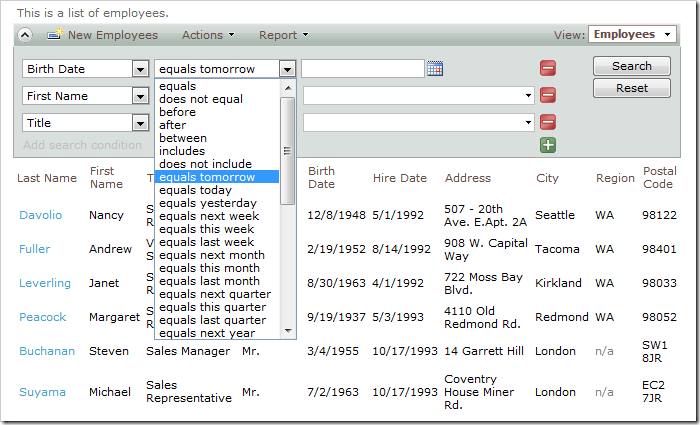
Advanced Search Bar with search options dropdown activated for a date field.

It is possible to limit the amount of options displayed to the user.

Let’s require users to search by the Birth Date field on the Employees grid view, and only permit between, equals, and includes search options.

Start the Project Designer. In the Project Explorer, switch to Controllers tab, and double-click on Employees / Views / grid1 / BirthDate data field node.
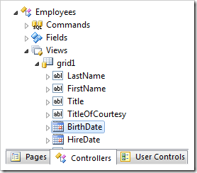
Birthdate data field of grid1 view in the Employees controller.

Make the following changes:

Property New Value
Search Mode Required
Search Options
$between,=,$in

Press OK to save the data field. On the toolbar, click Browse to regenerate the web application.

Navigate to the Employees page, and expand the advanced search bar.
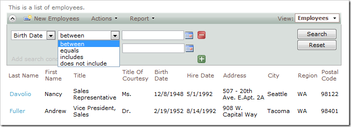
Birth Date search field showing search options of 'between', 'equals', 'includes', and 'does not include'.

The Birth Date search field will appear first, with a limited subset of search options. The first search option will be activated when the search bar is opened for the first time.

For the Last Name field, instead of having the default first search option of equals, let’s change it to begins with, and preserve the rest of the search options.

Go back to the Project Designer. In the Project Explorer, double-click on Employees / Views / grid1 / LastName data field node.
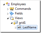
Last Name data field of grid1 view in Employees controller.

Make the following changes:

Property New Value
Search Mode Suggested
Search Options
$beginswith,*

Press OK to save the data field, and click Browse on the toolbar.

Activate the search bar on the Employees page, and you will see that Last Name shows up by default. The begins with search option will show up first, but the user can change it to any other option.
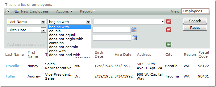
Last Name search field showing search option 'begins with' first.

Monday, June 4, 2012PrintSubscribe
Data Lookup Capabilities

Code On Time web applications offer rich data lookup capabilities.

Fields with an Items Style of Lookup render as link within a textbox. The Eraser icon to the right of the link will clear the field. The New Record icon to the right of the textbox will create a new lookup item.

Data lookup field rendered as a link within a textbox.

When the link is clicked on, a lookup window will open. Users can perform Quick Find or use Advanced Search Bar.

Data lookup windows allows sorting, adaptive filtering, quick find, and advanced search bar.

A lookup field can be configured as an Auto Complete text box. When a user types in a value, the list of lookup items will be filtered. If an item is selected, it is inserted in the field. If no item is selected, the field value will revert.

Auto Complete data lookup fields will filter according to the parameter entered by the user.

Both Lookup and Auto Complete styles do not prefetch data items when the form view is loaded.

A lookup field can also be configured as a Check Box List. The values can come from a static list or a many-to-many table.

Data Lookups can be configured as a Check Box List so that the user can select multiple values.

Data lookup fields can be rendered as a Radio Button List.

Data lookup rendered as a radio button list.

Consult the following list of properties when configuring a lookup field.

Property Description
Items Style Select the type of Items Style for the lookup. The options include: Auto Complete, Check Box, Check Box List, Drop Down List, List Box, Lookup, Radio Button List, User ID Lookup, User Name Lookup.
Items Data Controller Select the controller data source.
Items Data View Select the data view that will be displayed for the lookup.
Data Value Field Select the value that the field will save to the database.
Data Text Field Select the text that the field will display to the end user.
New Data View If the user is allowed to create new lookup items, this will specify the data view that will be used. A blank value will hide the New Record icon.
Copy You can copy field values from the selected lookup item into the current record.
Search On Start Enabling this property will open the lookup in search mode.
Activate If Blank Enabling this property will open the lookup if the field is blank when a user opens the form.
Lookup Window Description Specify the text that will be displayed above the lookup.
Page Size Specify how many lookup items will be displayed at one time in the lookup modal window.
Search By First Letter Allows you to search for a lookup item by the first letter.