Code On Time release 8.5.0.0 includes a monumental collection of enhancements and features.
The release highlights are presented below. Detailed tutorials dedicated to individual features will be published over this week. The roadmap for 2015/2016 with detailed release notes will also become available this week. We are looking forward to your input.
“Charts” View Style for Touch UI
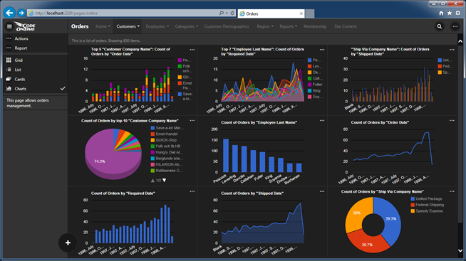
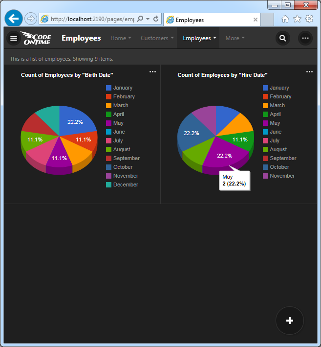
Touch UI applications now supports a new presentation view style called “Charts”. The feature works automatically and can be configured at design time. Here is a sample of charts created for Orders data controller in the Northwind sample.
Learn about Charts view style now!
“List” View Style for Touch UI
We have reworked “Cards” and “List” view styles for Touch UI. Touch-enabled devices will default to “List” view, while the “Grid” view is the default option for desktop users. The new “List” view style displays items of uneven height with every single field presented to the users. Text of field values will wrap to the next line.
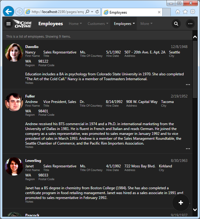
View style “Cards” offers multi-column presentation of items. All items have the same height. The text of “long” values does not wrap. Only a subset of fields may be visible within a card.
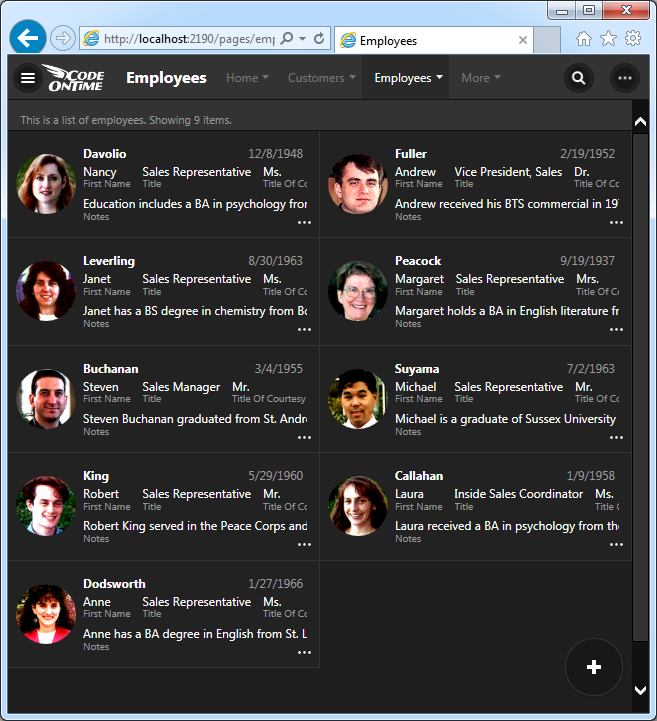
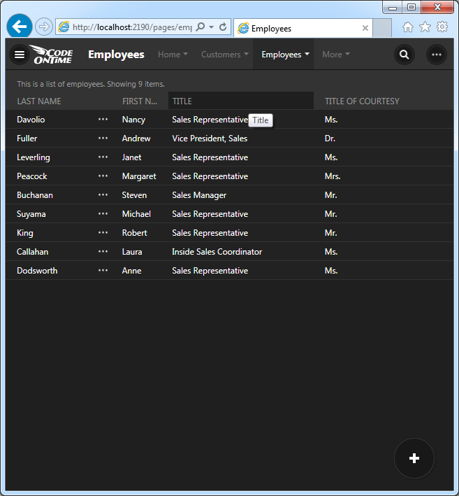
Grid view style offers the most compact presentation of data.
“Charts” view style provides an insight into the current data set.
Drag & Drop File Upload
Drag & Drop file upload is now supported in both Desktop and Touch UI. File upload preview is also integrated.
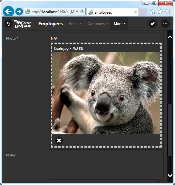
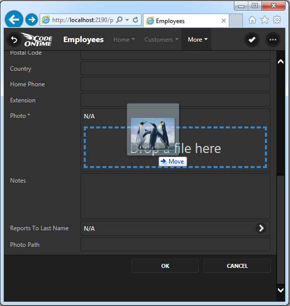
First, the user taps or clicks on the drop box to show the file upload prompt. The user may also drag the files into the drop area directly from the file system.
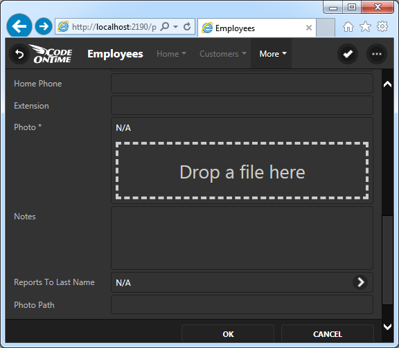
A preview of the files is displayed directly in the form prior to upload.
The drop box provides visual feedback when files are dragged over.
Progress indicator is displayed at the top of the drop box while the files are being sent to the server.
The relevant FileName, DataContentType, and Length data fields will updated when the user drags or drops the file.
End users can capture images directly from camera or mobile operating system on touch-enabled devices.
Signature Capturing
If you have a binary field in a table then you can configure the field to capture signatures for Touch and Desktop UI. Just set On Demand Display Style to “Signature” to have it activated.
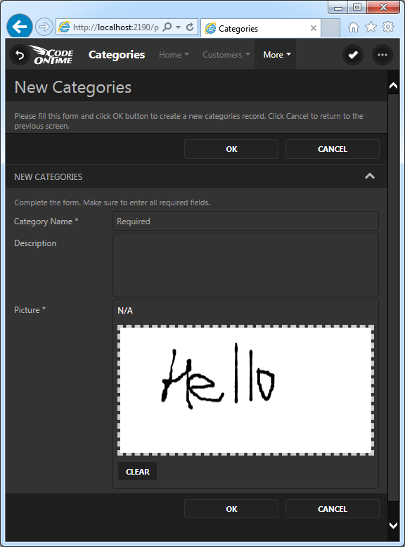
End users can use touch gestures or pointer devices to draw a signature. The signature is uploaded as PNG file with white background directly to the database.
Single Page Applications
A new single-page application implementation based on HTML is now supported for Azure Factory, Mobile Factory, Web App Factory, and Web Site Factory projects.
Create a new project with default settings to see it in action. There are no *.aspx files in the project, just the HTML files. Here is the sample markup of the Customers page in the sample Northwind web app.
<!DOCTYPE html >
<html xmlns="http://www.w3.org/1999/xhtml">
  <head>
    <title>Customers</title>
    <meta name="description" content="This page allows customers management." />
  </head>
  <body>
    <div data-flow="row">
      <div id="view1" data-controller="Customers" data-view="grid1"
           data-show-in-summary="true"></div>
    </div>
    <div data-flow="row">
      <div data-activator="Tab|Orders">
        <div id="view2" data-controller="Orders" data-view="grid1" data-filter-source="view1"
             data-filter-fields="CustomerID" data-page-size="5" data-auto-hide="container"
             data-show-modal-forms="true"> </div>
      </div>
      <div data-activator="Tab|Customer Demo">
        <div id="view3" data-controller="CustomerCustomerDemo" data-view="grid1"
             data-filter-source="view1" data-filter-fields="CustomerID" data-page-size="5"
             data-auto-hide="container" data-show-modal-forms="true"> </div>
      </div>
      <div data-activator="Tab|Order Details">
        <div id="view4" data-controller="OrderDetails" data-view="grid1"
             data-filter-source="view1"
             data-filter-fields="OrderCustomerID" data-page-size="5" data-auto-hide="container"
             data-show-modal-forms="true"> </div>
      </div>
    </div>
  </body>
</html>
Integrated Content Management System
Applications generated with SPA page implementation can include an integrated content management system that turns your app in a highly customizable solution. Just create the table called SiteContent shown below and have it included in your project (SITE_CONTENT and site_content variations are also supported).
CREATE TABLE [dbo].[SiteContent](
    [SiteContentID] [int] IDENTITY(1,1) NOT NULL PRIMARY KEY,
    [FileName] [nvarchar](100) NOT NULL,
    [Path] [nvarchar](100) NULL,
    [ContentType] [nvarchar](150) NOT NULL,
    [Length] [int] NULL,
    [Data] [image] NULL,
    [Text] [ntext] NULL,
    [Roles] [nvarchar](50) NULL,
    [Users] [nvarchar](50) NULL
)
Generate your app, navigate to ~/pages/site-content and upload images, html pages, data controllers, or any other content. Specify the path to the files and they will become available to the authorized users. Hook up content to your static navigation system with the help of dynamic sitemaps.
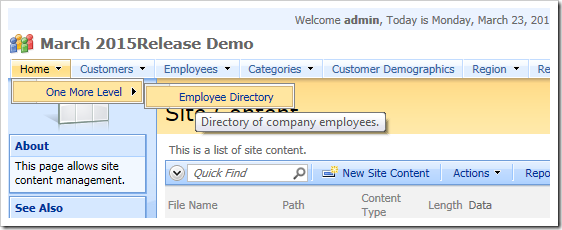
The sitemap sys/sitemaps/employee-directory will merge with the default sitemap to create new navigation options in the default app.
+ Home
++ One More Level
+++Employee Directory
~/hr/directory
description: Directory of company employees.
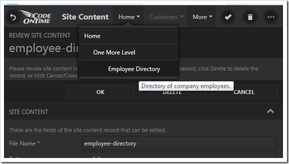
Create a sitemap with the name sys/sitemaps/main to replace the default navigation system of your app.
Integrated CMS is supported in both Desktop and Touch UI.
Dynamic Access Control List
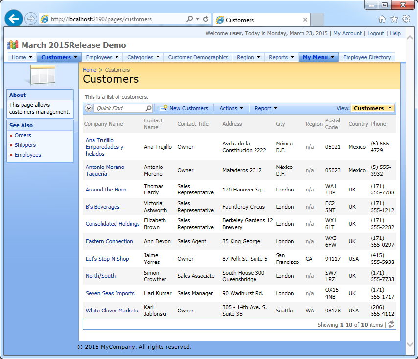
Premium and Unlimited edition users can take advantage of Dynamic Access Control List. Create access rules in the integrated CMS with the path sys/dacl. Application framework will locate files stored in the CMS and apply rules to all matching SELECT statements composed at runtime. You can also store access control rules as text files in the ~/dacl folder of your application.
This sample set of rules will affect all data controllers of the Northwind sample that have CustomerID field in the views.
Field: CustomerID
Roles: Users
Role-Exceptions: Administrators
[CustomerID] in ('ANTON', 'ANATR')
Field: CustomerID
Controller: Customers
Users: user
[Country]='USA' and [ContactTitle]='Owner'
Field: CustomerID
Role-Exceptions: Administrators
select CustomerID from Customers
where Country='UK' and City='London'
The picture below shows the effect of the rules on the Customers data controller.
Learn more about access control rules that can be written in code.
Dynamic Controller Customization
Integrated CMS can also store customizations of data controllers.
For example, file sys/controllers/hr/Employees.Alter.Directory will turn Employees data controller in a phone directory when defined as follows:
when-tagged("employee-directory");
select-views("editForm1", "createForm1").delete();
when-user-interface("Touch").select-view("grid1")
.create-data-field("Photo")
.create-data-field("HomePhone")
.create-data-field("Extension").set-header-text("Ext");
select-view("grid1")
.set-access("Public")
.select-data-fields("LastName", "FirstName", "Extension", "HomePhone", "Photo")
.use()
.set-columns("20");
select-actions("CHANGE", "Select", "EXPORT")
.delete();
This is how the new phone directory will look.
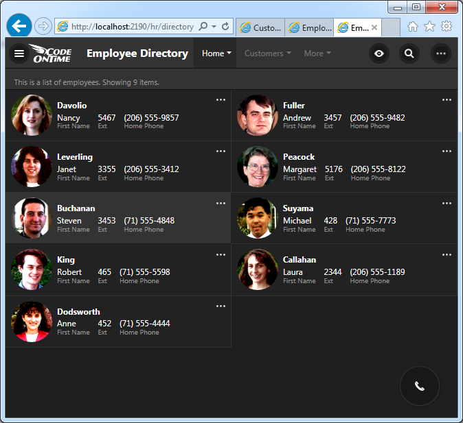
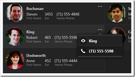
It is not possible to edit any data on this page. Only a small subset of actions is visible.
Workflow Register
Workflow Register uses the integrated content management system to define workflows as a collection of resources. For example, the workflow sys/workflows/hr can be defined as the following collection.
hr/directory
sys/controllers/hr/Employees.Alter.Directory
sys/sitemaps/employee-directory
It provides access to page hr/directory, activates a customization for controller Employees, and adds employee-directory sitemap to the application sitemap.
The workflow can be assigned to anonymous users by creating the entry “sys/register/roles/?” with the text “hr” in the site content.
Consolidated Client Library Files
The script library has been consolidated. The scripts have been renamed.
- daf.js <- Web.DataView.js
- daf-resources.js <- Web.DataViewResources.js + Web.MembershipResources.js
- daf-membership.js <- Web.Membership.js + Web.MemershipManager.js
- daf-menu.js <- Web.Menu.js
- daf-extensions.js <- Web.DatViewExtensions.js
- touch.js <- Web.Mobile.js
Pages Can Be Generated “First Time Only”
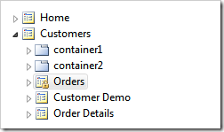
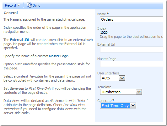
Pages of the project can be based on templates and be configured to generate “First Time Only” similar to user controls.
