Blog: Posts from June, 2012

Labels
AJAX(112) App Studio(7) Apple(1) Application Builder(245) Application Factory(207) ASP.NET(95) ASP.NET 3.5(45) ASP.NET Code Generator(72) ASP.NET Membership(28) Azure(18) Barcode(2) Barcodes(3) BLOB(18) Business Rules(1) Business Rules/Logic(140) BYOD(13) Caching(2) Calendar(5) Charts(29) Cloud(14) Cloud On Time(2) Cloud On Time for Windows 7(2) Code Generator(54) Collaboration(11) command line(1) Conflict Detection(1) Content Management System(12) COT Tools for Excel(26) CRUD(1) Custom Actions(1) Data Aquarium Framework(122) Data Sheet(9) Data Sources(22) Database Lookups(50) Deployment(22) Designer(177) Device(1) DotNetNuke(12) EASE(20) Email(6) Features(101) Firebird(1) Form Builder(14) Globalization and Localization(6) How To(1) Hypermedia(2) Inline Editing(1) Installation(5) JavaScript(20) Kiosk(1) Low Code(3) Mac(1) Many-To-Many(4) Maps(6) Master/Detail(36) Microservices(4) Mobile(63) Mode Builder(3) Model Builder(3) MySQL(10) Native Apps(5) News(18) OAuth(9) OAuth Scopes(1) OAuth2(13) Offline(20) Offline Apps(4) Offline Sync(5) Oracle(11) PKCE(2) Postgre SQL(1) PostgreSQL(2) PWA(2) QR codes(2) Rapid Application Development(5) Reading Pane(2) Release Notes(183) Reports(48) REST(29) RESTful(29) RESTful Workshop(15) RFID tags(1) SaaS(7) Security(81) SharePoint(12) SPA(6) SQL Anywhere(3) SQL Server(26) SSO(1) Stored Procedure(4) Teamwork(15) Tips and Tricks(87) Tools for Excel(2) Touch UI(93) Transactions(5) Tutorials(183) Universal Windows Platform(3) User Interface(338) Video Tutorial(37) Web 2.0(100) Web App Generator(101) Web Application Generator(607) Web Form Builder(40) Web.Config(9) Workflow(28)
Archive
Blog
Posts from June, 2012
Monday, June 4, 2012PrintSubscribe
Data Field Search Options

The Advanced Search Bar automatically determines multiple search options for each search field, based on the type of the field.

Advanced Search Bar with search options dropdown activated for a date field.

It is possible to limit the amount of options displayed to the user.

Let’s require users to search by the Birth Date field on the Employees grid view, and only permit between, equals, and includes search options.

Start the Project Designer. In the Project Explorer, switch to Controllers tab, and double-click on Employees / Views / grid1 / BirthDate data field node.

Birthdate data field of grid1 view in the Employees controller.

Make the following changes:

Property New Value
Search Mode Required
Search Options
$between,=,$in

Press OK to save the data field. On the toolbar, click Browse to regenerate the web application.

Navigate to the Employees page, and expand the advanced search bar.

Birth Date search field showing search options of 'between', 'equals', 'includes', and 'does not include'.

The Birth Date search field will appear first, with a limited subset of search options. The first search option will be activated when the search bar is opened for the first time.

For the Last Name field, instead of having the default first search option of equals, let’s change it to begins with, and preserve the rest of the search options.

Go back to the Project Designer. In the Project Explorer, double-click on Employees / Views / grid1 / LastName data field node.

Last Name data field of grid1 view in Employees controller.

Make the following changes:

Property New Value
Search Mode Suggested
Search Options
$beginswith,*

Press OK to save the data field, and click Browse on the toolbar.

Activate the search bar on the Employees page, and you will see that Last Name shows up by default. The begins with search option will show up first, but the user can change it to any other option.

Last Name search field showing search option 'begins with' first.

Monday, June 4, 2012PrintSubscribe
Data Lookup Capabilities

Code On Time web applications offer rich data lookup capabilities.

Fields with an Items Style of Lookup render as link within a textbox. The Eraser icon to the right of the link will clear the field. The New Record icon to the right of the textbox will create a new lookup item.

Data lookup field rendered as a link within a textbox.

When the link is clicked on, a lookup window will open. Users can perform Quick Find or use Advanced Search Bar.

Data lookup windows allows sorting, adaptive filtering, quick find, and advanced search bar.

A lookup field can be configured as an Auto Complete text box. When a user types in a value, the list of lookup items will be filtered. If an item is selected, it is inserted in the field. If no item is selected, the field value will revert.

Auto Complete data lookup fields will filter according to the parameter entered by the user.

Both Lookup and Auto Complete styles do not prefetch data items when the form view is loaded.

A lookup field can also be configured as a Check Box List. The values can come from a static list or a many-to-many table.

Data Lookups can be configured as a Check Box List so that the user can select multiple values.

Data lookup fields can be rendered as a Radio Button List.

Data lookup rendered as a radio button list.

Consult the following list of properties when configuring a lookup field.

Property Description
Items Style Select the type of Items Style for the lookup. The options include: Auto Complete, Check Box, Check Box List, Drop Down List, List Box, Lookup, Radio Button List, User ID Lookup, User Name Lookup.
Items Data Controller Select the controller data source.
Items Data View Select the data view that will be displayed for the lookup.
Data Value Field Select the value that the field will save to the database.
Data Text Field Select the text that the field will display to the end user.
New Data View If the user is allowed to create new lookup items, this will specify the data view that will be used. A blank value will hide the New Record icon.
Copy You can copy field values from the selected lookup item into the current record.
Search On Start Enabling this property will open the lookup in search mode.
Activate If Blank Enabling this property will open the lookup if the field is blank when a user opens the form.
Lookup Window Description Specify the text that will be displayed above the lookup.
Page Size Specify how many lookup items will be displayed at one time in the lookup modal window.
Search By First Letter Allows you to search for a lookup item by the first letter.
Monday, June 4, 2012PrintSubscribe
Extending Pages with Custom Content

If you would like to use a standard or third-party ASP.NET components on your pages, then a custom user control should be created and inserted in the page. Let’s add a few custom user controls and a data view to a test page.

Creating the Page

Start the Project Designer. On the action bar, click New | New Page option.
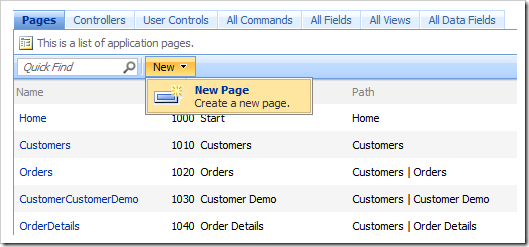
New Page menu option in the Project Designer.

Give this page the following properties:

Property Value
Name Test
Index 1005
Title Test
Path Test
Description This is a test page.
Style Categories
About This Page This page will host several user controls.
Roles N/A

Press OK to save the page.

Adding Containers

In the Project Explorer, right click on Test page node, and select New Container.
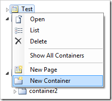
New Container to 'Test' page in Project Explorer.

Enter the following properties:

Property Value
Flow New Row
Width 33%

Press OK to save the container. Create three more containers, configured as follows:

Property Value
Flow New Column
Width 200px

Property Value
Flow New Column

Property Value
Flow New Row
Creating and Adding the User Controls

In the Project Explorer, right-click on Test / c100 container node, and select New Control.
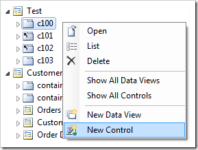
Add New Control to 'c100' container in Project Explorer.

Next to the User Control property, click on the New User Control icon.
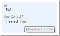
Create New User Control icon on New Control form.

Give this user control the following properties:

Property Value
Name TopLeft

Press OK to create the user control and have it selected in the User Control property.
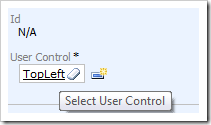
TopLeft user control inserted in the 'User Control' property.

Press OK again to save the control.

Right-click on Test / c101 container node, and choose New Control. Click on the New Record icon again, and create a new user control:

Property Value
Name TopCenter

Press OK to save the user control, and again to save the control. Create another control on Test / c102 container node. The new user control will have the following parameter:

Property Value
Name TopRight

Save the user control and control, and create another control on Test / c103 container node. The user control will use the following:

Property Value
Name CustomerList

Save the user control, and then the control. The logical page structure in the Project Explorer should look like the picture below.
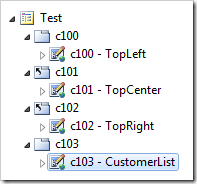
User controls populated for each container on Test page.

Exit the designer, and generate the web application.

When your default web browser opens the app, navigate to the Test page. There will be four user controls on the page, in two rows.
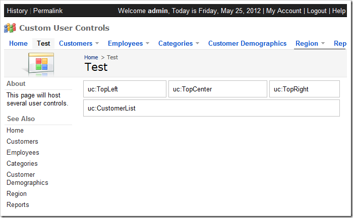
Test page with uncustomized user controls.

Customizing the User Controls

Switch back to the web application generator, click on the project name, and select Develop to open the project in Visual Studio. In the Solution Explorer, double-click 0n ~\Controls\TopLeft.ascx file.
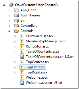
TopLeft user control in Visual Studio's Solution Explorer.

Press Ctrl+K, Ctrl+D to format the document. Add the highlighed CSS rule to the style attribute of the div element:

<%@ Control Language="C#" AutoEventWireup="true" CodeFile="TopLeft.ascx.cs" 
    Inherits="Controls_TopLeft" %>
<asp:UpdatePanel ID="UpdatePanel1" runat="server">
    <ContentTemplate>
        <div style="margin: 2px; border: solid 1px silver; padding: 8px; 
            background-color:LightBlue; height: 150px;">
            uc:TopLeft</div>
    </ContentTemplate>
</asp:UpdatePanel>

Save the file. In the Solution Explorer, double-click on ~\Controls\TopCenter.ascx file.
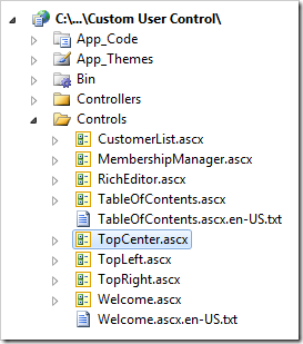
TopCenter user control in Visual Studio's Solution Explorer.

Format the document using Ctrl+K, Ctrl+D, and enter the following CSS properties in the style attribute of the div element:

background-color: LightGreen; height: 150px;

Save the file. In the Solution Explorer, double-click on ~\Controls\TopRight.ascx file.
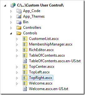
TopRight user control in Visual Studio's Solution Explorer.

Format the document, and enter the following CSS properties in the style attribute of the div element:

background-color: Pink; height: 120px;

Save the file. Switch back to the web browser and refresh the page. The three top user controls will have the assigned background colors and height.
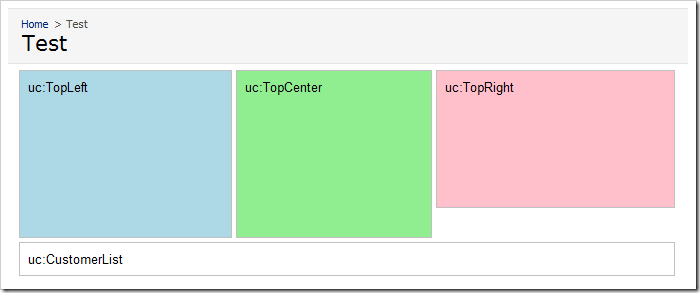
Test page with customized 'Top' user controls.

Adding a Data View

Switch back to Visual Studio. In the Solution Explorer, double-click on ~\Controls\CustomerList.ascx document,
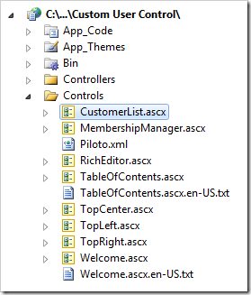
CustomerList user control in Visual Studio's Solution Explorer.

Press Ctrl+K, Ctrl+D to format. Making sure to preserve the original <%@Control%>  header, replace the UpdatePanel element in the file with the following:

<asp:UpdatePanel ID="UpdatePanel1" runat="server">
    <ContentTemplate>
        <div id="Customers" runat="server">
        </div>
        <aquarium:DataViewExtender ID="dve1" runat="server" 
        Controller="Customers" TargetControlID="Customers"
            PageSize="5" ShowInSummary="true" ShowPager="false"/>
    </ContentTemplate>
</asp:UpdatePanel>

Save the file, and refresh the webpage. The customers list will load underneath the three colorful user controls.
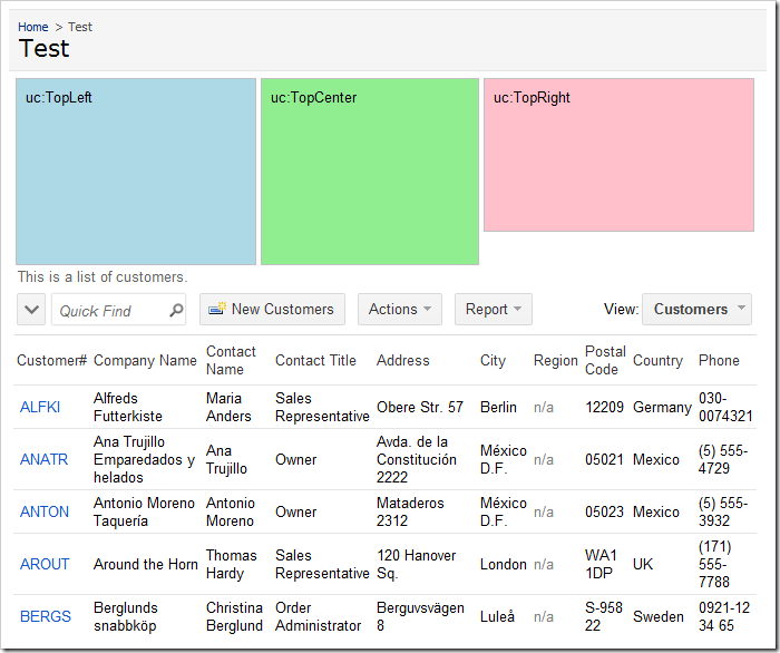
Test page with customized 'Top' user controls and customer list at the bottom of the page.

Changing the Page Layout

Switch back to the Project Designer. In the Project Explorer, expand the Test page. Move the c103 container to the first position.
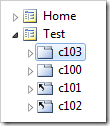
Test page with 'c103' container moved to first position in Project Explorer.

On the toolbar, press Browse. Navigate to the Test page, and you will see that the customers list will be at the top of the page, with the colorful user controls underneath.
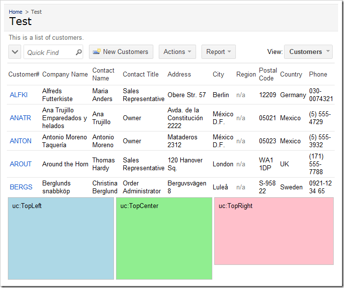
Test page with customized 'Top' user controls and customer list at the top of the page.