Blog

Labels
AJAX(112) App Studio(7) Apple(1) Application Builder(245) Application Factory(207) ASP.NET(95) ASP.NET 3.5(45) ASP.NET Code Generator(72) ASP.NET Membership(28) Azure(18) Barcode(2) Barcodes(3) BLOB(18) Business Rules(1) Business Rules/Logic(140) BYOD(13) Caching(2) Calendar(5) Charts(29) Cloud(14) Cloud On Time(2) Cloud On Time for Windows 7(2) Code Generator(54) Collaboration(11) command line(1) Conflict Detection(1) Content Management System(12) COT Tools for Excel(26) CRUD(1) Custom Actions(1) Data Aquarium Framework(122) Data Sheet(9) Data Sources(22) Database Lookups(50) Deployment(22) Designer(177) Device(1) DotNetNuke(12) EASE(20) Email(6) Features(101) Firebird(1) Form Builder(14) Globalization and Localization(6) How To(1) Hypermedia(2) Inline Editing(1) Installation(5) JavaScript(20) Kiosk(1) Low Code(3) Mac(1) Many-To-Many(4) Maps(6) Master/Detail(36) Microservices(4) Mobile(63) Mode Builder(3) Model Builder(3) MySQL(10) Native Apps(5) News(18) OAuth(9) OAuth Scopes(1) OAuth2(13) Offline(20) Offline Apps(4) Offline Sync(5) Oracle(11) PKCE(2) Postgre SQL(1) PostgreSQL(2) PWA(2) QR codes(2) Rapid Application Development(5) Reading Pane(2) Release Notes(183) Reports(48) REST(29) RESTful(29) RESTful Workshop(15) RFID tags(1) SaaS(7) Security(81) SharePoint(12) SPA(6) SQL Anywhere(3) SQL Server(26) SSO(1) Stored Procedure(4) Teamwork(15) Tips and Tricks(87) Tools for Excel(2) Touch UI(93) Transactions(5) Tutorials(183) Universal Windows Platform(3) User Interface(338) Video Tutorial(37) Web 2.0(100) Web App Generator(101) Web Application Generator(607) Web Form Builder(40) Web.Config(9) Workflow(28)
Archive
Blog
Monday, March 2, 2015PrintSubscribe
Automatic Construction of Charts in Touch UI

Data views in an app created with Code On Time may present users with the view style called “Charts”. This view style is either enabled automatically by application at runtime or by developers at design time. The purpose of the view style is to provide instant insight into data.

If the definitions of charts are not a part of application design, then the application framework will compose up to nine charts based on the properties of fields in the data view if possible.  The app will attempt to define charts after examining the presence of lookup, date, or numeric fields in the view. First, it will try creating charts with dates as the rows, and lookups as the values. Then, it will pair a few numeric fields with a lookup.

The picture shown below displays the charts automatically created for the Orders controller of the Northwind sample application.

All nine charts that were automatically composed for Orders page of Northwind sample database.

The automatically created definitions for all of the nine charts are shown below. Each chart is described with one or two tags that start with “pivot-“ keyword followed by properties.  The elegant simplicity of the tag language makes possible sophisticated collections of charts defined both by developers and end users.

The chart definitions generated by the client library.

Application framework performs efficient server-side data pivots following the tag specification. Data pivots for all charts are performed on the server simultaneously. Data pivots take into account application-level and user-defined filters.

Let’s see how each chart works.

Chart 1 – Stacked Column + Dates

The first chart pivots customers by the order date in a stacked column chart.

Pivoted data of the 'stacked column + dates' chart.

This chart uses the first date field, OrderDate, as the rows. The “pivot1” property assigns the field to the pivot with ID of “1”. The “row” property sets the field as a row in the pivot, and assigns it index “1”.

The property “date” instructs the application to try several date bucket groups and choose the best one available based on the number of rows in the output. Application framework tries not to have too many or too few “date” rows in a pivot. For the dataset in the picture, the framework has produced the pivoted data as if tags “pivot1-row1-year pivot1-row2-month” were specified.

The “all” property ensures that any empty gaps in the data will be included in the pivot dimension.

The first lookup field, CustomerID, is used for the columns. The columns are sorted in descending order by the value of each column. Then, only the top five customers are kept, and the rest of them are dropped from the output. The “columnstacked” property defines the type of chart.

When a value field is not defined for the chart, a count of the first available field is used.

Field Name Tag
OrderDate pivot1-row1-date-all
CustomerID pivot1-col1-sortdescbyvalue-columnstacked-top5

Chart 2 – Area + Dates

The second chart pivots employees by required date in an area chart.

Pivoted data of the 'area + dates' chart.

This chart uses the second date field, RequiredDate, as the rows.

The second lookup field, EmployeeID, is used for the columns, and the top seven employees sorted in descending order are used. The “area” property specifies the chart type.

Field Name Tag
RequiredDate pivot2-row1-date-all
EmployeeID pivot2-col1-sortdescbyvalue-area-top7

Chart 3 – Column + Dates

This chart pivots shipper companies by the shipped date in a column chart.

Pivoted data of 'column + dates' chart.

This chart uses the third date field, ShippedDate, as the rows of the output.

The ShipVia lookup field is used, and only the top five values are kept. The type of the chart is defined as “column”.

Field Name Tag
ShipVia pivot3-col1-sortdescbyvalue-column-top5
ShippedDate pivot3-row1-date-all

Chart 4 – 3d Pie

This chart shows the top ten orders by customer in a 3d pie chart.

Pivoted data of 3d pie chart.

The fourth chart uses CustomerID as the row values. The top ten values are displayed. The “other” property commands the server to sum up the rest of the values in an “Other” row. The type of chart is “pie3d”.

When no column field is defined, there will be only one column to display the value.

Field Name Tag
CustomerID pivot4-row1-top10-other-sortdescbyvalue-pie3d

Chart 5 – Columns

This chart shows the top 10 employees that made orders in a column chart.

Pivoted data of 'column' chart.

The fifth chart uses EmployeeID lookup field for the rows. The top ten values are displayed, and the rest are summed up into an “Other” row. The type of chart is “column”.

Field Name Tag
EmployeeID pivot5-row1-top10-other-sortdescbyvalue-column

Chart 6 – Line

This chart shows the count of orders made by order date in a line chart.

Pivoted data of 'line' chart.

The next chart uses the OrderDate field as the rows. The “date” property will generate multiple sets of data, differentiated by bucket size, and use the best result for the chart. The property “all” will ensure that there are no missing values in the date range. The type of chart is “line”.

Field Name Tag
OrderDate pivot6-row1-line-date-all

Chart 7 – Columns

This chart shows a count of orders made by required date in a column chart.

Pivoted data of 'column' chart.

This chart uses the RequiredDate field for the row values. The type of chart is “column”. The server will compose multiple results and pick the best one that fits in the graph when “date” is used. The chart will not miss any gaps in dates with the “all” keyword.

Field Name Tag
RequiredDate pivot7-row1-column-date-all

Chart 8 - Area

This chart shows the count of orders made by shipped date.

Pivoted data of 'area' chart.

This chart shows values grouped into rows by the ShippedDate field.

Field Name Tag
ShippedDate pivot8-row1-area-date-all

Chart 9- Donut

This chart shows the count of orders made, grouped by shipper company, in a donut chart.

Pivoted data of 'donut' chart.

This chart uses the ShipVia lookup field for the rows of the result. The “top10” tag is disregarded as there are less than ten values in the result.

Field Name Tag
ShipVia pivot9-row1-top10-other-sortdescbyvalue-donut
Saturday, January 24, 2015PrintSubscribe
Charts Everywhere

Every IT project involves collection of data. Development teams put a lot of thought into database design, middleware programming, business rules. Analysis of data is always somewhere a few milestones away on the project timeline. Sure the charts can make your app look good, but one needs data to feed the charts. Therefore the data analysis and charts will only become a feature of a project if it survives the initial developments stages.

Users Love Charts

Why do users love charts? The charts can tell the story that the raw data cannot.

For example, a typical list of orders hides a treasure trove of information that can be unlocked if data is pivoted, sorted, counted, and summed.  Consider the collection of charts in the screenshot below.

Charts view style in a Touch UI app created with Code On Time app generator.

These charts are derived from the orders stored in the Northwind database. The master-detail form with order data is shown next.

Master-detail form view in a Touch UI app created with Code On Time app generator.

Data fields Order Date, Employee Last Name, Ship Via Company Name, and Ship Country can truly illuminate the business processes within the Northwind mail order company.

For example, we can answer the following questions:

  • Which countries are the main contributors to the sales?
  • Which employee is the most productive?
  • How much are shippers utilized to fulfill orders?
  • Are sales getting better over time?
  • Which employee is contributing the most to the expense of fulfilling orders?
  • How do sales compare year over year?
  • Which month can be expected to be the busiest?

The charts in the screenshot answer the questions.

Charts in the app with Touch UI created with Code On Time.

Charts Are Created Automatically

Application framework has a built-in ability to recognize what data can be analyzed. “Lookup” and “date” fields are tagged to produce various charts without any need for programming.

If the compatible fields are detected than the “Charts” view style becomes available to end users. Charts are literally everywhere!

Sample chart displayed in the user interface of an app with Touch UI.

Developers can tag the fields for charting by default.  A typical “chart” tag in a data controller XML file will cause the chart above to become available when “Charts” view style is activated.

<dataField fieldName="ShipVia" aliasFieldName="ShipViaCompanyName" 
tag="pivot1-row-pie3d"/>

The server-side code of application will pivot the data and package it in the fashion suitable for chart presentation. Application produces multiple pivots while reading the same set of records from the database.  A single request to the server will retrieve all pivots for the charts displayed when “Charts” view style is activated.

The built-in ability to pivot data can be utilized to create custom charts and data presenters.

Responsive Presentation of Charts

Charts are responsive. Users will be able to interact with charts on any device. The small form factor will cause a simple list of charts to be displayed. The height of the charts is computed based on the available width and the height of the display.

Responsive charts are displayed in a window with small form factor in a Touch UI app.

Application will try to fit as many charts as possible on screen without requiring user to scroll horizontally to see the entire set of charts.

Wide displays will allow Touch UI to render multiple charts without the need for scrolling.

Activating “Charts” View Style

The option to activate “Charts” view style is visible on the sidebar as shown in the illustration above. The sidebar may not be visible on all screen sizes.

Context menu provides “Charts” option in the list of data presentation styles. A single touch or click will show the available charts.

Context menu includes an option to activate Charts view style in an app with Touch UI.   Charts view style in an app with Touch UI created with Code On Time app generator.

Shaping The data In The Charts

Users shape the data set rendered in the “Charts” style with the help of Quick Find, Adaptive Filters, and Advanced Search.

For example, a user can specify a criteria for “deep search” that requires data to match the ship country to France and Italy and have associated line items with products in categories that include “Confections” and “Seafood”.

Advanced Search screen in an app with Touch UI.

Here is the result set rendered in the “List” style. User can access “Charts” view style by touching or clicking the context menu button on the right side of the toolbar.

Activating context menu in a Touch UI application.

Here is the set of charts reflecting the “deep search” criteria that required searching in orders and related order details.

Charts view style shows data produced by deep search of orders and linked order details in Touch UI application.

This screenshot shows charts for orders shipped to Canada, USA, and UK and placed by employees Buchanan and Fuller.

Compact set of charts rendered in Charts view style in an app with Touch UI.

User may activate responsive grid view style to see the data behind the charts.

Responsive grid view style in a Touch UI app created with Code On Time.

Wider window will show charts distributed in three columns.

Responsive Charts view style displayed three charts side-by-side in an app with Touch UI.

Friday, January 23, 2015PrintSubscribe
Creating Project for Touch UI

What is Touch UI?

Touch UI is the new user interface of single page apps (SPA) created with Code On Time database application generator. This responsive user interface is based on jQuery Mobile and adapted to work on both mobile and desktop devices with any screen size. It also integrates popular Bootstrap framework to simplify content creation and content oriented SPAs.

Choose Project Type

Touch UI is available in applications created as Azure Factory, Mobile Factory, Web App Factory, or Web Site Factory project.

End users of your application will not be able to tell its project type. 

Developers will notice that Mobile Factory and Web Site Factory project files are grouped in folders, which allows Microsoft ASP.NET to compile the code dynamically. Web App Factory project has a more complex folder structure and uses a solution file to keep track of the project components. It must be compiled in Visual Studio explicitly. These three project types can be deployed to any physical or hosted Windows Sever.

Azure Factory project type is similar to Web App Factory. It is designed specifically for deployment and hosting in Microsoft Azure as a cloud service.

The most versatile and simplest to maintain project type is Web Site Factory.
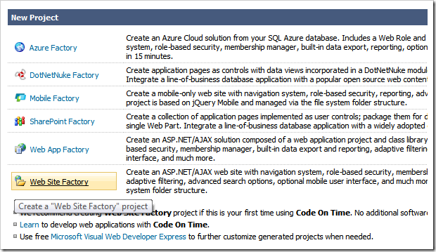
Choosing a project type for an application with Touch UI.

Start the app generator and create a new application by choosing the desired project type.

Framework and User Interface

Make sure that application framework is set to .NET Framework 4.5 or higher. Also select Touch UI as the user interface default option.

If you are creating your project with Unlimited edition of the app generator, then your application will support both Touch UI and Desktop UI. The secondary user interface will work with browsers that are not compatible with HTML5. Your app will automatically downgrade to desktop user interface as needed. If you choose Desktop UI as a default user interface option then Touch UI will only be activated on mobile devices.

Note that dual user interface is not supported in other product editions.
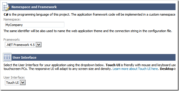
Specifying Framework and User Interface for an app with Touch UI.

Click Next until your reach a page that allows configuring a database connection for your project.

Configuring Data Provider

 Code On Time allows creating apps straight from your database or from external data sources such as web services or file system.

The default data provider for the app is Microsoft SQL Server. A variety of other database engines is also supported.

If you are not planning to use a database engine as a source of data then choose Custom Data Provider option in the drop down.

Specifying a data provider for an app with Touch UI.

Click on the button with three dots next to Connection String input to configure the connection string for the selected provider.

Setting Up a Sample Data Set

If you are creating a project for Microsoft SQL Server or Microsoft SQL Server Express then you can configure a sample database that is used in the tutorials.

First make sure to specify your server address. If you have Microsoft SQL Express installed on your computer then make sure to enter “.\sqlexpress” without double quotes in the Server input field.

Enter Northwind in the Database input and click Create button. A confirmation will be displayed when an empty database has been created.
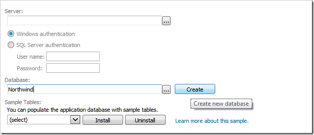
Creating an empty sample database for a project with Touch UI.

Select Northwind  in the drop down under Sample Tables. Click Install to create a sample data set. Wait for the confirmation to be displayed.
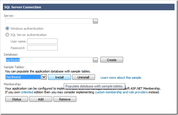
Populating empty sample database with data for a project with Touch UI.

Add a security system to your project by clicking Add button under Membership section.
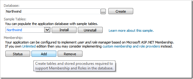
Adding a security system to a project with Touch UI.

The new database with sample data is configured and you can click OK to save settings and see the application connection string parameters.

Controllers, Pages, or Empty Project

Now it is time to decide if you want the app generator to create sample data controllers and pages (single page apps) from the contents of your database.

If you are planning to build a collection of single page apps using jQuery Mobile or Bootstrap then choose only Data Controllers to generate. Consider taking advantage of the automatically created SPAs and choose Data Controllers and Pages. If the pages are not matching your needs then you can always delete them later in Project Designer.

If your plan to define data controllers later then choose Empty Project instead.
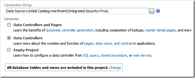
Choosing data controller and page creation mode for the app with Touch UI.

Choosing Database Tables

The app generator can created data controllers and SPAs for every table and view found in the database. This will be the case if you proceed to the Next step.

For the purpose of the tutorials click Change  next to “All database tables and views are included in this project” and choose tables listed at the bottom of the next screenshot.
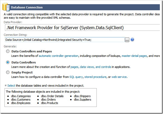
Choosing specific tables to be used for generation of data controllers and SPAs in a Touch UI app.

New database tables and views can be added to a project later. 

Press Next until your arrive to Reporting configuration section of your project.

Reporting

Application framework  creates dynamical reports in PDF, Word, Excel, and TIFF format. Complex master-detail custom reports can also be created.

We recommend enabling reports even if you are creating SPAs with jQuery Mobile or Bootstrap without relying on data presentation capabilities of Touch UI. Reports can be defined on the server and invoked with minimal  JavaScript code via custom user interface.
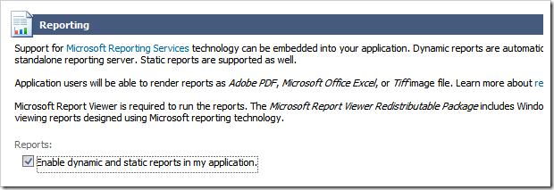
Enabling reports for an app with Touch UI.

Generating Application

Continue pressing Next and you will reach a page with a summary of data controllers that will be created in your project. The summary will be blank if you are creating a project with a custom data provider.
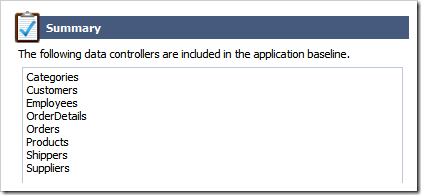
Summary of data controllers that will be created in Touch UI app by Code On Time application generator.

Click Generate button and wait for the  web browser window to open.
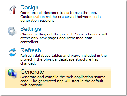
Starting project code generation in Code On Time.

Application generator will create the source code of your project, compile it, launch IIS Express, and start the web browser with the home page address of your app loaded.

Exploring App with Touch UI

Touch UI application is a collection of pages (single page apps) that provide access to content or data. A unified navigation system allows switching between single page apps. The default application will have a single SPA called home with several virtual pages.
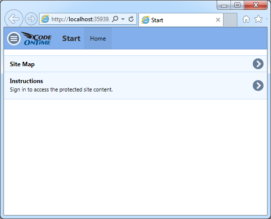
The default home page of a single page app created with Code On Time.

Click on Site Map or Instructions to transition to the corresponding virtual page of the SPA. The default transition on Android devices is “fade”. Other mobile devices and desktop computers will use “slide” transition animation.

Proceed to Instructions and click or touch Login button. Enter admin/admin123% as user identity and hit Enter key.
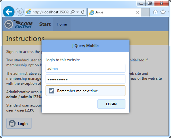
Logging into a Touch UI app created with Code On Time.

SPA Home will reload and three  options will be displayed in the sitemap.
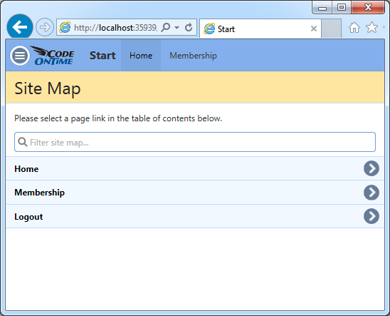
Home SPA of a user with a known identity in a Touch UI app.

Option Membership allows administrators to access user and role manager built into the app.
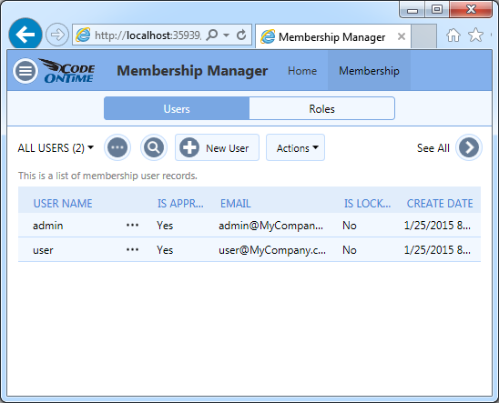
Buil-in user and role manager in app with Touch UI.

If you have an app created with Data Controller and Pages then the navigation menu will have numerous SPA options.
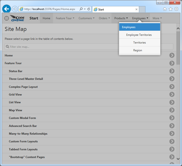
A navigation system with single page apps automatically created by Code On Time applicaiton generator.

Application SPAs will provide access to data stored in database tables and views. This particular single page app allows managing employees stored in the sample database in Employees table.
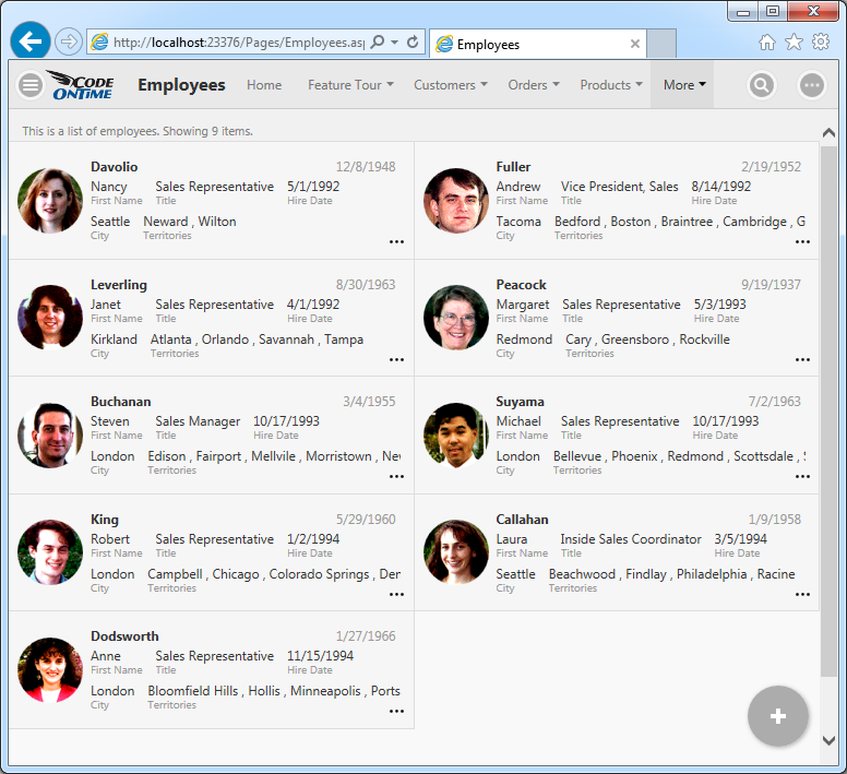
A single page app allows managing employees in the application with Touch UI created with Code On Time.

Changing App Settings

Click or touch Menu button on the left side of the application toolbar. Select Settings option in the menu and change the application theme to Dark.
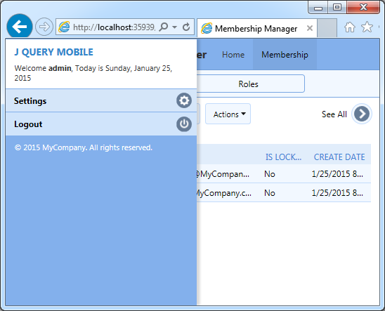
Changing settings of application with Touch UI.

This is how the Membership Manager will look in Dark theme. There are 37 themes to choose from.
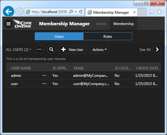
An alternative Dark theme activated in an app with Touch UI.

Touch or click Menu button again and select Logout in the slide-out drawer panel. The current SPA will reload.
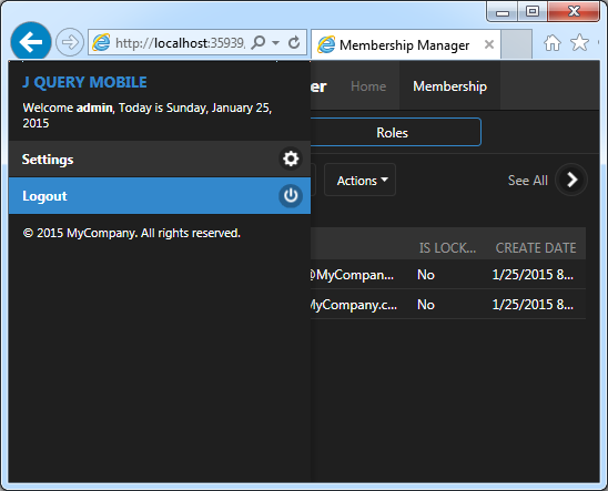
Logging out of the app with Touch UI.

The original application theme will be displayed. You are now an anonymous user and the default theme will be activated.

If the last SPA has required authorization than that application page will not be loaded. Instead user will be transitioned to the home SPA accessible to anonymous users and asked to log in.
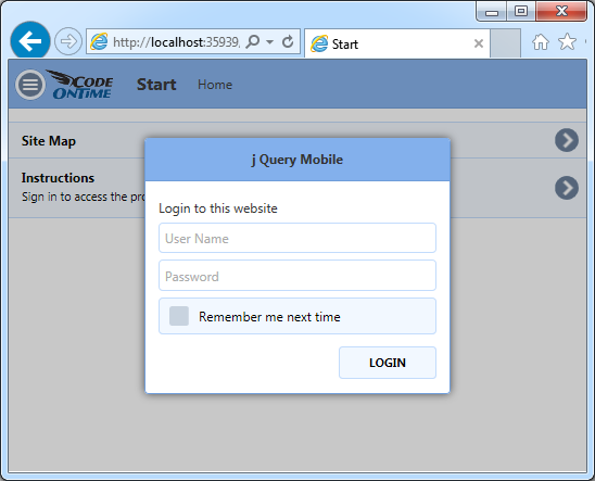
Home SPA will request identification if the user just has logged out of the SPA that required authorizaton in an application with Touch UI.

Many application settings and features are user-configurable and stored in the local database of your browser.

Configuring Default Settings of Touch UI

You can specify default settings of Touch UI for your project such as global display density or label alignments in data-enabled SPAs.

For example, if you notice that transition animations between virtual pages are not smooth enough on the hardware of your end users than consider changing default settings for transitions. Select your project on the start page of the app generator and choose Features in the project settings.
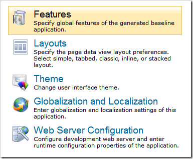
Change features of the app with Touch UI in Code On Time.

Select Touch UI section and set Transitions to None. This will disable transitions between virtual pages of SPAs by default.
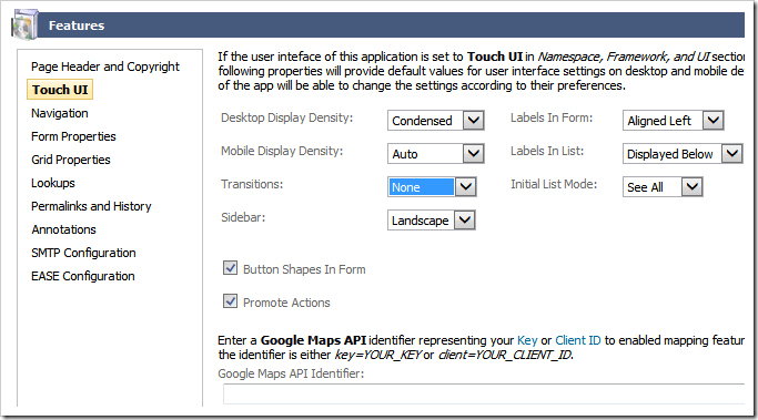
Specifying default configuration settings for the Touch UI application.

Application end users can still choose their preference for transitions on their own.

Developers can remove various settings from the user interface with a few lines of JavaScript.