Every IT project involves collection of data. Development teams put a lot of thought into database design, middleware programming, business rules. Analysis of data is always somewhere a few milestones away on the project timeline. Sure the charts can make your app look good, but one needs data to feed the charts. Therefore the data analysis and charts will only become a feature of a project if it survives the initial developments stages.
Users Love Charts
Why do users love charts? The charts can tell the story that the raw data cannot.
For example, a typical list of orders hides a treasure trove of information that can be unlocked if data is pivoted, sorted, counted, and summed. Consider the collection of charts in the screenshot below.
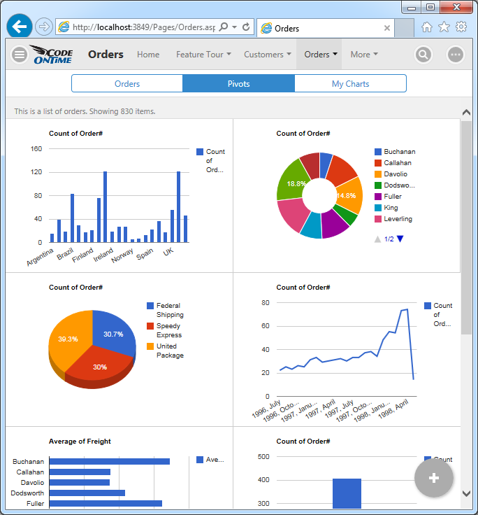
These charts are derived from the orders stored in the Northwind database. The master-detail form with order data is shown next.
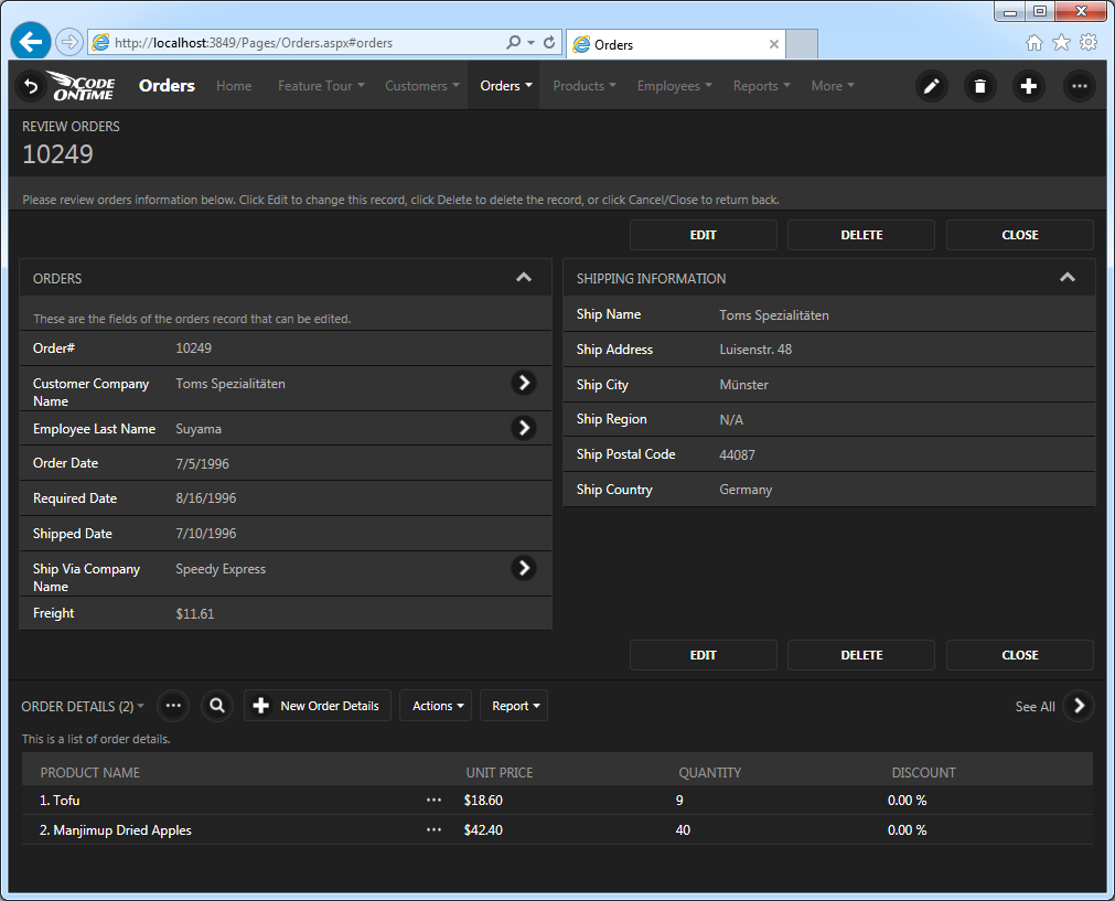
Data fields Order Date, Employee Last Name, Ship Via Company Name, and Ship Country can truly illuminate the business processes within the Northwind mail order company.
For example, we can answer the following questions:
- Which countries are the main contributors to the sales?
- Which employee is the most productive?
- How much are shippers utilized to fulfill orders?
- Are sales getting better over time?
- Which employee is contributing the most to the expense of fulfilling orders?
- How do sales compare year over year?
- Which month can be expected to be the busiest?
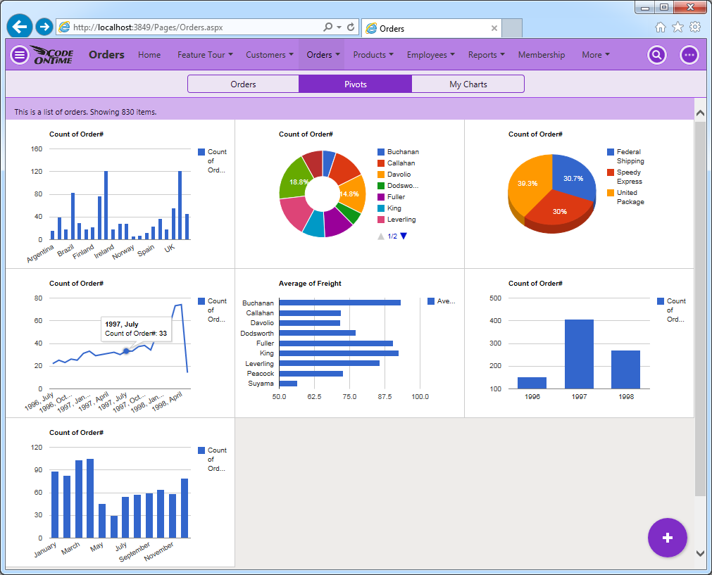
The charts in the screenshot answer the questions.
Charts Are Created Automatically
Application framework has a built-in ability to recognize what data can be analyzed. “Lookup” and “date” fields are tagged to produce various charts without any need for programming.
If the compatible fields are detected than the “Charts” view style becomes available to end users. Charts are literally everywhere!
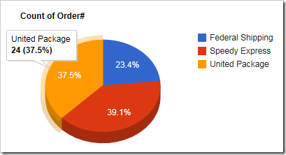
Developers can tag the fields for charting by default. A typical “chart” tag in a data controller XML file will cause the chart above to become available when “Charts” view style is activated.
<dataField fieldName="ShipVia" aliasFieldName="ShipViaCompanyName"
           tag="pivot1-row-pie3d"/>
The server-side code of application will pivot the data and package it in the fashion suitable for chart presentation. Application produces multiple pivots while reading the same set of records from the database. A single request to the server will retrieve all pivots for the charts displayed when “Charts” view style is activated.
The built-in ability to pivot data can be utilized to create custom charts and data presenters.
Responsive Presentation of Charts
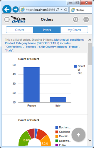
Charts are responsive. Users will be able to interact with charts on any device. The small form factor will cause a simple list of charts to be displayed. The height of the charts is computed based on the available width and the height of the display.
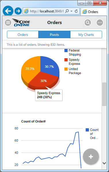
Application will try to fit as many charts as possible on screen without requiring user to scroll horizontally to see the entire set of charts.
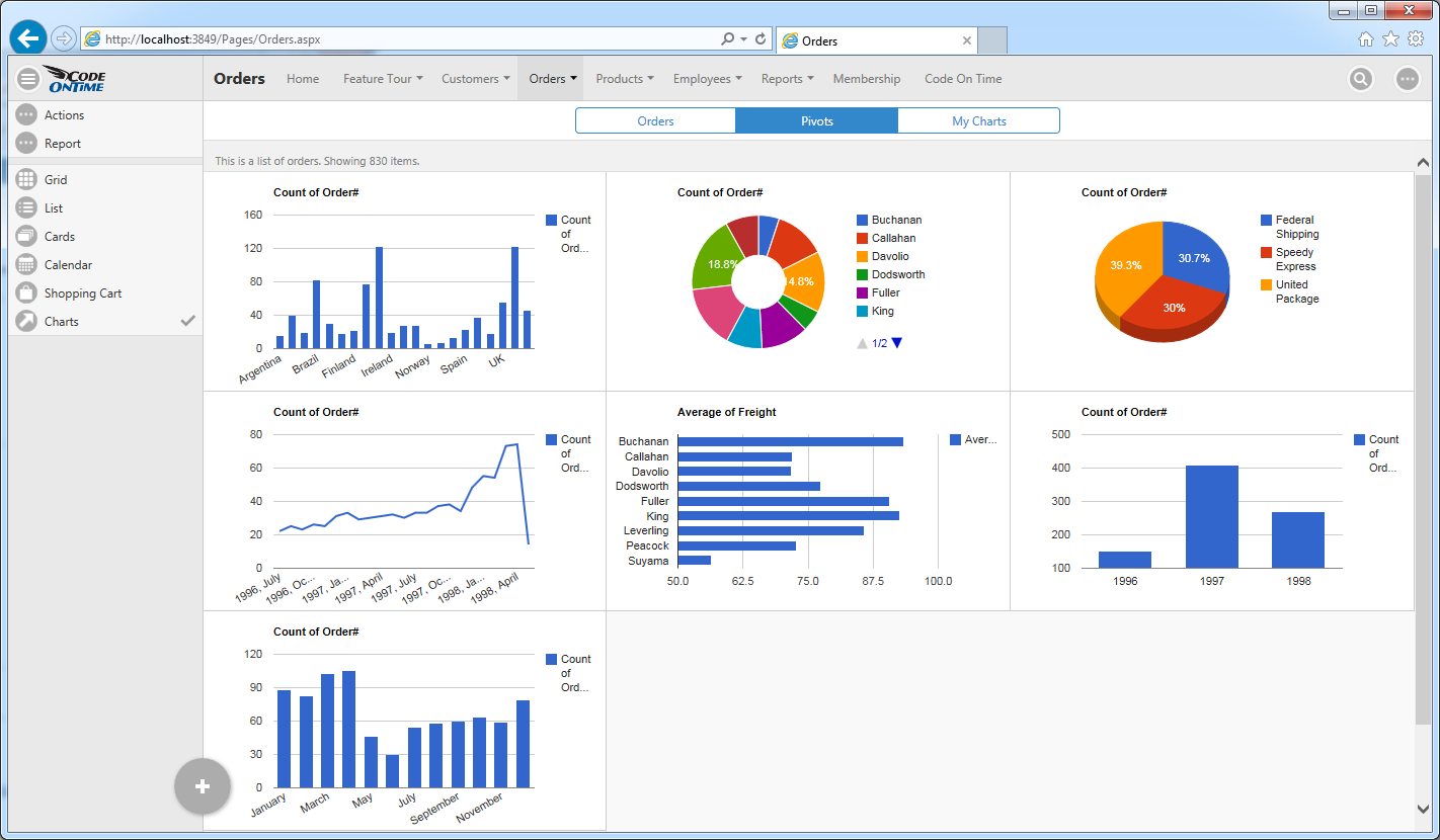
Activating “Charts” View Style
The option to activate “Charts” view style is visible on the sidebar as shown in the illustration above. The sidebar may not be visible on all screen sizes.
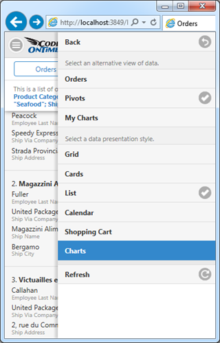
Context menu provides “Charts” option in the list of data presentation styles. A single touch or click will show the available charts.
Shaping The data In The Charts
Users shape the data set rendered in the “Charts” style with the help of Quick Find, Adaptive Filters, and Advanced Search.
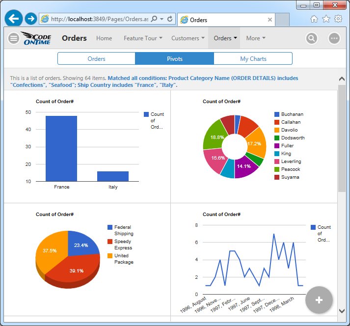
For example, a user can specify a criteria for “deep search” that requires data to match the ship country to France and Italy and have associated line items with products in categories that include “Confections” and “Seafood”.
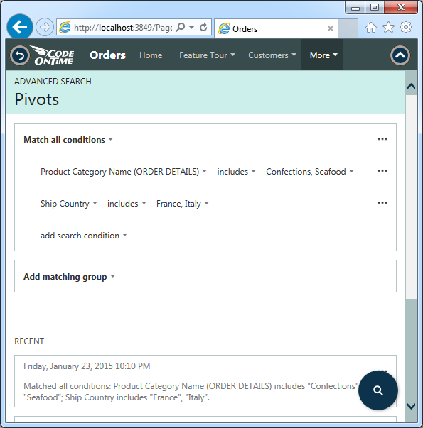
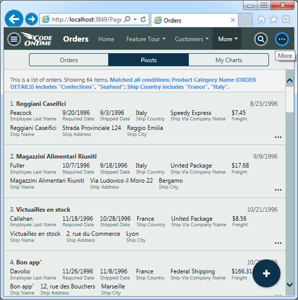
Here is the result set rendered in the “List” style. User can access “Charts” view style by touching or clicking the context menu button on the right side of the toolbar.
Here is the set of charts reflecting the “deep search” criteria that required searching in orders and related order details.
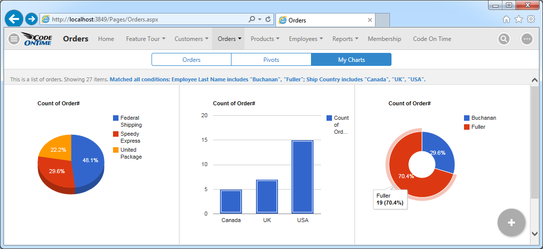
This screenshot shows charts for orders shipped to Canada, USA, and UK and placed by employees Buchanan and Fuller.
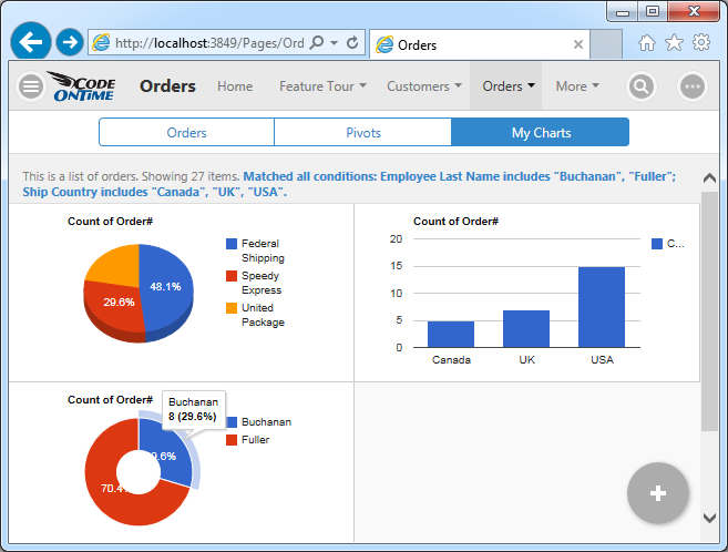
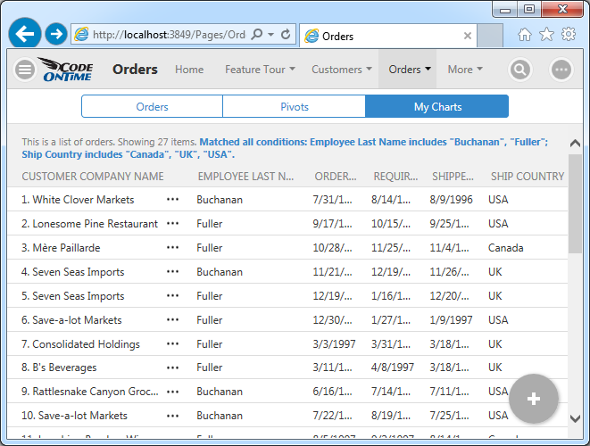
User may activate responsive grid view style to see the data behind the charts.
Wider window will show charts distributed in three columns.
