User Interface

Labels
AJAX(112) App Studio(9) Apple(1) Application Builder(245) Application Factory(207) ASP.NET(95) ASP.NET 3.5(45) ASP.NET Code Generator(72) ASP.NET Membership(28) Azure(18) Barcode(2) Barcodes(3) BLOB(18) Business Rules(1) Business Rules/Logic(140) BYOD(13) Caching(2) Calendar(5) Charts(29) Cloud(14) Cloud On Time(2) Cloud On Time for Windows 7(2) Code Generator(54) Collaboration(11) command line(1) Conflict Detection(1) Content Management System(12) COT Tools for Excel(26) CRUD(1) Custom Actions(1) Data Aquarium Framework(122) Data Sheet(9) Data Sources(22) Database Lookups(50) Deployment(22) Designer(178) Device(1) DotNetNuke(12) EASE(20) Email(6) Features(101) Firebird(1) Form Builder(14) Globalization and Localization(6) How To(1) Hypermedia(2) Inline Editing(1) Installation(5) JavaScript(20) Kiosk(1) Low Code(3) Mac(1) Many-To-Many(4) Maps(6) Master/Detail(36) Microservices(4) Mobile(63) Mode Builder(3) Model Builder(3) MySQL(10) Native Apps(5) News(18) OAuth(9) OAuth Scopes(1) OAuth2(13) Offline(20) Offline Apps(4) Offline Sync(5) Oracle(11) PKCE(2) Postgre SQL(1) PostgreSQL(2) PWA(2) QR codes(2) Rapid Application Development(5) Reading Pane(2) Release Notes(184) Reports(48) REST(29) RESTful(29) RESTful Workshop(15) RFID tags(1) SaaS(7) Security(81) SharePoint(12) SPA(6) SQL Anywhere(3) SQL Server(26) SSO(1) Stored Procedure(4) Teamwork(15) Tips and Tricks(87) Tools for Excel(3) Touch UI(93) Transactions(5) Tutorials(183) Universal Windows Platform(3) User Interface(338) Video Tutorial(37) Web 2.0(100) Web App Generator(101) Web Application Generator(607) Web Form Builder(40) Web.Config(9) Workflow(28)
Archive
Blog
User Interface
Saturday, March 27, 2021PrintSubscribe
Navigation Menu

Apps created with Touch UI have three options for the placement for the navigation menu. By default the top-level items of the navigation hierarchy are displayed as tabs in the toolbar. Menu items with children will have a dropdown menu. The spill-over items are moved under “More” menu item created automatically as needed.


Developers may choose to move the menu to the sidebar displayed on the left side of the app. The space in the sidebar is at the premium and the complex menus will be collapsed with the current node expanded. The sublevels of the menu can be individually expanded and collapsed. The same collapsible menu is also displayed when the Apps button is pressed. It is also visible in the hamburger menu and on the small screens.


Enter the following in ~/touch-settings.json to move the menu to the sidebar and to relocate the Apps button next to the user profile icon on the toolbar. 


The Apps button is the icon represented with 3 x 3 solid squares or circles. You will find it in the sidebar, on the toolbar, or in the hamburger menu of your app. Its purpose is to provide quick access to the most important pages of the app and to the full navigation menu.

Assign a dedicated icon to a page by entering the icon name in the Icon / Custom Style property of the page in the Project Designer .The  extensive Material Icons library is included with the framework. The name of the icon can be entered with the material-icon- prefix (e.g. material-icon-emoji-people).The icons will be displayed in the sidebar, in the context menu options, and in the drop down menus of the app toolbar. The top-level items will not have the  icons in the menu with the default placement.

Up to five icons are visible in the mini sidebar and the full set is presented in the context panel activated with the Apps button. The More option in the context panel will show the complete navigation menu.


If at least two pages have a dedicated icon, then the app will display the tabs at the bottom of the screen when the sidebar is hidden. The spill-over icons will migrate to the More tab.


The hamburger menu will display the full navigation menu.


Developers may opt to hide the navigation menu from the toolbar and the sidebar by setting ui.menu.location to none in ~/touch-settings.json for a minimalist look and feel. The navigation menu will still be available through the Apps button and the hamburger menu.

The state of nodes in the navigation menu with the vertical layout is controlled by ui.menu.autoExpand property. The default value is current, which will expand one level of the menu node representing the current page. Setting this option to false will keep the current node collapsed. The all value will have all items fully expanded when the navigation menu is rendered vertically.

Touch UI completely automates the navigation menu presentation while letting the developer focus on what’s important.

Thursday, March 25, 2021PrintSubscribe
Lines, Lines, Lines

 Horizontal and Vertical Lines

The signature feature of Touch UI is the “lined paper” style of data presentation. A list of items is rendered in the table format that looks like a spreadsheet. A single data item is displayed in a form with the rows of values separated by horizontal lines. The reading pane mode provides a great example of that.


The height of each row is automatically adjusted to fit the content. The form will also distribute the field values in multiple columns if the floating is enabled and the form is wide enough.


Developers have a great control over the horizontal and vertical lines globally and on the fine-grained level. Let’s learn more about it.

Grid Lines

The vertical lines in the grid can be hidden in the file ~/touch-settings.json:


Setting the ui.grid.lines.vertical property to false will hide the vertical lines and force the framework to display the “n/a” abbreviation in the empty data cells in a muted color to provide a visual point of reference for the “null” values.


Compare this to the default presentation with the horizontal and vertical lines, where the “empty” values are easy to spot without a visual aid.


If you prefer the default grid presentation with the horizontal and vertical lines but need to hide the vertical lines in a particular data view, then have it tagged as
grid-lines-vertical-none to achieve the same effect.

If the opposite effect is needed then hide the horizontal lines by setting the ui.grid.lines.horizontal to false in ~/touch-settings.json or tag a view as grid-lines-horizontal-none.


The minimalist presentation can be achieved by turning the horizontal and vertical lines “off” either in ~/touch-setting.json or by tagging a data view simultaneously with the two tags.


This is the no-lines view in the grid:


The boundaries of the selected field value are easy to see in the inline editing mode whether or not the grid has a look of a spreadsheet.

Form Lines

Get that minimalist look in the forms by getting rid of the horizontal lines.


You can accomplish that by setting ui.form.lines.horizontal option to false in ~/touch-settings.json


The tag form-lines-horizontal-none will hide the horizontal lines in a data view form shown below.


Form with the horizontal lines hidden will display an “Optional” text as a placeholder for the fields that accept the “null” value. The placeholders are visible when the end user is entering a new record or editing an existing one. This standard placeholder text can be overridden by setting a custom placeholder for the data field in the data controller view.


Finally you can have the lines to wrap around the field values like this.


The “outlined” input focus will work well when the input lines are enabled. This configuration of ~/touch-settings.json will display the lines around the text inputs and show the thick outline in the accent color of the theme when an input is focused.


Friday, January 8, 2021PrintSubscribe
Reading Pane
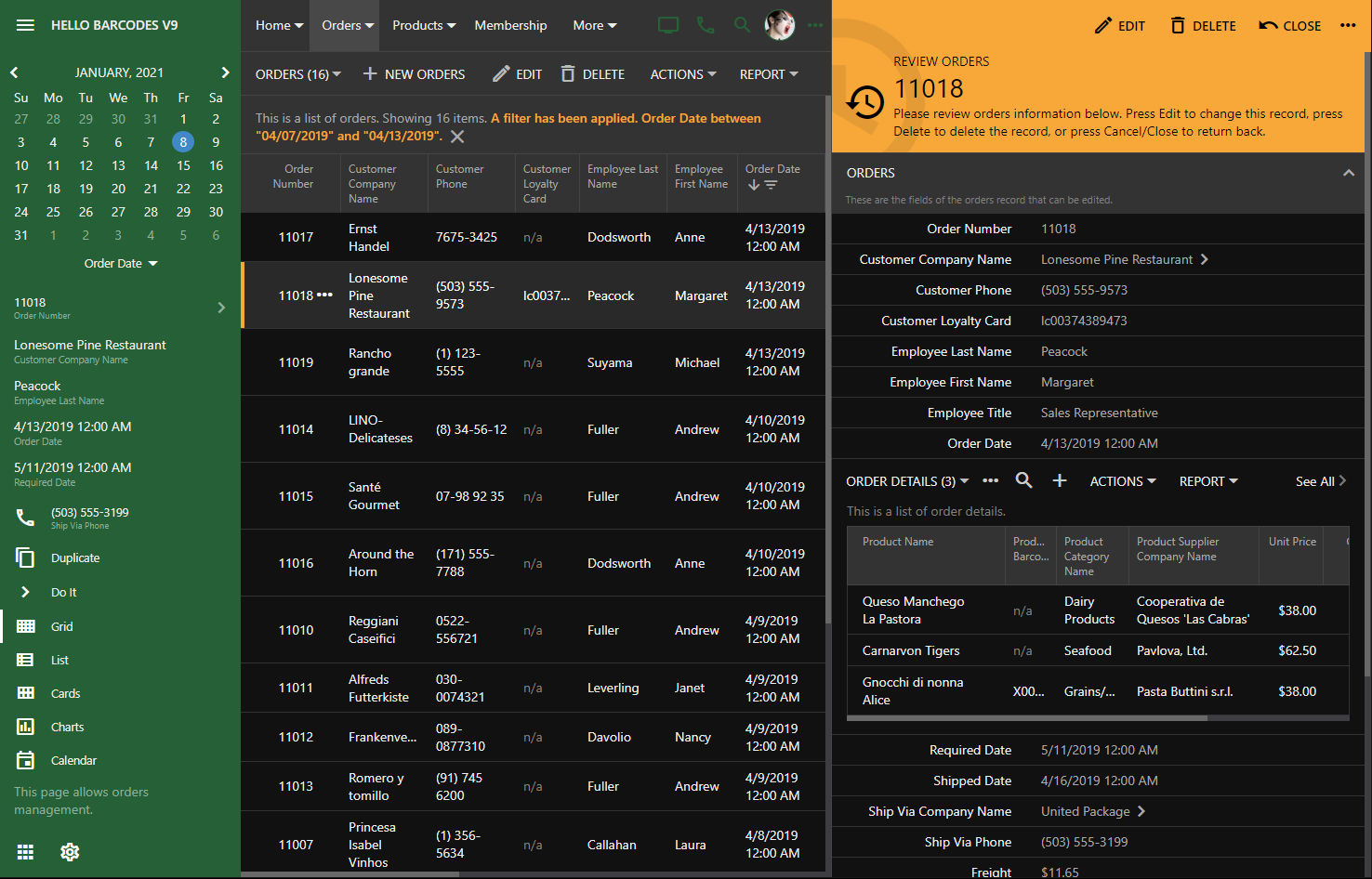
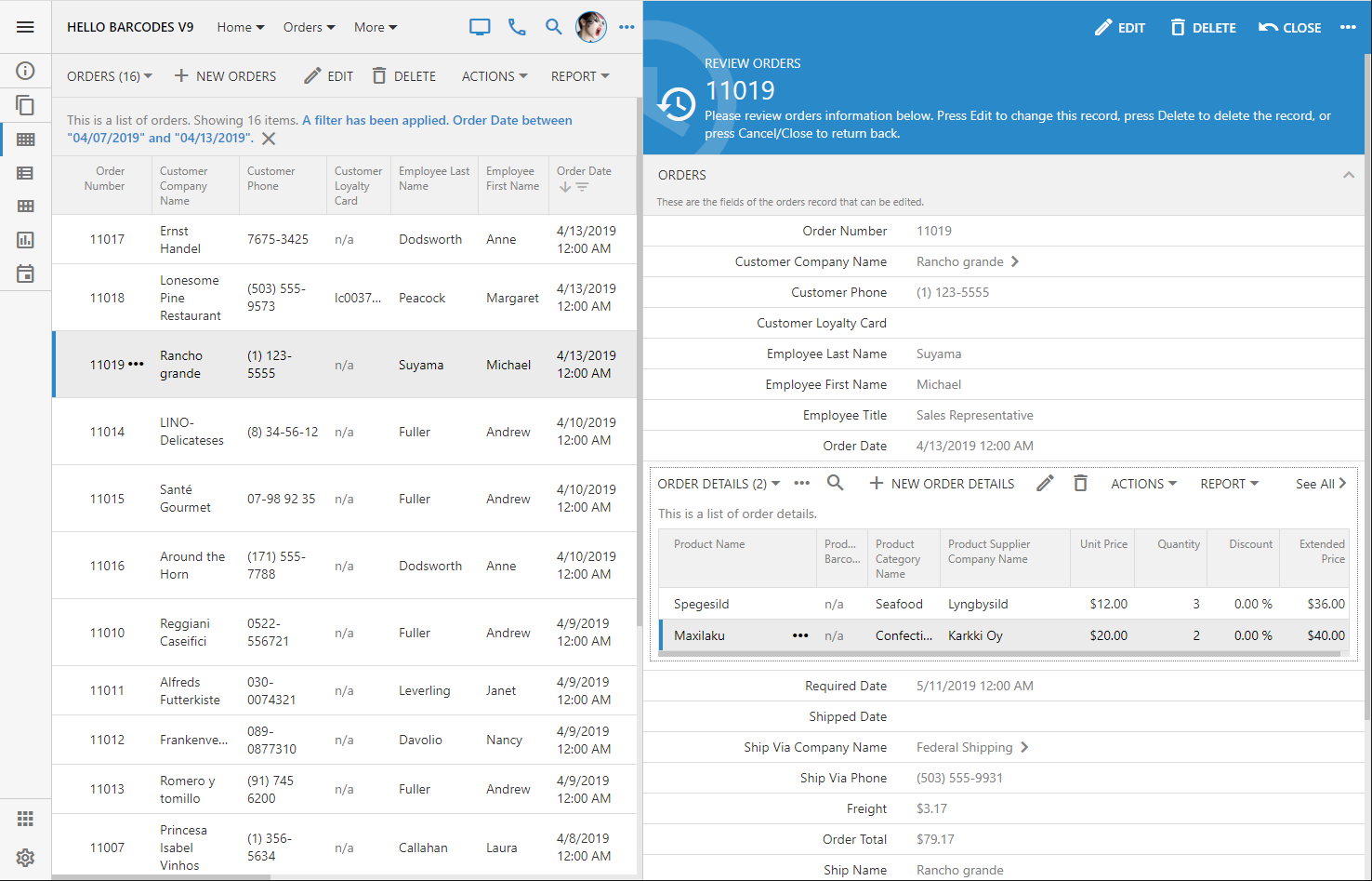
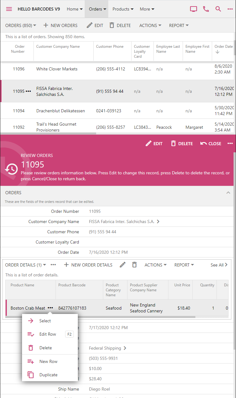
Touch UI provides the built-in option to display the details of the selected record side-by-side with the master list.

Reading Pane

Popular email applications have proven this presentation style to be very effective. The end user can view the details of the selected message and has the quick access to the contents of the inbox.

The prototype of this presentation style has been a part of the framework for the past two years. Our team was able to bring it to the production state just now. The technical challenge was to provide a simultaneous access to the master and detail panes each holding a virtual page of the Touch UI application. A consistent styling has also been worked out.


The reading pane detail is empty by default. The placeholder area is filled with the standard background image that can be changed in ~/touch-settings.json through the ui.readingPane.background parameter. Set the option to false to disable the image or specify your own alternative (for example, ~/images/app-bkg.jpg).


The modal form fills this area when a selection is made in the master list or a new item is created. Both master and detail panes can be scrolled and are fully interactive. The familiar form buttons are migrated to the top of the detail pane and have icons to complement the toolbar of the master pane.


Set the option ui.actions.form.icons to true to enable action icons in all forms of the app. By default, only the form buttons in the reading pane are rendered with icons.

If the reading pane is not enabled then the familiar modal presentation will take place when the user is interacting with the master list.


Any forms activated from the detail pane are displayed on the top of the reading pane.


The option to enable the reading pane is available to the end user through the view selector if the screen size is that of a typical tablet. Developers can also tag the data view on the page as reading-pane-auto to activate the reading pane by default. The option and the mode are not activated if the screen is small.


Touch UI allows specifying the default minimal size of the reading pane master and detail in ~/touch-settings.json through the options ui.readingPane.minLeft, ui.readingPane.minRight, ui.readingPane.minTop, and ui.readingPane.minBottom. The default value for these options is 375 measured in pixels.

The device with the vertical orientation will display the reading pane detail at the bottom of the screen.


The master pane displays all supported presentation styles.


Hover over or touch the middle divider and drag it to the desired position to change the panes.


The responsive Touch UI will present the data in the best way possible within the available space of master and detail panes.


The reading pane mode enhances the productivity of the end users and requires zero effort on the part of the developer. If for any reason this mode is not desirable, then disable it with ui.readingPane.enabled option in ~/touch-settings.json. The reading pane mode is available only on the pages with a single master dataview.