Friday, January 8, 2021
Reading Pane
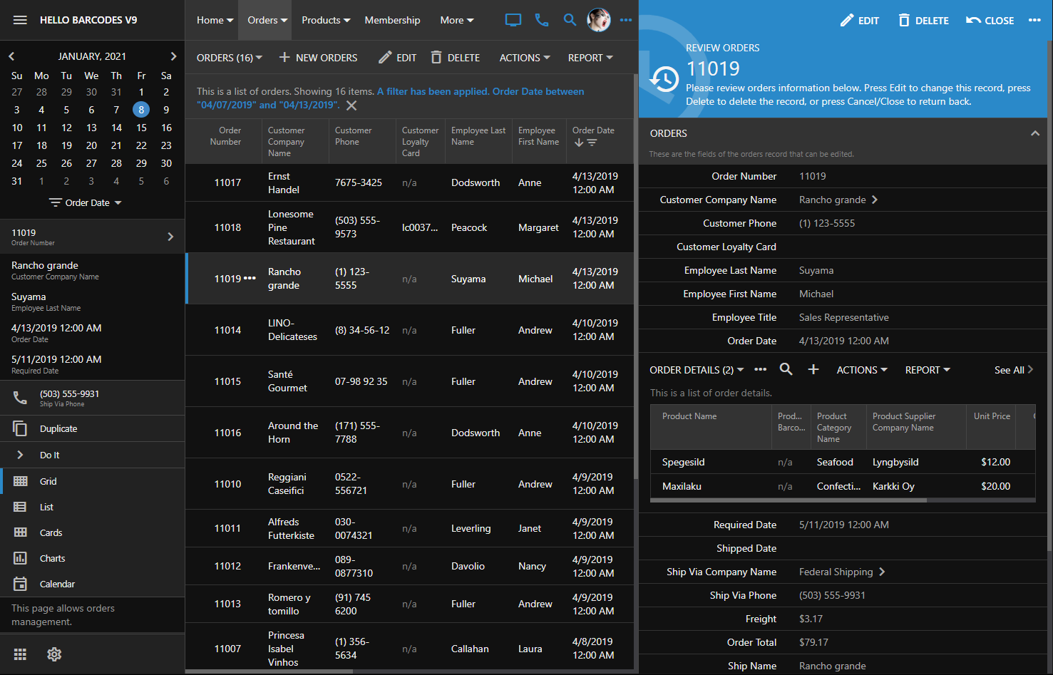
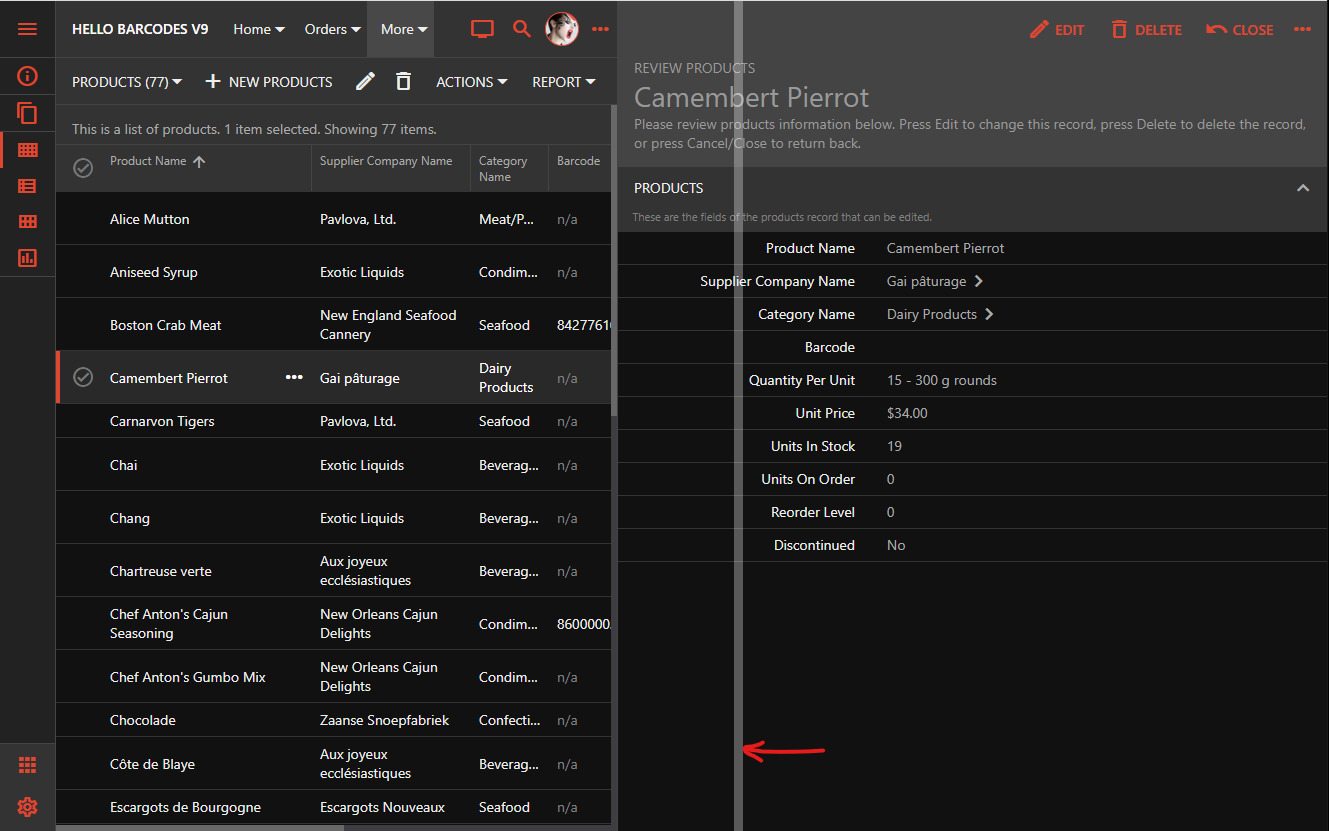
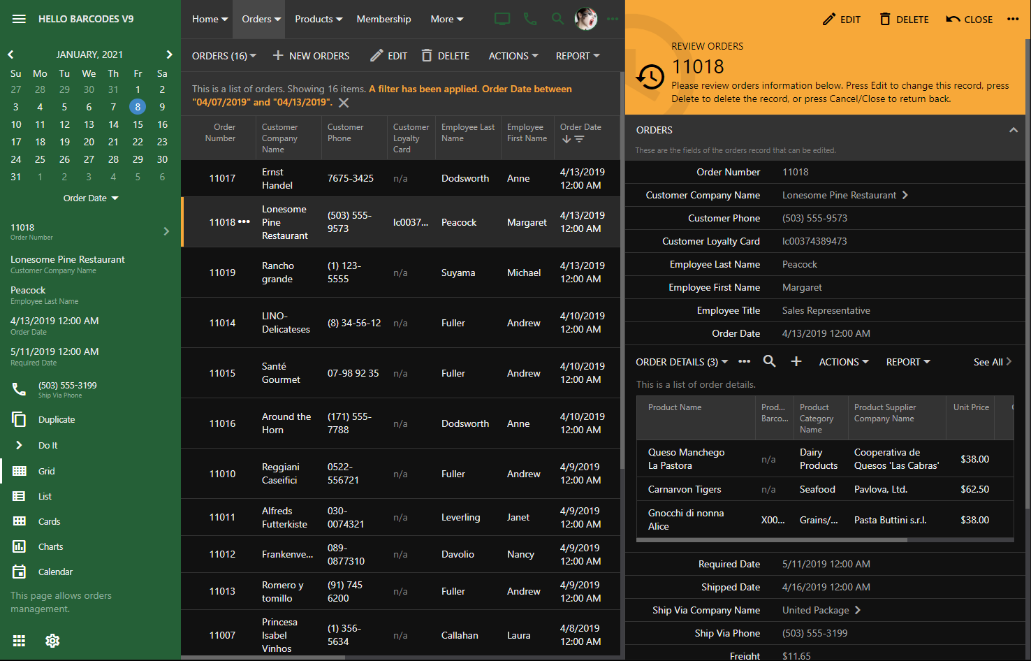
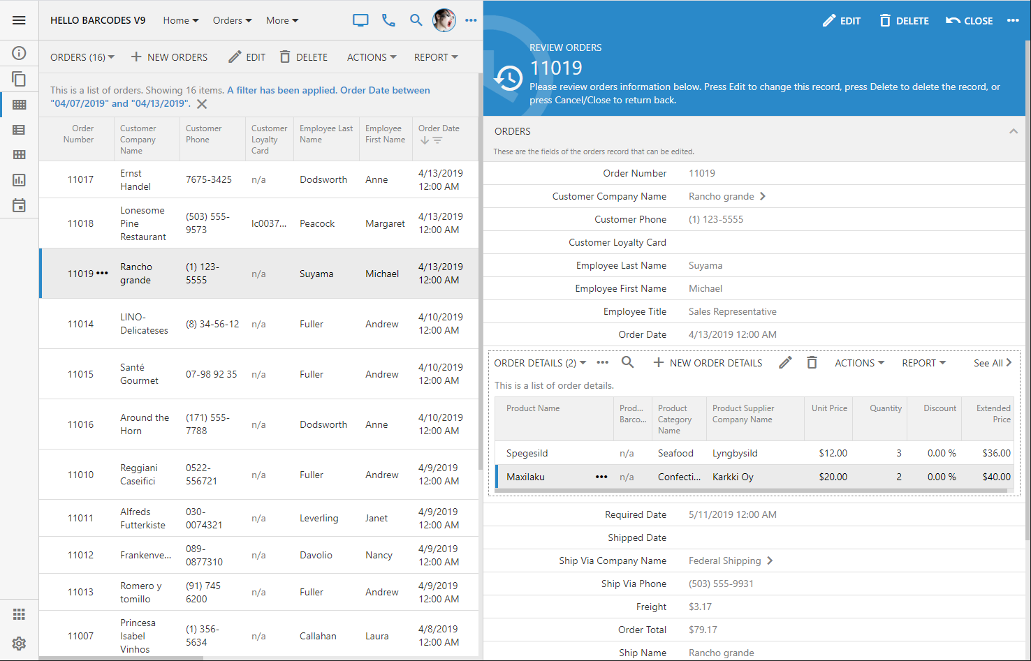
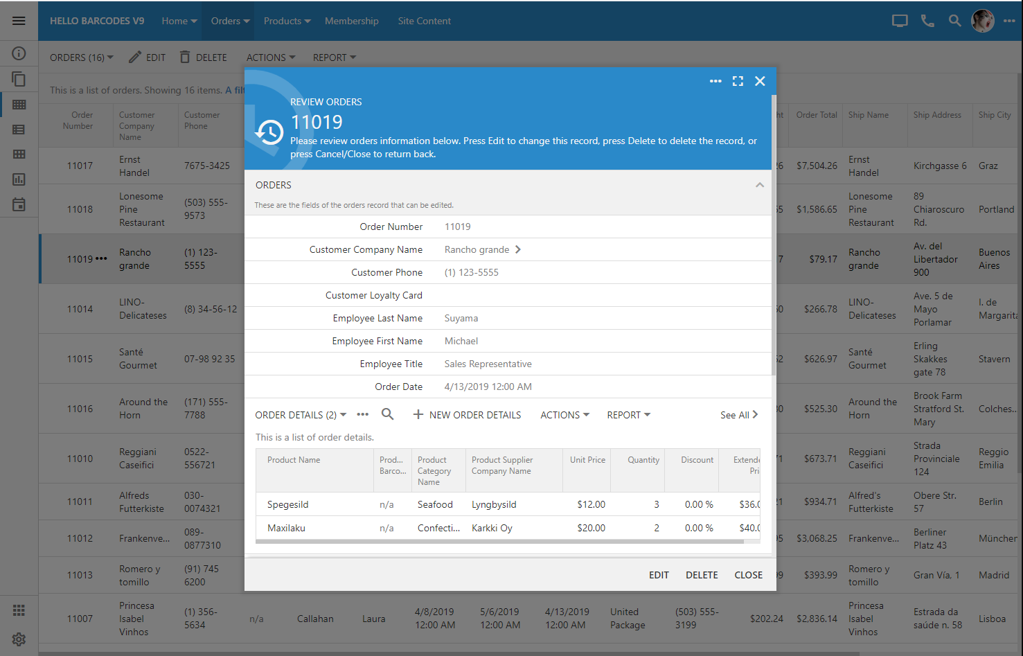
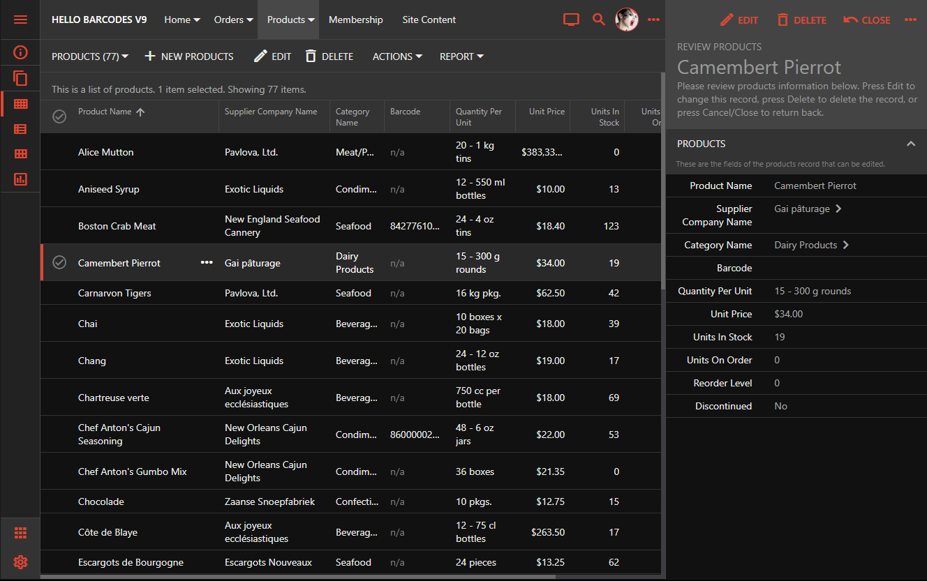
Touch UI provides the built-in option to display the details of the selected record side-by-side with the master list.
Popular email applications have proven this presentation style to be very effective. The end user can view the details of the selected message and has the quick access to the contents of the inbox.
The prototype of this presentation style has been a part of the framework for the past two years. Our team was able to bring it to the production state just now. The technical challenge was to provide a simultaneous access to the master and detail panes each holding a virtual page of the Touch UI application. A consistent styling has also been worked out.

The reading pane detail is empty by default. The placeholder area is filled with the standard background image that can be changed in ~/touch-settings.json through the ui.readingPane.background parameter. Set the option to false to disable the image or specify your own alternative (for example, ~/images/app-bkg.jpg).

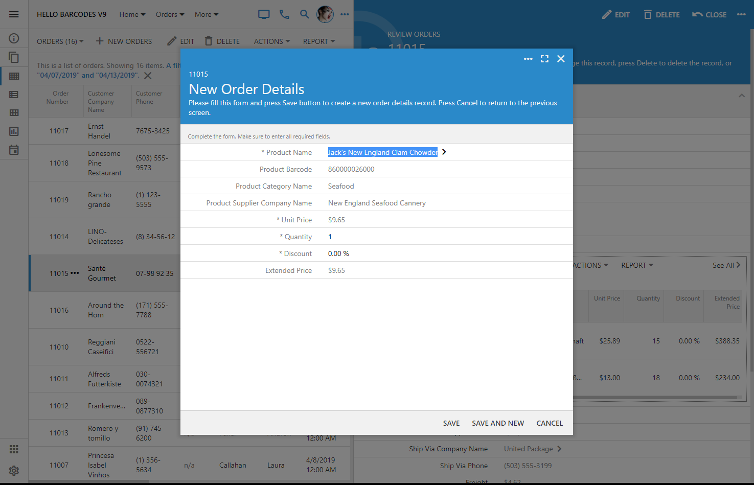
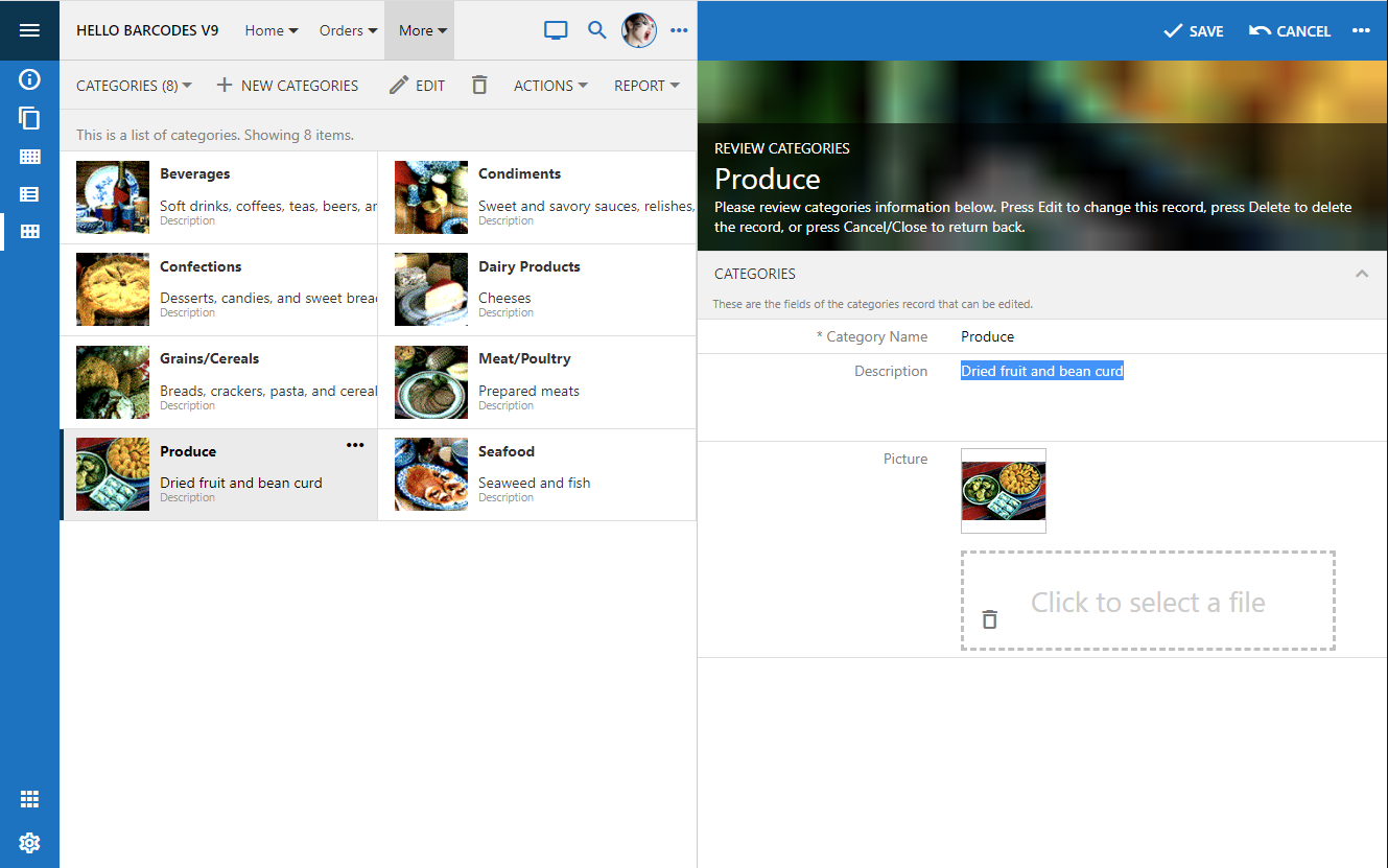
The modal form fills this area when a selection is made in the master list or a new item is created. Both master and detail panes can be scrolled and are fully interactive. The familiar form buttons are migrated to the top of the detail pane and have icons to complement the toolbar of the master pane.

Set the option ui.actions.form.icons to true to enable action icons in all forms of the app. By default, only the form buttons in the reading pane are rendered with icons.
If the reading pane is not enabled then the familiar modal presentation will take place when the user is interacting with the master list.

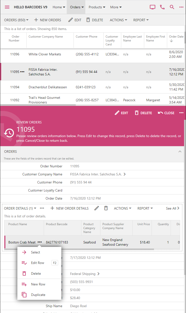
Any forms activated from the detail pane are displayed on the top of the reading pane.
The option to enable the reading pane is available to the end user through the view selector if the screen size is that of a typical tablet. Developers can also tag the data view on the page as reading-pane-auto to activate the reading pane by default. The option and the mode are not activated if the screen is small.

Touch UI allows specifying the default minimal size of the reading pane master and detail in ~/touch-settings.json through the options ui.readingPane.minLeft, ui.readingPane.minRight, ui.readingPane.minTop, and ui.readingPane.minBottom. The default value for these options is 375 measured in pixels.
The device with the vertical orientation will display the reading pane detail at the bottom of the screen.
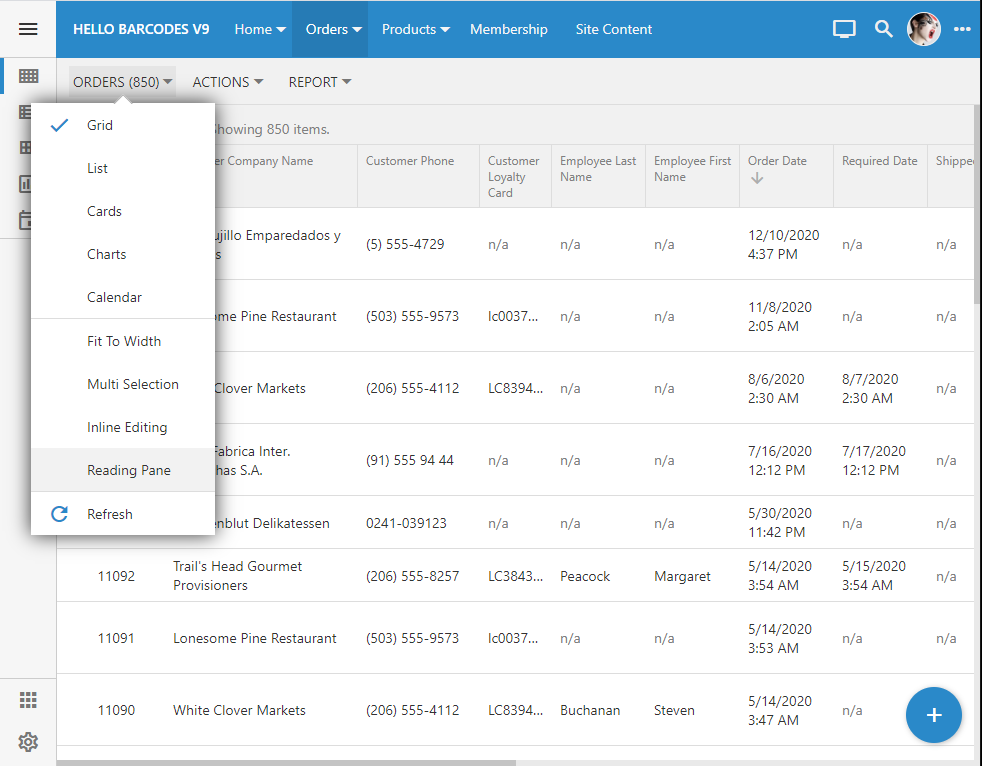
The master pane displays all supported presentation styles.
Hover over or touch the middle divider and drag it to the desired position to change the panes.
The responsive Touch UI will present the data in the best way possible within the available space of master and detail panes.

The reading pane mode enhances the productivity of the end users and requires zero effort on the part of the developer. If for any reason this mode is not desirable, then disable it with ui.readingPane.enabled option in ~/touch-settings.json. The reading pane mode is available only on the pages with a single master dataview.

Popular email applications have proven this presentation style to be very effective. The end user can view the details of the selected message and has the quick access to the contents of the inbox.
The prototype of this presentation style has been a part of the framework for the past two years. Our team was able to bring it to the production state just now. The technical challenge was to provide a simultaneous access to the master and detail panes each holding a virtual page of the Touch UI application. A consistent styling has also been worked out.
The reading pane detail is empty by default. The placeholder area is filled with the standard background image that can be changed in ~/touch-settings.json through the ui.readingPane.background parameter. Set the option to false to disable the image or specify your own alternative (for example, ~/images/app-bkg.jpg).
The modal form fills this area when a selection is made in the master list or a new item is created. Both master and detail panes can be scrolled and are fully interactive. The familiar form buttons are migrated to the top of the detail pane and have icons to complement the toolbar of the master pane.
Set the option ui.actions.form.icons to true to enable action icons in all forms of the app. By default, only the form buttons in the reading pane are rendered with icons.
If the reading pane is not enabled then the familiar modal presentation will take place when the user is interacting with the master list.
Any forms activated from the detail pane are displayed on the top of the reading pane.

The option to enable the reading pane is available to the end user through the view selector if the screen size is that of a typical tablet. Developers can also tag the data view on the page as reading-pane-auto to activate the reading pane by default. The option and the mode are not activated if the screen is small.
Touch UI allows specifying the default minimal size of the reading pane master and detail in ~/touch-settings.json through the options ui.readingPane.minLeft, ui.readingPane.minRight, ui.readingPane.minTop, and ui.readingPane.minBottom. The default value for these options is 375 measured in pixels.
The device with the vertical orientation will display the reading pane detail at the bottom of the screen.

The master pane displays all supported presentation styles.

Hover over or touch the middle divider and drag it to the desired position to change the panes.
The responsive Touch UI will present the data in the best way possible within the available space of master and detail panes.
The reading pane mode enhances the productivity of the end users and requires zero effort on the part of the developer. If for any reason this mode is not desirable, then disable it with ui.readingPane.enabled option in ~/touch-settings.json. The reading pane mode is available only on the pages with a single master dataview.