Thursday, March 25, 2021
Lines, Lines, Lines
Horizontal and Vertical Lines
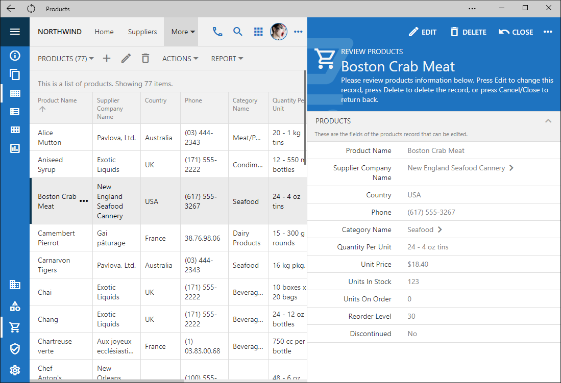
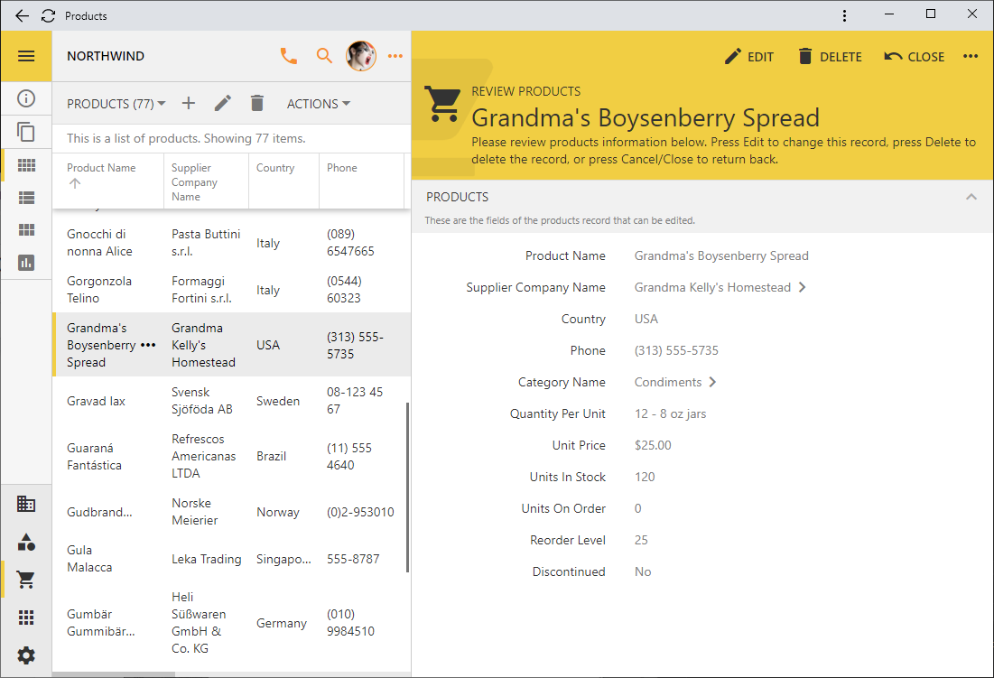
The signature feature of Touch UI is the “lined paper” style of data presentation. A list of items is rendered in the table format that looks like a spreadsheet. A single data item is displayed in a form with the rows of values separated by horizontal lines. The reading pane mode provides a great example of that.
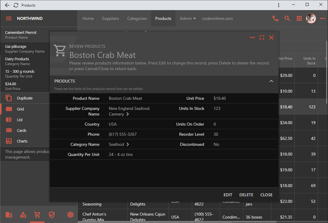
The height of each row is automatically adjusted to fit the content. The form will also distribute the field values in multiple columns if the floating is enabled and the form is wide enough.
Developers have a great control over the horizontal and vertical lines globally and on the fine-grained level. Let’s learn more about it.
Grid Lines
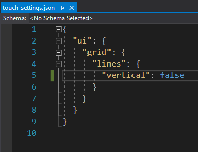
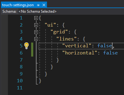
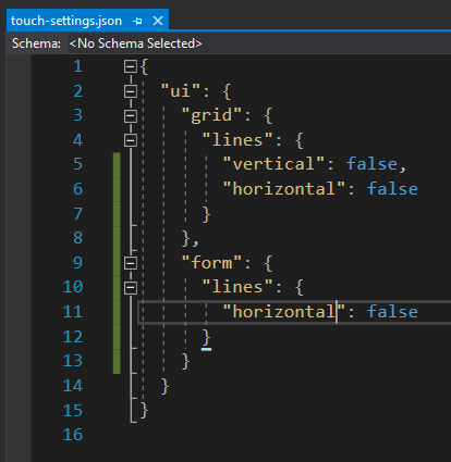
The vertical lines in the grid can be hidden in the file ~/touch-settings.json:
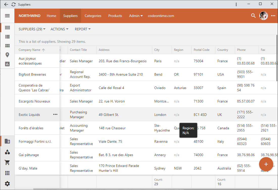
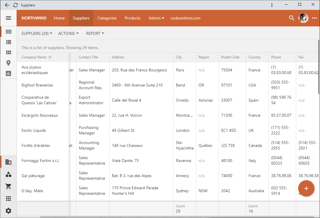
Setting the ui.grid.lines.vertical property to false will hide the vertical lines and force the framework to display the “n/a” abbreviation in the empty data cells in a muted color to provide a visual point of reference for the “null” values.
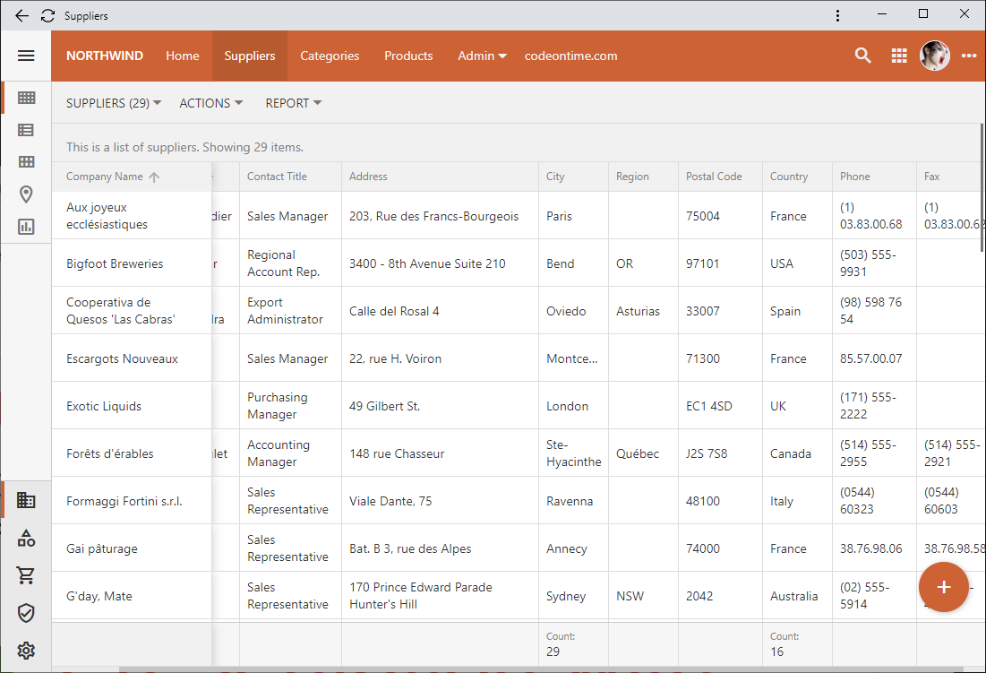
Compare this to the default presentation with the horizontal and vertical lines, where the “empty” values are easy to spot without a visual aid.
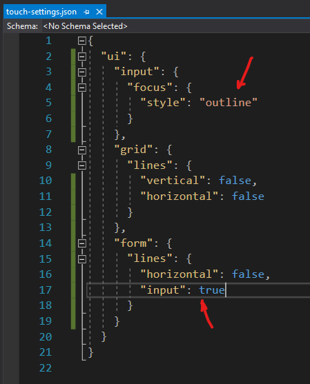
If the opposite effect is needed then hide the horizontal lines by setting the ui.grid.lines.horizontal to false in ~/touch-settings.json or tag a view as grid-lines-horizontal-none.
The minimalist presentation can be achieved by turning the horizontal and vertical lines “off” either in ~/touch-setting.json or by tagging a data view simultaneously with the two tags.
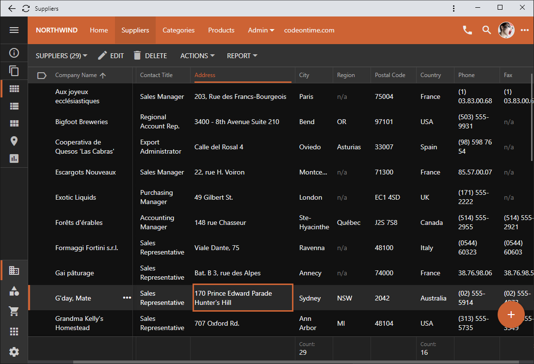
The boundaries of the selected field value are easy to see in the inline editing mode whether or not the grid has a look of a spreadsheet.
Form Lines
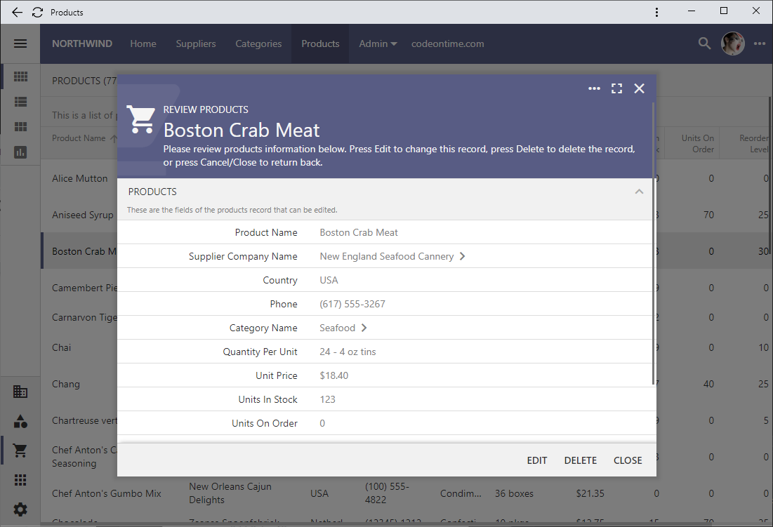
Get that minimalist look in the forms by getting rid of the horizontal lines.
You can accomplish that by setting ui.form.lines.horizontal option to false in ~/touch-settings.json.
The tag form-lines-horizontal-none will hide the horizontal lines in a data view form shown below.
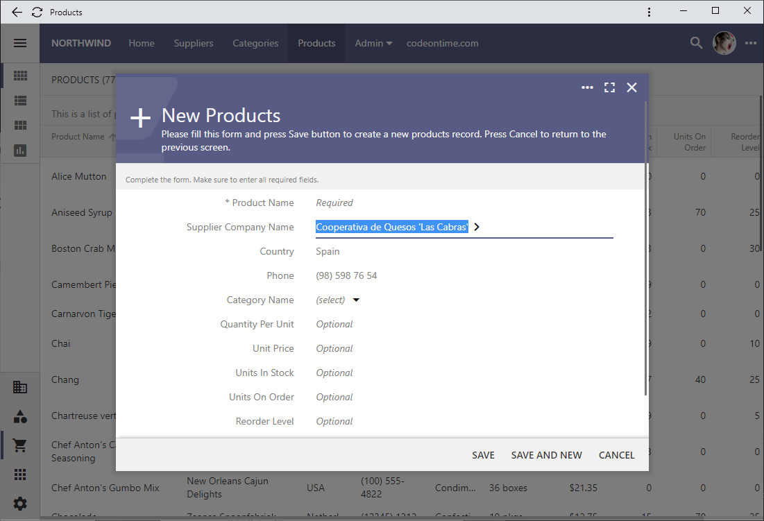
Form with the horizontal lines hidden will display an “Optional” text as a placeholder for the fields that accept the “null” value. The placeholders are visible when the end user is entering a new record or editing an existing one. This standard placeholder text can be overridden by setting a custom placeholder for the data field in the data controller view.
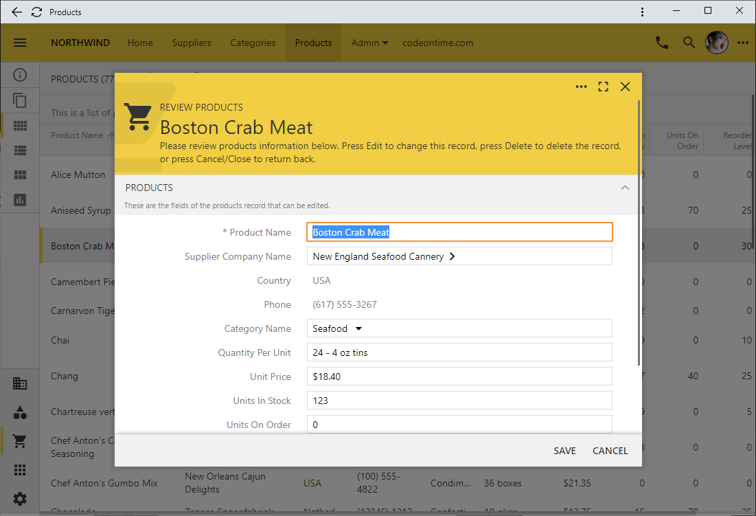
Finally you can have the lines to wrap around the field values like this.
The “outlined” input focus will work well when the input lines are enabled. This configuration of ~/touch-settings.json will display the lines around the text inputs and show the thick outline in the accent color of the theme when an input is focused.
