User Interface

Labels
AJAX(112) App Studio(8) Apple(1) Application Builder(245) Application Factory(207) ASP.NET(95) ASP.NET 3.5(45) ASP.NET Code Generator(72) ASP.NET Membership(28) Azure(18) Barcode(2) Barcodes(3) BLOB(18) Business Rules(1) Business Rules/Logic(140) BYOD(13) Caching(2) Calendar(5) Charts(29) Cloud(14) Cloud On Time(2) Cloud On Time for Windows 7(2) Code Generator(54) Collaboration(11) command line(1) Conflict Detection(1) Content Management System(12) COT Tools for Excel(26) CRUD(1) Custom Actions(1) Data Aquarium Framework(122) Data Sheet(9) Data Sources(22) Database Lookups(50) Deployment(22) Designer(177) Device(1) DotNetNuke(12) EASE(20) Email(6) Features(101) Firebird(1) Form Builder(14) Globalization and Localization(6) How To(1) Hypermedia(2) Inline Editing(1) Installation(5) JavaScript(20) Kiosk(1) Low Code(3) Mac(1) Many-To-Many(4) Maps(6) Master/Detail(36) Microservices(4) Mobile(63) Mode Builder(3) Model Builder(3) MySQL(10) Native Apps(5) News(18) OAuth(9) OAuth Scopes(1) OAuth2(13) Offline(20) Offline Apps(4) Offline Sync(5) Oracle(11) PKCE(2) Postgre SQL(1) PostgreSQL(2) PWA(2) QR codes(2) Rapid Application Development(5) Reading Pane(2) Release Notes(184) Reports(48) REST(29) RESTful(29) RESTful Workshop(15) RFID tags(1) SaaS(7) Security(81) SharePoint(12) SPA(6) SQL Anywhere(3) SQL Server(26) SSO(1) Stored Procedure(4) Teamwork(15) Tips and Tricks(87) Tools for Excel(2) Touch UI(93) Transactions(5) Tutorials(183) Universal Windows Platform(3) User Interface(338) Video Tutorial(37) Web 2.0(100) Web App Generator(101) Web Application Generator(607) Web Form Builder(40) Web.Config(9) Workflow(28)
Archive
Blog
User Interface
Tuesday, March 10, 2015PrintSubscribe
Maximizing Charts

Several sample charts are displayed below. Note that the axis values, legend, title, and any labels are placed outside of the chart. The chart itself floats in the center of the cell in the view.

Several example charts from Orders which have all elements outside the graph area with the chart floating in the center of the cell.

It is possible to expand each chart so that they fill the entire available area. All elements of the chart will be place inside the axes in order to full utilize all available screen size. The legend will be placed at the top of the graph, axis labels are placed inside the axes, and the title is also located inside the graph area.

In order to specify a chart to use this expanded mode, add the keyword “maximize” for every pivot defined in the view.

Data Field Tag
CustomerID pivot3-col1-top5-sortdescbyvalue pivot3-maximize
EmployeeID pivot2-row1-bar pivot2-maximize
OrderDate pivot1-row1-date-line pivot3-row1-date-all-columnstacked pivot4-row1-date pivot1-maximize
ShipVia pivot4-col1-areastacked pivot4-maximize

The charts will now maximize the available space.

The new charts have maximized the available space, and all elements are placed inside the chart.

Tuesday, March 10, 2015PrintSubscribe
Enabling Crosshairs on Charts

Line and area charts allow the user to click on a data point to see the value. The chart below shows how the tooltip appears.

Data Field Tag
EmployeeID pivot1-col1-top3
OrderDate pivot1-row1-line-curve-date
Freight pivot1-val1-sum

Line chart with crosshairs disabled.

However, it can be difficult to gauge where the actual value is on the horizontal and vertical axes. Using the “crosshair” keyword in the tag will enable a horizontal and vertical line that makes it easier for the user to see the value in relation to the chart. The color of the crosshair also shows which value is selected.

Data Field Tag
EmployeeID pivot1-col1-top3
OrderDate pivot1-row1-line-curve-date-crosshair
Freight pivot1-val1-sum

Line chart with crosshairs enabled.

The “crosshair” keyword will by default enable a line for both the horizontal and vertical axis. The “crosshair” property can also use the value “horizontal” or “vertical” to limit the line to the respective axis.

Data Field Tag
EmployeeID pivot1-col1-top3
OrderDate pivot1-row1-line-curve-date pivot1-crosshair:"vertical"
Freight pivot1-val1-sum

Line chart with crosshairs enabled in the vertical axis only.

Tuesday, March 10, 2015PrintSubscribe
Specifying Default Size On Charts

Charts presentation style will display as many reasonably-sized charts as possible on each device size. By default, each chart is of size “small”, which means that the chart will use 1/3 of the available space in each dimension on large screens.
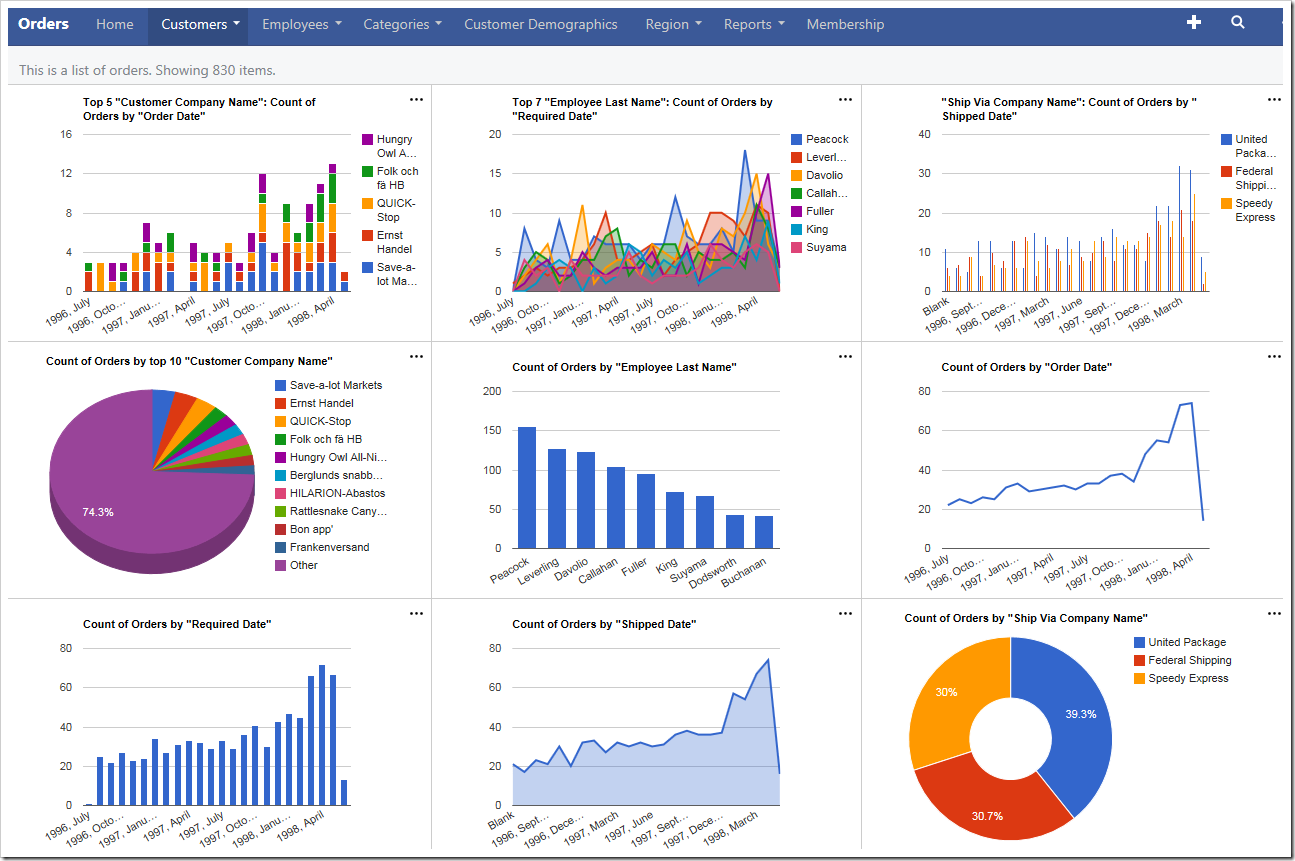
The default charts for Orders page will attempt to show three charts in each dimension on large screens.

On medium-sized devices, the charts will use 1/2 of the available space.
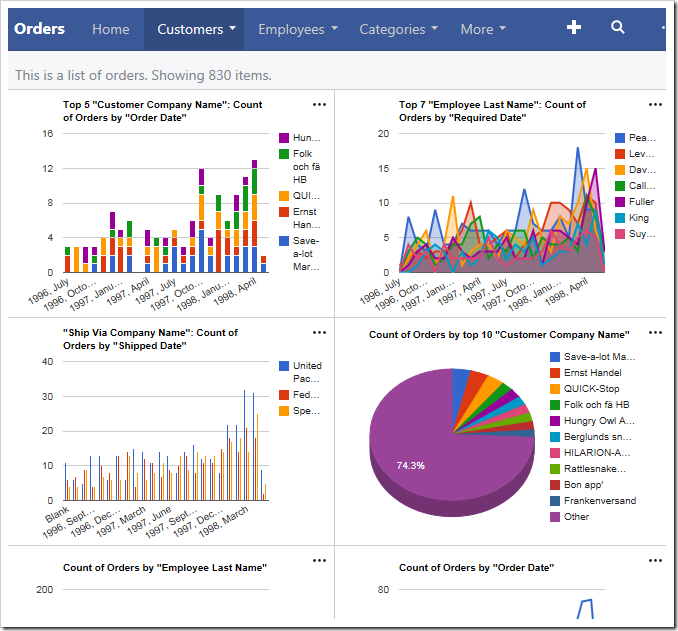
Small charts on medium-size devices will show two in each dimension.

The smallest devices will display only one chart at a time.
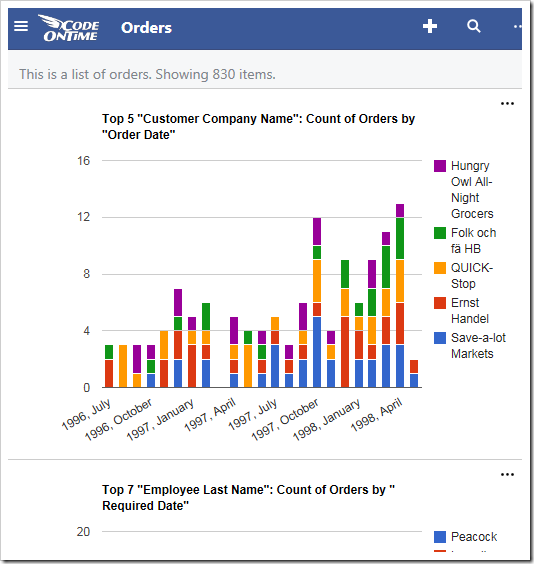
Small devices only show one chart at at time.

The user is able to change the size of the charts using the context menu in the top right corner of each chart. “Large” is only available on large devices, and “Medium” is only available on moderately sized devices and tablets.
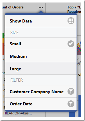
The user is able to change the size of the charts using the context menu in the top right corner of each chart.

The developer is also capable of specifying the default size for each chart by adding the keywords “medium” or “large”. Suppose that the Orders controller has manually specified charts matching those that have been automatically created. The highlighted tags below will specify the default sizes for those charts.

Data Field Tag
CustomerID pivot1-col1-sortdescbyvalue-columnstacked-top5 pivot1-medium pivot4-row1-top10-other-sortdescbyvalue-pie3d pivot4-large
EmployeeID pivot2-col1-sortdescbyvalue-area-top7 pivot5-row1-top10-other-sortdescbyvalue-column
OrderDate pivot1-row1-date-all pivot6-row1-line-date-all
RequiredDate pivot2-row1-date-all pivot7-row1-column-date-all
ShippedDate pivot3-row1-date-all pivot8-row1-area-date-all
ShipVia pivot3-col1-sortdescbyvalue-column-top5 pivot9-row1-top10-other-sortdescbyvalue-donut

Upon regenerating the app and refreshing the page, notice that the default sizes have been applied. The first chart is of “medium” size and now takes 2/3s of the screen on large devices.
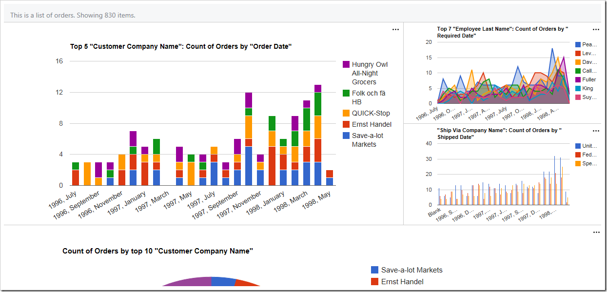
The first chart has size of "medium" and takes 2/3s of the screen.

The “large” fourth chart takes the whole screen.
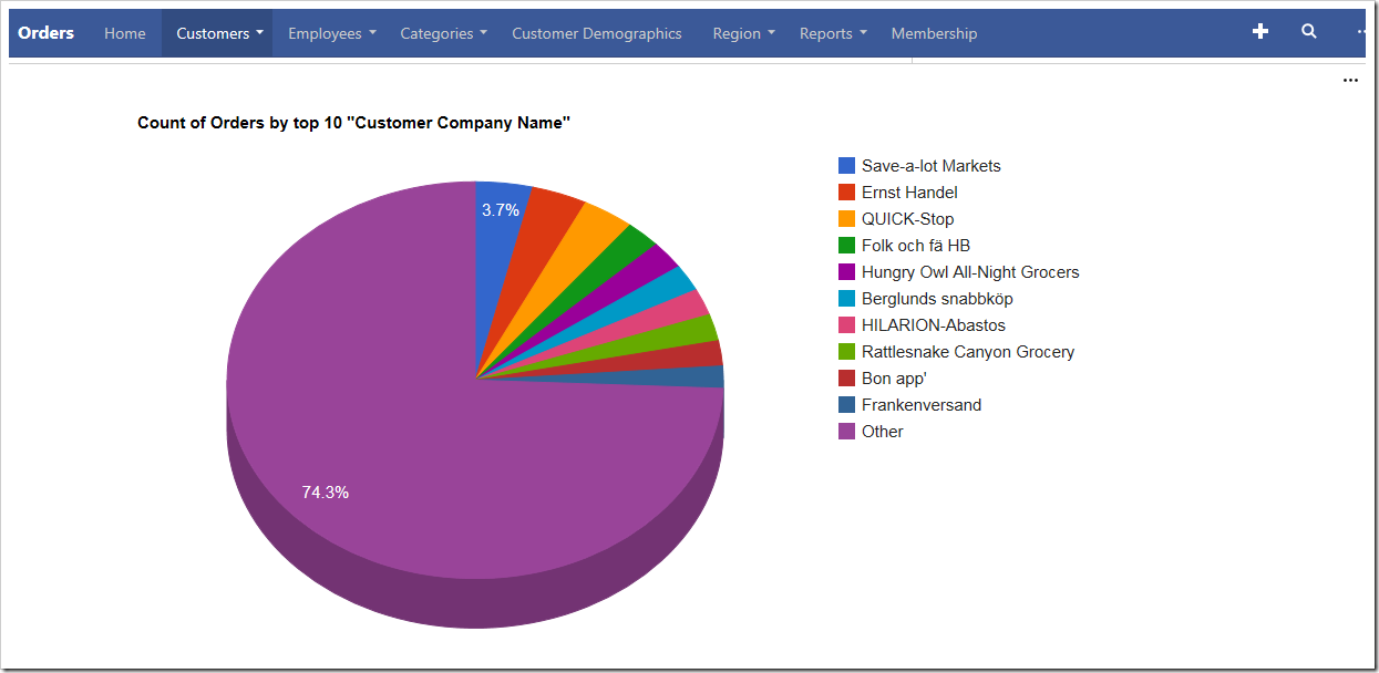
The fourth chart is "large" and takes the full screen