Tutorials

Labels
AJAX(112) App Studio(7) Apple(1) Application Builder(245) Application Factory(207) ASP.NET(95) ASP.NET 3.5(45) ASP.NET Code Generator(72) ASP.NET Membership(28) Azure(18) Barcode(2) Barcodes(3) BLOB(18) Business Rules(1) Business Rules/Logic(140) BYOD(13) Caching(2) Calendar(5) Charts(29) Cloud(14) Cloud On Time(2) Cloud On Time for Windows 7(2) Code Generator(54) Collaboration(11) command line(1) Conflict Detection(1) Content Management System(12) COT Tools for Excel(26) CRUD(1) Custom Actions(1) Data Aquarium Framework(122) Data Sheet(9) Data Sources(22) Database Lookups(50) Deployment(22) Designer(177) Device(1) DotNetNuke(12) EASE(20) Email(6) Features(101) Firebird(1) Form Builder(14) Globalization and Localization(6) How To(1) Hypermedia(2) Inline Editing(1) Installation(5) JavaScript(20) Kiosk(1) Low Code(3) Mac(1) Many-To-Many(4) Maps(6) Master/Detail(36) Microservices(4) Mobile(63) Mode Builder(3) Model Builder(3) MySQL(10) Native Apps(5) News(18) OAuth(9) OAuth Scopes(1) OAuth2(13) Offline(20) Offline Apps(4) Offline Sync(5) Oracle(11) PKCE(2) Postgre SQL(1) PostgreSQL(2) PWA(2) QR codes(2) Rapid Application Development(5) Reading Pane(2) Release Notes(183) Reports(48) REST(29) RESTful(29) RESTful Workshop(15) RFID tags(1) SaaS(7) Security(81) SharePoint(12) SPA(6) SQL Anywhere(3) SQL Server(26) SSO(1) Stored Procedure(4) Teamwork(15) Tips and Tricks(87) Tools for Excel(2) Touch UI(93) Transactions(5) Tutorials(183) Universal Windows Platform(3) User Interface(338) Video Tutorial(37) Web 2.0(100) Web App Generator(101) Web Application Generator(607) Web Form Builder(40) Web.Config(9) Workflow(28)
Archive
Blog
Tutorials
Saturday, March 7, 2015PrintSubscribe
Geo Chart Type

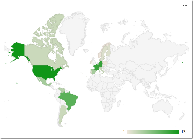
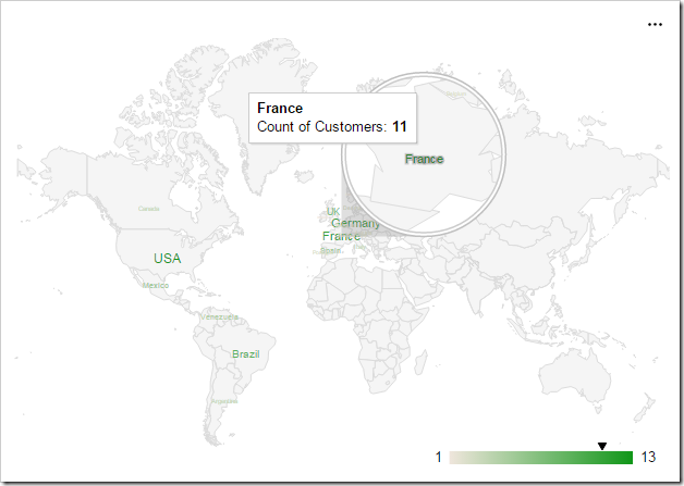
The “geo” chart type will render a map of the Earth. Each value will be a country, region, or city with a number associated with it. Countries with larger numbers will be a darker shade. The scale for the values is shown in the bottom right corner. The example below shows the location of customers by country in the Northwind sample app.

To use “geo” chart type, add the keyword “geo” to any “pivot-” tag, and make sure that it is separated with hyphens (-).

Data Field Tag
Country pivot1-row1-geo

Geo chart showing customers in each country.

The data for the chart can be seen below.
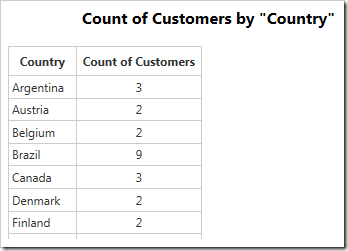
Data for the geo chart of customers in each country.

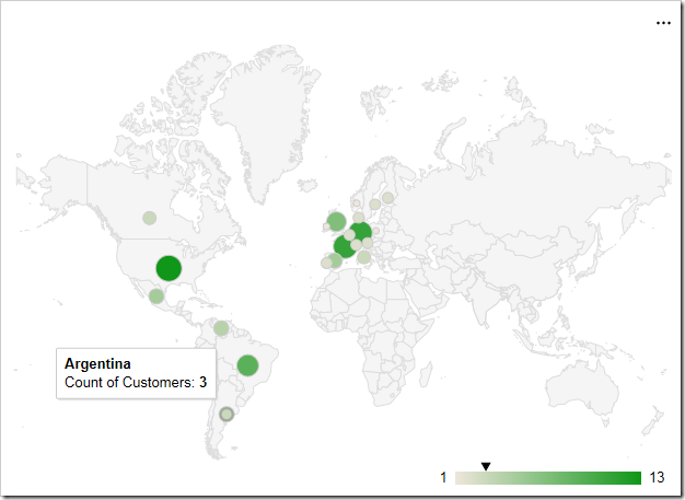
Hovering over a data point will reveal the data. An arrow will be rendered on the scale in the bottom right corner.
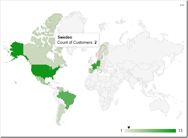
Hovering over a country or region will reveal the value.

The label for each row is attempted to be resolved by Google Maps. Please see the Google Maps Terms of Service for more information on their data policy.

Display Mode

The “displaymode” property determines the rendering of data points on the chart. By default, the mode is determined automatically. When using countries, such as in the example above, it will render using “regions”. One alternative mode is to place markers that are relative to the size of the value by specifying “markers”.

To define the display mode, add the keyword “displaymode”, followed by a colon and the value in quotation marks. This keyword must be the last in the tag.

Data Field Tag
Country pivot1-row1-geo pivot1-displaymode:"markers"

The geo chart also supports displaying values as marker.

Hovering over densely packed data points will magnify the region.
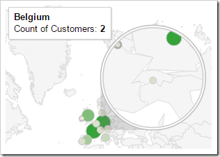
Hovering over dense data points will magnify the area.

Using a display mode of “text” will render the value as a string over the correct location. The size and boldness of the text reflects the size of the value.
The 'text' display mode will render data points as text.

Region

The “region” property allows setting the zoom level of the map. By default, the property is set to “world”, to display the full map. The value can be set to a continent using its 3-digit code, a country with the ISO 3166-1 alpha-2 code, or a state in the United States with the ISO 3166-2:US code. If using a state, the resolution property must be set to “provinces” or “metros”.

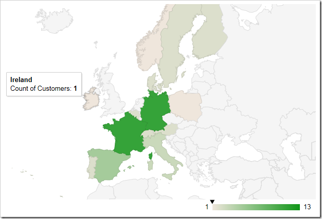
The example below is set to zoom into the continent of Europe with code “150”.

Data Field Tag
Country pivot1-row1-geo pivot1-region:"150"

The geo chart is set to only render the region of Europe.

Resolution

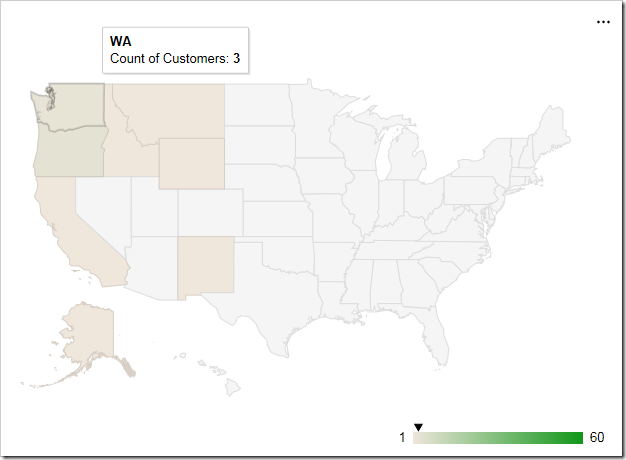
The “resolution” property determines the display of data points on the geo chart. By default, it is set to “countries”. The “provinces” value is supported for some country regions and US state regions. The “metros” value is supported for US country region and US state regions only.

Data Field Tag
Region pivot1-row1-geo pivot1-region:"US" pivot1-resolution:"provinces"

The geo chart shows a map of the US and has resolution of 'provinces'.

An example of the “metros” resolution mode can be seen below. The chart uses “markers” display mode.

Data Field Tag
City pivot1-row1-geo pivot1-region:"US" pivot1-displaymode:"markers' pivot1-resolution:"metros"

The geo chart shows a resolution of 'metros' in the United States.

Saturday, March 7, 2015PrintSubscribe
Column Chart Type

The “column” chart type renders multiple vertical columns for each row of data. This chart type has many use cases, such as comparing values grouped by lookup values, or showing change over time. The example below shows the number of orders received over time in the Northwind sample app.

To use “column” chart type, add the keyword “column” to any “pivot-” tag, and make sure that it is separated with hyphens (-).

Data Field Tag
EmployeeID pivot1-row1-column

A column chart showing the count of orders made by each employee.

The data for the graph is displayed below.

The data for the chart showing the count of orders made by each employee.

Hovering over or clicking on a column will reveal the data.

A tooltip is shown for each column.

If multiple values are specified for each row of data, a column will be rendered for each value in a different color.

Data Field Tag
EmployeeID pivot1-row1-column
ShipVia pivot1-col1

Multiple values will render in multiple columns in the chart.

Multiple values for each row can be seen in the data below.

The data for the chart of count of orders by employee, split by shipper.

Each row can also be displayed as a single column and stack the values on that column by using the “columnstacked” chart type.

Data Field Tag
EmployeeID pivot1-row1-columnstacked
ShipVia pivot1-col1

Stacked columns will group all values for each datarow into a single column.

Saturday, March 7, 2015PrintSubscribe
Bar Chart Type

The “bar” chart type renders horizontal bars for each row of data. One use case would be to quickly compare records grouped by lookup values. For example, it can be used to show the number of orders made with each employee on the Orders page of the Northwind sample app. The chart reveals that “Peacock” is the most active employee.

To use “bar” chart type, add the keyword “bar” to any “pivot-” tag, and make sure that it is separated with hyphens (-).

Data Field Tag
EmployeeID pivot1-row1-bar

A bar chart showing count of orders by employee.

Here is the data for the above graph:

The data for the chart of count of orders by employee.

Hovering over or clicking on a single bar will reveal the data behind that bar.

The tooltip reveals the value behind the bar.

When multiple values are specified for each row, a bar will be rendered for each value in a different color.

Data Field Tag
EmployeeID pivot1-row1-bar
ShipVia pivot1-col1

Multiple values for each row render multiple separate bars.

Multiple columns of data can be seen in the table below.

The values for the chart showing count of orders by customer grouped by shipper.

Each row can also be displayed as a single bar, with values stacked on that bar, by using the “barstacked” chart type.

Data Field Tag
EmployeeID pivot1-row1-barstacked
ShipVia pivot1-col1

The stacked bar chart type renders all values for each row in a single bar.

Continue to Area Chart Type