Form Builder

Labels
AJAX(112) App Studio(7) Apple(1) Application Builder(245) Application Factory(207) ASP.NET(95) ASP.NET 3.5(45) ASP.NET Code Generator(72) ASP.NET Membership(28) Azure(18) Barcode(2) Barcodes(3) BLOB(18) Business Rules(1) Business Rules/Logic(140) BYOD(13) Caching(2) Calendar(5) Charts(29) Cloud(14) Cloud On Time(2) Cloud On Time for Windows 7(2) Code Generator(54) Collaboration(11) command line(1) Conflict Detection(1) Content Management System(12) COT Tools for Excel(26) CRUD(1) Custom Actions(1) Data Aquarium Framework(122) Data Sheet(9) Data Sources(22) Database Lookups(50) Deployment(22) Designer(177) Device(1) DotNetNuke(12) EASE(20) Email(6) Features(101) Firebird(1) Form Builder(14) Globalization and Localization(6) How To(1) Hypermedia(2) Inline Editing(1) Installation(5) JavaScript(20) Kiosk(1) Low Code(3) Mac(1) Many-To-Many(4) Maps(6) Master/Detail(36) Microservices(4) Mobile(63) Mode Builder(3) Model Builder(3) MySQL(10) Native Apps(5) News(18) OAuth(9) OAuth Scopes(1) OAuth2(13) Offline(20) Offline Apps(4) Offline Sync(5) Oracle(11) PKCE(2) Postgre SQL(1) PostgreSQL(2) PWA(2) QR codes(2) Rapid Application Development(5) Reading Pane(2) Release Notes(183) Reports(48) REST(29) RESTful(29) RESTful Workshop(15) RFID tags(1) SaaS(7) Security(81) SharePoint(12) SPA(6) SQL Anywhere(3) SQL Server(26) SSO(1) Stored Procedure(4) Teamwork(15) Tips and Tricks(87) Tools for Excel(2) Touch UI(93) Transactions(5) Tutorials(183) Universal Windows Platform(3) User Interface(338) Video Tutorial(37) Web 2.0(100) Web App Generator(101) Web Application Generator(607) Web Form Builder(40) Web.Config(9) Workflow(28)
Archive
Blog
Form Builder
Sunday, February 5, 2017PrintSubscribe
View Icons

Icons can be assigned to views in order to better communicate the purpose of a particular form at a glance.

Customers edit form with a custom icon.

By default, view headers will display the view label, description, and the first field value. The background will be a solid color.

Standard customers form with no icon.

Scrolling down will move the header text to the toolbar.

Scrolling down in a modal will move the header text to the toolbar.

Let’s assign an icon to the views of Customers controller in the Northwind sample app.

Switch back to the Project Designer. In the Project Explorer, switch to the Controllers tab. Double-click on “Customers / Views / editForm1”.

Editing the "editForm1" view of Customers controller.

Icons can be defined by specifying the icon library and the icon name. Spaces are replaced with dashes.

Assign an icon to the view in the Tags property, and press OK to save.

Property Value
Tags material-icon-group

Double-click on “Customers / Views / createForm1”. Assign an icon to this view as well.

Property Value
Tags material-icon-group-add

On the toolbar, press Browse. Navigate to the Customers page, and select a customer. The header will display the new icon on the left side. The background will show a large greyed out version of the same icon.

The Customers editForm1 view with a custom icon

Scrolling down will reveal a smaller version of the icon.

The icon is also displayed in the modal toolbar.

Close the form, and press the New icon. The create form will display the assigned icon as well. The picture below shows the create form on a smaller device or window.

The view header shows the custom icon on smaller screens.

Sunday, February 5, 2017PrintSubscribe
Page Icons

In Touch UI apps, icons can be assigned to pages in order to convey additional meaning to the users. Up to five page icons will be displayed in the Quick Launch area at the bottom of the sidebar.

Icons displayed in menus and Quick Launch area of the sidebar.

Let’s customize the default Northwind app. Initially, this app does not have any icons assigned to pages. Only “Apps” and “Settings” icons are displayed in the Quick Launch area.
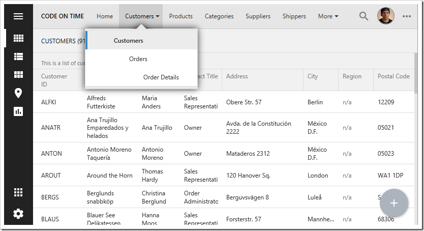
Default Northwind app has no page icons assigned.

Pressing the “Apps” button will reveal a site map with no icons.
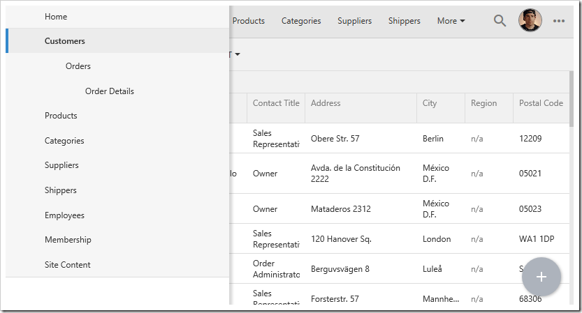
The "Apps" menu will display the site map.

Let’s assign some icons to the primary pages in our app to help the user find them quickly.

Start the Project Designer. In the Project Explorer on the right side of the screen, double-click on Customers page node.
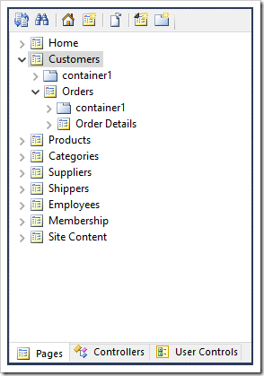
The Customers page of the sample Northwind app.

Icons can be defined by specifying the icon library plus the icon name. Replace spaces with dashes.

Let’s assign the “group” icon from the Material Icons library.

Property Value
Icon / Custom Style material-icon-group

Press OK to save the page. Double-click on the “Orders” page, and make the following change.

Property Value
Icon / Custom Style material-icon-shop

Save the change, and double-click on “Products” page to set an icon.

Property Value
Icon / Custom Style material-icon-local-offer

On the toolbar, press Browse. When generation is complete, the app will open in the default browser. Notice that the first three page icons are displayed in Quick Launch. If the “apps” button is disabled or moved to the toolbar, an additional page icon will be displayed. If “Settings” button is disabled, another icon slot will become available.

Notice that some themes will emphasize the Quick Launch area if at least one page icon is defined. Page icons will also be displayed in toolbar menu dropdowns.
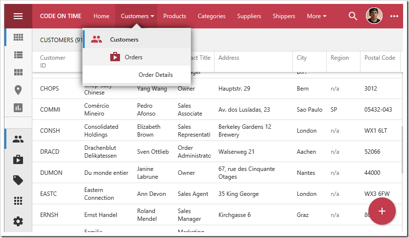
Icons have been assigned to pages. Icons are added to the Quick Launch area of the sidebar.

Pushing the hamburger button in the top left corner will expand the sidebar. The Quick Launch area will rotate to fit horizontally.
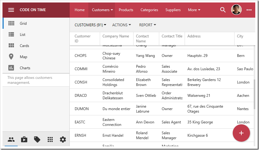
Expanding the sidebar will rotate the Quick Launch area.

Press the “Apps” button to reveal the site menu. Notice that pages with an assigned icon will be placed in a grid at the top of the menu.
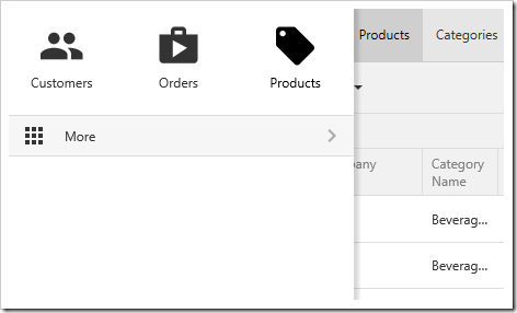
Activating the "Apps" menu will display a grid of icons representing pages.

Pressing “More” will reveal the full site map. Icons will be displayed next to their assigned page.
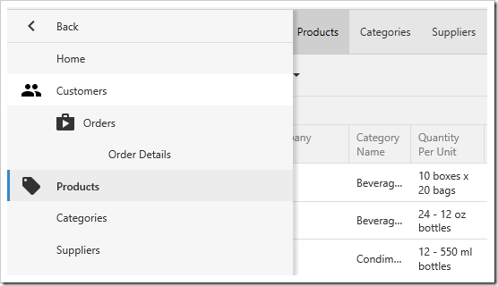
Pressing "More" from the "Apps" menu will display the site map.