Features

Labels
AJAX(112) App Studio(7) Apple(1) Application Builder(245) Application Factory(207) ASP.NET(95) ASP.NET 3.5(45) ASP.NET Code Generator(72) ASP.NET Membership(28) Azure(18) Barcode(2) Barcodes(3) BLOB(18) Business Rules(1) Business Rules/Logic(140) BYOD(13) Caching(2) Calendar(5) Charts(29) Cloud(14) Cloud On Time(2) Cloud On Time for Windows 7(2) Code Generator(54) Collaboration(11) command line(1) Conflict Detection(1) Content Management System(12) COT Tools for Excel(26) CRUD(1) Custom Actions(1) Data Aquarium Framework(122) Data Sheet(9) Data Sources(22) Database Lookups(50) Deployment(22) Designer(177) Device(1) DotNetNuke(12) EASE(20) Email(6) Features(101) Firebird(1) Form Builder(14) Globalization and Localization(6) How To(1) Hypermedia(2) Inline Editing(1) Installation(5) JavaScript(20) Kiosk(1) Low Code(3) Mac(1) Many-To-Many(4) Maps(6) Master/Detail(36) Microservices(4) Mobile(63) Mode Builder(3) Model Builder(3) MySQL(10) Native Apps(5) News(18) OAuth(8) OAuth Scopes(1) OAuth2(11) Offline(20) Offline Apps(4) Offline Sync(5) Oracle(10) PKCE(2) PostgreSQL(2) PWA(2) QR codes(2) Rapid Application Development(5) Reading Pane(2) Release Notes(180) Reports(48) REST(29) RESTful(29) RESTful Workshop(15) RFID tags(1) SaaS(7) Security(80) SharePoint(12) SPA(6) SQL Anywhere(3) SQL Server(26) SSO(1) Stored Procedure(4) Teamwork(15) Tips and Tricks(87) Tools for Excel(2) Touch UI(93) Transactions(5) Tutorials(183) Universal Windows Platform(3) User Interface(338) Video Tutorial(37) Web 2.0(100) Web App Generator(101) Web Application Generator(607) Web Form Builder(40) Web.Config(9) Workflow(28)
Archive
Blog
Features
Thursday, March 4, 2021PrintSubscribe
Light or Dark? Automatic Theme Detection.

 If you had a pleasure of setting up a new device recently, then you might remember the challenge of choosing between the Light and Dark themes for the user interface. The modern operating systems also have an optional automatic transition between the two based on the time of the day.

Touch UI does have two major theme variations called Light and Dark with multiple accents that make possible bringing a splash of color to each theme. Your app will automatically detect the theme of the device and switch the theme for you.

Here is an example of iPad Mini with the online app in Dark theme.


The color accent of the app will not change when the switch of the theme occurs. If you have designed your own brand accent or prefer a particular standard accent, then your customization choice will remain in place. 

If you are a Windows user willing to experiment with the automatic theme detection, then search for Theme in the Start menu, load up your app in the browser and try switching the dark and light app modes in the Colors settings.


Choose the dark colors and observe the instant change from Light to Dark: The browsers will go “dark” and so is the app.


Flick the switch and bring the light back. The user interface of the operating system changes and so does the application built with Code On Time. The screen shot shows Chrome, Edge, and FireFox respond in exactly the same way.


Your application will also detect that the theme has changed when it loads up.

If you prefer to force the particular theme for the application, then disable the theme detection in ~/touch-settings.json like this:


The dark mode of the operating system will be ignored.


Our recommendation is to keep the theme detection in the enabled state. Light color on the dark display or the dark panels on the light background may cause an unintended distress to the end users of your app.

If you have designed your own “brand-name” accent, then make sure that it supports both themes of Touch UI or make the specific adjustments as we do in the configuration of the Vantage accent found at ~\app\css\themes\touch-accent.vantage.json:


Labels: Features, Touch UI
Friday, January 8, 2021PrintSubscribe
Reading Pane
Touch UI provides the built-in option to display the details of the selected record side-by-side with the master list.

Reading Pane

Popular email applications have proven this presentation style to be very effective. The end user can view the details of the selected message and has the quick access to the contents of the inbox.

The prototype of this presentation style has been a part of the framework for the past two years. Our team was able to bring it to the production state just now. The technical challenge was to provide a simultaneous access to the master and detail panes each holding a virtual page of the Touch UI application. A consistent styling has also been worked out.


The reading pane detail is empty by default. The placeholder area is filled with the standard background image that can be changed in ~/touch-settings.json through the ui.readingPane.background parameter. Set the option to false to disable the image or specify your own alternative (for example, ~/images/app-bkg.jpg).


The modal form fills this area when a selection is made in the master list or a new item is created. Both master and detail panes can be scrolled and are fully interactive. The familiar form buttons are migrated to the top of the detail pane and have icons to complement the toolbar of the master pane.


Set the option ui.actions.form.icons to true to enable action icons in all forms of the app. By default, only the form buttons in the reading pane are rendered with icons.

If the reading pane is not enabled then the familiar modal presentation will take place when the user is interacting with the master list.


Any forms activated from the detail pane are displayed on the top of the reading pane.


The option to enable the reading pane is available to the end user through the view selector if the screen size is that of a typical tablet. Developers can also tag the data view on the page as reading-pane-auto to activate the reading pane by default. The option and the mode are not activated if the screen is small.


Touch UI allows specifying the default minimal size of the reading pane master and detail in ~/touch-settings.json through the options ui.readingPane.minLeft, ui.readingPane.minRight, ui.readingPane.minTop, and ui.readingPane.minBottom. The default value for these options is 375 measured in pixels.

The device with the vertical orientation will display the reading pane detail at the bottom of the screen.


The master pane displays all supported presentation styles.


Hover over or touch the middle divider and drag it to the desired position to change the panes.


The responsive Touch UI will present the data in the best way possible within the available space of master and detail panes.


The reading pane mode enhances the productivity of the end users and requires zero effort on the part of the developer. If for any reason this mode is not desirable, then disable it with ui.readingPane.enabled option in ~/touch-settings.json. The reading pane mode is available only on the pages with a single master dataview.
Monday, April 9, 2018PrintSubscribe
Changing Field Values Via JavaScript Business Rules

Some form of validation is required in every application to help the user insert the correct data. Applications created with Code On Time app generator offer validation in the form of business rules.
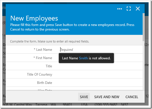
Validating the Last Name field of the New Employees form.

Let’s add validation business rules the Employees controller of our sample Northwind app.

Open the Project Designer. In the Solution Explorer, switch to the Controllers tab, right-click on Employees / Business Rules node, and press New Business Rule.
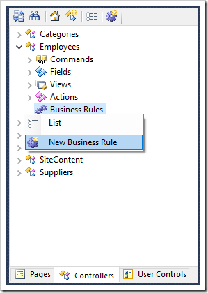
Creating a new business rule on Employees controller.

Specify the following:

Property Value
Type JavaScript
Command Name Insert
Phase Before
Script
if ($row.LastName == 'Smith') {
    this.preventDefault();
    $row.LastName = null;
}

The above script will run when the user presses Save. It will check if the user has specified a Last Name of “Smith” – if so, it will cancel the save operation and clear the field.

Save the new business rule. On the toolbar, press Browse to run the app. Navigate to the Employees page and create a new record.
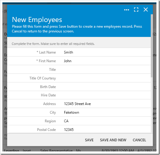
Creating a new employee with Last Name of "Smith".

Enter values for the employee and press Save. The save operation will not be executed, and the Last Name field will be cleared.
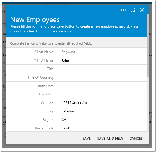
The Last Name field has been cleared.

Our business rule does ensure the user does not enter an incorrect value, but it does not make it clear to the user what is going on. We will want to add some feedback in the form of a message box to help the user understand.

Change the business rule as shown below:

if ($row.LastName == 'Smith') {
    this.preventDefault();
    // show message box
    $app.alert('Last Name "Smith" is not allowed.').done(function () {
        // update field value to null
        $app.input.execute({
            values: [
                { name: 'LastName', value: null }
            ]
        });
        // focus on the field
        $app.input.focus({ fieldName: 'LastName' });
    });
}

Our updated business rule has a few changes. Notice that the $app.alert function is used to display a message to the user. However, this alert will show a different form and change the current context. Attempting to update the field LastName after an alert is displayed will attempt to update a LastName field inside the alert form – which does not exist. Therefore, a done handler will need to be added to the $app.alert method call in order to execute code after the user closes the alert.

One more point to notice is that the $row variable is only in scope during the execution of the business rule. The asynchronous code in the done handler is executed when $row is out of scope. Therefore, it is necessary to use the $app.input.execute API to update the field values when the user returns to the Employees create form. The execute method accepts an object with the property values that contains a list of key value pairs. The $app.input.focus API is called in order to focus on a field called LastName as well.

Save the business rule and regenerate the project. Create a new employee with the last name of “Smith” and attempt to save. Notice that a message box now notifies the user that the last name is not allowed.
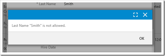
Alert message box is displayed to the user.

Press OK to close the message box. The Last Name field has been cleared and is currently focused.
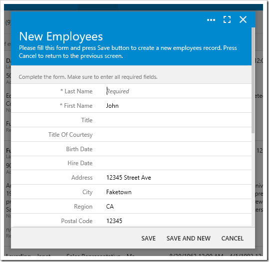
The last name field is cleared and focused.

There are other ways of displaying a message to the user without interrupting the workflow. Let’s try the following:

if ($row.LastName == 'Smith') {
    this.preventDefault();
    $row.LastName = null;
    // focus and show message next to field
    this.result.focus('LastName', 'Last Name "Smith" is not allowed.');
}

The example above will clear the field, and use the result.focus() method to focus on the field, and display a message next to the input. The result can be seen below.

Focus message displayed next to the LastName field.

Another technique is to use the notification API to display a transient message to the user at the bottom of the screen.

if ($row.LastName == 'Smith') {
    this.preventDefault();
    $row.LastName = null;
    this.result.focus('LastName');
    $app.touch.notify('Last Name "Smith" is not allowed.');
}

The result can be seen below:
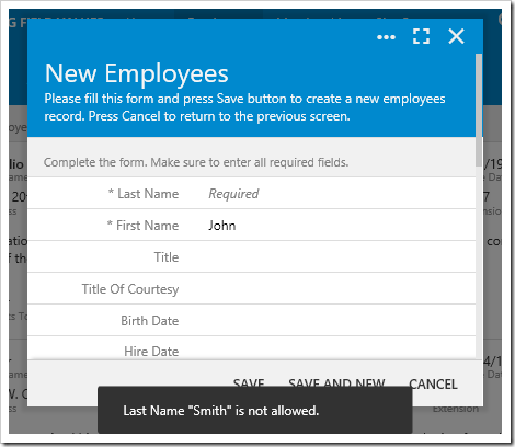
image

The notification will disappear after a default of 2 seconds.