Designer

Labels
AJAX(112) App Studio(8) Apple(1) Application Builder(245) Application Factory(207) ASP.NET(95) ASP.NET 3.5(45) ASP.NET Code Generator(72) ASP.NET Membership(28) Azure(18) Barcode(2) Barcodes(3) BLOB(18) Business Rules(1) Business Rules/Logic(140) BYOD(13) Caching(2) Calendar(5) Charts(29) Cloud(14) Cloud On Time(2) Cloud On Time for Windows 7(2) Code Generator(54) Collaboration(11) command line(1) Conflict Detection(1) Content Management System(12) COT Tools for Excel(26) CRUD(1) Custom Actions(1) Data Aquarium Framework(122) Data Sheet(9) Data Sources(22) Database Lookups(50) Deployment(22) Designer(177) Device(1) DotNetNuke(12) EASE(20) Email(6) Features(101) Firebird(1) Form Builder(14) Globalization and Localization(6) How To(1) Hypermedia(2) Inline Editing(1) Installation(5) JavaScript(20) Kiosk(1) Low Code(3) Mac(1) Many-To-Many(4) Maps(6) Master/Detail(36) Microservices(4) Mobile(63) Mode Builder(3) Model Builder(3) MySQL(10) Native Apps(5) News(18) OAuth(9) OAuth Scopes(1) OAuth2(13) Offline(20) Offline Apps(4) Offline Sync(5) Oracle(11) PKCE(2) Postgre SQL(1) PostgreSQL(2) PWA(2) QR codes(2) Rapid Application Development(5) Reading Pane(2) Release Notes(184) Reports(48) REST(29) RESTful(29) RESTful Workshop(15) RFID tags(1) SaaS(7) Security(81) SharePoint(12) SPA(6) SQL Anywhere(3) SQL Server(26) SSO(1) Stored Procedure(4) Teamwork(15) Tips and Tricks(87) Tools for Excel(2) Touch UI(93) Transactions(5) Tutorials(183) Universal Windows Platform(3) User Interface(338) Video Tutorial(37) Web 2.0(100) Web App Generator(101) Web Application Generator(607) Web Form Builder(40) Web.Config(9) Workflow(28)
Archive
Blog
Designer
Tuesday, March 10, 2015PrintSubscribe
Maximizing Charts

Several sample charts are displayed below. Note that the axis values, legend, title, and any labels are placed outside of the chart. The chart itself floats in the center of the cell in the view.

Several example charts from Orders which have all elements outside the graph area with the chart floating in the center of the cell.

It is possible to expand each chart so that they fill the entire available area. All elements of the chart will be place inside the axes in order to full utilize all available screen size. The legend will be placed at the top of the graph, axis labels are placed inside the axes, and the title is also located inside the graph area.

In order to specify a chart to use this expanded mode, add the keyword “maximize” for every pivot defined in the view.

Data Field Tag
CustomerID pivot3-col1-top5-sortdescbyvalue pivot3-maximize
EmployeeID pivot2-row1-bar pivot2-maximize
OrderDate pivot1-row1-date-line pivot3-row1-date-all-columnstacked pivot4-row1-date pivot1-maximize
ShipVia pivot4-col1-areastacked pivot4-maximize

The charts will now maximize the available space.

The new charts have maximized the available space, and all elements are placed inside the chart.

Tuesday, March 10, 2015PrintSubscribe
Specifying Default Size On Charts

Charts presentation style will display as many reasonably-sized charts as possible on each device size. By default, each chart is of size “small”, which means that the chart will use 1/3 of the available space in each dimension on large screens.

The default charts for Orders page will attempt to show three charts in each dimension on large screens.

On medium-sized devices, the charts will use 1/2 of the available space.

Small charts on medium-size devices will show two in each dimension.

The smallest devices will display only one chart at a time.

Small devices only show one chart at at time.

The user is able to change the size of the charts using the context menu in the top right corner of each chart. “Large” is only available on large devices, and “Medium” is only available on moderately sized devices and tablets.

The user is able to change the size of the charts using the context menu in the top right corner of each chart.

The developer is also capable of specifying the default size for each chart by adding the keywords “medium” or “large”. Suppose that the Orders controller has manually specified charts matching those that have been automatically created. The highlighted tags below will specify the default sizes for those charts.

Data Field Tag
CustomerID pivot1-col1-sortdescbyvalue-columnstacked-top5 pivot1-medium pivot4-row1-top10-other-sortdescbyvalue-pie3d pivot4-large
EmployeeID pivot2-col1-sortdescbyvalue-area-top7 pivot5-row1-top10-other-sortdescbyvalue-column
OrderDate pivot1-row1-date-all pivot6-row1-line-date-all
RequiredDate pivot2-row1-date-all pivot7-row1-column-date-all
ShippedDate pivot3-row1-date-all pivot8-row1-area-date-all
ShipVia pivot3-col1-sortdescbyvalue-column-top5 pivot9-row1-top10-other-sortdescbyvalue-donut

Upon regenerating the app and refreshing the page, notice that the default sizes have been applied. The first chart is of “medium” size and now takes 2/3s of the screen on large devices.

The first chart has size of "medium" and takes 2/3s of the screen.

The “large” fourth chart takes the whole screen.

The fourth chart is "large" and takes the full screen

Tuesday, March 10, 2015PrintSubscribe
Specifying Titles and Axis Labels on Charts

Every chart that has been automatically or manually defined will display a title. This title will be composed using the row, column, and value fields and their properties that have been specified for the chart. For example, suppose we create a curved line chart on Orders page of the Northwind sample app that uses OrderDate for rows, EmployeeID for columns, and the sum of Freight for values.

Data Field Tag
EmployeeID pivot1-col1-top3
OrderDate pivot1-row1-line-curve-date
Freight pivot1-val1-sum

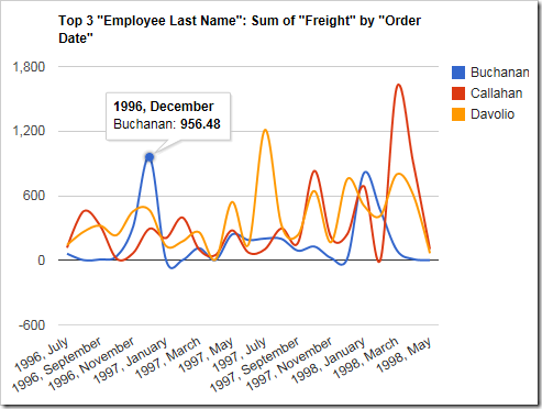
A line chart showing sum of freight by employee over Order Date that shows the default title.

The data for the chart can be seen below.

The data for a line chart showing sum of freight by employee over Order Date that shows the default title.

The title states that the chart shows top three “Employee Last Name”. The value is the sum of “Freight” and the rows are grouped by “Order Date”. While the title may reveal all the necessary information, the title can be better. Let’s manually specify the title by adding the following tag. Note that the tags do not need to be on any particular data field, as long as the correct pivot ID is specified. Open the Project Designer. In the Project Explorer, switch to the Controllers tab and double-click on Orders / Views / grid1 / EmployeeID data field node.
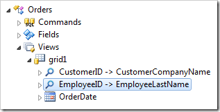
The EmployeeID data field of the Orders controller in the Project Explorer of Code On Time app generator.

Add the highlighted tag:

Data Field Tag
EmployeeID pivot1-col1-top3 pivot1-title:"Sum of Freight By Employee"
OrderDate pivot1-row1-line-curve-date
Freight pivot1-val1-sum

Save the data field and regenerate the app. When the page comes up in your browser, navigate to the Orders page. Note that the new title has been applied.
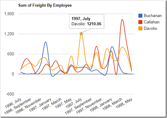
The line chart now displays the new, custom defined title.

The new title will also be displayed above the chart data.
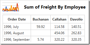
The data for the chart shows the new, custom defined title.

By default, the axes do not have a title applied. One can use the “haxistitle” or “vaxistitle” properties to manually specify a title for the horizontal or vertical axis, respectively. Let’s specify the following axis titles:

Data Field Tag
EmployeeID pivot1-col1-top3 pivot1-title:"Sum of Freight By Employee"
OrderDate pivot1-row1-line-curve-date pivot1-haxistitle:"Order Date"
Freight pivot1-val1-sum pivot1-vaxistitle:"Freight"

The new chart will display the specified labels on each axis.
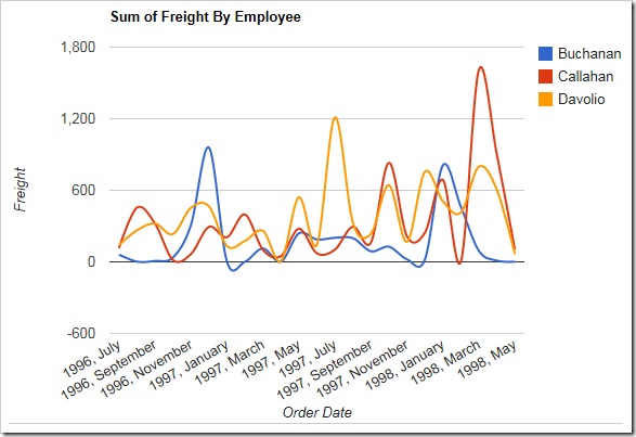
The chart also displays custom axis labels.

The chart data will not be changed.