Cloud

Labels
AJAX(112) App Studio(8) Apple(1) Application Builder(245) Application Factory(207) ASP.NET(95) ASP.NET 3.5(45) ASP.NET Code Generator(72) ASP.NET Membership(28) Azure(18) Barcode(2) Barcodes(3) BLOB(18) Business Rules(1) Business Rules/Logic(140) BYOD(13) Caching(2) Calendar(5) Charts(29) Cloud(14) Cloud On Time(2) Cloud On Time for Windows 7(2) Code Generator(54) Collaboration(11) command line(1) Conflict Detection(1) Content Management System(12) COT Tools for Excel(26) CRUD(1) Custom Actions(1) Data Aquarium Framework(122) Data Sheet(9) Data Sources(22) Database Lookups(50) Deployment(22) Designer(177) Device(1) DotNetNuke(12) EASE(20) Email(6) Features(101) Firebird(1) Form Builder(14) Globalization and Localization(6) How To(1) Hypermedia(2) Inline Editing(1) Installation(5) JavaScript(20) Kiosk(1) Low Code(3) Mac(1) Many-To-Many(4) Maps(6) Master/Detail(36) Microservices(4) Mobile(63) Mode Builder(3) Model Builder(3) MySQL(10) Native Apps(5) News(18) OAuth(9) OAuth Scopes(1) OAuth2(13) Offline(20) Offline Apps(4) Offline Sync(5) Oracle(11) PKCE(2) Postgre SQL(1) PostgreSQL(2) PWA(2) QR codes(2) Rapid Application Development(5) Reading Pane(2) Release Notes(184) Reports(48) REST(29) RESTful(29) RESTful Workshop(15) RFID tags(1) SaaS(7) Security(81) SharePoint(12) SPA(6) SQL Anywhere(3) SQL Server(26) SSO(1) Stored Procedure(4) Teamwork(15) Tips and Tricks(87) Tools for Excel(2) Touch UI(93) Transactions(5) Tutorials(183) Universal Windows Platform(3) User Interface(338) Video Tutorial(37) Web 2.0(100) Web App Generator(101) Web Application Generator(607) Web Form Builder(40) Web.Config(9) Workflow(28)
Archive
Blog
Cloud
Friday, September 8, 2017PrintSubscribe
Announcing Cloud On Time Connector for DotNetNuke

Starting with release 8.6.6.0, apps created with any edition of Code On Time generator can be integrated with external DotNetNuke websites with the help of Cloud On Time Connector for DotNetNuke.

Cloud On Time Connector for DotNetNuke is a ready-to-deploy module that provides OAuth 2.0 endpoints for any number of external apps created with Code On Time. It also enables application data presentation/links within the portal pages. Utilize the power of Code On Time to rapidly build database applications integrated with DotNetNuke.

Users will also have the ability to “Login with DotNetNuke”, and use their existing DotNetNuke accounts in the Code On Time app.

The instructions below will use the Northwind sample and a fresh instance of DNN 9.0.2 hosted on Microsoft Azure.

Make sure to enable Content Management System for the database of your app. 

Installing Cloud On Time Connector for DotNetNuke module

The next step is to install the Cloud On Time Connector for DotNetNuke module into your DNN portal instance. Download the latest release of the module from the Releases page.

Using your preferred browser, navigate to your DNN portal and sign in with a SuperUser account.
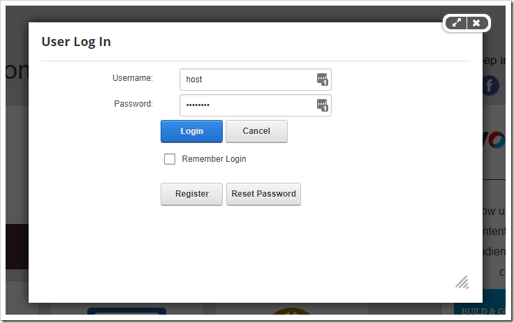
Logging into DotNetNuke with a SuperUser  account.

In the sidebar, hover over the gear icon and press “Extensions”.
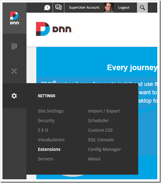
Opening extensions panel.

At the top of the Extensions panel, press “Install Extension”.

Installing a new extension.

Upload the zip file containing the Cloud On Time Connector for DotNetNuke module.
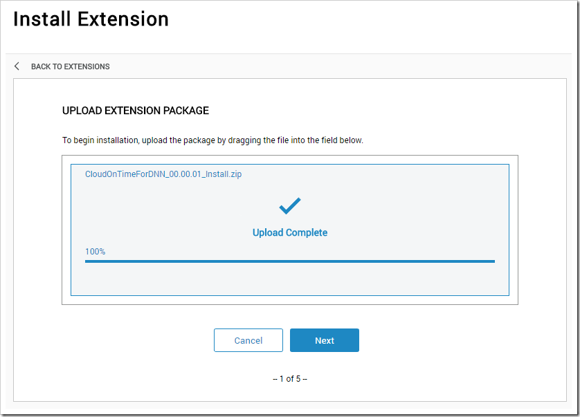
Uploading the extension.

Press “Next” to confirm the package information, and press “Next” again to confirm reviewing the release notes. Accept the license, and press “Next” one more time to begin installation.
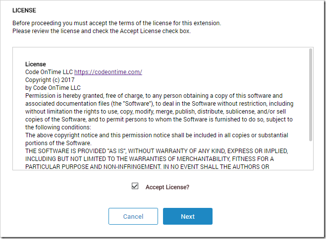
Accepting the extension license.

Once installation is complete, the installation report will be displayed.
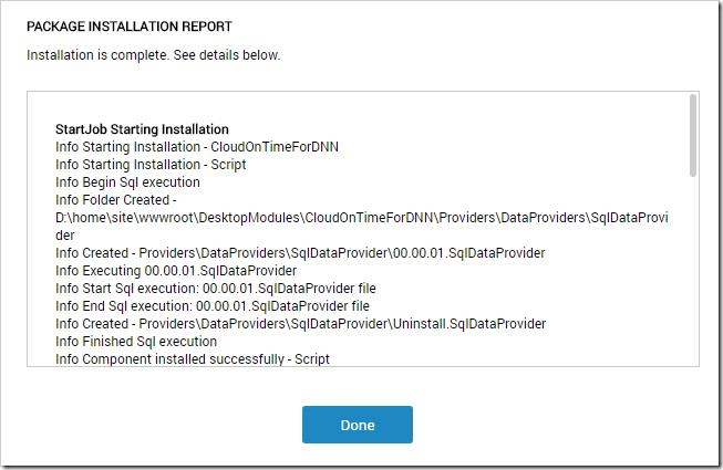
The package installed successfully.

The module is now installed in your DotNetNuke instance.  Note that the website will restart, which may cause some delay immediately after installation.

Configuring Authentication Endpoint

Cloud On Time Connector for DotNetNuke can integrate any number of external applications into your DotNetNuke portal. An endpoint page with an instance of the module will need to be created in the portal for each integrated application. The developer must configure the Code On Time app and the module instance on the portal page with matching parameters to enable communications over OAuth 2.0 protocol.

First, let’s create a publicly-accessible endpoint page.  Under the “Content” icon in the sidebar, select the “Pages” option.

Opening the Pages panel.

In the top right corner of the Pages panel, press “Add Page”.

Adding a new page.

Specify the following properties:

Property Value
Name end-point-app1
URL /end-point-app1
Display In Menu Off

The name and URL provided above are for demonstration purposes only. You can choose any name and URL that you like.

Under the Permissions tab, check the box to allow all users to view tab. This will enable both anonymous and authenticated users to access the page.
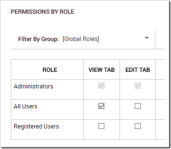
Allowing all users to view the tab.

Press “Add Page”. On the next screen, drag the page to the end of the page list.
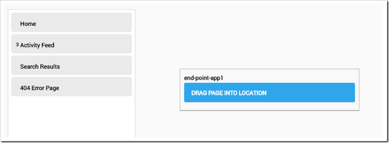
Positiong the page in the menu.

The browser will then redirect to the page in edit mode. In the bottom-left corner, press the “Add Module” button.

Adding a module to the page.

From the Add Module screen, click on “Cloud On Time Connector”.
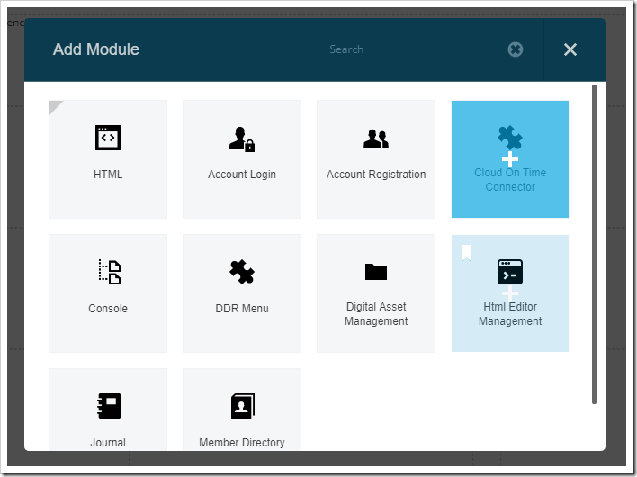
Adding the "Cloud On Time Connector" module.

Drag the floating module and drop on the first dashed placeholder in the end-point-app1 page.

Dropping the module into the first placeholder.

Mouse over the top right corner of the module instance on the page to reveal the control bar.  Mouse over the gear icon, and press “Settings” in the hover menu.

Opening the settings for the module.

Switch to the “Configuration” tab. Use the following settings:

Property Value Explanation
Mode Authentication Endpoint This module instance will serve to authenticate users and offer an endpoint for the Code On Time app.
Client ID app1 The unique identifier for your Code On Time app.
App URL [Your app URL] The location that your application is accessible from.
example: https://cotapp1.azurewebsites.net
Client Secret [randomly generated] A secret value used for server-to-server communications.
example: 4eba319ad0fe41c9b1f02ae69b7466f2
Allowed Tokens Portal:PortalName User:DisplayName A comma- or space-separated list of DNN tokens that will be passed to the app created with Code On Time at the time of user login. Optional.

When configuration is complete, press “Update” to save your changes. Now the module instance on the page end-point-app1 has been configured to accept authentication connections.

We will need to configure the app created with Code On Time to request authentication connections to the DotNetNuke portal.

Navigate to your app, login as admin, and switch to the Site Content page. Press the Plus icon to create a new record.
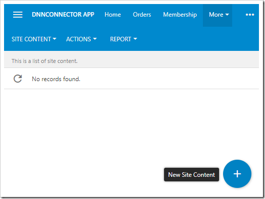
Adding a new Site Content record.

Select “Open Authentication Registration”, and press OK.
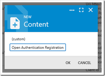
Creating a new Open Authentication Registration.

Configure the following:

Property Value
Authentication DotNetNuke
Client Id app1
Client Secret [randomly generated secret from the module settings]
Client Uri [Your DNN portal URL]/end-point-app1
Redirect Uri [Public URL of your app]/appservices/saas/dnn
Tokens Portal:PortalName User:DisplayName

Your configuration should look like the one below:
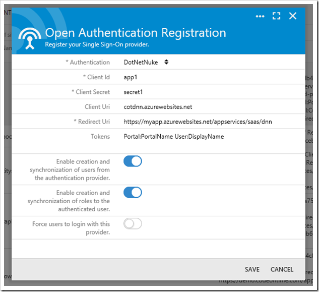
Open Authentication registration form has been filled out.

Press the checkmark icon to save the new record. Your app is now configured for authentication connections with DotNetNuke portal.

To test the connection, log out of your app.
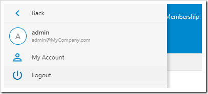
Logging out of the app.

Once logged out, your app will show the login form. Notice that a new action “LOGIN WITH DOTNETNUKE” is now available.
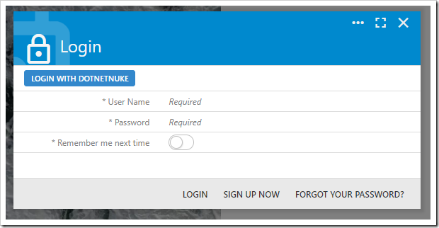
Login with DotNetNuke is now visible on the login form.

Push the new action, and you will be navigated to your DotNetNuke portal. If you are not signed into your portal, the login page will be displayed.
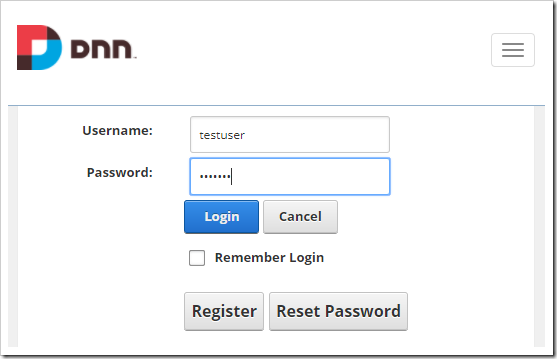
Redirected to the DNN login page.

After user has logged in, the login page will redirect to the authentication endpoint. If there are no issues with the configuration, the portal and app will communicate over OAuth2.0 protocol. A user account will be created in the app membership database with the DotNetNuke username, email, roles, picture, and random password. If tokens were requested in the configuration of the app, then the values will be captured by the application.
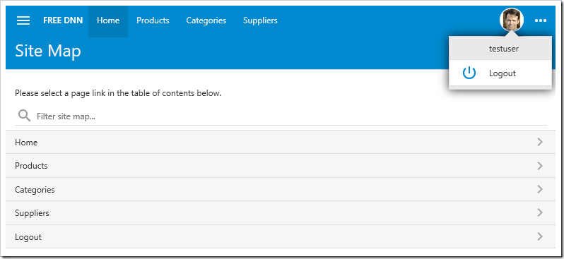
The DotNetNuke user has been signed in.

If the Account Manager is enabled in the application, subsequent logins will not authenticate with DotNetNuke portal again until the user logs out. You can add “Auto Login: true” parameter to the sys/saas/dnn entry in the SiteContent table to automatically redirect unauthenticated users to DotNetNuke.

If you have developed multiple applications, then create additional authentication endpoint pages following the instructions above for each app. Note that your apps can be deployed anywhere and do not need to physically reside on the same server as the DotNetNuke portal.

Data Presentation in DNN Portal

The Cloud On Time Connector for DotNetNuke module also allows displaying data from your application directly in the portal pages.

Navigate to your DotNetNuke portal with the configured application endpoint as a SuperUser account.

Hover over the Content icon on the sidebar, and press “Pages”.
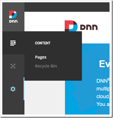
Opening the Pages panel.

In the top right corner of the Pages panel, press “Add Page”.
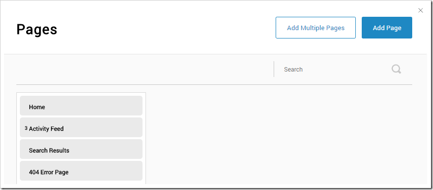
Adding a new page to the DNN portal.

Specify the following properties:

Property Value
Name Products
URL /products

Switch to the Permissions tab, and check the box to allow registered users to view tab.
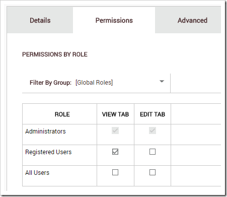
Allowing registered users to access the tab.

Press “Add Page”. On the next screen, drag to place the new page after the Home page.
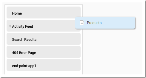
Positioning the Products page.

You will be navigated to the new Products page. In the bottom left corner, press “Add Module”.
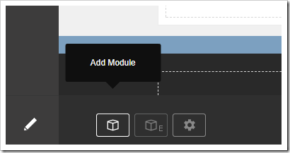
Adding a module to the page.

Select the “Cloud On Time Connector” module from the list.

Adding the Cloud On Time Connector module.

Drag the floating module and drop on the first dashed area in the page.
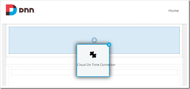
Dropping the module onto the page.

Hover over the gear icon above the module, and press “Settings”.
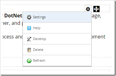
Opening the settings for the module.

Switch to the Configuration tab. If the authentication endpoint has already been configured, then the Mode property of this module instance will be set to “Data Presentation”. Enter the following:

Property Value
Mode Data Presentation
App App1 ([your URL])
Page URL ~/pages/products
Height 600px
Show Navigation false

Press “Update” to save your changes. Proceed to refresh the page. The module will now display a grid of products.
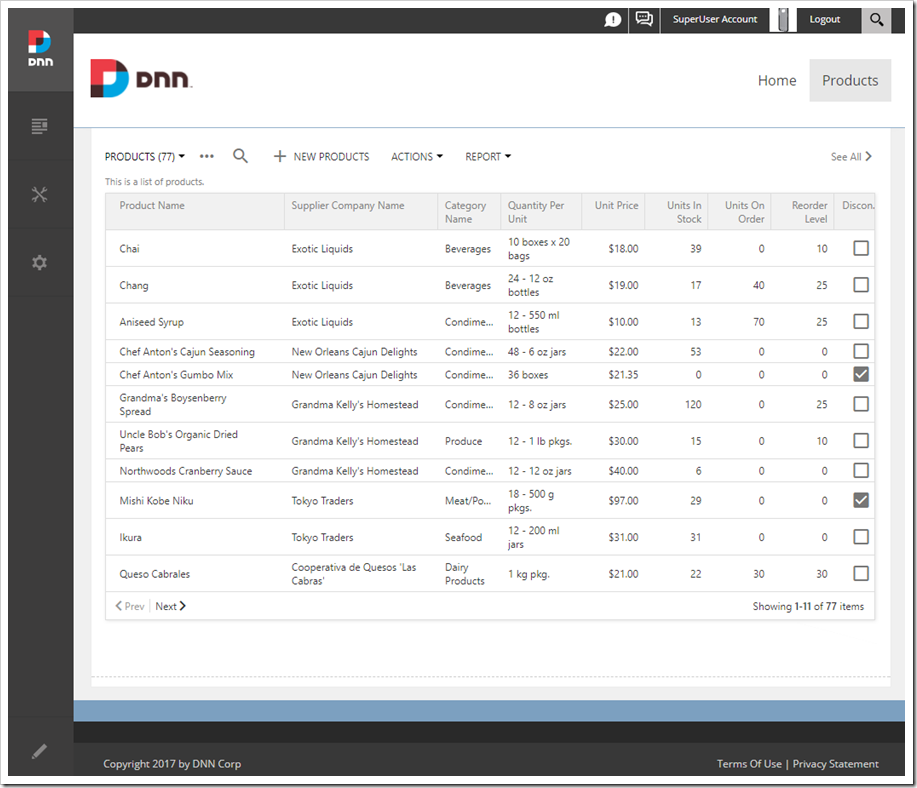
A grid of products is now displayed within the DotNetNuke portal

Accessing User Tokens

If tokens were configured for both sys/saas/dnn entry and the authentication endpoint of DotNetNuke portal, then the values can be used in the implementation of business rules in the application. For example, token “User:DisplayName” can be accessed by the following sample code:

SQL:

set @Result_ShowAlert = 'Hello ' + @Profile_User_DisplayName

C#:

Result.ShowAlert("Hello " + Convert.ToString(GetProperty("Profile_User_DisplayName")));

Visual Basic:

Result.ShowAlert("Hello " & Convert.ToString(GetProperty("Profile_User_DisplayName")))
Sunday, July 2, 2017PrintSubscribe
Advanced Search 3.0, Integrated Deployment, Enhanced Baskets & Lookups

Release 8.6.3.0 is here! While the revision number is minor, some major features are contained in this release.
 
First on the headline is brand new Advanced Search 3.0 for Touch UI. Major upgrades were required for the Form Rendering Engine to support dynamically created forms. Survey capabilities have been greatly expanded in order to support the functionality required for Advanced Search. 
 
One important aspect of every app is dealing with deployment. The new Publish capabilities introduced in 8.6.3.0 make it easy to get your apps running on the cloud or a dedicated server. Read on below for more information.
 
A large number of other enhancements and fixes are also included in this release.

Advanced Search 3.0

The original implementation of Advanced Search for Touch UI was a custom solution. The introduction of modal pages in release 8.6.0.0 necessitated a rewrite of the functionality. The new implementation in release 8.6.3.0 brings integration with the latest features available in Touch UI - lookups, basket lookups, date inputs, modal forms, surveys, and custom form templates.
 
The new default layout for Advanced Search will read a story to the user. Use Tab, Enter, or arrow keys to quickly navigate through field values. Push Enter key to perform the Search.
 
Advanced Search 3.0 now correctly handles typed inputs. A date picker will be displayed for date fields. Lookups are used for every field to allow the user to select existing values.
 
image
 
For fields in a “Match All” group, the lookups will be cross-dependent on each other and apply filters to available values based on the current selection. This greatly helps the user explore and understand the dataset without having to perform searches.

Integrated Publishing/Deployment

A major step of every app is to deploy it to the web. Release 8.6.3.0 makes it easy to bring the app to your users with the push of a button.
 
The “Publish” action in previous releases would simply compile the app and open the target folder. In the new release, the action will now display the list of options below.
  image

The “File System” option allows publishing directly a folder in the file system.
 
image
 
The “FTP” option allows publishing the app directly to an FTP-enabled server.
 
image

Publishing to Microsoft Azure is covered in great details in the brand new tutorials at  

https://www.youtube.com/playlist?list=PLy2g3SjvDe2YbSdvoXilUh9BvkllO50jh

Integrated publishing to the cloud if the foundation of the mobile application deployment in the upcoming release 8.7.0.0.  Only Code On Time will allow creating a server-side application that becomes automatically mobile and capable of working entirely offline in the release 8.8.0.0. Consult our roadmap for more details at http://codeontime.com/roadmap.

Each Publish option offers the ability to specify overrides for app settings that will be applied when Publish is complete. Here are some of the options:

  • Primary and membership connection strings
  • Enabling remote debug messages
  • Blob adapter configurations

Support for Microsoft Visual Studio 2017

The app generator now fully supports Visual Studio 2017.

Rich Text Format

Support for rich text has been now introduced in the grid, list, and cards presentation styles. Forms display a keyboard freindly rich text editor. We will be making a few enhancements in the follow-up releases (toolbar, formattings options, etc.) in the coming weeks.

Identity Server OAuth Provider

You can now use Identity Server 4 for the purpose of user authentication based on Microsoft Identity technology.

Microsoft Graph OAuth Provider (Windows Live, Outlook, Office, SharePoint, Azure AD)

This releases also introduces new options that allow authentication of users via Microsoft Azure Active Directory. We are preparing video tutorials that will explain how that works.

Additional Enhancements

  • Baskets are now displaying the selected items inline with the text input for a more compact presentation. Selected options are eliminated from the list of options available for selection.
  • Powerful client-side caching in database lookups brings performance of applications to a new level.
  • Changing models will no longer rebuild data model from the database - much faster for users using remote database servers.
  • Project backups are now zipped, reducing Backup folder size by ~90%.
  • Published projects are now backed up and zipped.
  • New ServiceRequestHandler class allows extending “_invoke” API with new custom handlers.
    Web.config modification instructions now support “SetAttribute” command. See example below:
        SetAttribute: /configuration/system.web/pages
        validateRequest:false
  • Azure Blob Adapter updated to use API version 2015-12-11.
  • Sitemaps defined in CMS now support “CSS Class” property.
  • It is now possible to control default modal behavior using touch-settings.json file using “ui.modal.max” and “ui.modal.when” properties.. See example below:
    {
      "ui": {
        "modal": {
          "max": "lg",
          "when": "sm"
        }
      }
    }
  • Added ability to set thumbnail size in touch-settings.json using the “ui.thumbnail.width” and “ui.thumbnail.height” properties.
  • New icons in the app generator.
  • Warning shown under connection string when it differs from the membership connection string.
  • Only one connection string is created in web.config if primary and membership connection string are equal.
  • Updated translations for Portuguese - thank you Nielsen Batista!
  • Updated translations for German - thank you Peter Teutsch!
  • Added tag “lookup-collapsible” to automatically collapse ListBox and RadioButtonList controls when the user makes a selection. A  chevron is displayed to expand the lookup again.
  • Custom button support in surveys.
  • ExportBase.ToClientUrl() is now overridable to allow customization of IQY files.
  • Calendar Input will focus next field after the date is selected on DateTime fields on desktop devices.
  • Basket lookups will hide values that have already been selected.
  • Lookup controls will expand faster to ensure text does not scroll as the user types.
  • Enhanced support for conversion of strings to date values. For example, type in “011215” to get Jan 12, 2015.
  • Close button added to Calendar Input when mouse is primary pointer.
  • Blob Adapter values are stored in the web.config as app settings.
  • Many-to-many field processing is moved before “After” business rules, and after “Before” business rules, to ensure rules use the correct values.
  • Tag “open-on-tap” will open a lookup dropdown instead of focusing on text input.
  • Tag “lookup-distinct” allows reducing the available lookup options to distinct values.
  • Custom JavaScript files will now be read and appended to the framework when placed under ~/js folder. ApplicationServices.ConfigureScripts() allows controlling which scripts are included.
  • Custom Cascading Stylesheet files (CSS) will be read and appended to the library when placed under ~/css folder.
  • Surveys are now loaded from ~/js/surveys folder. When using survey called “mysurvey”, API will pick up files in this order:
  • Survey definition: mysurvey.min.js, mysurvey.js
  • Survey rules: mysurvey.rules.min.js, mysurvey.rules.js
  • Survey template: mysurvey.html
     

Miscellaneous Fixes:

  • Fixed dedicated login redirect issue with projects using ASPX page implementation.
  • Fixed issue “Error 500: Dangerous request in form” when a form is submitted with HTML formatted values.
  • Fixed issue with Membership Manager not updating LoweredRoleName column.
  • Fixes with page sizing after device rotation.
  • Custom Membership supports optional PasswordQuestion/Answer.
  • Charts are now supported with custom controllers.
  • Blob Adapters with Source Field value containing spaces is now supported.
  • MyProfileBusinessRules properly inherits from SharedBusinessRules when the feature is enabled.
  • Fixed “Unable to get property ‘1’ of undefined” error in Project Designer.
  • Disabled discard changes prompt in MyProfile controller.
  • Fixed issue with Model class objects using Turkish “i” in field names.
  • Export action ignores DataView fields.
  • Tag “action-call-disabled” now works.
Tuesday, September 1, 2015PrintSubscribe
“Calendar” View For You

Applications created with Code On Time use a well defined entity model that prescribes presentation of data as grid and form views and determines transition of views via actions. Data may come from any source. For example, a developer can defined an SQL query or stored procedure to read data from the database. An entity can also be programmed to read/write data from a web service, file system, or any other source. Application framework interprets the entity and displays data in various view styles. For example, a typical grid view can be rendered as responsive grid, list, collection of data cards, map, and charts. Request an interactive Webex presentation to learn more.

“Calendar” is a brand new view style that will become available with update 8.5.5.0 on September 2, 2015 . A presence of a “date” field will tell application framework that there is possibility of rendering data as a calendar. New view style offers Day, Week, Month, Year, and Agenda modes. Any field in the view can serve as a “color” field. The framework will assign a color to each data value.  End users can drag and drop events to change values of date fields. Standard form view of an entity is display when an event is selected enabling seamless editing of data.

“Day” view in the screen shot shows 4 data records rendered as events.

'Day' mode in calendar view of an app created with Code On Time.

Mini calendar on the side bar uses bold font to indicate dates of the month with events. Mini calendar alternates presentation of data between day and week mode when a particular date is clicked. Color legend shows associated data values, which represents the name of the employee assigned to the “order” event. An “event” is a record from Orders table of the Northwind sample.

“Week” view offers seven days of events. Future updates are expected to support 3 and 4 day weeks. Both “Day” and “Week” view are infinitely horizontally scrollable.

'Week' mode in calendar view of an app created with Code On Time.

“Month” view offers infinitely scrollable events organized in months.

'Month' mode in calendar view of an app created with Code On Time.

Click on any item in the color map on the sidebar and the application will “dim” events associated with other employees in “Day”, “Week”, “Month”, and “Agenda” views.

'Dimming' of events is possible by tapping on the color legend in 'Day', 'Week', 'Month', and 'Agenda' modes of calendar view style in apps created with Code On Time.

“Year” view offers analytical presentation of an entire year and also enables quick data-driven navigation to a month or a specific day.

'Year' view in Calendar view style of an app created with Code On Time.

“Agenda” view provides a convenient condensed summary list of events with a dynamic timeline.

'Agenda' view in Calendar view style of an app created with Code On Time.

All modes of the calendar view style are responsive. Smartphone users will see presentation scaled to fit the form factor of their device. For example, these two screen shots demonstrate “Day” and “Agenda” view on a typical smart phone.

'Day' view in Calendar view style of an app created with Code On Time displayed on a screen with small form factor.   'Agenda' view in Calendar view style of an app created with Code On Time displayed on a screen with small form factor.

These amazing capabilities require no programming or coding. Developers can opt to disable the calendar when not desired. Otherwise application will simply offer the end user yet another way to see their data.

Calendar view now joins a first class collection of presentations styles that were made available in the previous releases and greatly enhanced with this new iteration. View selector and sidebar provide access to every view style available for a particular dataset.

Selecting a view style for data presentation in an app created with Code On Time.

For example, charts view displays automatically constructed charts without developer writing any code.  Any number of custom charts can be defined when needed at design time.

'Charts' view style in an app created with Code On Time.

“Cards” view presents data items as multi-line cards with the same size. Application framework breaks each three fields in paragraphs offering another way to see data. Cards presented in 3, 2, or 1 column based on the screen size. The screenshot shows two columns of automatically configured cards.

'Cards' view style in an app created with Code On Time.

“List” view is the most universal presentation style that will work with fields of any length and any screen size. Field values float from left to right and continue on the next line.

'List' view style in an app created with Code On Time.

“Grid” view style enhances responsive presentation by introducing automatic data balancing. The new release reduces the number of visible columns by applying 2, 5, 8, 10, and 12 column breakpoints based on screen size when data is rendered. This makes it possible to display a grid of rows with “important” fields without being forced to scroll horizontally. For example, this screenshot shows five columns of data rows in Orders table.

Responsive 'Grid' view style in an app created with Code On Time.

Developers can indicate the minimal screen size that a particular column must be displayed on. For example, tag “grid-tn” will force a column to show up even on “tiny” screen. Small screes with show every column marked as “grid-sm”. The release notes of the update will explain expected logical pixels of tiny, extra small, small, medium, large, and extra large screens.

Previous release required explicit tagging of each field. The new approach is to assume that all fields must be displayed if possible. The mere intent of a developer to place a field in a grid implies that it must visible. Developer-defined tags simply enforcing display of fields on particular screen sizes in responsive grid. The next screenshot shows 8 columns displayed when the sidebar is not visible. Automatic data balancing ensures that “shorter” fields reclaim more real estate from “longer” fields with enforced minimal width to ensure quality “balanced” presentation of data in columns with fixed width.

Long press brings up a context menu with data sensitive options in an app created with Code On Time.

All view styles also support “long press” that allows displaying of context menu and selection of records on both desktop and touch-enabled devices. The screenshot above shows context-sensitive filtering and sorting options.

“Map” view style is one more method of presenting data that becomes available when latitude/longitude or Address/City fields are present in the gird view.

'Map' view style in an app created with Code On Time.

Context menus and data cards are now displayed at the bottom of the screen on devices with small form factor to enable easy touch operations. A couple of screenshots below show data card of “Map” view style and view selector on a small screen.

Data card displayed on a screen with small form factor presented by app created with Code On Time.   Context menu displayed on a screen with small form factor presented by app created with Code On Time.

The standard collection of presentation styles will be enhanced with horizontally scrollable “Datasheet” view and “Hierarchy” view styles. The implementation of remaining view style is well under way and is based on horizontal scrolling mechanism that was developed and perfected with “Calendar” view.