Application Factory

Labels
AJAX(112) App Studio(9) Apple(1) Application Builder(245) Application Factory(207) ASP.NET(95) ASP.NET 3.5(45) ASP.NET Code Generator(72) ASP.NET Membership(28) Azure(18) Barcode(2) Barcodes(3) BLOB(18) Business Rules(1) Business Rules/Logic(140) BYOD(13) Caching(2) Calendar(5) Charts(29) Cloud(14) Cloud On Time(2) Cloud On Time for Windows 7(2) Code Generator(54) Collaboration(11) command line(1) Conflict Detection(1) Content Management System(12) COT Tools for Excel(26) CRUD(1) Custom Actions(1) Data Aquarium Framework(122) Data Sheet(9) Data Sources(22) Database Lookups(50) Deployment(22) Designer(178) Device(1) DotNetNuke(12) EASE(20) Email(6) Features(101) Firebird(1) Form Builder(14) Globalization and Localization(6) How To(1) Hypermedia(2) Inline Editing(1) Installation(5) JavaScript(20) Kiosk(1) Low Code(3) Mac(1) Many-To-Many(4) Maps(6) Master/Detail(36) Microservices(4) Mobile(63) Mode Builder(3) Model Builder(3) MySQL(10) Native Apps(5) News(18) OAuth(9) OAuth Scopes(1) OAuth2(13) Offline(20) Offline Apps(4) Offline Sync(5) Oracle(11) PKCE(2) Postgre SQL(1) PostgreSQL(2) PWA(2) QR codes(2) Rapid Application Development(5) Reading Pane(2) Release Notes(184) Reports(48) REST(29) RESTful(29) RESTful Workshop(15) RFID tags(1) SaaS(7) Security(81) SharePoint(12) SPA(6) SQL Anywhere(3) SQL Server(26) SSO(1) Stored Procedure(4) Teamwork(15) Tips and Tricks(87) Tools for Excel(3) Touch UI(93) Transactions(5) Tutorials(183) Universal Windows Platform(3) User Interface(338) Video Tutorial(37) Web 2.0(100) Web App Generator(101) Web Application Generator(607) Web Form Builder(40) Web.Config(9) Workflow(28)
Archive
Blog
Application Factory
Sunday, July 13, 2014PrintSubscribe
Changing the Transition in Touch UI

By default, Touch UI will use “Slide” transition when moving between pages. This transition will slide the new page from the right while the old page will slide out to the left. An example can be seen below.

Slide transition on an iPhone using Code On Time's Touch UI.

The default transition can be changed by the user through the Settings panel.

In the top-right corner of the page, click on the context menu button.

Clicking on the context menu button.

Then, click on the Settings button.

Clicking on the settings button in context panel.

Click on the Transitions butt0n to see a list of available transitions.

Changing the default Transition of the Code On Time web app.

Select a new transition.

Selecting the "Turn" transition.

Close the panel, and click on a record to see your new transition.

Turn transition on an iPhone using Code On Time's Touch UI.

Thursday, May 29, 2014PrintSubscribe
Introducing Map View Style in Touch UI

Code On Time announces a new view style that will become available in June 2014 release.

The multi-tier application framework of apps produced with our code generator implements separation of business logic and user interface presentation. This allows creating alternative data presentation styles without a need for custom programming.

The new “Map” view style is based on Google Maps. Any data set that contains at least “Address” and “City” fields is presentable on an interactive map. Map view will automatically geocode addresses or use latitude and longitude field values when available.

This new view style is supported in apps configured to use Touch UI. Exactly the same capabilities are available in responsive pages on both mobile and desktop devices.

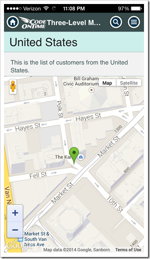
These screen shots show a map view on iPhone 5 in full-screen demo. There is no need to perform any special configuration of your app if a typical set of fields that allows locating an address is available. The map view can be selected from the context menu in view options.
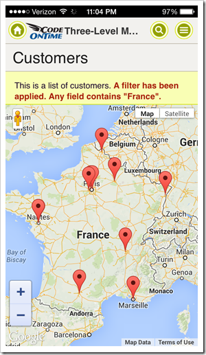
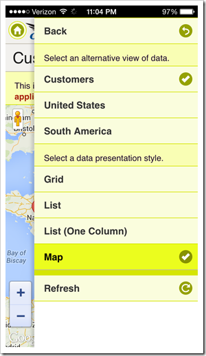
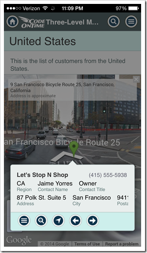
Fullscreen mobile app shows Map view style. This app has been created with Code On Time app generator.  Touch UI offers end-users options that allows switch view style of data presentation.

The map view style can be configured to be displayed by default. Data view and data fields can be individually tagged when necessary.

End user taps a marker on a map to bring up an item data card. If you have configured a responsive list presentation for your data, then there is nothing else to do. The same responsive configuration will be used when the “Map” view style is activated.

User can tap on the item card to activate the first action available in the context menu. Typically this will display the data item in “View” or “Edit” mode.

If you are performing a data lookup, then the item will be selected when the data card is tapped. This introduces an amazing ability of performing a geo-lookup by application end users.
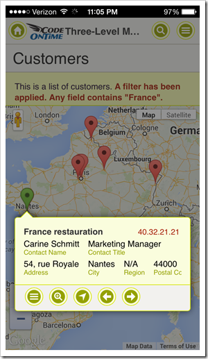
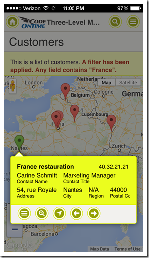
Item data card is derived from the "List" view configuration of the app created with Code On Time.  Tapping on the item data card will cause the first available context menu action to execute. Typically this will be Select or Edit. Lookup data views allow geo-lookup of data.

Item data card displays “Menu”, “Zoom In/Out”, “Driving Directions”, “Next” and “Previous” buttons.

Users can instantly pan to the marked location on the map by tapping “Zoom In”.
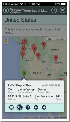
Item data card offers Menu, Zoom In/Out, Driving Directions, Next and Previous buttons in the apps created with Code On Time.  A single click will pan the map to the stree-level with the marker in the middle in the Map presentation of data.

Dragging the “street level” marker to the location will switch the map to the street view.
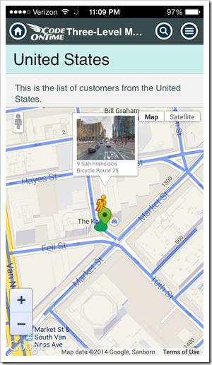
Dragging the Street View figure with touch gestures or mouse to the desired location will activate the street view.  Item data card is displayed next to the marker when map is switched to Street View.

Geo-coded addresses are cached in the client browser to speed up positioning of markers when users interact with the map.

Progressive geo-coding is preformed whenever the data set is changed. The map will automatically update markers in response.

Larger screens allow instant switching between available view style. The corresponding buttons are displayed on the sidebar.

Next screen shot shows IE 11 with customers presented on a map. Sidebar displays “Grid” and “List” presentation styles that can be chosen as alternative.
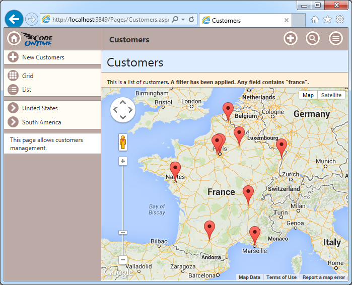
Map view style is activated in the app with Touch UI created with Code On Time app generator.

The same data set is displayed in a responsive grid in Safari. The sidebar shows “List” and “Map” view styles as available alternatives.
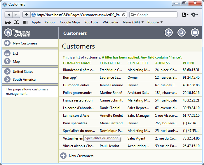
Responsive Grid view style is activated in the app with Touch UI created with Code On Time app generator.

This screen shots shows the data set presented in responsive “List’' style in Chrome. “Grid” and “Map” styles are only a click away.
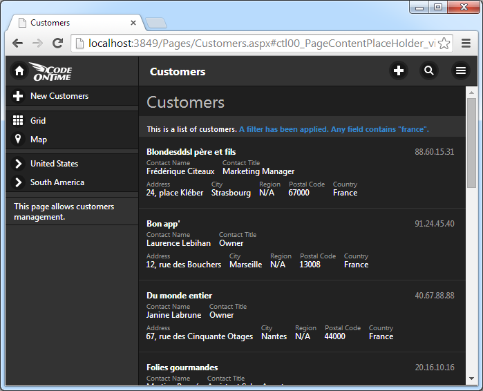
Responsive List view style is activated in the app with Touch UI created with Code On Time app generator.

We are completing implementation of three more presentation styles that will be released during Summer of 2014:

  1. “Chart” view will allow presenting a single date set as a chart. New tags will allow mapping multiple chart views for the same data set. We are considering implementing automatic tagging of lookup and aggregate fields to enable instant visualization.
  2. “Calendar” view will present any dataset with dates on a touch-enabled calendar. The data interactions will be similar to “Map” view style. Developers will tag the predefined “date” fields for use in the calendar. End users will be able to switch the “date” fields at will.
  3. “Data Sheet” view will present data in a fashion similar to the responsive grid shown above. The responsive grid automatically hides and shows columns while trying to fit without scrolling the fields defined on the item data card. The data sheet view will show all fields by enabling horizontal scrolling of data columns. Touch-enabled devices will allow editing data in a single input control displayed at the top of the screen similar to typical spreadsheet applications. Touch UI will also allow in-place editing in data cells in “desktop” browsers.

All view types will offer configuration options to the end users with the ability to memorize “named” presentation styles along with sort order and filters.

Tuesday, May 6, 2014PrintSubscribe
Full Screen Mobile Apps, Responsive Grid, etc.

Code On Time release 8.0.5.0 introduces numerous enhancements in Touch UI that brings closer our goal of delivering a new generation of a responsive user interface that works great on both mobile and desktop devices. Your line-of-business web apps will look great, now with an option to display a full screen presentation on mobile devices delivering close-to-native performance.

A web app displayed in full screen mode on iPad Air. The app has been created with Code On Time app generator.

A responsive grid view is now also available providing a responsive “table” presentation of data on any device. Application intelligently hides and reveals grid columns depending on the available screen width. Developers control the logic of field selection by configuring the list presentation of data.

A repsonsive grid in a web app with Touch UI shows a context menu of actions that can be applied to the selected row and entire data set. Application has been created with Code On Time app generator.

End users can switch between grid and list presentation by selecting a corresponding option on the sidebar on in the “view menu” item. Open the context menu of grid or list view to select “view menu” item when sidebar is not visible. It will be the first option displaying the name of the data set and number of records.

Note that future releases will also offer a data sheet view. This type of view will allow viewing all fields defined in the application with ability to scroll data horizontally and modify data in-place.

The following features and enhancements were introduces in this release:

  • Folder “Mobile” has been replace with “touch” in the source code of Web Site Factory, Mobile Factory, Azure Factory, and Web App Factory projects. We recommend deleting “Mobile” folder from the source code of existing apps.
     
  • TimeStamp fields support client-side formatting in the client library. For example, setting Data Format String of a TimeStamp field to hh:mm tt will format time as '03:17 PM'. Auto-complete options are also having a matching format.
     
  • A label of a checkbox field is displayed in a form when editing data, if a "CheckBox" field is marked as read-only or static. Previously only a value was rendered by Desktop UI.
     
  • New colorful themes are now available in Touch UI. The definitions can be found in ~/touch/app-themes.css. End users can select a theme in Settings menu of Touch UI. We are developing additional themes for the next release. 
     
  • Standard logo and icon are created for Touch UI. Follow instructions to replace the standard logo with your own images.
     
  • CSS class app-selected indicates a selected item in list and grid views of Touch UI.
     
  • Web apps can be displayed in full screen on mobile devices after being added to a home screen.
     
  • Items with lookup style “Checkbox” are rendered as “flip switch” in Touch UI.
     
  • Touch UI now supports three display density options: Comfortable, Compact, and Condensed. “Comfortable” display density is selected automatically on mobile devices. “Compact” option is selected automatically on desktop devices. “Condensed” option has been introduced for presentation similar to the current Desktop UI. End users can choose a preferred display density in Settings menu of Touch UI.
     
  • Users can activate Touch UI with “_touch=true” URL parameter. This parameter replaces “_mobile” option, which will be phased out in the future. Note that applications automatically switch to Touch UI on mobile devices. Future releases will likely allow configuring a default UI for generated applications. Legacy apps will default to Desktop UI. New apps will default to Touch UI on all types of devices. Only apps created with Unlimited edition will support simultaneously Touch and Desktop user interface.

We are developing brand new tutorials that explain configuration of Touch UI in details. Several tutorials will be published weekly. Please be patient.

The next release is expected to include simultaneous display of multiple data sets in Touch UI on a single screen. Tabbed data views will be supported to replicate functionality available in Desktop UI.

We are also planning to release all-new Advanced Search and Filter for Touch UI.  End users will be able to save their own filters for future use. Client-side data caching will be supported shortly after advanced search becomes available. Developers will specify caching conditions for improved performance. A set of filtering options will be reduced when client-side caching of data is activated.

Upload/Download will be enabled in Touch UI in the next few weeks. The feature will also be enhanced to allow signature capturing on touch-enabled devices.