Compare the design and presentation style of a supplier list in an app with Touch UI.
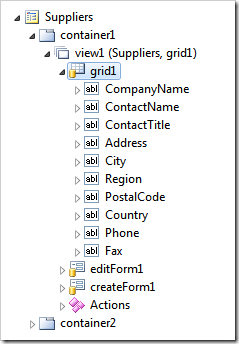
The grid view grid1 contains ten data fields.
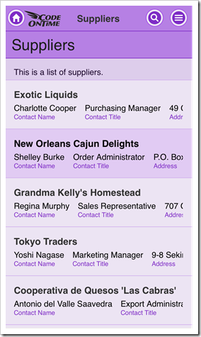
The grid view is presented in ‘List’ style on iPhone with only first three fields fully visible.
The same supplier list shows first five fields defined in grid1 when displayed on iPad Air. Field names and values of a selected supplier record are displayed in the summary on the sidebar.
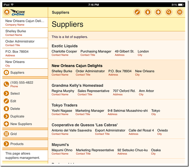
The iPhone version of the list seems to display more than it can fit, while the iPad version does not display enough fields in the empty space.
In fact, both devices display only the data fields marked to be shown in the summary. Application generator configures the first five fields of the grid view grid1 as “Show In Summary” in all data controller, when the baseline application is constructed.
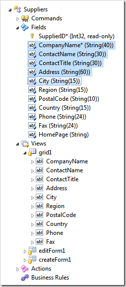
Therefore only first five fields are rendered in the views with “List” style by Touch UI.
Touch UI also offers a precise method of controlling presentation of data in lists through data field tags. The tags may include numerical suffixes to create a responsive presentation on any device. It is important to know the logical display width of list item cards when configuring such tags.
| Tag | Purpose |
| item-heading | Specifies that the field must be displayed as a heading in a list item. |
| item-aside | Makes the field displayed on the right side of a list item opposite to the heading. |
| item-count | Turns item value into a bubble displayed on the the right side of a list item. |
| item-desc | Item is displayed below the heading with the value on top and the field label below the value. |
| item-descNN | Performs the same function as “item-desc”. The numeric suffix must be divisible by five to indicate the minimal list item width expressed in logical display elements. If the current display width of the list item matches or exceeds the suffix, then the field is visible. |
| item-para | Causes the flow of data fields marked as “item-desc” to restart in the next row. Must be used along with “item-desc” tag. |
| item-labelNN | Allows controlling if the field label is displayed next to the field value. Must include a numeric suffix divisible by five to indicate the minimal list item width expressed in logical display elements. If the current display width of the list item matches or exceeds the suffix value, then the field label is visible. |
| item-thumb | Forces the field to be displayed as a thumbnail of a list item. Must be used with On Demand fields only. |
Tagging any data field in a grid view with an “item-“ tag will disable the default list construction based on “Show In Summary” property of data fields.
The following reference uses Suppliers controller from Northwind sample as an example.
item-heading
If an explicit item-heading tag is not specified, then the first visible field of a grid view will be configured as list item heading.
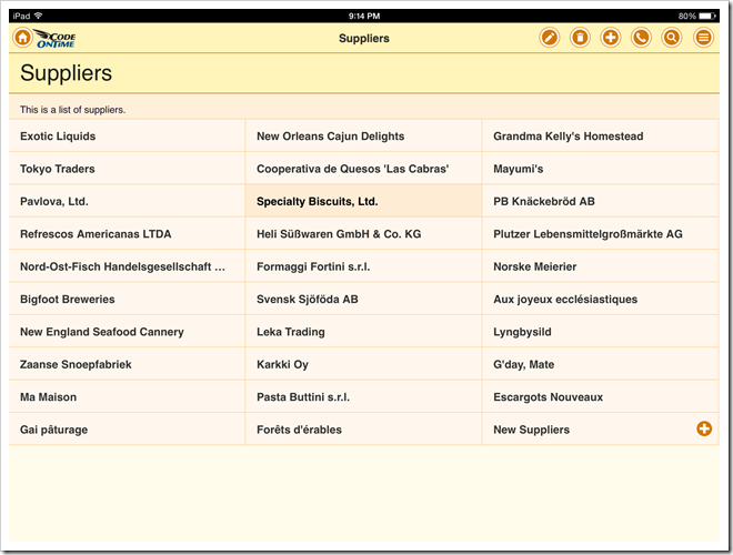
Specify item-heading tag for Suppliers / Views / grid1 / CompanyName data field on Controllers tab of Project Designer.
The item data card is now reduced to a single field value.

item-aside
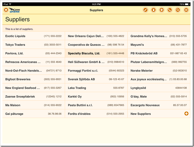
Specify item-aside tag for Suppliers / Views / grid1 / Phone data field on Controllers tab of Project Designer to display the phone number on the opposite side of the heading in a data card.

item-count
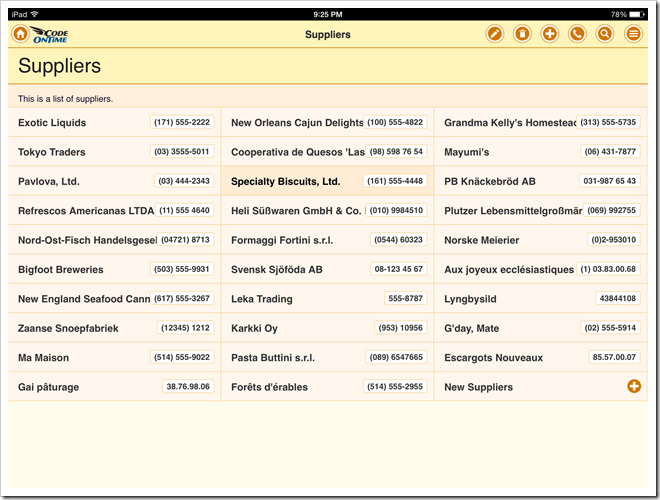
As an alternative to item-heading consider using item-count. This will display the data field in bubble on the right side of the data card.
Specify item-count tag for Suppliers / Views / grid1 / Phone data field on Controllers tab of Project Designer to display the phone number as a bubble in a data card.
Note that bubble is centered vertically in a list item.

item-desc
Specify item-desc tag for Suppliers / Views / grid1 / ContactName and Suppliers / Views / grid1 / ContactTitle data fields on Controllers tab of Project Designer to display both fields in a row under the heading of list item.
A field label is displayed under the value of the field.

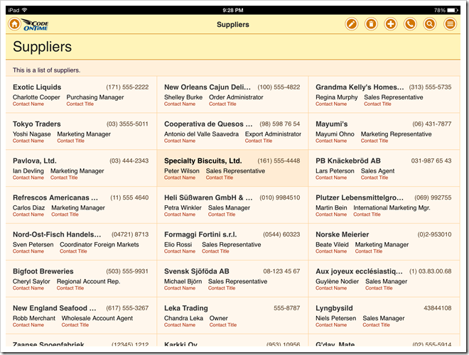
If you do not wish a label to be visible, then also specify responsive tag item-label with a large value a suffix. For example, if you enter item-desc, item-label100 as tags then both description fields will be rendered without a label on most devices. Labels will be visible only if the width of a list item is at 100 logical elements or wider. Remember that the suffix value must be divisible by five.

item-para
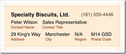
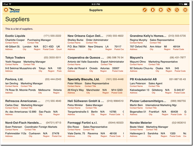
Additional descriptive fields can be started in the next row of the list item data card.
Enter a combined value item-para,item-desc as a tag of data field Suppliers / Views / grid1 / Address. Enter item-desc as tags for the data fields City, Region, PostalCode, Country and Fax of the grid view grid1.
Responsive Descriptions and Labels
Application will display all data fields configured to be a part of list item data card. If the field value does not fit, then it will be visible either partially or hidden completely. End users can change device orientation or browser window size to reveal or hide data fields in lists.
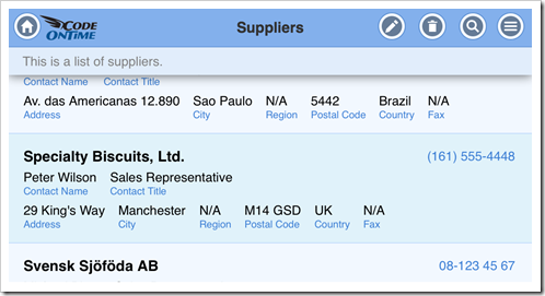
If you prefer to minimize partial display of field values and labels, then consider applying numeric tag suffixes representing the minimal item width that allows a field and/or its label to be visible. The display width is expressed in logical elements divisible by five. Press Ctrl+Shift and double click a data card to find the list item width in a desktop browser.
For example, the following screen shot of iPhone has City, Region, PostalCode, Country, and Fax data fields partially visible or not visible at all when the device has a portrait orientation.
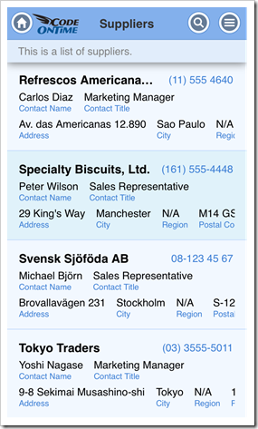
Specify item-desc30 tag for these fields to ensure their visibility only on a wider screen. This will result in a cleaner presentation in portrait orientation.
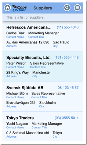
Consider using various suffixes to ensure a better presentation in desktop web browsers where width may vary significantly.
item-thumb
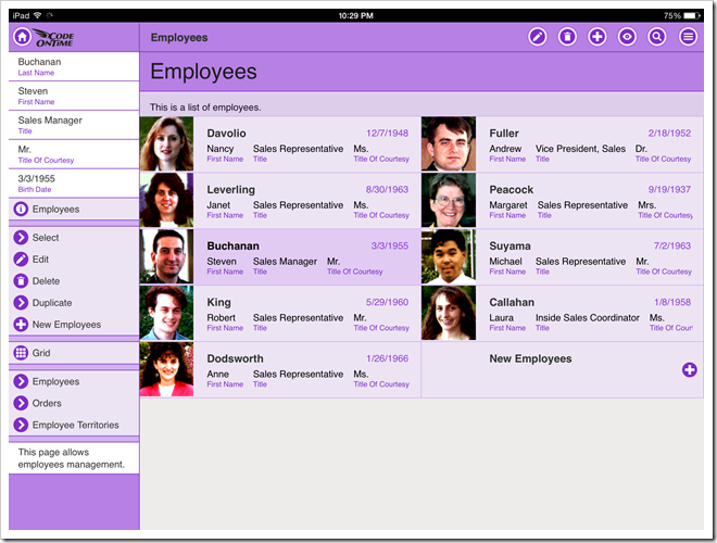
If an on-demand field is storing images, then consider configuring the field in a grid view to be displayed as a thumbnail in the list item data card. Simply enter item-thumb in Tag property to indicate the purpose of the data field in the list.
For example, the sample at http://northwind.cloudapp.net is configured to display the photo of an employee when a grid view is presented in “List” style.

Forcing List Presentation by Default
Grid views of apps with Touch UI automatically switch to “List” presentation style on mobile devices and present as “Grid” on desktop devices. The exception from this rule is a grid view with a data field tagged as item-thumb. The default presentation style of a grid view is “List” in that case.
Here is the same grid view Suppliers / Views / grid1 that was configured in the previous steps. This screen shot shows Google Chrome browser with a responsive “Grid” presentation style of data.
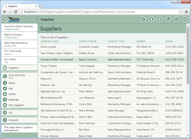
Application users can switch data presentation style from “Grid” to “List” by selecting the corresponding option on the sidebar. This selection will remain permanent until the user decides to have a different presentation style.
Developers can request the “List” presentation of a grid view on all devices by default. Specify display-style-list in the Tag property of data view Region / Suppliers / container1 / view1. This will force suppliers to be displayed as a “List” on all types of devices by default.
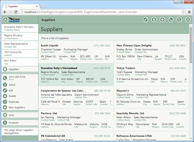
Presentation style “List” may display items in one, two, or three columns. The number of columns depends on the screen width and device orientation.
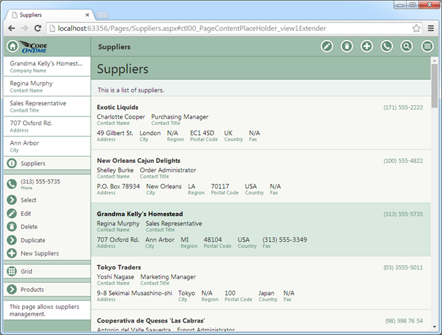
A grid view can also be configured to present as a list with one column, which may work well with a large number of fields. Specify display-style-listonecolumn in the Tag property of the data view to enable this presentation style on all devices by default.
Configuring Lists with “Tools for Excel”
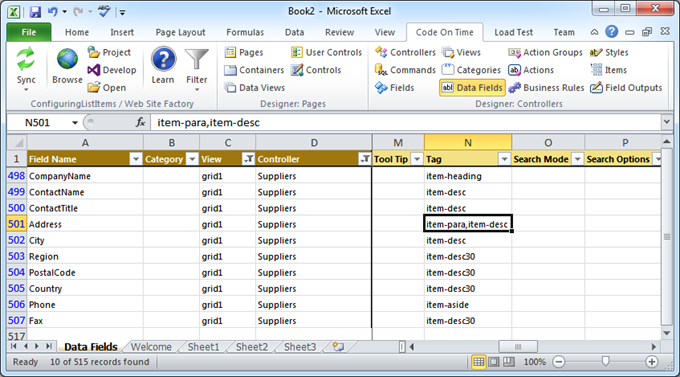
Code On Time comes with a free productivity feature called Tools for Excel. If you need to change tags on a large number of fields, than consider taking advantage of this feature as an alternative to Project Designer.
Here is the screen shot of tags that were configured for this tutorial.
