ASP.NET

Labels
AJAX(112) App Studio(8) Apple(1) Application Builder(245) Application Factory(207) ASP.NET(95) ASP.NET 3.5(45) ASP.NET Code Generator(72) ASP.NET Membership(28) Azure(18) Barcode(2) Barcodes(3) BLOB(18) Business Rules(1) Business Rules/Logic(140) BYOD(13) Caching(2) Calendar(5) Charts(29) Cloud(14) Cloud On Time(2) Cloud On Time for Windows 7(2) Code Generator(54) Collaboration(11) command line(1) Conflict Detection(1) Content Management System(12) COT Tools for Excel(26) CRUD(1) Custom Actions(1) Data Aquarium Framework(122) Data Sheet(9) Data Sources(22) Database Lookups(50) Deployment(22) Designer(177) Device(1) DotNetNuke(12) EASE(20) Email(6) Features(101) Firebird(1) Form Builder(14) Globalization and Localization(6) How To(1) Hypermedia(2) Inline Editing(1) Installation(5) JavaScript(20) Kiosk(1) Low Code(3) Mac(1) Many-To-Many(4) Maps(6) Master/Detail(36) Microservices(4) Mobile(63) Mode Builder(3) Model Builder(3) MySQL(10) Native Apps(5) News(18) OAuth(9) OAuth Scopes(1) OAuth2(13) Offline(20) Offline Apps(4) Offline Sync(5) Oracle(11) PKCE(2) Postgre SQL(1) PostgreSQL(2) PWA(2) QR codes(2) Rapid Application Development(5) Reading Pane(2) Release Notes(184) Reports(48) REST(29) RESTful(29) RESTful Workshop(15) RFID tags(1) SaaS(7) Security(81) SharePoint(12) SPA(6) SQL Anywhere(3) SQL Server(26) SSO(1) Stored Procedure(4) Teamwork(15) Tips and Tricks(87) Tools for Excel(2) Touch UI(93) Transactions(5) Tutorials(183) Universal Windows Platform(3) User Interface(338) Video Tutorial(37) Web 2.0(100) Web App Generator(101) Web Application Generator(607) Web Form Builder(40) Web.Config(9) Workflow(28)
Archive
Blog
ASP.NET
Tuesday, March 31, 2015PrintSubscribe
Reducing the Number of Rows with “Top” and “Other” in Charts

Suppose that a chart is made for the Orders page in the sample Northwind app. This chart will show the count of orders made by each customer, sorted in descending order. The tag configuration is listed below.

Data Field Tag
CustomerID pivot1-row1-column-sortbyvalue

The result of the tag can be seen in the screenshot.

An Orders chart showing the number of orders made by each customer

The data for the chart can be seen below.

The data for an Orders chart showing the number of orders made by each customer

With such a large number of rows, it becomes difficult to read the row values. In order to fix this problem, restrict the number of rows by using the “topX” keyword, with the X value being equal to the max number of rows displayed.

Data Field Tag
CustomerID pivot1-row1-column-sortbyvalue-top5

The new chart now displays the column for only 5 customers.

An orders chart showing the number of orders made by the top 5 customers.

The data reveals that only 5 rows are present.

The data for a chart showing the top 5 customers.

However, it may be desirable to group the rest of the values into a single “Other” column, in order to show the relative size of the top 5 compared to the rest of the data. This can be done with the “other” keyword in combination with “topX” keyword.

Data Field Tag
CustomerID pivot1-row1-column-sortbyvalue-top5-other

The chart showing the “Other” column is displayed below.

A chart showing the top 5 customers, with the rest of the orders grouped into "Other" column.

The data reveals the sixth row combines the values of the hidden rows.

The chart data shows that the last row grouped the values from the hidden rows.

Tuesday, March 10, 2015PrintSubscribe
Calculation of Chart Values

If a chart does not have a value field specified, the chart will take a count of records that fall into the row and column group. For example, if the EmployeeID data field in the Orders controller is specified as a row field, then the count of Orders will be used as the value.

Data Field Tag
EmployeeID pivot1-row1-bar

The chart uses the count of records in each row.

The chart data shows that the count of Orders is used as the value.

The data shows the count of records in each group.

In order to use a different value for the chart, a value field must be specified. Tag the data field that you wish to use with the correct pivot ID and assign it “val” plus the order for the data field. The example below will use Freight field as a value.

Data Field Tag
EmployeeID pivot1-row1-bar
Freight pivot1-val1

The count of Freight is used in the graph.

Notice that the values are the same! That is because the value mode of Freight is the default “count”. You must specify a value mode to manipulate the number. The example below will use the sum of Freight by using the keyword “sum”.

Data Field Tag
EmployeeID pivot1-row1-bar
Freight pivot1-val1-sum

The sum of freight is used as the value in this chart.

The correct sum can be seen in the chart and data.

The chart date shows the correct value, the sum of Freight.

The table below shows a list of the available value modes.

Keyword Description
count The default mode. Will count every record.
sum Will summate the value in every record in the row/column group.
min The smallest value in the group.
max The largest value in the group.
avg The sum divided by the count.
Tuesday, March 10, 2015PrintSubscribe
Sorting Rows and Columns in Charts

Suppose that you have a chart on the Orders page that shows the number of orders made by up to 10 customers. By default, the rows are sorted in ascending alphabetical order of the customer’s name.

Data Field Tag
CustomerID pivot1-row1-column-top10

The chart with alphabetically sorted customers is shown below.
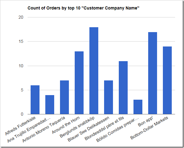
Chart shows count of orders made by customers. The first 10 customers by alphabetical order of the customer last name is shown.

The chart data shows that the first ten customers were included in the chart.
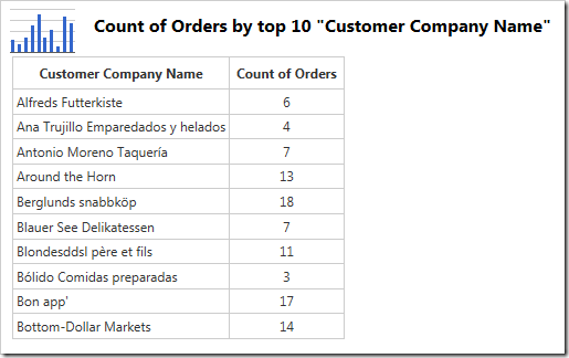
The data shows that the first 10 customer in alphabetical order were included.

The customers can also be sorted in descending alphabetical order by using the keyword “sort” or “sortdesc”.

Data Field Tag
CustomerID pivot1-row1-column-top10-sort

The new chart shows the first 10 customers in descending order.
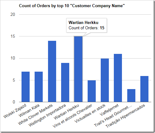
The chart shows the last 10 customers in alphabetical order

The chart data will show customers sorted in descending alphabetical order.
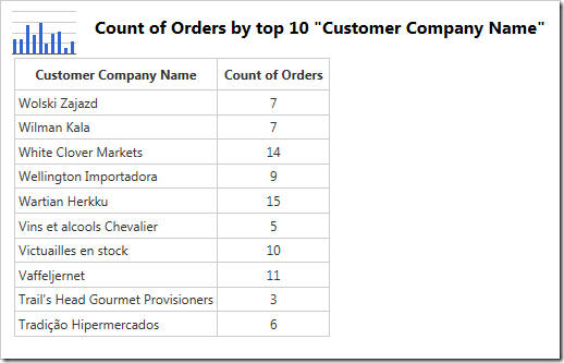
The data shows the first 10 customers in descending alphabetical order.

Sometimes it may be necessary to sort the rows by a column value. Use “sortbyvalue” or “sortdescbyvalue” to sort in descending order of the row value.

Data Field Tag
CustomerID pivot1-row1-column-top10-sortbyvalue

The chart now shows the top 10 customers that make orders.
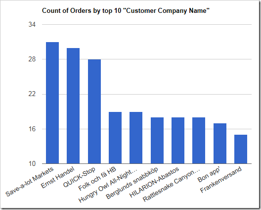
The chart shows customers sorted in descending order by value.

The data shows that the rows have been sorted by the “Count of Orders” column.
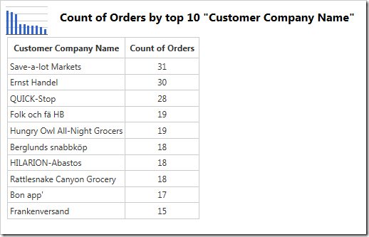
The chart data shows the customers sorted by the count of orders.

In a similar fashion, the bottom 10 customers making orders can be displayed by using “sortascbyvalue” keyword.

Data Field Tag
CustomerID pivot1-row1-column-top10-sortascbyvalue

The chart now shows the least active customers.
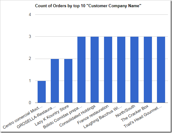
The bottom ten customes by value are shown in this chart.

The chart data will reveal the correct ascending order.
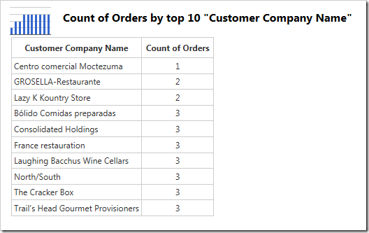
The chart data shows the customers sorted in ascending order by value.

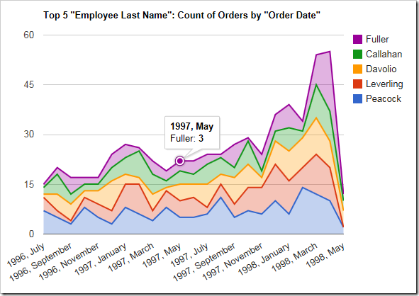
Column fields can be sorted with the same keywords. For example, the chart below shows the top 5 employees making orders over the Order Date. It appears “Peacock” made the most orders in this time period.

Data Field Tag
EmployeeID pivot1-col1-top5-sortbyvalue
OrderDate pivot1-row1-date-areastacked

The columns are sorted in descending order of value. Only the top 5 performing employees are shown.

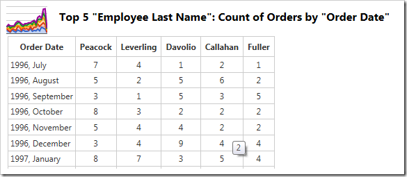
The data can be seen here:

The data shows only the top 5 performing employee columns.