Blog

Labels
AJAX(112) App Studio(8) Apple(1) Application Builder(245) Application Factory(207) ASP.NET(95) ASP.NET 3.5(45) ASP.NET Code Generator(72) ASP.NET Membership(28) Azure(18) Barcode(2) Barcodes(3) BLOB(18) Business Rules(1) Business Rules/Logic(140) BYOD(13) Caching(2) Calendar(5) Charts(29) Cloud(14) Cloud On Time(2) Cloud On Time for Windows 7(2) Code Generator(54) Collaboration(11) command line(1) Conflict Detection(1) Content Management System(12) COT Tools for Excel(26) CRUD(1) Custom Actions(1) Data Aquarium Framework(122) Data Sheet(9) Data Sources(22) Database Lookups(50) Deployment(22) Designer(177) Device(1) DotNetNuke(12) EASE(20) Email(6) Features(101) Firebird(1) Form Builder(14) Globalization and Localization(6) How To(1) Hypermedia(2) Inline Editing(1) Installation(5) JavaScript(20) Kiosk(1) Low Code(3) Mac(1) Many-To-Many(4) Maps(6) Master/Detail(36) Microservices(4) Mobile(63) Mode Builder(3) Model Builder(3) MySQL(10) Native Apps(5) News(18) OAuth(9) OAuth Scopes(1) OAuth2(13) Offline(20) Offline Apps(4) Offline Sync(5) Oracle(11) PKCE(2) Postgre SQL(1) PostgreSQL(2) PWA(2) QR codes(2) Rapid Application Development(5) Reading Pane(2) Release Notes(184) Reports(48) REST(29) RESTful(29) RESTful Workshop(15) RFID tags(1) SaaS(7) Security(81) SharePoint(12) SPA(6) SQL Anywhere(3) SQL Server(26) SSO(1) Stored Procedure(4) Teamwork(15) Tips and Tricks(87) Tools for Excel(2) Touch UI(93) Transactions(5) Tutorials(183) Universal Windows Platform(3) User Interface(338) Video Tutorial(37) Web 2.0(100) Web App Generator(101) Web Application Generator(607) Web Form Builder(40) Web.Config(9) Workflow(28)
Archive
Blog
Tuesday, September 1, 2015PrintSubscribe
“Calendar” View For You

Applications created with Code On Time use a well defined entity model that prescribes presentation of data as grid and form views and determines transition of views via actions. Data may come from any source. For example, a developer can defined an SQL query or stored procedure to read data from the database. An entity can also be programmed to read/write data from a web service, file system, or any other source. Application framework interprets the entity and displays data in various view styles. For example, a typical grid view can be rendered as responsive grid, list, collection of data cards, map, and charts. Request an interactive Webex presentation to learn more.

“Calendar” is a brand new view style that will become available with update 8.5.5.0 on September 2, 2015 . A presence of a “date” field will tell application framework that there is possibility of rendering data as a calendar. New view style offers Day, Week, Month, Year, and Agenda modes. Any field in the view can serve as a “color” field. The framework will assign a color to each data value.  End users can drag and drop events to change values of date fields. Standard form view of an entity is display when an event is selected enabling seamless editing of data.

“Day” view in the screen shot shows 4 data records rendered as events.
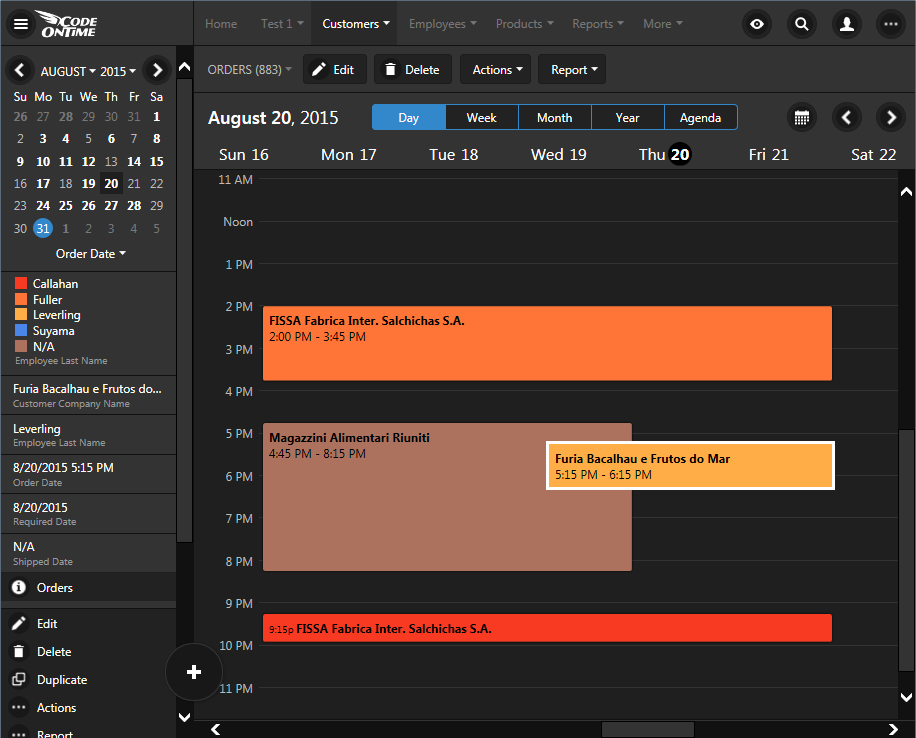
'Day' mode in calendar view of an app created with Code On Time.

Mini calendar on the side bar uses bold font to indicate dates of the month with events. Mini calendar alternates presentation of data between day and week mode when a particular date is clicked. Color legend shows associated data values, which represents the name of the employee assigned to the “order” event. An “event” is a record from Orders table of the Northwind sample.

“Week” view offers seven days of events. Future updates are expected to support 3 and 4 day weeks. Both “Day” and “Week” view are infinitely horizontally scrollable.
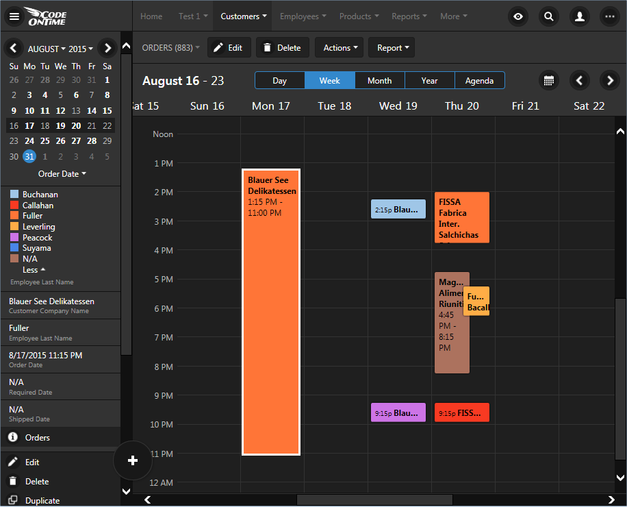
'Week' mode in calendar view of an app created with Code On Time.

“Month” view offers infinitely scrollable events organized in months.
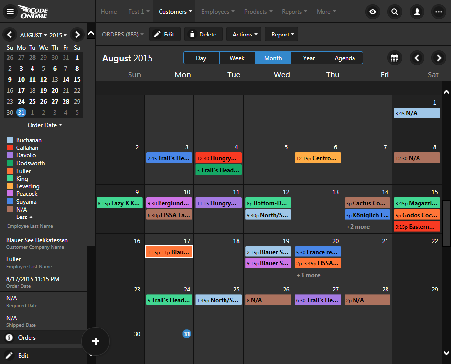
'Month' mode in calendar view of an app created with Code On Time.

Click on any item in the color map on the sidebar and the application will “dim” events associated with other employees in “Day”, “Week”, “Month”, and “Agenda” views.
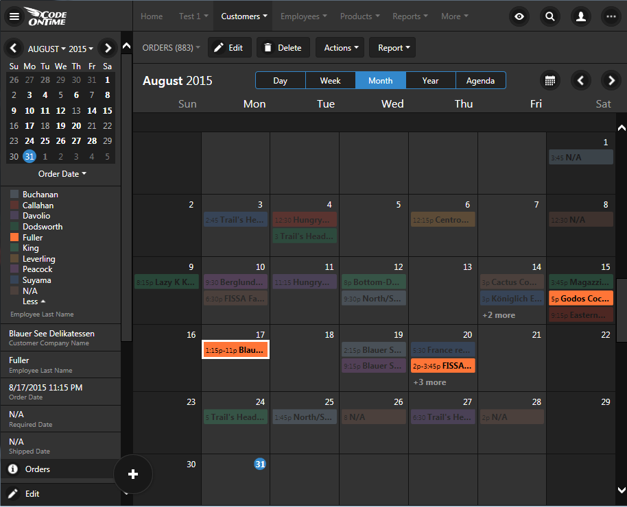
'Dimming' of events is possible by tapping on the color legend in 'Day', 'Week', 'Month', and 'Agenda' modes of calendar view style in apps created with Code On Time.

“Year” view offers analytical presentation of an entire year and also enables quick data-driven navigation to a month or a specific day.
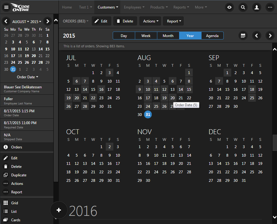
'Year' view in Calendar view style of an app created with Code On Time.

“Agenda” view provides a convenient condensed summary list of events with a dynamic timeline.
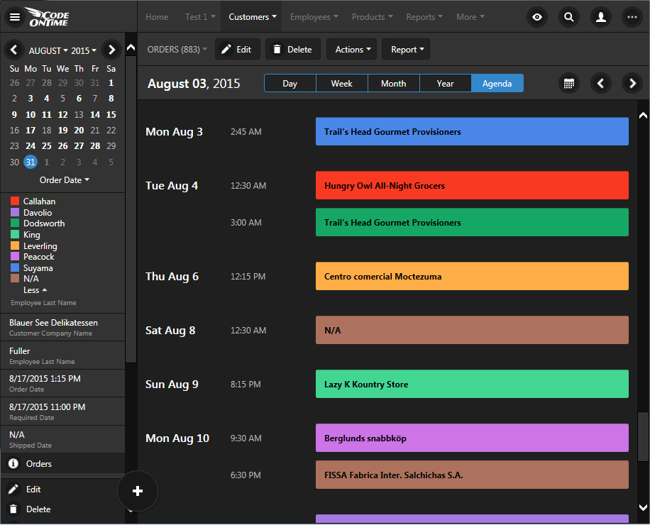
'Agenda' view in Calendar view style of an app created with Code On Time.

All modes of the calendar view style are responsive. Smartphone users will see presentation scaled to fit the form factor of their device. For example, these two screen shots demonstrate “Day” and “Agenda” view on a typical smart phone.
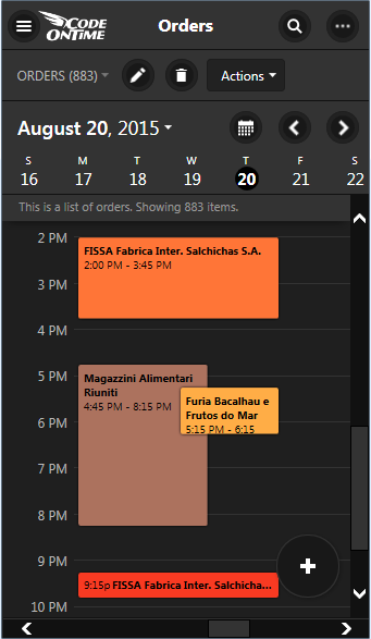
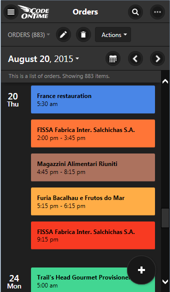
'Day' view in Calendar view style of an app created with Code On Time displayed on a screen with small form factor.   'Agenda' view in Calendar view style of an app created with Code On Time displayed on a screen with small form factor.

These amazing capabilities require no programming or coding. Developers can opt to disable the calendar when not desired. Otherwise application will simply offer the end user yet another way to see their data.

Calendar view now joins a first class collection of presentations styles that were made available in the previous releases and greatly enhanced with this new iteration. View selector and sidebar provide access to every view style available for a particular dataset.
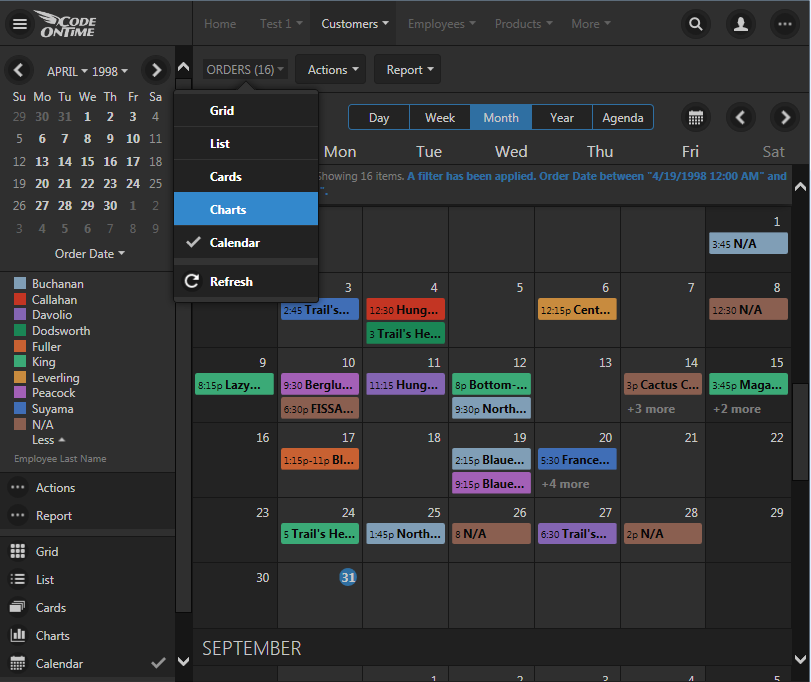
Selecting a view style for data presentation in an app created with Code On Time.

For example, charts view displays automatically constructed charts without developer writing any code.  Any number of custom charts can be defined when needed at design time.
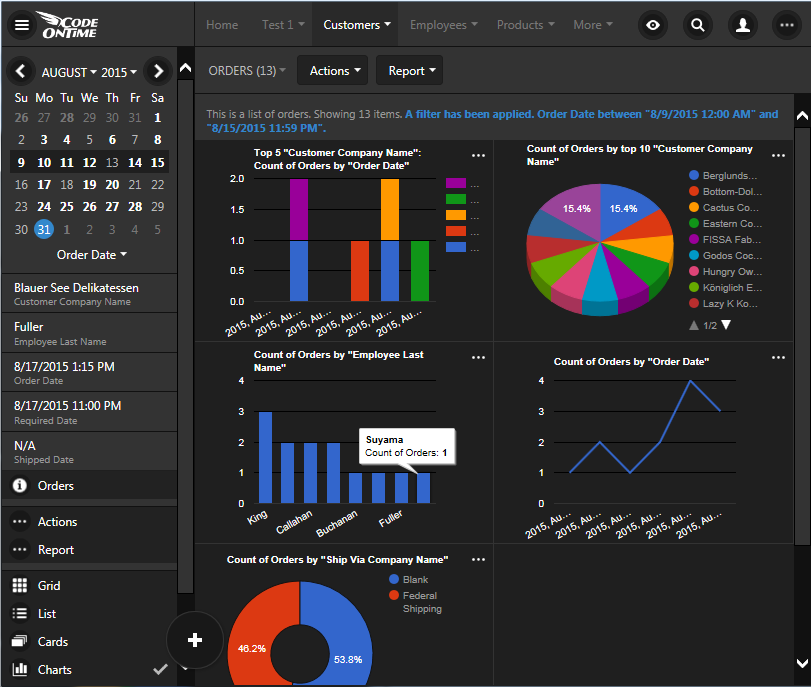
'Charts' view style in an app created with Code On Time.

“Cards” view presents data items as multi-line cards with the same size. Application framework breaks each three fields in paragraphs offering another way to see data. Cards presented in 3, 2, or 1 column based on the screen size. The screenshot shows two columns of automatically configured cards.
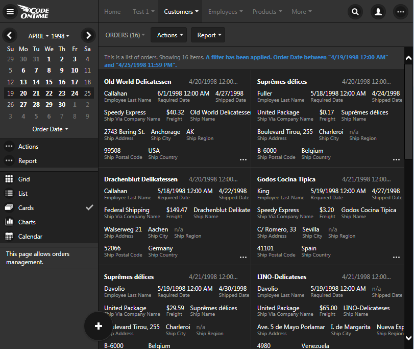
'Cards' view style in an app created with Code On Time.

“List” view is the most universal presentation style that will work with fields of any length and any screen size. Field values float from left to right and continue on the next line.
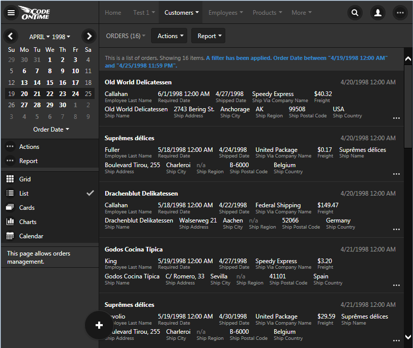
'List' view style in an app created with Code On Time.

“Grid” view style enhances responsive presentation by introducing automatic data balancing. The new release reduces the number of visible columns by applying 2, 5, 8, 10, and 12 column breakpoints based on screen size when data is rendered. This makes it possible to display a grid of rows with “important” fields without being forced to scroll horizontally. For example, this screenshot shows five columns of data rows in Orders table.
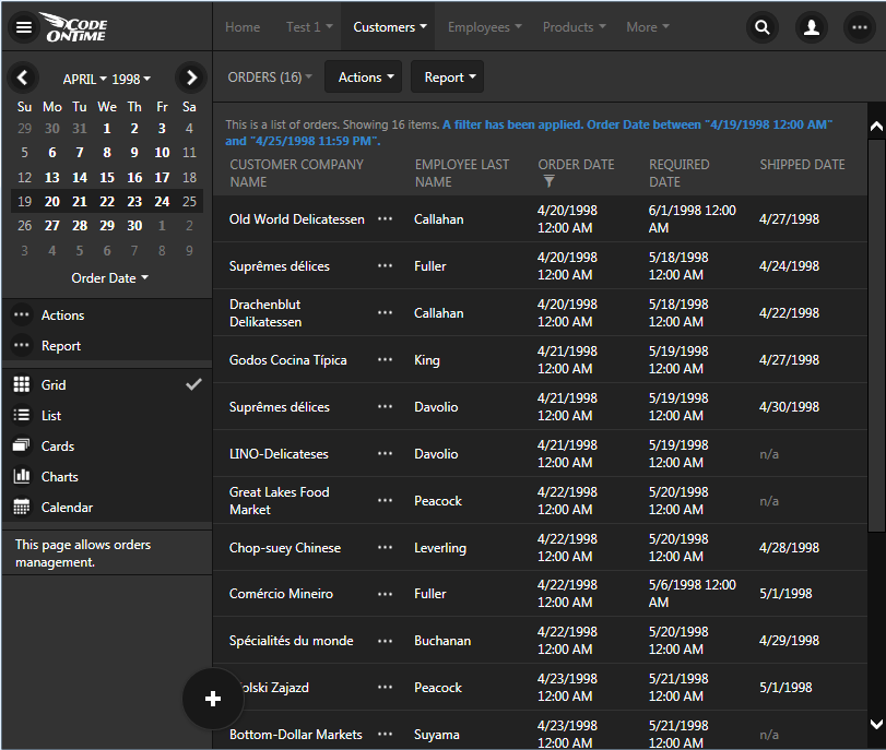
Responsive 'Grid' view style in an app created with Code On Time.

Developers can indicate the minimal screen size that a particular column must be displayed on. For example, tag “grid-tn” will force a column to show up even on “tiny” screen. Small screes with show every column marked as “grid-sm”. The release notes of the update will explain expected logical pixels of tiny, extra small, small, medium, large, and extra large screens.

Previous release required explicit tagging of each field. The new approach is to assume that all fields must be displayed if possible. The mere intent of a developer to place a field in a grid implies that it must visible. Developer-defined tags simply enforcing display of fields on particular screen sizes in responsive grid. The next screenshot shows 8 columns displayed when the sidebar is not visible. Automatic data balancing ensures that “shorter” fields reclaim more real estate from “longer” fields with enforced minimal width to ensure quality “balanced” presentation of data in columns with fixed width.
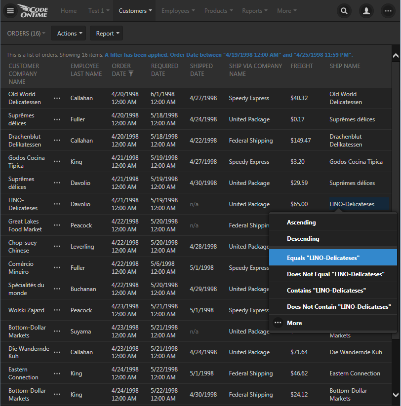
Long press brings up a context menu with data sensitive options in an app created with Code On Time.

All view styles also support “long press” that allows displaying of context menu and selection of records on both desktop and touch-enabled devices. The screenshot above shows context-sensitive filtering and sorting options.

“Map” view style is one more method of presenting data that becomes available when latitude/longitude or Address/City fields are present in the gird view.
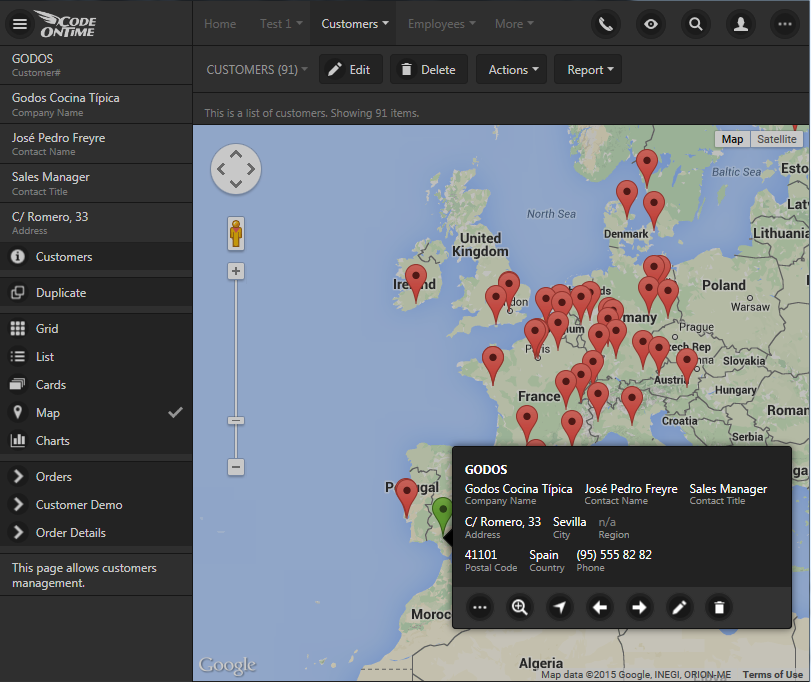
'Map' view style in an app created with Code On Time.

Context menus and data cards are now displayed at the bottom of the screen on devices with small form factor to enable easy touch operations. A couple of screenshots below show data card of “Map” view style and view selector on a small screen.
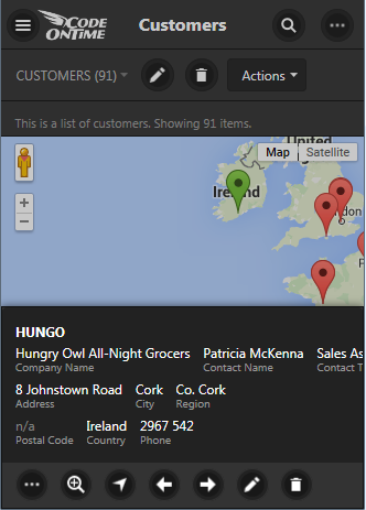
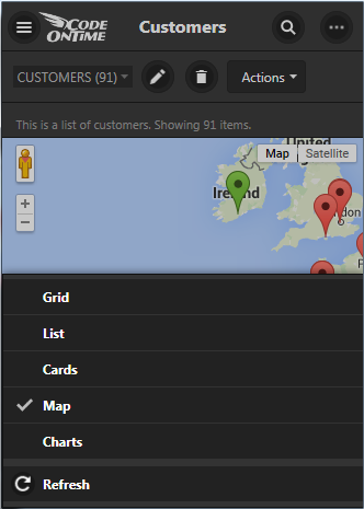
Data card displayed on a screen with small form factor presented by app created with Code On Time.   Context menu displayed on a screen with small form factor presented by app created with Code On Time.

The standard collection of presentation styles will be enhanced with horizontally scrollable “Datasheet” view and “Hierarchy” view styles. The implementation of remaining view style is well under way and is based on horizontal scrolling mechanism that was developed and perfected with “Calendar” view.

Monday, June 29, 2015PrintSubscribe
Calendar, Multi-Column Grouping, and Sorting in the upcoming July 2015 Release

The upcoming release 8.5.5.0 will incude the brand new Calendar view style, mini-calendar on the sidebar, ability to sort, and group data by multiple columns in Touch UI.  The release is expected to go out in the third week of July. The screen shots show the working version of the features, which may change at the time of release.

Calendar View Style

“Year” mode displays a full calendar with indication of data activity.

Year mode of Calendar view style in Touch UI

This mode scales in a responsive fashion on the phones.

Year mode of Calendar view style in Touch UI on a small screen

“Month” mode  shows a vertically scrollable infinite list of months.

Month mode of Calendar view style in Touch UI

This is how it scales on smaller screen.

Month mode of Calendar view style in Touch UI on a small screen

“Week” mode provides a horizontally scrollable wireframe of data.

Week mode of Calendar view style in Touch UI

Week mode of Calendar view style in Touch UI on a small screen

“Day” mode reduces “week” presentation to a single day.

Day mode of Calendar view style in Touch UI

Day mode of Calendar view style in Touch UI on a small screen

Smaller form factor will migrate calendar mode selector to the view selector.

Mode selector of calendar view style migrates to the view selector in Touch UI

Mini-calendar in Sidebar

The brand new mini-calendar feature works in “see all” mode of display. It complements well the calendar view style as can be seen in the pictures above. Mini-calendar also works with the other view styles as well. Mini-calendar becomes visible as soon as at least one “date” field is detected in the dataset.

Mini-calendar will be integrated in the Desktop UI in release 8.5.6.0.

Click on a day to select a week. If a day in a selected week is clicked or touched then the “day” selection mode is activated. If the selected day is clicked or touched then “week” selection mode is activated.

Mini-calendar in List view style of an app with Touch UI


Mini-calendar in Cards view style of an app with Touch UI

Mini-calendar in Charts view style of an app with Touch UI

Mini-calendar in Grid view style of an app with Touch UI

Multi-Column Sorting

Users can now sort by multiple columns. Taping of column names will set the sort order. Subsequent tapping will cycle sorting of the fields between “ascending”, “descending”, and “none”.

Users of apps with Touch UI can configure multi-column sorting.

Multi-Column Grouping

Powerful new feature bring the grouping capabilities in the hands of developers and end users.

This screenshot shows employees grouped by “Reports To” field displays in “Cards” view style.

Grouping of employees by Reports To field in an app with Touch UI

This screenshot shows products grouped by Supplier Company Name and Category Name.

Multi-column grouping of products in an app with Touch UI

Multi-column grouping works as extension to multi-column sorting. Data is sorted first by “group by” columns and then by “sort by” columns.

Monday, June 1, 2015PrintSubscribe
Responsive Grids, User Identity, and Preview of “Live” Content Editing

Code On Time release 8.5.4.0 introduces several important enhancements.

Touch UI now uses glyphicons to indicate sort and filter state. Contents of cells in responsive grid is wrapped to maximize the amount of visible information. The same “wrapped cell” design is implemented in “data sheet” view style, which will be available soon to complement responsive grid. The new view style will display a complete set of fields that can are scrolled horizontally on any screen size. The original implementation of responsive grid displayed rows of the same height making it difficult to read the content in the cells.

image

User identity icon is now displayed on the menu bar. The name of the user is displayed partially or completely next to the icon if the width of the device allows that. Otherwise the user name is displayed in the popup menu assigned to the icon.

image

Install integrated CMS in your app with Single Page App implementation model and you can try live editing of content pages. Add a content page based on any Bootstrap template to your project and select “Edit Page” in the “More” menu. If you choose “Properties’ then the app will redirect to the site content page. Only administrators, content editors, and developers are allowed to edit content pages.

image

Click on any content and change it directly in the browser.

image

Change the properties of content items.

image

Select glyphicons from context menu:

image

Save the page directly to integrated content management system.

image

Content pages stored in CMS are rendered both in Desktop and Touch UI. Live editing is only supported in Touch UI. Future releases will introduce a complete set of page editing capabilities that will enable constructing appealing content without effort. A collection of page templates and content fragments will be installed directly in the CMS.

The following bug fixes and enhancements are also included:

  • Master view refresh when children are changed is now supported in Touch UI. If a master view has one or more fields derived from child tables as aggregates (totals, counts, averages, etc.) then specifying “controller:NAME_OF_CHILD_DATA_CONTROLLER” in Context Fields property of a field will cause the master view to refresh and forms to recalculate the fields. This syntax is supported in both Desktop and Touch UI. The old syntax will also work.
     
  • Fixed desktop CSS but that has colored glyphicons in "content" pages. Now the color is scoped to ".DataViewContainer" selector.
     
  • Removed xmlns="http://www.w3.org/1999/xhtml" from SPA apps and enhanced content encoding tag in the output markup.
     
  • Introduced data-editable tag in content page templates to enable live editing of content.
     
  • Site content is considered to be text if its type is "application/javascript".
     
  • Desktop UI cancels pending "valueChanged" call in calcualted fields that leads to exceptions when a modal data view is closed.
     
  • Client framework will pass a combined filter that includes standard user filters and advanced search options when executing actions.
     
  • User Lookup does not crashes desktop UI anymore.
     
  • If a popup list of options does fit entirely on screen than Touch UI does not resize the menu and instead positions it sideways.
     
  • Touch UI aligns thumbnails vertically when Cards view style is active.
     
  • Touch UI aligns thumbnails to the top in lists with multiple paragraphs.

Calendar View Style is Coming Soon

We are getting close to completion of the new view style called Calendar. Take a look at a few screen shots below. The new view style uses a common “horizontal infinite scrolling” infrastructure in day and week sub-views shared with the upcoming “data sheet” view style. The screen shots are displayed without data. Data will be displayed on demand when user stops scrolling. The data pivoting technology implemented to support Smarts Charts is the foundation of the Calendar view style.

Year

image

Month

image

Week

image

Year View on  a Small Screen

image