Touch UI Framework has long been using the A tag (anchor element) to represent data items in grids, lists, and cards. This approach is inherited from the jQuery Mobile that served as the framework foundation many years ago. It does make a lot of sense to represent the actionable elements of the user interface as a link. On the other hand it is not possible or recommended to place a link in a link or wrap a link around the table or other complex markup.
Release 8.9.36.0 uses the div tag (content division element) as a container for the data items in grids, lists, and cards. This makes possible the custom renderers for the list items and cards.
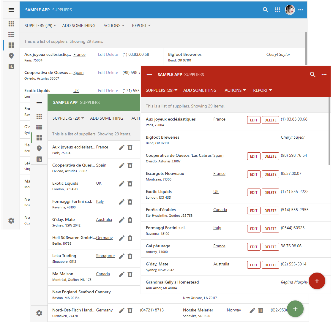 Custom list items and cards can be produced with JavaScript. Developers declare custom renderers for the views in the data controllers to produce items with the data field values, static text, links, buttons, icons, and images. Full inline editing capabilities are supported automatically.
The data items in screenshots above are rendered with the following code that makes use of the template literals for formatting. Touch UI framework creates an instance of an object with the properties set to the field values. The custom renderer function is invoked as the method of the object instance during the rendering process. Place this code to the ~/app/js folder in a file with an arbitrary name.
JavaScript
12345678910111213141516171819202122232425262728293031323334353637383940414243444546474849505152(function () {

    $app.touch.render.Suppliers = {
        grid1: {
            cards: doRenderItem,
            list: doRenderItem
        }
    };

    function doRenderItem(dataView, container) {
        if (this.Country === 'USA')
            return `
                <div style="display:flex;justify-content:space-between;margin-right:40px">
                  <div style="font-weight:600;width:80%;overflow:hidden;text-overflow:ellipsis" class="app-field app-field-CompanyName">
                    ${this._formatted.CompanyName}
                    <br/>
                    <span style="font-size:.8em">${this._formatted.City}, ${this._formatted.Region} ${this._formatted.PostalCode}</span>
                  </div>
                  <div style="width:20%;">
                    <i>${this._formatted.ContactName}</i>
                  </dvi>
                </div>
                `;
        return `
            <div style="display:flex;justify-content:space-between;margin-right:40px">
                <div style="font-weight:600;width:40%;overflow:hidden;text-overflow:ellipsis" class="app-field app-field-CompanyName">
                    ${this._formatted.CompanyName}
                    <br/>
                    <span style="font-size:.8em">${this._formatted.City}, ${this._formatted.Region} ${this._formatted.PostalCode}</span>
                </div>
                <div style="text-align:left;width:20%;;overflow:hidden;text-overflow:ellipsis"  class="app-field app-field-Country">
                <a href="https://codeontime.com?supplierId=${this.SupplierID}" target2="_blank">${this._formatted.Country}</a>
                </div>
                <div style="width:20%;white-space:normal;visibility:${this.SupplierID == null ? 'hidden' : 'visible'}">
                    <!--
                    <a data-action-path="ag4/a1" title="Try that">Edit</a>
                    <a data-action-path="ag1/a3" title="Go do this!">Delete</a>
                    -->

                    <!--
                    <span data-control="action" data-action-path="ag4/a1">Edit</span>
                    <span data-control="action" data-action-path="ag1/a3">Delete</span>
                    -->

                    <i class="app-icon material-icon" data-action-path="ag4/a1" title="Edit">edit</i>
                    <i class="app-icon material-icon" data-action-path="ag1/a3" title="Delete">delete</i>
                </div>
                <div style="text-align:left;width:20%;"  class="app-field app-field-Phone">${this._formatted.Phone}</div>
            </div>
            `;
    }
})();
Here is an example of the custom cards that display images.
 The minimal JavaScript code and HTML markup can liven up the default rendering of even the simplests sets of data.
The following features, bug fixed, and enhancements are included in this release:
- (Charts) The "day" cell in month presentation is inferred from the drag & drop target.
- (ODP) Offline Data Processor now handles the 'url' and 'download' actions in the "summary" data views.
- (Inline Editor) Inline editor does not throw an exception when the data item is removed.
- (Touch Core) Added support for the "div"-based list items.
- (Touch UI) Virtual page transitions start in the next animation frame. Previously the transitions started immediately, which causes a premature completion of animation on the fast devices.
- (Touch UI) Custom "more" buttons can be introduced to the item by list/card custom renderers.
- (Touch UI) The menu strip fades in when the window is resized.
- (Touch UI) Html elements with "data-action-path" attribute are handled with the universal code.
- (Touch UI) Actions embedded in the item or card correctly trigger whether or not the multi-select is enabled. Clicked/tapped action elements are searched in the "Action Column", "Grid", "Action Bar", and "Custom" scopes.
- (Touch UI) The grid/list/cards items are rendered as div elements. Previously the anchor element was used. It is now possible to embed the "a" elements inside of the item markup when needed.
- (Touch UI) Custom HTML renderers specified in the $app.render class are invoked. Developers can specify a custom renderer function as $app.render.[controller].[viewId].[list|card]. The function is invoked on the instance of a JavaScript object that has every field raw value as the property. The formatted values are specified in the "this._formatted" instance. The renderer must return the physical contents of the list item or card.
- (Touch UI) The minimum height of the list/card is set to fit vertically the actions available in the "Action Column'' scope.
- (Touch UI) The context menu of a field in the data item does not display the lookup "View" option if the data field is tagged as view-details-hidden.
- (Touch UI) The notification that was invoked with the exception instance will stop the ongoing transition and set the framework to the "page ready" state.
- (Touch UI) Custom actions can be specified in the custom markup of a data item or card
- (Virtual Keyboard) The virtual keyboard displayed on the values with the spaces or text breaking characters will not cause the value to appear as "wrapped".
- (App Studio) The inspector will skip the CSS tests that are not supported in the browser. The corresponding exception is logged in the console.
- (Touch UI) Replaced the "a" tag with the "div' tag in the grid/list/cards presentation.
- (Touch UI) Fixed incorrect rendering of the field selector and legend expansion in the calendar.
- (Touch UI) Enhanced the visual presentation of the lists and cards in forms.
- (PropGrid) The properties with the conditional complexity are identified whether or not they have the 'visibility' property of their own.
- (ODP) The cleanup of the expired "changed" images is performed in the function to ensure compatibility with IE11. Please note that the new features of the Touch UI framework will not be compatible with this browser.
- (Touch UI) The vertical menu takes into account the top of the virtual screen when nodes with the children are collapsed and expanded.
- (Prop Grid) Optimized the tagging of properties.
- (Touch UI) The modal form views with the modal-max-(tn|xxs|xs|md|lg|xl|xxl) will be 1 pixel wider than before.
- (PropGrid) Method _tagged(regex) assigned to the property evaluation targets will return an object without properties if the matching is not found.
- (RESTful) The view IDs specifies in the resources will not force the RESTful API to treat them as the view ID specifier. Instead they are treated as row identifiers. The new method RESTfulREsource.SegementIsIdentifier return return true when the data controller name is Views and there is an identifier of the Controllers. This allows App Studio to fetch views from the data controllers by their "id" attribute value.
- (Universal Input) Pressing Delete, Backspace, and Space in the input field will not cause the vertical scrolling in the webkit browsers.
- (PropGrid) The read-only fields will not clear when Delete, Backspace, and Del keys are pressed.
- (Prop Grid) The "compound" complex properties are collapsed when are displayed in the Properties Window for the first time. Their value color matches the color of the editable input fields. The "boolean" subproperties contribute their name to the "compound' field value while the other subproperties are contributing their value instead.
- (Prop Grid) Double-clicking the compound value of the complex property will expand or collapse its children.
- (Prop Grid) The HTML selection is disabled completely in the Properties Window when users are dragging the mouse pointer between various elements.
- (Prop Grid) Pressing Escape key will gradually remove the focus from the active input to the active property, from the active property to the property window. If there is no focused property in the Properties Window then the hierarchy is closed.
- (ODP) The search implementation is using the native unicode support in the regular expressions available in the modern browsers.
- (Framework) Prepared the alternative implementation of the $app;prettyText based on the native unicode classes available in the browsers. The framework will be switched to this implementation when the legacy Project Designer is disabled in the v9. This sys/unicode.js will be removed from the framework in v9.
- (PropGrid) The smooth expansion of a complex property is not performed when the selected child property is focused during the initial display of the hierarchy.
- (Touch UI) The notification messages appear as detached from the bottom of the screen by default. The 'ui.notify.detached' option controls behavior. Previously the notifications were displayed "flush" with the bottom of the screen.
- (Touch UI) The new option 'ui.notify.bottomMargin' specifies whether there is margin between the bottom of the screen and the notification. The default value is true.
- (2FA) If the email is not specified in server.2FA.setup.methods, then the automatic setup is always assumed to have the 'email: true' option.
- (Prop Grid) Complex properties may be "comlex" on demand. If the child sub-properties are not visible, then the "complex" property is displayed as a "simple" property without a toggle next to it.