Blog

Labels
AJAX(112) App Studio(7) Apple(1) Application Builder(245) Application Factory(207) ASP.NET(95) ASP.NET 3.5(45) ASP.NET Code Generator(72) ASP.NET Membership(28) Azure(18) Barcode(2) Barcodes(3) BLOB(18) Business Rules(1) Business Rules/Logic(140) BYOD(13) Caching(2) Calendar(5) Charts(29) Cloud(14) Cloud On Time(2) Cloud On Time for Windows 7(2) Code Generator(54) Collaboration(11) command line(1) Conflict Detection(1) Content Management System(12) COT Tools for Excel(26) CRUD(1) Custom Actions(1) Data Aquarium Framework(122) Data Sheet(9) Data Sources(22) Database Lookups(50) Deployment(22) Designer(177) Device(1) DotNetNuke(12) EASE(20) Email(6) Features(101) Firebird(1) Form Builder(14) Globalization and Localization(6) How To(1) Hypermedia(2) Inline Editing(1) Installation(5) JavaScript(20) Kiosk(1) Low Code(3) Mac(1) Many-To-Many(4) Maps(6) Master/Detail(36) Microservices(4) Mobile(63) Mode Builder(3) Model Builder(3) MySQL(10) Native Apps(5) News(18) OAuth(8) OAuth Scopes(1) OAuth2(11) Offline(20) Offline Apps(4) Offline Sync(5) Oracle(10) PKCE(2) PostgreSQL(2) PWA(2) QR codes(2) Rapid Application Development(5) Reading Pane(2) Release Notes(180) Reports(48) REST(29) RESTful(29) RESTful Workshop(15) RFID tags(1) SaaS(7) Security(80) SharePoint(12) SPA(6) SQL Anywhere(3) SQL Server(26) SSO(1) Stored Procedure(4) Teamwork(15) Tips and Tricks(87) Tools for Excel(2) Touch UI(93) Transactions(5) Tutorials(183) Universal Windows Platform(3) User Interface(338) Video Tutorial(37) Web 2.0(100) Web App Generator(101) Web Application Generator(607) Web Form Builder(40) Web.Config(9) Workflow(28)
Archive
Blog
Tuesday, March 30, 2021PrintSubscribe
Icons, Icons, Icons

 Material Icons and 3rd Party Icon Fonts

Touch UI gets its good looks from the Material Icons library designed by Google. Apps based on Touch UI feel at home on the Android devices and Chromebooks. They look crisp and professional on iOS, Mac, and Windows.

Touch UI apps support several build-in icon styles and can be extended to use the 3rd party icon collections. 

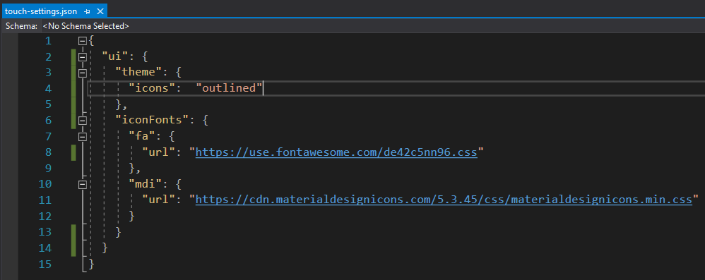
There are four different styles of icons that help your app to stand out - filled, outlined, rounded, and sharp. The default style filled can be changed by setting the value to ui.theme.icons property in ~/touch-settings.json configuration file. 


The built-in icons come from the web fonts stored under the ~/fonts folder of your application. 

Configuring 3rd Party Icon Fonts

Touch UI makes it easy to integrate additional icon libraries in the application. The following configuration in the ~/touch-settings.json file will set the built-in icon font to the outlined style and link the icon collections called Font Awesome and Material Design Icons. The former offers the popular set of free and commercial icons. The latter is the community-driven effort not affiliated with Google, but bearing a similar name.


Please note that the Font Awesome URL is provided for illustrative purposes only. The vendor requires registration via email. Sign up and you will receive an email with the JavaScript snippet that will hook the web font to your pages. Use the script filename in the ui.iconFonts.fa.url property but keep the “*.css” extension as shown above.

The prefixes “fa” and “mdi” are not accidental. Review the documentation of the web font provider and take a notice of the prefix used in the example. Use the same prefix when registering the font in your app. It is the industry standard to prefix the icon names with the same sequence of characters. The cascading style sheets linked to the app will have the corresponding definitions with the references to the icon font family. 

Touch UI will create dynamic CSS rules at runtime to make the 3rd party icons match the width and height of the built-in icons. Specify a numeric “size” property for the prefix defined in ui.theme.iconFonts if the icons appear to be larger or smaller than the standard icons of Touch UI. The default size of the icons is 24 pixels.

Using Icons in the Application


Let’s apply the standard icon shopping_cart  to the editForm1 view in the Products data controller. Open your app in the Project Designer, find the view, and enter material-icon-shopping-cart in the Tags property.


This will enhance your form with the corresponding icon in the header. The icon is over-imposed on the larger self visible partially in the background for an added artistic touch.


Clear the tag on the view editForm1 and enter the fa-shopping-basket to activate the shopping basket icon from the Font Awesome library.


Here is what happens if you tag the editForm1 view with the mdi-basket and engage the Material Design Icons library.


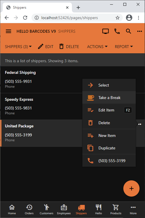
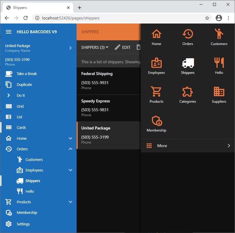
Assign icons to actions and pages by entering the icon name in their Icon / Custom Style property. For example, icons fa-truck and fa-coffee are assigned to the Shippers page and custom action Take a Break in the screenshots. The icons will show on the sidebar, in the navigation tabs, and in the menu options.


Embedding Icon Fonts in Apps

If you plan to run your app in the native mode or prefer not to have the external dependencies, then consider embedding the stylesheets and fonts directly in the app folders. 

Run the app in the web browser and bring up its Web Inspector. Disable caching on the Network tab and refresh the page. You will find the external references to the CSS stylesheets and the web fonts listed in the traffic. Save them in a dedicated folder under ~/css directory of your app. 

Next remove the “url” property from the prefix under ui.iconFonts in ~/touch-settings.json. Keep the prefix even if it is empty. Run the app and make sure that only the local references appear in the network traffic of the browser. The CSS files will be loaded automatically, but you may need to manipulate the relative references to the web fonts in the CSS files if icons do not show up.

Saturday, March 27, 2021PrintSubscribe
Navigation Menu

Apps created with Touch UI have three options for the placement for the navigation menu. By default the top-level items of the navigation hierarchy are displayed as tabs in the toolbar. Menu items with children will have a dropdown menu. The spill-over items are moved under “More” menu item created automatically as needed.


Developers may choose to move the menu to the sidebar displayed on the left side of the app. The space in the sidebar is at the premium and the complex menus will be collapsed with the current node expanded. The sublevels of the menu can be individually expanded and collapsed. The same collapsible menu is also displayed when the Apps button is pressed. It is also visible in the hamburger menu and on the small screens.


Enter the following in ~/touch-settings.json to move the menu to the sidebar and to relocate the Apps button next to the user profile icon on the toolbar. 


The Apps button is the icon represented with 3 x 3 solid squares or circles. You will find it in the sidebar, on the toolbar, or in the hamburger menu of your app. Its purpose is to provide quick access to the most important pages of the app and to the full navigation menu.

Assign a dedicated icon to a page by entering the icon name in the Icon / Custom Style property of the page in the Project Designer .The  extensive Material Icons library is included with the framework. The name of the icon can be entered with the material-icon- prefix (e.g. material-icon-emoji-people).The icons will be displayed in the sidebar, in the context menu options, and in the drop down menus of the app toolbar. The top-level items will not have the  icons in the menu with the default placement.

Up to five icons are visible in the mini sidebar and the full set is presented in the context panel activated with the Apps button. The More option in the context panel will show the complete navigation menu.


If at least two pages have a dedicated icon, then the app will display the tabs at the bottom of the screen when the sidebar is hidden. The spill-over icons will migrate to the More tab.


The hamburger menu will display the full navigation menu.


Developers may opt to hide the navigation menu from the toolbar and the sidebar by setting ui.menu.location to none in ~/touch-settings.json for a minimalist look and feel. The navigation menu will still be available through the Apps button and the hamburger menu.

The state of nodes in the navigation menu with the vertical layout is controlled by ui.menu.autoExpand property. The default value is current, which will expand one level of the menu node representing the current page. Setting this option to false will keep the current node collapsed. The all value will have all items fully expanded when the navigation menu is rendered vertically.

Touch UI completely automates the navigation menu presentation while letting the developer focus on what’s important.

Thursday, March 25, 2021PrintSubscribe
Lines, Lines, Lines

 Horizontal and Vertical Lines

The signature feature of Touch UI is the “lined paper” style of data presentation. A list of items is rendered in the table format that looks like a spreadsheet. A single data item is displayed in a form with the rows of values separated by horizontal lines. The reading pane mode provides a great example of that.


The height of each row is automatically adjusted to fit the content. The form will also distribute the field values in multiple columns if the floating is enabled and the form is wide enough.


Developers have a great control over the horizontal and vertical lines globally and on the fine-grained level. Let’s learn more about it.

Grid Lines

The vertical lines in the grid can be hidden in the file ~/touch-settings.json:


Setting the ui.grid.lines.vertical property to false will hide the vertical lines and force the framework to display the “n/a” abbreviation in the empty data cells in a muted color to provide a visual point of reference for the “null” values.


Compare this to the default presentation with the horizontal and vertical lines, where the “empty” values are easy to spot without a visual aid.


If you prefer the default grid presentation with the horizontal and vertical lines but need to hide the vertical lines in a particular data view, then have it tagged as
grid-lines-vertical-none to achieve the same effect.

If the opposite effect is needed then hide the horizontal lines by setting the ui.grid.lines.horizontal to false in ~/touch-settings.json or tag a view as grid-lines-horizontal-none.


The minimalist presentation can be achieved by turning the horizontal and vertical lines “off” either in ~/touch-setting.json or by tagging a data view simultaneously with the two tags.


This is the no-lines view in the grid:


The boundaries of the selected field value are easy to see in the inline editing mode whether or not the grid has a look of a spreadsheet.

Form Lines

Get that minimalist look in the forms by getting rid of the horizontal lines.


You can accomplish that by setting ui.form.lines.horizontal option to false in ~/touch-settings.json


The tag form-lines-horizontal-none will hide the horizontal lines in a data view form shown below.


Form with the horizontal lines hidden will display an “Optional” text as a placeholder for the fields that accept the “null” value. The placeholders are visible when the end user is entering a new record or editing an existing one. This standard placeholder text can be overridden by setting a custom placeholder for the data field in the data controller view.


Finally you can have the lines to wrap around the field values like this.


The “outlined” input focus will work well when the input lines are enabled. This configuration of ~/touch-settings.json will display the lines around the text inputs and show the thick outline in the accent color of the theme when an input is focused.