Blog: Posts from May, 2012

Labels
AJAX(112) App Studio(7) Apple(1) Application Builder(245) Application Factory(207) ASP.NET(95) ASP.NET 3.5(45) ASP.NET Code Generator(72) ASP.NET Membership(28) Azure(18) Barcode(2) Barcodes(3) BLOB(18) Business Rules(1) Business Rules/Logic(140) BYOD(13) Caching(2) Calendar(5) Charts(29) Cloud(14) Cloud On Time(2) Cloud On Time for Windows 7(2) Code Generator(54) Collaboration(11) command line(1) Conflict Detection(1) Content Management System(12) COT Tools for Excel(26) CRUD(1) Custom Actions(1) Data Aquarium Framework(122) Data Sheet(9) Data Sources(22) Database Lookups(50) Deployment(22) Designer(177) Device(1) DotNetNuke(12) EASE(20) Email(6) Features(101) Firebird(1) Form Builder(14) Globalization and Localization(6) How To(1) Hypermedia(2) Inline Editing(1) Installation(5) JavaScript(20) Kiosk(1) Low Code(3) Mac(1) Many-To-Many(4) Maps(6) Master/Detail(36) Microservices(4) Mobile(63) Mode Builder(3) Model Builder(3) MySQL(10) Native Apps(5) News(18) OAuth(8) OAuth Scopes(1) OAuth2(11) Offline(20) Offline Apps(4) Offline Sync(5) Oracle(10) PKCE(2) PostgreSQL(2) PWA(2) QR codes(2) Rapid Application Development(5) Reading Pane(2) Release Notes(180) Reports(48) REST(29) RESTful(29) RESTful Workshop(15) RFID tags(1) SaaS(7) Security(80) SharePoint(12) SPA(6) SQL Anywhere(3) SQL Server(26) SSO(1) Stored Procedure(4) Teamwork(15) Tips and Tricks(87) Tools for Excel(2) Touch UI(93) Transactions(5) Tutorials(183) Universal Windows Platform(3) User Interface(338) Video Tutorial(37) Web 2.0(100) Web App Generator(101) Web Application Generator(607) Web Form Builder(40) Web.Config(9) Workflow(28)
Archive
Blog
Posts from May, 2012
Friday, May 25, 2012PrintSubscribe
Feature: Automatic Search Bar

The Advanced Search Bar is available in all grid and data sheet views. The Search Bar can be activated by clicking on the Chevron icon Advanced Search Bar on the action bar next to Quick Find. It requires no additional configuration and automatically displays the first three data fields in the view.

Advanced Search Bar activated in the Employees grid view.

It allows end users to form complex and specific queries to find the data they need. This capability complements Quick Find.

Advanced search bar with complex search query.

When necessary, the available fields and filter options can be configured.

Learn more about using Advanced Search Bar.

Friday, May 25, 2012PrintSubscribe
Using Automatic Search Bar

The Quick Find box is used to perform quick searches of the data. If a more specific query needs to be composed, the Search Bar is a readily available option. The Search Bar can be activated by clicking on the Chevron icon Automatic Search Bar on the action bar next to Quick Find.

Click on the chevron icon to the left of Quick Find to open the Search Bar.

The Search Bar will open under the action bar. By default, the first three visible data fields are available for filtering.

Developers can preconfigure the search bar to display specific fields and available filtering operations when the action bar is activated for the first time. The search bar may be displayed on start without retrieving the first page of data in page data views and lookup fields.

Employee grid view with Advanced Search Bar activated.

The first dropdown allows you to select a filter field. Visible and hidden data fields are available for selection.

The first dropdown on the Search Bar determines the field.

The second dropdown specifies the filter operation on the field. The type of the field determines which operations are available. The filter operations are configurable.

The second dropdown on the Search Bar determines the filter operation.

Enter your filtering parameters in the textbox. The textbox has autocomplete capabilities.

Search parameter field has auto complete capabilities.

If the filter parameters are dates, then a date picker is available.

image

You can clear a filter by clicking the Clear Filter iconClear Filter on the right side of the input field.

Clear the filter using the Clear Filter icon on the right side of the field.

You can add additional filters by clicking on the Plus iconAdd Filter or on the link Add search condition at the bottom of the search bar. Remove a filter by clicking on the Minus icon Remove Filter to the right of the filter.

Add search condition by clicking on the '+' icon.

The Reset button on the right side will reset the filter parameters in the search bar to match the current filter in the grid view.

The Reset button resets the filter to match the grid filter.

You can close the Search Bar and bring back Quick Find by clicking on the Chevron icon Advanced Search on the left side of the action bar.

Close or open the search by clicking on the chevron icon on the left side of the action bar.

Friday, May 25, 2012PrintSubscribe
Conditional CSS Styling

Suppose that you need to visually highlight order details with a Unit Price above $30 or a Discount equal to or greater than 15% in the following data view.
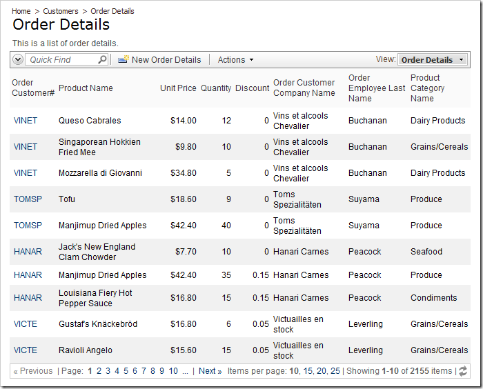
Order Details page without any conditional CSS styling.

Start the Project Designer. In the Project Explorer, switch to the Controllers tab, and double-click on OrderDetails / Views / grid1 view node.
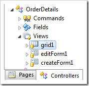
'Grid1' view of OrderDetails controller in Project Explorer.

In the left top corner of the Designer window, switch to the Styles tab. On the action bar, select New | New Style option.
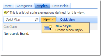
Create a new Style on the Styles tab of Project Designer.

Give this style the following properties:

Property Value
Css Class
HighDiscount
Test [Discount]>=.15

Press OK to save. Create another style:

Property Value
Css Class
TooExpensive
Test [UnitPrice]>=30

Press OK to save the style. On the tool bar, press Browse to generate the web application. Navigate to the Order Details page.

We will be using Internet Explorer 9’s Developer Tools. Many other browser have similar tools or add-ons.

On your keyboard, press F12 to access Developer Tools. On the tool bar, click on the Refresh icon and then click on the Arrow icon to enter Inspection mode. Mouse over a row that has a Unit Price above $30 and click on it.
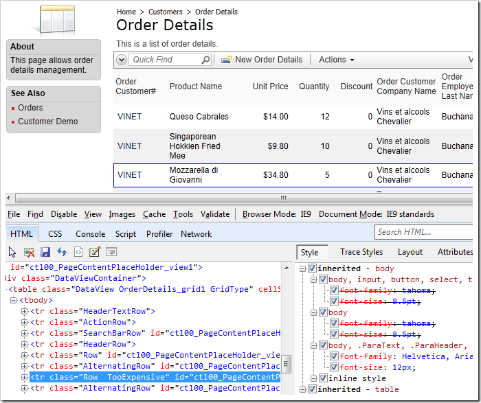
Inspecting a row in the Order Details grid view, you can see that the proper CSS classes have been assigned.

The selected HTML element will be displayed on the HTML tab. You can see that the row has the classes “Row” and “TooExpensive” – we can use this class to assign a style to rows. If you scroll down, you can find rows with the class “HighDiscount” as well.

Switch back to the web application generator, click on the project name, and choose Develop to open the project in Visual Studio. In the Solution Explorer, right-click on ~\App_Themes\MyCompany, and press Add New Item option. If you changed your namespace, add the item in the corresponding folder.
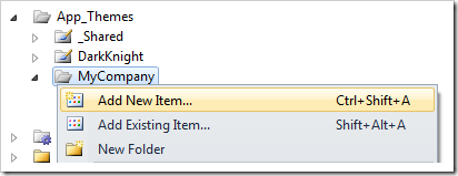
Add New Item to MyCompany folder of the project.

Select Style Sheet item, and press Add to create a new style sheet.
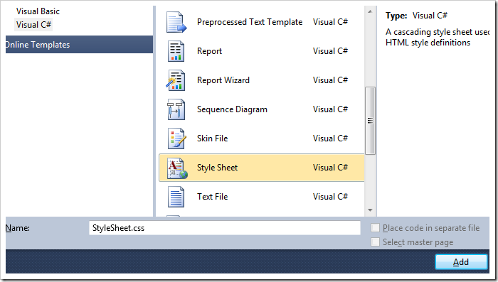
Add a Style Sheet file to the folder.

Replace the default text with the following rules:

tr.TooExpensive td.Cell
{
    background-color:#ffe79c!important;
    border-color:#ffe79c!important;
}

tr.HighDiscount td.Discount
{
    background-image:none!important;
    background-color:#9C0B12!important;
    color:white;
}

tr.TooExpensive.Highlight td.Cell
{
    background-color:#C5C5C5!important;
    border-color:#9E9E9E!important;
}

The first class will change the background color of all Order Details with Unit Price above $30 to yellow. The second class will change the background color of all Discount cells greater than 15% to red. The third class will improve the presentation for selected items.

Save the file, and refresh the web page. You will see that the CSS styles work as planned, and the relevant information is much easier to see at a glance.
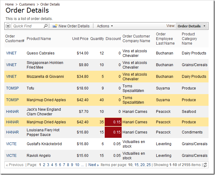
Order Details grid view with conditional CSS styling.