Blog

Labels
AJAX(112) App Studio(7) Apple(1) Application Builder(245) Application Factory(207) ASP.NET(95) ASP.NET 3.5(45) ASP.NET Code Generator(72) ASP.NET Membership(28) Azure(18) Barcode(2) Barcodes(3) BLOB(18) Business Rules(1) Business Rules/Logic(140) BYOD(13) Caching(2) Calendar(5) Charts(29) Cloud(14) Cloud On Time(2) Cloud On Time for Windows 7(2) Code Generator(54) Collaboration(11) command line(1) Conflict Detection(1) Content Management System(12) COT Tools for Excel(26) CRUD(1) Custom Actions(1) Data Aquarium Framework(122) Data Sheet(9) Data Sources(22) Database Lookups(50) Deployment(22) Designer(177) Device(1) DotNetNuke(12) EASE(20) Email(6) Features(101) Firebird(1) Form Builder(14) Globalization and Localization(6) How To(1) Hypermedia(2) Inline Editing(1) Installation(5) JavaScript(20) Kiosk(1) Low Code(3) Mac(1) Many-To-Many(4) Maps(6) Master/Detail(36) Microservices(4) Mobile(63) Mode Builder(3) Model Builder(3) MySQL(10) Native Apps(5) News(18) OAuth(9) OAuth Scopes(1) OAuth2(13) Offline(20) Offline Apps(4) Offline Sync(5) Oracle(11) PKCE(2) Postgre SQL(1) PostgreSQL(2) PWA(2) QR codes(2) Rapid Application Development(5) Reading Pane(2) Release Notes(183) Reports(48) REST(29) RESTful(29) RESTful Workshop(15) RFID tags(1) SaaS(7) Security(81) SharePoint(12) SPA(6) SQL Anywhere(3) SQL Server(26) SSO(1) Stored Procedure(4) Teamwork(15) Tips and Tricks(87) Tools for Excel(2) Touch UI(93) Transactions(5) Tutorials(183) Universal Windows Platform(3) User Interface(338) Video Tutorial(37) Web 2.0(100) Web App Generator(101) Web Application Generator(607) Web Form Builder(40) Web.Config(9) Workflow(28)
Archive
Blog
Monday, July 11, 2016PrintSubscribe
Form Templates

Forms in Touch UI apps are laid out by HTML templates. When a form view is requested in the application framework, the ~/Views folder is queried for a template with file name of [Controller Name].[View Name].html. If the developer has placed a file matching that name in the Views folder, then the framework will read the file and pass it to the client library. The client will then use this template and inject data field inputs, labels, data views, and other controls into the template before rendering to the user. Otherwise, the client library will automatically build a template based on the definitions of categories and data fields.

The picture below shows the automatically built template for the default editForm1 view of Orders controller in the sample Northwind app.

The default template for Orders editForm1 view.

The generated template can be seen below. 

<div data-container="collapsible" data-wrap="false" data-header-text="Orders">
    <div data-container="row">
        <div data-control="description">These are the fields of the orders record that can be edited.</div>
    </div>
    <div data-container="row">
        <span data-control="label" data-field="CustomerID">CustomerID</span>
        <span data-control="field" data-field="CustomerID">[CustomerID]</span>
    </div>
    <div data-container="row">
        <span data-control="label" data-field="EmployeeID">EmployeeID</span>
        <span data-control="field" data-field="EmployeeID">[EmployeeID]</span>
    </div>
    <div data-container="row">
        <span data-control="label" data-field="OrderDate">OrderDate</span>
        <span data-control="field" data-field="OrderDate">[OrderDate]</span>
    </div>
    <div data-container="row">
        <span data-control="label" data-field="RequiredDate">RequiredDate</span>
        <span data-control="field" data-field="RequiredDate">[RequiredDate]</span>
    </div>
    <div data-container="row">
        <span data-control="label" data-field="ShippedDate">ShippedDate</span>
        <span data-control="field" data-field="ShippedDate">[ShippedDate]</span>
    </div>
    <div data-container="row">
        <span data-control="label" data-field="ShipVia">ShipVia</span>
        <span data-control="field" data-field="ShipVia">[ShipVia]</span>
    </div>
    <div data-container="row">
        <span data-control="label" data-field="Freight">Freight</span>
        <span data-control="field" data-field="Freight">[Freight]</span>
    </div>
    <div data-container="row">
        <span data-control="label" data-field="ShipName">ShipName</span>
        <span data-control="field" data-field="ShipName">[ShipName]</span>
    </div>
    <div data-container="row">
        <span data-control="label" data-field="ShipAddress">ShipAddress</span>
        <span data-control="field" data-field="ShipAddress">[ShipAddress]</span>
    </div>
    <div data-container="row">
        <span data-control="label" data-field="ShipCity">ShipCity</span>
        <span data-control="field" data-field="ShipCity">[ShipCity]</span>
    </div>
    <div data-container="row">
        <span data-control="label" data-field="ShipRegion">ShipRegion</span>
        <span data-control="field" data-field="ShipRegion">[ShipRegion]</span>
    </div>
    <div data-container="row">
        <span data-control="label" data-field="ShipPostalCode">ShipPostalCode</span>
        <span data-control="field" data-field="ShipPostalCode">[ShipPostalCode]</span>
    </div>
    <div data-container="row">
        <span data-control="label" data-field="ShipCountry">ShipCountry</span>
        <span data-control="field" data-field="ShipCountry">[ShipCountry]</span>
    </div>
</div>

Each category is converted to a div element with attribute data-container set to “collapsible”. A header bar will be rendered, and a border at the bottom of the container. The value of attribute “data-header-text” will be rendered as the text in the header bar. The “data-wrap” attribute is set to “false” in order to allow the field label and value to render in two columns for sufficiently wide screens. Collapsible containers will take the full width if they are the only container in that row. Otherwise, a border and drop shadow will be rendered on the left and right sides. Collapsible containers are an easy way to group fields in an attractive way.

Inside the category, several data containers of type “row” are added. These containers take the full width of the outer container, and will render a border above in order to delineate rows.

Inside each row container, there are various span elements marked with different data-control attributes.

The first data-control element is marked as “description”, and contains the category description. This text will be rendered smaller and with a lighter color.

The next data-control element is marked as “label”, and has a data-field attribute with value defined as the name of a data field in the view. The text of the element will be replaced by the label defined for that data field. When the form is in edit mode, the color of the text will be grey, and clicking on this element will shift focus to the nearest field control with matching data-field.

The other data-control element used in this template is “field”. The content of this element will be replaced by the value of the field matched by the name specified in the data-field attribute. The text wrapped in square brackets provide for easy debugging if the field is not matched to a data field in the view. The text will be rendered as grey when the form is in read-only mode. When the form is switched to edit mode, the color will change to black and the user will be able to click on the element to start editing the field value.

The default Orders editForm1 template in edit mode.

Note that there is no limit to the number of times a data field can be used for a label or field control. The client library will automatically synchronize the values of these fields after a user makes changes to the field.

There are various other utility containers that offer different capabilities for laying out your fields.

Tabs

Tabs are a common user interface element used to group fields. See an example below.

Two tabs rendered in editForm1 view of Orders page.

Tabs can be created by defining a “tabset” container that contains a set of tabs. Within this container, several “tab” containers can be defined, each with a “data-tab-text” value that defines the label displayed on the tab. The template used to create the example can be seen below.

<div data-container="tabset">
    <div data-container="tab" data-tab-text="Order Info">
        <div data-container="collapsible" data-header-text="Order Info">
            <div data-container="row">
                <span data-control="label" data-field="CustomerID">CustomerID</span>
                <span data-control="field" data-field="CustomerID">[CustomerID]</span>
            </div>
            <div data-container="row">
                <span data-control="label" data-field="EmployeeID">EmployeeID</span>
                <span data-control="field" data-field="EmployeeID">[EmployeeID]</span>
            </div>
            <div data-container="row">
                <span data-control="label" data-field="OrderDate">OrderDate</span>
                <span data-control="field" data-field="OrderDate">[OrderDate]</span>
            </div>
            <div data-container="row">
                <span data-control="label" data-field="RequiredDate">RequiredDate</span>
                <span data-control="field" data-field="RequiredDate">[RequiredDate]</span>
            </div>
            <div data-container="row">
                <span data-control="label" data-field="ShippedDate">ShippedDate</span>
                <span data-control="field" data-field="ShippedDate">[ShippedDate]</span>
            </div>
            <div data-container="row">
                <span data-control="label" data-field="ShipVia">ShipVia</span>
                <span data-control="field" data-field="ShipVia">[ShipVia]</span>
            </div>
            <div data-container="row">
                <span data-control="label" data-field="Freight">Freight</span>
                <span data-control="field" data-field="Freight">[Freight]</span>
            </div>
        </div>
    </div>
    <div data-container="tab" data-tab-text="Shipping Info">
        <div data-container="collapsible" data-header-text="Shipping Info">
            <div data-container="row">
                <span data-control="label" data-field="ShipName">ShipName</span>
                <span data-control="field" data-field="ShipName">[ShipName]</span>
            </div>
            <div data-container="row">
                <span data-control="label" data-field="ShipAddress">ShipAddress</span>
                <span data-control="field" data-field="ShipAddress">[ShipAddress]</span>
            </div>
            <div data-container="row">
                <span data-control="label" data-field="ShipCity">ShipCity</span>
                <span data-control="field" data-field="ShipCity">[ShipCity]</span>
            </div>
            <div data-container="row">
                <span data-control="label" data-field="ShipRegion">ShipRegion</span>
                <span data-control="field" data-field="ShipRegion">[ShipRegion]</span>
            </div>
            <div data-container="row">
                <span data-control="label" data-field="ShipPostalCode">ShipPostalCode</span>
                <span data-control="field" data-field="ShipPostalCode">[ShipPostalCode]</span>
            </div>
            <div data-container="row">
                <span data-control="label" data-field="ShipCountry">ShipCountry</span>
                <span data-control="field" data-field="ShipCountry">[ShipCountry]</span>
            </div>
        </div>
    </div>
</div>

This template can be used by creating a file at “~/Views/Orders.editForm1.html” and replacing the contents with the above HTML template.

Columns

Data fields can be placed into multiple columns using the data-container=“column” attribute.

Orders editForm1 view rendered in multiple columns.

Each column container must have a width specified. See example of template below:

<div data-container="tabset">
    <div data-container="tab" data-tab-text="Order Info">
        <div data-container="collapsible" data-header-text="Order">
            <div data-container="column" style="width: 50%">
                <div data-container="row">
                    <span data-control="label" data-field="CustomerID">CustomerID</span>
                    <span data-control="field" data-field="CustomerID">[CustomerID]</span>
                </div>
                <div data-container="row">
                    <span data-control="label" data-field="EmployeeID">EmployeeID</span>
                    <span data-control="field" data-field="EmployeeID">[EmployeeID]</span>
                </div>
                <div data-container="row">
                    <span data-control="label" data-field="OrderDate">OrderDate</span>
                    <span data-control="field" data-field="OrderDate">[OrderDate]</span>
                </div>
            </div>
            <div data-container="column" style="width: 49%">
                <div data-container="row" data-wrap="false">
                    <span data-control="label" data-field="RequiredDate">RequiredDate</span>
                    <span data-control="field" data-field="RequiredDate">[RequiredDate]</span>
                </div>
                <div data-container="row">
                    <span data-control="label" data-field="ShippedDate">ShippedDate</span>
                    <span data-control="field" data-field="ShippedDate">[ShippedDate]</span>
                </div>
                <div data-container="row">
                    <span data-control="label" data-field="Freight">Freight</span>
                    <span data-control="field" data-field="Freight">[Freight]</span>
                </div>
            </div>
        </div>
    </div>
    <div data-container="tab" data-tab-text="Shipping Info">
        <div data-container="row">
            <span data-control="label" data-field="ShipVia">ShipVia</span>
            <span data-control="field" data-field="ShipVia">[ShipVia]</span>
        </div>
        <div data-container="row">
            <span data-control="label" data-field="ShipName">ShipName</span>
            <span data-control="field" data-field="ShipName">[ShipName]</span>
        </div>
        <div data-container="row">
            <span data-control="label" data-field="ShipAddress">ShipAddress</span>
            <span data-control="field" data-field="ShipAddress">[ShipAddress]</span>
        </div>
        <div data-container="row">
            <span data-control="label" data-field="ShipCity">ShipCity</span>
            <span data-control="field" data-field="ShipCity">[ShipCity]</span>
        </div>
        <div data-container="row">
            <span data-control="label" data-field="ShipRegion">ShipRegion</span>
            <span data-control="field" data-field="ShipRegion">[ShipRegion]</span>
        </div>
        <div data-container="row">
            <span data-control="label" data-field="ShipPostalCode">ShipPostalCode</span>
            <span data-control="field" data-field="ShipPostalCode">[ShipPostalCode]</span>
        </div>
        <div data-container="row">
            <span data-control="label" data-field="ShipCountry">ShipCountry</span>
            <span data-control="field" data-field="ShipCountry">[ShipCountry]</span>
        </div>
    </div>
</div>

Custom Content

One of the main reasons to define a custom template for your view would be to place custom content. The example below places several headers, images, and glyphicons among data field rows.

Orders editForm1 view with custom content, including headers, glyphicons, and images injected into the form.

Containers with a type of “content” allow placing any content into them, without any special effects being added by the client library. Styles are applied on the proper elements in order to ensure the correct positioning of form elements.

<div data-container="content" data-wrap="true">
    <div data-container="column" style="width: 50%">
        <div data-container="content">
            <h2 style="padding-left: 12px"><span class="glyphicon glyphicon-cog"></span> General Information</h2>
        </div>
        <div data-container="row">
            <span data-control="label" data-field="CustomerID">CustomerID</span>
            <span data-control="field" data-field="CustomerID">[CustomerID]</span>
        </div>
        <div data-container="row">
            <span data-control="label" data-field="EmployeeID">EmployeeID</span>
            <span data-control="field" data-field="EmployeeID">[EmployeeID]</span>
        </div>
        <div data-container="row">
            <span data-control="label" data-field="OrderDate">OrderDate</span>
            <span data-control="field" data-field="OrderDate">[OrderDate]</span>
        </div>
    </div>
    <div data-container="column" style="width: 49%">
        <div data-container="content">
            <h2 style="padding-left: 12px"><span class="glyphicon glyphicon-time"></span> Date Information</h2>
        </div>
        <div data-container="row" data-wrap="false">
            <span data-control="label" data-field="RequiredDate">RequiredDate</span>
            <span data-control="field" data-field="RequiredDate">[RequiredDate]</span>
        </div>
        <div data-container="row">
            <span data-control="label" data-field="ShippedDate">ShippedDate</span>
            <span data-control="field" data-field="ShippedDate">[ShippedDate]</span>
        </div>
        <div data-container="row">
            <span data-control="label" data-field="Freight">Freight</span>
            <span data-control="field" data-field="Freight">[Freight]</span>
        </div>
    </div>
</div>
<div data-container="content" style="padding: 0 1em 0.5em; text-align: center; height: 100px;">
    <img src="/touch/logo-color.png" style="vertical-align: bottom; padding-right: 6px" />
    <h1>These are my shipping fields.</h1>
</div>
<div data-container="content" data-wrap="false">
    <div data-container="row">
        <span data-control="label" data-field="ShipVia">ShipVia</span>
        <span data-control="field" data-field="ShipVia">[ShipVia]</span>
    </div>
    <div data-container="row">
        <span data-control="label" data-field="ShipName">ShipName</span>
        <span data-control="field" data-field="ShipName">[ShipName]</span>
    </div>
    <div data-container="row">
        <span data-control="label" data-field="ShipAddress">ShipAddress</span>
        <span data-control="field" data-field="ShipAddress">[ShipAddress]</span>
    </div>
    <div data-container="row">
        <span data-control="label" data-field="ShipCity">ShipCity</span>
        <span data-control="field" data-field="ShipCity">[ShipCity]</span>
    </div>
    <div data-container="row">
        <span data-control="label" data-field="ShipRegion">ShipRegion</span>
        <span data-control="field" data-field="ShipRegion">[ShipRegion]</span>
    </div>
    <div data-container="row">
        <span data-control="label" data-field="ShipPostalCode">ShipPostalCode</span>
        <span data-control="field" data-field="ShipPostalCode">[ShipPostalCode]</span>
    </div>
    <div data-container="row">
        <span data-control="label" data-field="ShipCountry">ShipCountry</span>
        <span data-control="field" data-field="ShipCountry">[ShipCountry]</span>
    </div>
</div>

Actions

Form templates also allow positioning actions defined in the controller onto the form.

Orders editForm1 view with multiple actions positioned on the form.

Actions are defined in the HTML template by placing an element with attribute data-control of value “action”. Then, add an attribute “data-action” with value of “[Action Group ID]/[Action ID]”. The text of the element will be replaced by the action label.

<div data-container="content" data-wrap="true">
    <div data-container="column" style="width: 50%">
        <div data-container="content">
            <h2 style="padding-left: 12px"><span class="glyphicon glyphicon-cog"></span> General Information</h2>
        </div>
        <div data-container="row">
            <span data-control="label" data-field="CustomerID">CustomerID</span>
            <span data-control="field" data-field="CustomerID">[CustomerID]</span>
        </div>
        <div data-container="row">
            <span data-control="label" data-field="EmployeeID">EmployeeID</span>
            <span data-control="field" data-field="EmployeeID">[EmployeeID]</span>
        </div>
        <div data-container="row">
            <span data-control="label" data-field="OrderDate">OrderDate</span>
            <span data-control="field" data-field="OrderDate">[OrderDate]</span>
        </div>
    </div>
    <div data-container="column" style="width: 49%">
        <div data-container="content">
            <h2 style="padding-left: 12px"><span class="glyphicon glyphicon-time"></span> Date Information</h2>
        </div>
        <div data-container="row" data-wrap="false">
            <span data-control="label" data-field="RequiredDate">RequiredDate</span>
            <span data-control="field" data-field="RequiredDate">[RequiredDate]</span>
        </div>
        <div data-container="row">
            <span data-control="label" data-field="ShippedDate">ShippedDate</span>
            <span data-control="field" data-field="ShippedDate">[ShippedDate]</span>
        </div>
        <div data-container="row">
            <span data-control="label" data-field="Freight">Freight</span>
            <span data-control="field" data-field="Freight">[Freight]</span>
        </div>
    </div>
</div>
<div data-container="content" style="padding: 0 1em 0.5em; height: 40px; text-align: center;">
    <h4 style="padding-bottom: 6px">Create a report of this record:</h4>
    <span data-control="action" data-action="ag7/a1" style="width: 25%; float: left">PDF</span>
    <span data-control="action" data-action="ag7/a2" style="width: 25%; float: left">Image</span>
    <span data-control="action" data-action="ag7/a3" style="width: 25%; float: left">Excel</span>
    <span data-control="action" data-action="ag7/a4" style="width: 25%; float: left">Word</span>
</div>
<div data-container="content" data-wrap="false">
    <div data-container="row">
        <span data-control="label" data-field="ShipVia">ShipVia</span>
        <span data-control="field" data-field="ShipVia">[ShipVia]</span>
    </div>
    <div data-container="row">
        <span data-control="label" data-field="ShipName">ShipName</span>
        <span data-control="field" data-field="ShipName">[ShipName]</span>
    </div>
    <div data-container="row">
        <span data-control="label" data-field="ShipAddress">ShipAddress</span>
        <span data-control="field" data-field="ShipAddress">[ShipAddress]</span>
    </div>
    <div data-container="row">
        <span data-control="label" data-field="ShipCity">ShipCity</span>
        <span data-control="field" data-field="ShipCity">[ShipCity]</span>
    </div>
    <div data-container="row">
        <span data-control="label" data-field="ShipRegion">ShipRegion</span>
        <span data-control="field" data-field="ShipRegion">[ShipRegion]</span>
    </div>
    <div data-container="row">
        <span data-control="label" data-field="ShipPostalCode">ShipPostalCode</span>
        <span data-control="field" data-field="ShipPostalCode">[ShipPostalCode]</span>
    </div>
    <div data-container="row">
        <span data-control="label" data-field="ShipCountry">ShipCountry</span>
        <span data-control="field" data-field="ShipCountry">[ShipCountry]</span>
    </div>
</div>

Note that the action will always be visible in the form. If the action is not configured to be usable in the current form mode, it will render as greyed out. For example, see the screenshot below to see the actions greyed out when the user presses “Edit”.

Custom positioned actions in the form template will be greyed out when not applicable.

Data View Fields

One powerful capability offered by form templates is the positioning of data view fields. The example below places a list of order details associated with the current order.

Orders editForm1 view with a custom template that positions a list of order details on the right side.

For the example below, make sure to add a new field to the Orders controller:

Property Value
Field Name OrderDetails
Type DataView
Data View Controller OrderDetails
Data View grid1
Filter Field #1 OrderID

Save the new field. Then, drag the new field onto editForm1 of Orders controller to create a data field.

The template for the example can be seen below. The data view field is placed in the template as a data-control with value “dataview”.

<div data-container="column" style="width: 50%">
    <div data-container="collapsible" data-header-text="Order">
        <div data-container="row">
            <span data-control="label" data-field="CustomerID">CustomerID</span>
            <span data-control="field" data-field="CustomerID">[CustomerID]</span>
        </div>
        <div data-container="row">
            <span data-control="label" data-field="EmployeeID">EmployeeID</span>
            <span data-control="field" data-field="EmployeeID">[EmployeeID]</span>
        </div>
        <div data-container="row">
            <span data-control="label" data-field="OrderDate">OrderDate</span>
            <span data-control="field" data-field="OrderDate">[OrderDate]</span>
        </div>
        <div data-container="row">
            <span data-control="label" data-field="RequiredDate">RequiredDate</span>
            <span data-control="field" data-field="RequiredDate">[RequiredDate]</span>
        </div>
        <div data-container="row">
            <span data-control="label" data-field="ShippedDate">ShippedDate</span>
            <span data-control="field" data-field="ShippedDate">[ShippedDate]</span>
        </div>
        <div data-container="row">
            <span data-control="label" data-field="Freight">Freight</span>
            <span data-control="field" data-field="Freight">[Freight]</span>
        </div>
    </div>
</div>
<div data-container="column" style="width: 49%">
    <div style="padding-left: 1em">
        <div data-control="dataview" data-field="OrderDetails">[OrderDetails]</div>
    </div>
</div>
<div data-container="content" data-wrap="false">
    <div data-container="collapsible" data-header-text="More Info">
        <div data-container="row">
            <span data-control="label" data-field="ShipVia">ShipVia</span>
            <span data-control="field" data-field="ShipVia">[ShipVia]</span>
        </div>
        <div data-container="row">
            <span data-control="label" data-field="ShipName">ShipName</span>
            <span data-control="field" data-field="ShipName">[ShipName]</span>
        </div>
        <div data-container="row">
            <span data-control="label" data-field="ShipAddress">ShipAddress</span>
            <span data-control="field" data-field="ShipAddress">[ShipAddress]</span>
        </div>
        <div data-container="row">
            <span data-control="label" data-field="ShipCity">ShipCity</span>
            <span data-control="field" data-field="ShipCity">[ShipCity]</span>
        </div>
        <div data-container="row">
            <span data-control="label" data-field="ShipRegion">ShipRegion</span>
            <span data-control="field" data-field="ShipRegion">[ShipRegion]</span>
        </div>
        <div data-container="row">
            <span data-control="label" data-field="ShipPostalCode">ShipPostalCode</span>
            <span data-control="field" data-field="ShipPostalCode">[ShipPostalCode]</span>
        </div>
        <div data-container="row">
            <span data-control="label" data-field="ShipCountry">ShipCountry</span>
            <span data-control="field" data-field="ShipCountry">[ShipCountry]</span>
        </div>
    </div>
</div>
Friday, June 24, 2016PrintSubscribe
Enhanced Lookup Styles, Membership, and Source Code Version Control

Code On Time release 8.5.9.0 introduces an expanded set of lookup styles for Touch UI with new capabilities.

Mobile Factory and Web Site Factory projects now have a new file structure.

We are retiring the Sync Server. Source Code Version Control is now completely based on the file system and requires no additional external software. Learn more about configuring Source Code Version Control for your project.

Touch UI now offers customizable standard Login form, My Account, Password Recovery, and New Account Sign Up. These features are now a part of MyProfile data controller.

Make sure to refresh your project when generating a project with this release.

Take a look a the screen shots of the latest UI changes.

Radio Button Lists with a new styling:

image

The revived List Box view style:

image

The new style for many-to-many fields (Territories) and Auto Complete lookup style (Reports To).

image

Here are some of the fixes included in the release.

  • Desktop
    • Focus is displayed in Desktop UI around lookup inputs and checkboxes.
    • Desktop UI page will not lose scrolling after selecting an item from the lookup.
  • Touch UI
    • Calculated business rules now work in Touch UI forms.
    • “Password” Text Mode is now supported in Touch UI forms.
    • Enabled new horizontal scroll bars.
    • Enabled dragging on scroll bars.
    • Typing in form when child view is visible will no longer trigger search on the child view.
    • Greatly increased performance in form rendering.
    • Forms are re-rendered when the screen width changes.
    • Blob and signature fields are now supported.
    • Result.ShowAlert() now uses Touch UI styled popups. Desktop will still use standard browser alert.
  • General
    • Data Models will now be validated after project is refreshed. Fields no longer present in the table will be removed.
    • Model Builder will now check if a column exists and show a warning before executing query in Data tab.
    • Calendar data requests will no longer clash with manually defined chart definitions.
    • Many-to-many implementation is now handled within the application framework, instead of generated business rules. The corresponding methods in BusinessRules class have been replaced with stub definitions to avoid compilation errors. The framework will look to the target controller for lookup fields pointing to the primary controller and items controller to determine the correct field values to use.
    • GUID fields will not be included in grid and forms.

Next week we are planning to make available “basket” lookup style for many-to-many field processing.

Thursday, June 23, 2016PrintSubscribe
Source Code Version Control

Every user of a computer has experienced a situation when they really wish they could wind back time. From hardware failure losing recent work, to changes made to a file that need to be undone, this capability is necessary to ensure productivity is not lost.

Software development is no different. The most common solution to this problem is through the use of source control systems such as Git, Microsoft Team Foundation Services (TFS), or Apache Subversion (SVN). These solutions will monitor a specific set of files, and allow the user to “commit” a version of files to a repository. When necessary, the user can revert to older versions of these files. Even better, it allows the development of software projects among multiple users. 

Code OnTime app generator makes it easy to use source control with your project. When the type of source control is specified, the generator will create requisite files that allow easy exchange of application files and changes made to project configuration.

Getting Started With Source Control

Let’s place our sample Northwind project under source control using Git. On the home page of the app generator, click on the project name. Select “Settings” from the Project Action screen, and then select “Source Code and UI”.

From the Source Control dropdown, select “Git”.
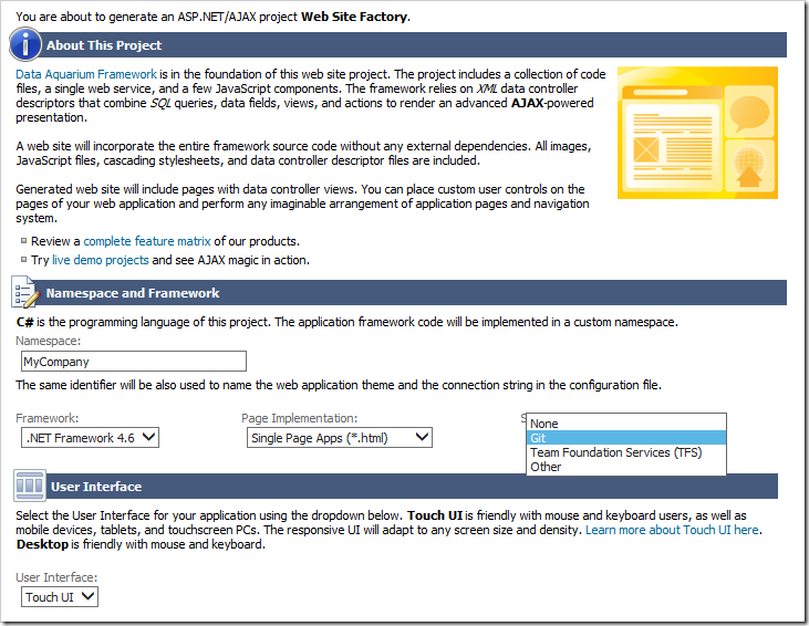
Selecting a source control for the project.

Press the Finish button, and then press “Generate” to generate the application. If the project folder is inspected, two files have been added to the root.
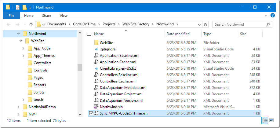
Project with source control now generates sync files.

A default “.gitignore” file is added, based on the standard file created by Visual Studio, with several Code OnTime files listed at the bottom. If TFS source control was selected, a corresponding “.tfignore” file will be added.

The other file will be named “Sync.[Machine Name]-[User Name].xml”. This file holds all transactions made in the Project Designer by the current user and machine. When the application is refreshed, all “Sync.XXX.xml” files at the root of the project will be merged together and sorted by transaction timestamp. The merged file is used to create the “Controllers.Log.xml” and “Application.Log.xml”, which hold transactions that are applied to controllers and application pages, controls, and data views, respectively.

This allows work from multiple machines to be smoothly integrated, without having to deal with manually merging XML files.

Next, let’s push this project to a new repository. This process may differ based on the source control and tool used to initialize the repository.

On the home page of the app generator, select the project name and press Develop to open the project in Visual Studio.

In the Solution Explorer (typically found on the right side of the screen), right-click on the solution node and press “Add Solution to Source Control”.
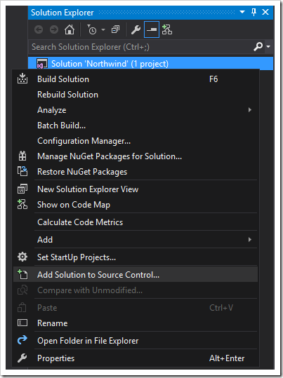
Adding the solution to source control using Visual Studio.

In the “Choose Source Control” popup that opens, select “Git” and press OK.
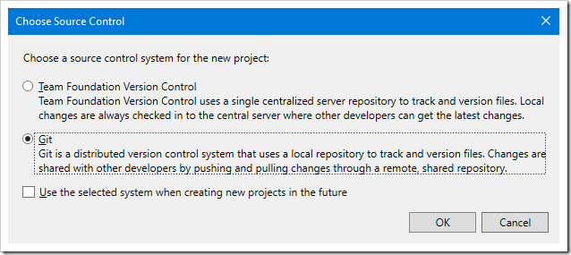
Selecting Git for the source control.

If the Visual Studio Git Provider has not been used before, it will require configuring your user name and email address. Click the “Configure” link, visible at the top of the Team Explorer window, set your desired settings, and press Update.

Next, enter a commit message, and press Commit to create the first commit in your local repository. Make sure that the necessary files are included in the commit.
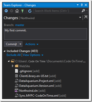
Creating the first commit.

If the commit was successful, a message will appear at the top of the screen, stating that the commit was created. It will also prompt to sync the repository with a server. Click the “Sync” link to sync to a server.

The same screen can be reached by pressing the Home icon from any screen, and selecting “Sync” option.
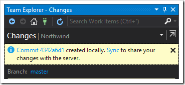
The first commit was created successfully locally. Time to synchronize online.

Several options will be available. For this example, we will use GitHub. If you have not logged into GitHub on this computer, click the “Login” button, enter your credentials, and press “Login” again.
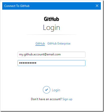
Logging into your GitHub account.

Select “Get Started” link under the “Publish to Github” section.
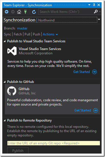
Getting started to synchronize your repo with Github.

Select your account, enter a repository name, and add a description (optional). Please note that private repositories require a subscription on GitHub. If the repository is public, then anyone can find the source code on the Internet. Choose accordingly.

Press Publish to push your repo to GitHub.
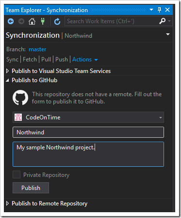
Selecting project name and description for pushing to Github.

Once the upload process is complete, you will be able to access your repository online.
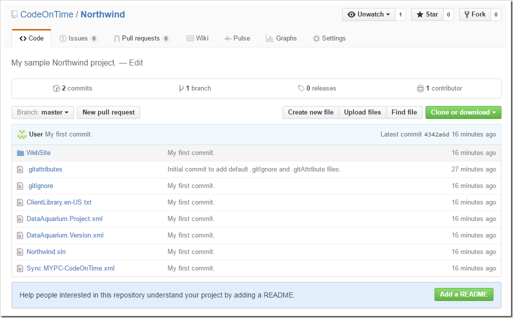
The online repository on Github.

Synchronizing Changes

Now that the repository is online, you will need to synchronize it. Suppose that several changes have been made to the web app. Pages have been shuffled around, data fields customized, models added, business rules changed. Make sure to generate the application before synchronizing any changes.

Open the project in Visual Studio, open the Team Explorer, and select “Changes”. You can also right-click on the solution and press “Commit”.
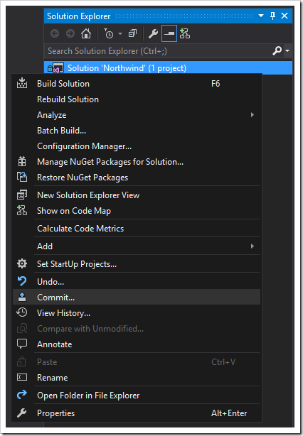
Uploading a new commit to Github.

Enter a commit message, and click the dropdown next to “Commit”.

Press the “Commit” button if you wish to create a local commit, but not upload your changes to the server.

Press “Commit and Push” to upload your commit to the server.

Press “Commit and Sync” to upload your commit, and download any changes that may have been pushed to the server previously.

At this point in time, press “Commit and Push”.
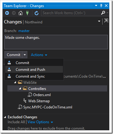
Commiting and pushing your commits to the online server.

When the process is complete, a message will be displayed.

Downloading a Web App From Source Control

Suppose a team member has joined your team. You will need to give your teammate access to your repository. Log into your repository server and give your team member’s account access to the repo.

For a GitHub repo, you will need to navigate to the correct webpage on the GitHub website. Select the Settings tab near the top of the screen, and switch to the “Collaborators & Teams” section. Enter your member’s screen name in the Search bar and press “Add collaborator”.
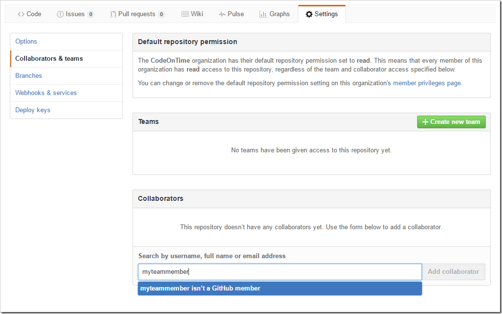
Adding a collaborator to the repo.

On your team member’s computer, start Visual Studio. Press “Open From Source Control…” on the Start Page if visible. Otherwise, press the green Connections icon on the Team Explorer.
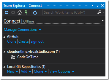
Connect pane in Team Explorer.

Select the “Clone” link under GitHub section. Click the repository you shared with the team member, and enter the correct path. In this case, the path is “~/Documents/Code OnTime/Projects/Web Site Factory”.
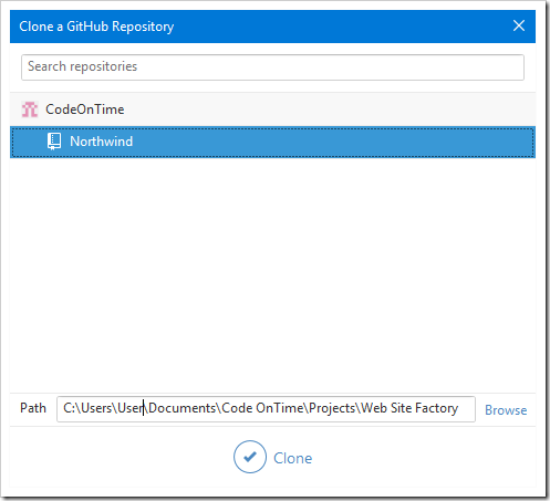
Selecting a repository to clone.

Restart the app generator. If the repository has been placed in the correct location, a new project will appear in the project list.

Pulling Changes From The Server

Suppose that your team member has made some changes, and you wish to pull these changes down to your computer.

Open the project in Visual Studio. In the Team Explorer, select “Sync” button.
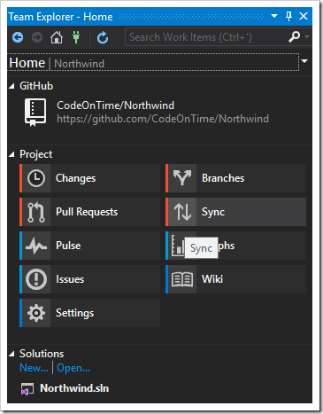
Home page of Team Explorer.

The Synchronization pane offers several options.

The “Fetch” button will download pending commits, but will not integrate changes.

The “Pull” button will download pending commits and perform merge operations if necessary to bring your repository in line with the server.

The “Sync” button will uploading pending commits, downloads commits from the server, and performs merge operations to integrate remote changes with your local changes.

At this time, press “Sync”. The commits made by your coworker will be downloaded and integrated.

One last step is needed. Switch back to Code OnTime app generator. Select the project name, and press “Refresh”. This will integrate synced changes into the current project.

Refreshing the project with Code OnTime app generator to integrate new changes into the project.

Continue to Web Site Factory