Tips and Tricks

Labels
AJAX(112) App Studio(9) Apple(1) Application Builder(245) Application Factory(207) ASP.NET(95) ASP.NET 3.5(45) ASP.NET Code Generator(72) ASP.NET Membership(28) Azure(18) Barcode(2) Barcodes(3) BLOB(18) Business Rules(1) Business Rules/Logic(140) BYOD(13) Caching(2) Calendar(5) Charts(29) Cloud(14) Cloud On Time(2) Cloud On Time for Windows 7(2) Code Generator(54) Collaboration(11) command line(1) Conflict Detection(1) Content Management System(12) COT Tools for Excel(26) CRUD(1) Custom Actions(1) Data Aquarium Framework(122) Data Sheet(9) Data Sources(22) Database Lookups(50) Deployment(22) Designer(178) Device(1) DotNetNuke(12) EASE(20) Email(6) Features(101) Firebird(1) Form Builder(14) Globalization and Localization(6) How To(1) Hypermedia(2) Inline Editing(1) Installation(5) JavaScript(20) Kiosk(1) Low Code(3) Mac(1) Many-To-Many(4) Maps(6) Master/Detail(36) Microservices(4) Mobile(63) Mode Builder(3) Model Builder(3) MySQL(10) Native Apps(5) News(18) OAuth(9) OAuth Scopes(1) OAuth2(13) Offline(20) Offline Apps(4) Offline Sync(5) Oracle(11) PKCE(2) Postgre SQL(1) PostgreSQL(2) PWA(2) QR codes(2) Rapid Application Development(5) Reading Pane(2) Release Notes(184) Reports(48) REST(29) RESTful(29) RESTful Workshop(15) RFID tags(1) SaaS(7) Security(81) SharePoint(12) SPA(6) SQL Anywhere(3) SQL Server(26) SSO(1) Stored Procedure(4) Teamwork(15) Tips and Tricks(87) Tools for Excel(3) Touch UI(93) Transactions(5) Tutorials(183) Universal Windows Platform(3) User Interface(338) Video Tutorial(37) Web 2.0(100) Web App Generator(101) Web Application Generator(607) Web Form Builder(40) Web.Config(9) Workflow(28)
Archive
Blog
Tips and Tricks
Monday, September 18, 2017PrintSubscribe
Executing Requests with the Client API

All apps created with Code On Time app generator contain a single client-side API used for all server-side operations, including Select, Insert, Update, Delete, Report, Batch Edit, etc. One significant advantage of using a centralized API is that any style of user interface is able to access the same API – this has allowed the co-development of Classic and Touch UI.

Another major advantage in the client-side API is that developers are able to extend their apps with custom behavior utilizing the same data access routines – any access control rules, data controller customizations, and security restrictions will also equally apply to these custom requests.

To access the client API from custom JavaScript, simply call the method $app.execute(options) with the required parameters set on the options object. See a list of available options parameters below.

Property Description Default Value
controller The controller to direct the request to. (required)
view The view of the controller to use. grid1
done
success
Callback function when the request was send and received successfully. First argument contains the results. List of records can be found under the result property equal to the name of the controller.
fail
error
Callback function when the request failed.
command The name of the command to execute. “Select”
argument The argument of the command to execute.
lastCommand The last command name.
lastCommandArgument The last command argument.
pageSize The number of records to return in a single page. 100
pageIndex The page number to return. 0
filter An array of field filter objects. Each object must have 3 properties:
- “field” specifies the field name
- “operation” specifies the filter operation to perform
- “value” specifies the value of the filter. For operations with two operands (such as “between”), specify an array of two values.
values An array of field value objects. Each object can have the following properties:
- “name” specifies the name of the field matching the one defined in the controller.
- “value” specifies the current value of the field.
- “newValue” specifies the new value.
- “modified” specifies that the new value will be used in any Insert or Update expressions. Setting “newValue” will set “modified” to true by default.
selectedValues An array of strings that contain the primary keys of the selected records. Used for batch update.
tags Specify a list of tags that can be processed on the server.
requiresData Specifies if data should be returned to the client. true
requiresAggregates Specifies if aggregates defined on the view should be returned with the request. false
fieldFilter Specifies a list of fields to include in the response for each record. Not setting this value will return all fields.
format Specifies if field values should be formatted when the results are returned. true
includeRawResponse Specifies if the result should include the raw response in the rawResponse property. false

The simplest way to test your queries is to use the Developer Tools Console, available in most modern browsers.

First, browse to your running site in your favorite browser. Press “F12” to bring up Developer Tools. Switch to the Console tab.
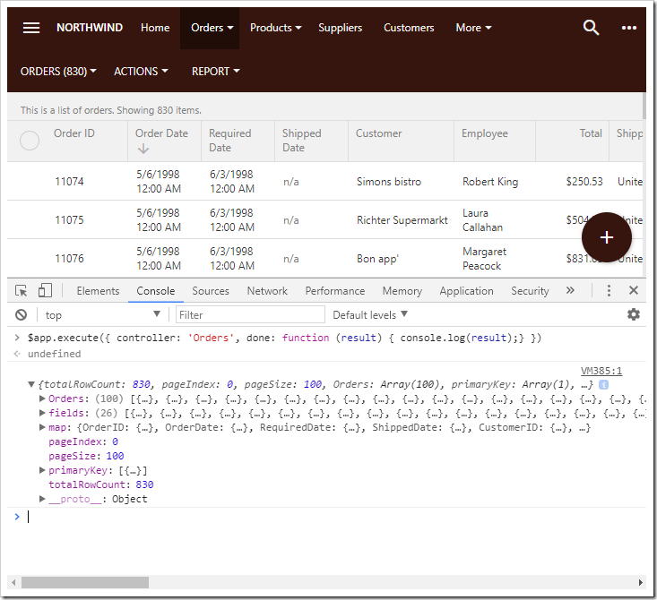
Using the Console tab of Developer Tools to test the $app.execute() API.

You may now begin typing in $app.execute() requests in the console. Note the use of console.log(result), which will print the JavaScript object to the console when the request returns.

The following examples will use the online Northwind sample.

Select

The simplest use case for using the API is to request a page of data. See the following example below on how to fetch the first 10 records from the Orders table where the field “ShipCountry” is equal to “USA”.

$app.execute({
    controller: 'Orders',
    pageSize: 10,
    filter: [
        { field: 'ShipCountry', operator: '=', value: 'USA' }
    ],
    done: function (result) {
        console.log(result);
    }
})

The result shown in the Developer Tools Console.
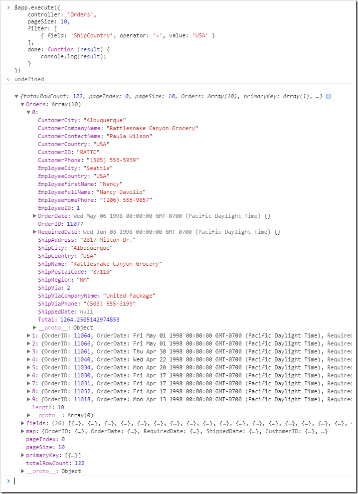
Selecting 10 orders with a filter.

Insert

In order to insert records to a particular table, the request must specify the “Insert” command and a list of field values. This list is represented by the values property. Each field value object contains a field name. Values that will be assigned to the new record are stored in the field value’s newValue property. The primary key of the table is added as a field value object with the property value equal to null in order for the response to return the new primary key of the inserted record.

$app.execute({
    controller: 'Orders',
    command: 'Insert',
    values: [
        { name: 'OrderID', value: null },
        { name: 'ShipCity', newValue: 'San Diego' },
        { name: 'ShipCountry', newValue: 'USA' }
    ],
    done: function (result) {
        console.log(result);
    }
})

See the results below.
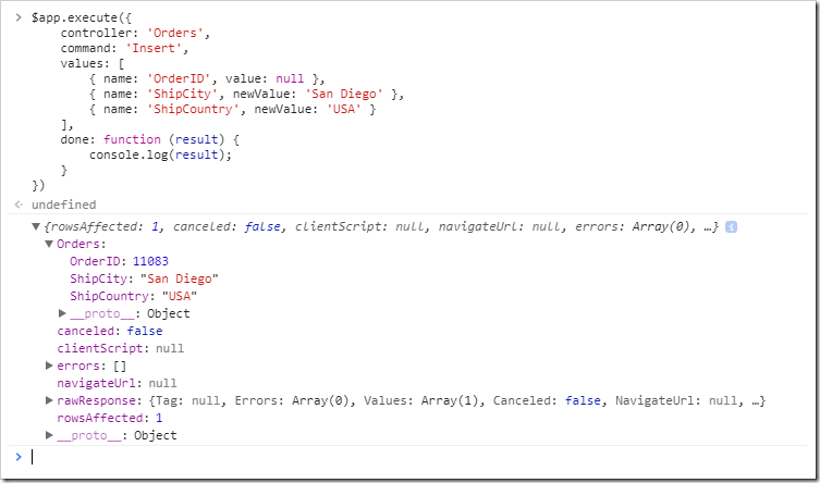
Inserting a record using the $app.execute() API.

Refreshing the view in the browser window will reveal the new record.
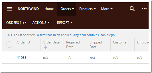
The new record is displayed in the grid.

Update

When performing operations on an existing record, either the primary key or an array of selected values must be specified. New field values must be specified in the newValue property.

$app.execute({
    controller: 'Orders',
    command: 'Update',
    values: [
        { name: 'OrderID', value: 11083 },
        { name: 'OrderDate', newValue: new Date() }
    ],
    done: function (result) {
        console.log(result);
    }
})

The result is shown below.
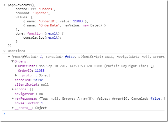
Updating an order via the $app.execute() API.

The result can be seen by refreshing the list of orders.
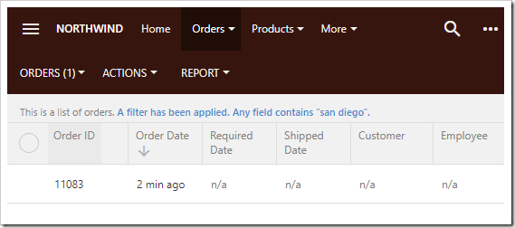
The updated field value is visible by refreshing the page.

Delete

Delete operations must specify the primary key in the values array.

$app.execute({
    controller: 'Orders',
    command: 'Delete',
    values: [
        { name: 'OrderID', value: 11079 }
    ],
    done: function (result) {
        console.log(result);
    }
})

See result below.
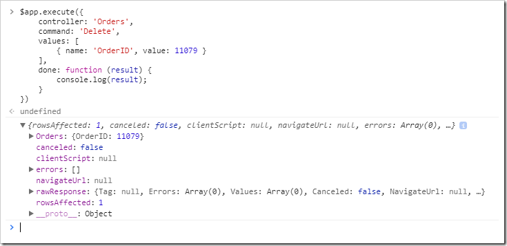
Deleting a record.

The rowsAffected property will be equal to “1” if the record was successfully deleted.

Wednesday, February 8, 2017PrintSubscribe
Customizing the Menu in Touch UI

The menu offers the user access to the pages in your application. The default location of the menu is in the toolbar at the top of the screen. Top level pages will be displayed as tabs in the toolbar. Nested pages can be accessed by pressing on the parent tab. Page icons will be displayed in the dropdown menu. The Quick Launch area of the sidebar will display up to five page icons, if any have been defined. The user can view a full list of pages by pressing the “Apps” icon (three by three grid of dots).

The site menu displayed in the application toolbar at the top of the screen.

If the screen width is insufficient to display the full menu, then the remaining options will be grouped under a “More” option.

If the screen is too narrow to display all menu options, a "More" option will be displayed.

If it is not possible to fit three or more pages, then the menu will be hidden.

The menu is hidden on very small devices.

The user can still access the full menu by pressing the hamburger icon in the top left corner. If any page icons are defined, then a grid of these icons will be displayed in the menu panel.

The menu panel will display a grid of page icons.

The full site map will be displayed if no page icons are defined, or when the user presses “More” in the menu panel.

The full site menu is visible in the menu panel.

Moving the Menu to the Sidebar

Depending on project requirements, it may be desirable to move the menu from the toolbar to the sidebar. One way of changing the location is to change “Menu Location” property under the Touch UI section of the Features page in the Project Wizard.

The other way to change the menu location is to set the ui.menu.location property in the “~/WebSite/touch-settings.json” file to “sidebar”. We will use this technique.

Start the app generator. Press on the project name, and press “Open” to reveal the project folder in File Explorer. Navigate to the WebSite folder, and double-click the “touch-settings.json” file to open in your default text editor. It is recommended to use Visual Studio or other editor that supports syntax highlighting and validation.

Opening the "touch-settings.json" file under the WebSite folder of the project directory.

Replace or merge the contents of the file with the following:

{
  "ui": {
    "menu": {
      "location": "sidebar",
      "apps": {
        "tiles": null,
        "location": null
      }
    }
  }
}

The ui.menu.location property has been set to “sidebar”.

Switch back to the browser, and refresh the app. The menu will now be rendered in the sidebar.

The Touch UI menu rendered in the sidebar.

Changing the Location of the “Apps” Icon

The “Apps” icon offers access to the full site menu. By default, it is displayed in the Quick Launch area of the sidebar.

The "Apps" icon is displayed in the Quick Launch area of the sidebar.

The “Apps” icon location can be changed using the ui.menu.apps.location property. The default value, shown in the picture above, is “sidebar”. The icon can also be placed in the toolbar. Make the following change to your touch-settings.json file:

{
  "ui": {
    "menu": {
      "location": "sidebar",
      "apps": {
        "tiles": null,
        "location": "toolbar"
      }
    }
  }
}

Save the file, and refresh the web page. The result of the change can be seen below. Notice that an additional page icon is now displayed in the Quick Launch area.

The "Apps" icon is rendered in the toolbar.

Disabling the “Apps” grid

Activating the “Apps” icon, or opening the menu panel on a small device, will show a grid of page icons. The rest of the pages can be accessed by pressing the “More” button.

The "Apps" icon will display an "Apps" grid if any page icons are available.

The “Apps” grid can be disabled by setting the ui.menu.apps.tiles property to “false”. Make the corresponding change to your touch-settings.json file:

{
  "ui": {
    "menu": {
      "location": "sidebar",
      "apps": {
        "tiles": false,
        "location": "toolbar"
      }
    }
  }
}

Save the file, and refresh the app. Press the “Apps” icon in the sidebar or toolbar. The full site menu will be shown, bypassing the “Apps” grid.

Disabling tiles will bypass the "Apps" grid.

Sunday, February 5, 2017PrintSubscribe
Page Icons

In Touch UI apps, icons can be assigned to pages in order to convey additional meaning to the users. Up to five page icons will be displayed in the Quick Launch area at the bottom of the sidebar.

Icons displayed in menus and Quick Launch area of the sidebar.

Let’s customize the default Northwind app. Initially, this app does not have any icons assigned to pages. Only “Apps” and “Settings” icons are displayed in the Quick Launch area.

Default Northwind app has no page icons assigned.

Pressing the “Apps” button will reveal a site map with no icons.

The "Apps" menu will display the site map.

Let’s assign some icons to the primary pages in our app to help the user find them quickly.

Start the Project Designer. In the Project Explorer on the right side of the screen, double-click on Customers page node.

The Customers page of the sample Northwind app.

Icons can be defined by specifying the icon library plus the icon name. Replace spaces with dashes.

Let’s assign the “group” icon from the Material Icons library.

Property Value
Icon / Custom Style material-icon-group

Press OK to save the page. Double-click on the “Orders” page, and make the following change.

Property Value
Icon / Custom Style material-icon-shop

Save the change, and double-click on “Products” page to set an icon.

Property Value
Icon / Custom Style material-icon-local-offer

On the toolbar, press Browse. When generation is complete, the app will open in the default browser. Notice that the first three page icons are displayed in Quick Launch. If the “apps” button is disabled or moved to the toolbar, an additional page icon will be displayed. If “Settings” button is disabled, another icon slot will become available.

Notice that some themes will emphasize the Quick Launch area if at least one page icon is defined. Page icons will also be displayed in toolbar menu dropdowns.

Icons have been assigned to pages. Icons are added to the Quick Launch area of the sidebar.

Pushing the hamburger button in the top left corner will expand the sidebar. The Quick Launch area will rotate to fit horizontally.

Expanding the sidebar will rotate the Quick Launch area.

Press the “Apps” button to reveal the site menu. Notice that pages with an assigned icon will be placed in a grid at the top of the menu.

Activating the "Apps" menu will display a grid of icons representing pages.

Pressing “More” will reveal the full site map. Icons will be displayed next to their assigned page.

Pressing "More" from the "Apps" menu will display the site map.