Mobile

Labels
AJAX(112) App Studio(7) Apple(1) Application Builder(245) Application Factory(207) ASP.NET(95) ASP.NET 3.5(45) ASP.NET Code Generator(72) ASP.NET Membership(28) Azure(18) Barcode(2) Barcodes(3) BLOB(18) Business Rules(1) Business Rules/Logic(140) BYOD(13) Caching(2) Calendar(5) Charts(29) Cloud(14) Cloud On Time(2) Cloud On Time for Windows 7(2) Code Generator(54) Collaboration(11) command line(1) Conflict Detection(1) Content Management System(12) COT Tools for Excel(26) CRUD(1) Custom Actions(1) Data Aquarium Framework(122) Data Sheet(9) Data Sources(22) Database Lookups(50) Deployment(22) Designer(177) Device(1) DotNetNuke(12) EASE(20) Email(6) Features(101) Firebird(1) Form Builder(14) Globalization and Localization(6) How To(1) Hypermedia(2) Inline Editing(1) Installation(5) JavaScript(20) Kiosk(1) Low Code(3) Mac(1) Many-To-Many(4) Maps(6) Master/Detail(36) Microservices(4) Mobile(63) Mode Builder(3) Model Builder(3) MySQL(10) Native Apps(5) News(18) OAuth(9) OAuth Scopes(1) OAuth2(13) Offline(20) Offline Apps(4) Offline Sync(5) Oracle(11) PKCE(2) Postgre SQL(1) PostgreSQL(2) PWA(2) QR codes(2) Rapid Application Development(5) Reading Pane(2) Release Notes(183) Reports(48) REST(29) RESTful(29) RESTful Workshop(15) RFID tags(1) SaaS(7) Security(81) SharePoint(12) SPA(6) SQL Anywhere(3) SQL Server(26) SSO(1) Stored Procedure(4) Teamwork(15) Tips and Tricks(87) Tools for Excel(2) Touch UI(93) Transactions(5) Tutorials(183) Universal Windows Platform(3) User Interface(338) Video Tutorial(37) Web 2.0(100) Web App Generator(101) Web Application Generator(607) Web Form Builder(40) Web.Config(9) Workflow(28)
Archive
Blog
Mobile
Friday, January 31, 2014PrintSubscribe
User Guide for Mobile Forms

Mobile apps created with Code On Time will display a form view in response to many user actions. A form will present data for a single database table record as a list of fields.

Navigating in a Form

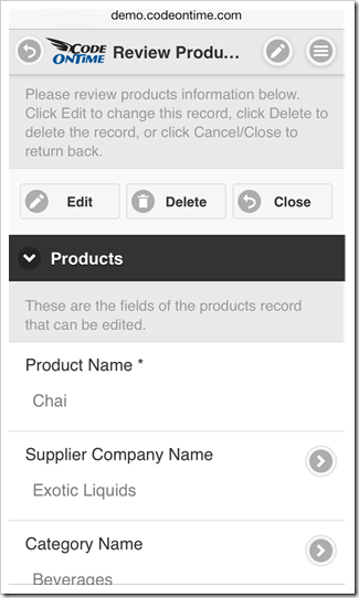
Here is an example of a form displayed in response to a tap on an item in a list of products.
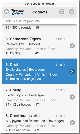
Tap on an item in a list will transition to a form view in a mobile app created with Code On Time mobile app generator.  A form view with portrait orientation displayed by iPhone 5s in a mobile app created with Code On Time mobile app generator.

A field label is displayed above the field value on devices with smaller screens. If orientation of a mobile device is changed, then a label will be displayed on the left side of the field value.
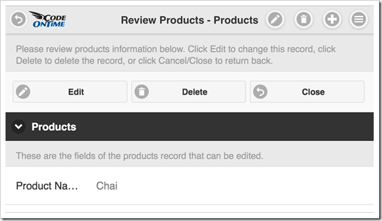
A form view of a mobile created with Code On Time mobile/desktop application generator is presented in landscape orientation.

Note that a change in orientation will also reveal additional user interface elements. Actions “Edit”, “Delete” and “New” are visible on the application toolbar in the top right corner of the screen.  Action “Edit” is the only available choice available on the mobile phone with a portrait orientation. Mobile apps created with Code On Time have a responsive design that ensures optimal viewing on a device with any screen size.

If a field label is too long, then it may become partially hidden. Tap and hold a field label for three quarters of a second to see a hint with the full label text.
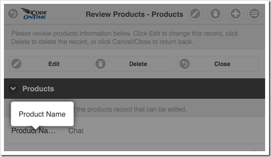
Tap and hold a label in a form view for about a second to see the full text in a popup in mobile apps created with Code On Time mobile app generator.

Fields of a form are grouped in one or more categories defined by the application. Tap a category to collapse a list of fields. Tap the same category again to have it expanded.
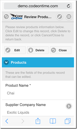
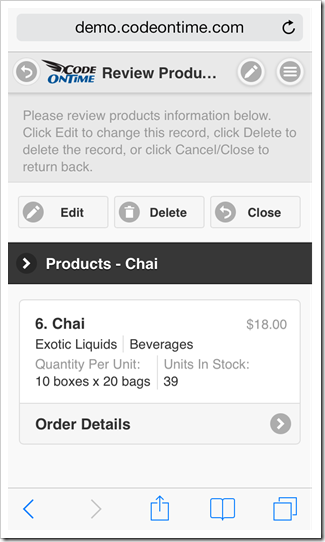
Tap a field category in a form view to have it collapsed in mobile apps created with Code On Time mobile app generator.   A collapsed field category in a form of a mobile app created with Code On Time mobile app generator.

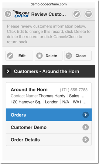
An item card with a summary of a data record will be displayed at the bottom of a form view when on a master-detail page. Links to related detail lists are displayed below the card.

Tap a link under the card and the form will transition to a list with corresponding items.
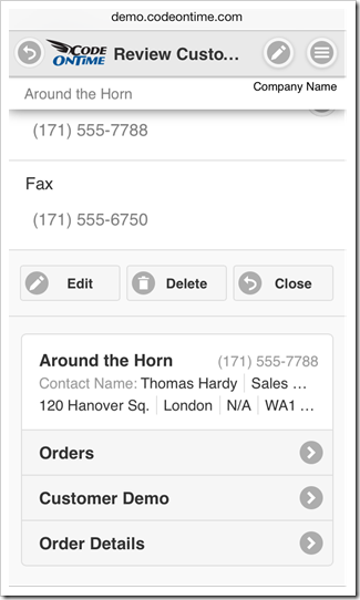
A summary card with links to details of the selected master record is dislayed in master-detail pages of mobile apps created with Code On Time mobile app generator.   Tap on the detail link below the summary card to see a list of details in a mobile created with Code On Time mobile database app generator.

Actions in Forms

The context menu provides access to all actions available in a form view. Tap the context menu icon on the right side of the toolbar to see the menu of actions.
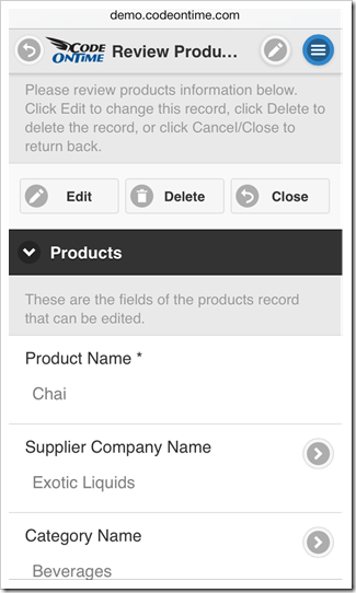
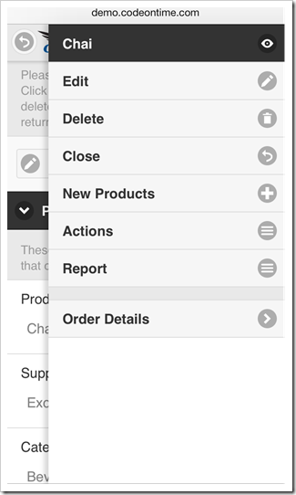
Tap a context menu button on the toolbar to see a complete list of actions available in a mobile app created with Code On Time mobile database app generator.   A context menu panel with a list of actions available in a form view on a mobile app created with Code On Time mobile/desktop application generator.

A context menu sidebar will be docked to the right side of mobile devices with a larger screen. Context menu button is not visible if the sidebar is docked.
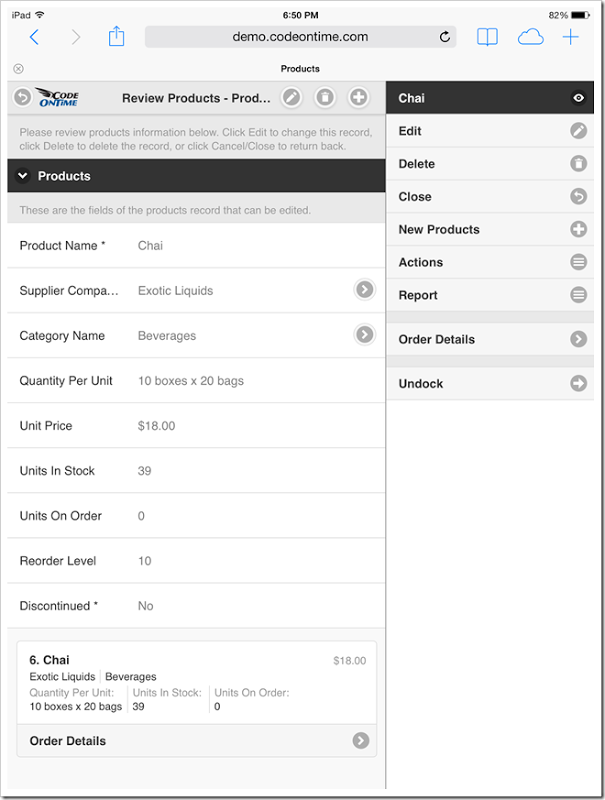
Form view actions listed in the docked sidebar on iPad Air in a mobile app created with Code On Time mobile/desktop app generator.

A subset of available actions is presented on the application toolbar as icons. The number of visible icons depends on the screen size.

Tap an icon to activate the corresponding action.

Tap a toolbar icon to activate a corresponding action available in a form view of an app created with Code On Time mobile app generator.

Form view may also display action buttons at the top and bottom of the view if the sidebar is undocked. The number of visible action buttons depends on the screen size. Tapping on a button will execute an action, which may result in a different set of buttons becoming available.
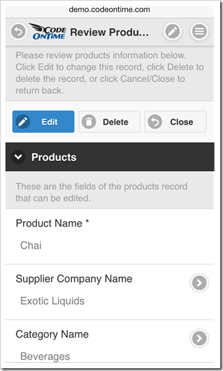
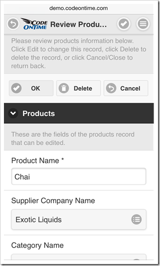
Editing of a data record in a form is activated when 'Edit' button is tapped in a mobile app created with Code On Time database mobile app generator.   A form view is displayed in edit mode in response to 'Edit' action in a mobile app created with Code On Time mobile database app generator.

Entering Data in Forms

Application form view will display input controls in response to “Edit” and “New” actions. Ability to create or edit data is controlled by the application and may not be available to all users.

Tap and hold a field value in a form view to quickly execute “Edit” action. The form will switch to “Edit” mode in response to tap and hold.  The form will set a focus on the field input control if you continue holding a finger on the screen of your mobile device.
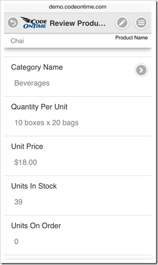
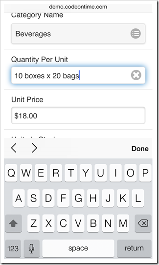
Tap and hold a field value in the form view to activate 'Edit' mode in a mobile apps created with Code On Time mobile app generator.  Extended 'tap and hold' on a field value will set focus on the field input control in a mobile app created with Code On Time mobile database app generator.

Form view will activate a standard text input keyboard on mobile devices when a text field is focused.

A numeric native keyboard is activated if the field has a numeric data type.
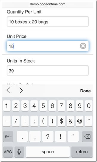
A numeric keyboard is displayed when a numeric field is focused in a form view of a mobile app created with Code On Time mobile app generator.

Fields configured to capture phone numbers will also have a dedicated input keyboard.
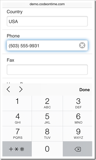
A 'phone number' keyboard is displayed when a 'phone' field is focused in a form view of a mobile app created with Code On Time mobile app generator.

Specialized native keyboards will also display if the focused text field is configured as URL or Email.

Lookup fields with lists of values will be displayed as native input controls.
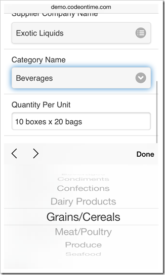
A native 'select' input control is displayed for lookup fields with lists of values in mobile apps created with Code On Time mobile database app generator.

Focused date fields will cause a native date input control to display. The type of control depends on the operating system of a mobile device.

Date input control on iPhone 5 is shown next.
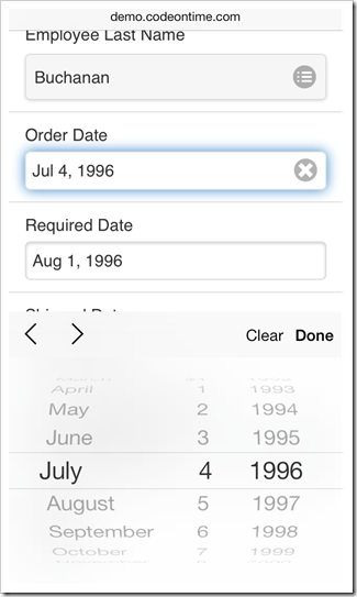
A native date input control of iOS 7 is shown in a form view of a mobile app created with Code On Time application generator.

Date input control on Nexus 7 is shown in this screenshot.
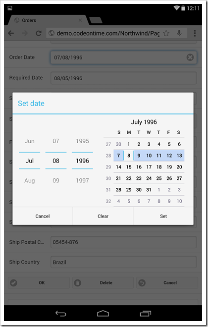
A native Android date input control is visible in a form view of a mobile app created with Code On Time mobile database app generator.

A specialized native date-time input control is displayed for fields that  allow capturing both date and time.

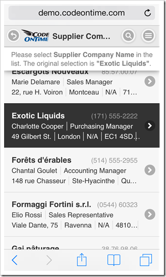
Database applications frequently require complex search criteria when selecting lookup values. It is possible that lookup tables contain many thousands of possible choices. Code On Time mobile apps are automatically configured to display a custom lookup input control for database lookup fields.

A lookup input control is shown before and after a tap on the field value.
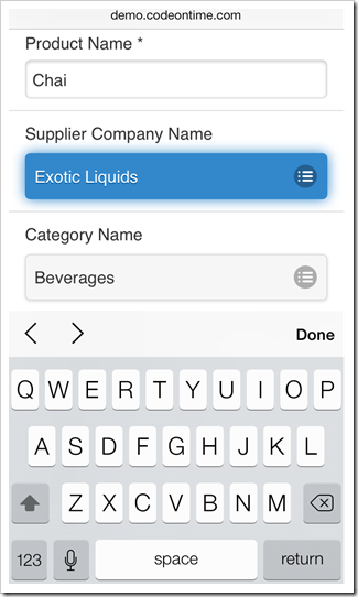
A database lookup input is displayed in a form view of a mobile app created with Code On Time mobile app generator.   A list of lookup values with support for endless scrolling, search, filtering, and sorting is displayed in a mobile app created with Code On Time mobile database application generator.

A list of lookup values behaves in exactly the same fashion as standalone lists with support for endless scrolling, search, filtering,  and sorting. Existing lookup items can be modified and new ones can be created if allowed by application business logic.

Advanced Form View Features

Application may define a status bar explaining a workflow status of a data item selected in a form view. The status bar is displayed at the top of the form. The contents of the status bar can be scrolled with horizontal swiping motions.
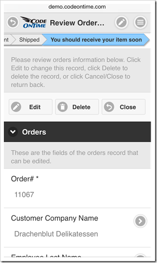
Status bars help users to understand the workflow status of items selected in a form view in mobile apps created with Code On Time mobile/desktop application generator.

Fields of complex forms are frequently organized in multiple categories. Categories can be independently collapsed and expanded. The screenshot shows a form with multiple categories displayed in iPad Air.
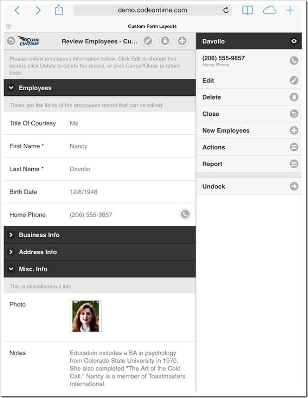
Collapsible field categories makes easier to work with large number of fields in mobile apps created with Code On Time mobile app generator.

Categories can be further organized with tabs. Tabs are displayed at the bottom of a form view. This screenshot shows a tabbed form with multiple categories displayed in Nexus 7 tablet.
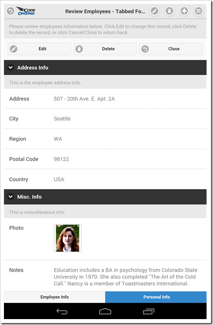
A form view with multiple categories and tabs in a mobile app created with Code On Time app generator.

If a form view is scrolled down, then a heading with the value of an identifiable data field may be displayed below the toolbar. This will happen if an identifiable field is not visible on the screen. The identifiable field is displayed as the first data element in lists.
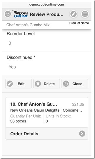
A heading with the value of identifiable field is dispalyed when a user scrolls down a form view in mobile apps created with Code OnTime mobile app generator.

The heading will disappear if a user starts editing data or scrolls the identifiable field back into view. Tap on the heading to have it hidden.

Thursday, January 30, 2014PrintSubscribe
User Guide for Mobile Lists

List is a common presentation style of data on mobile devices. Limited screen size calls for a stacked enumeration of data fields. Some fields may be provided with descriptive labels.

A list view in a mobile app created with Code On Time mobile app generator.

Applications produced with Code On Time have a responsive user interface design. Predefined and dynamic breakpoints will ensure that a list displays more fields with optional labels on a larger screen whenever possible. A simple change of a mobile device orientation will reveal additional information in list items.

 A list view on a mobile device with landscape orientation reveals addtional item details in a an app created with Code On Time mobile app generator.

Scrolling Items

User can scroll down to see items that are not visible on screen. Only a limited set of available data items is included in the initial rendering of a list. A special item labeled “Loading…” will become visible for a brief moment upon reaching the bottom of a list. Application detects that a user has reached the last visible list item and loads additional set of items from the server if they exist.

A list of items is about to be extened at the bottom in a mobile app created with Code On Time mobile app generator.   Additonal items were automatically loaded in a list after reaching the bottom of the initial data set in a mobile app created with Code On Time mobile app generator.

If a data item is edited or inserted by a user, then the application will retrieve a set of items containing the change.  That item will be displayed with an alternative background to indicated that it has been selected.

It is possible that the set of items with the selection is located somewhere in the middle of the entire data set. Scrolling up will reveal “Loading…” item at the top of the list in this case. Additional  items will become available shortly after an automatic interaction with the server.

A list is about to retreive additional items at the top in the mobile app created with Code On Time mobile app generator.   A list after additional items were loaded at the top in the app created with Code On Time mobile app generator.

Selecting an Item

There are two main methods of selecting an item in a list. The user can either tap an item or tap and hold an item for brief period of time. A tap on an item will cause an-application defined action to execute. Typically another view of data is displayed in response.

A tap on a list item will activate an application-defined action in a mobile-app created with Code On Time mobile app generator.   A form view of data item is displayed in response to an item tap in a mobile created with Code On Time mobile app generator.

Tapping and holding an item for three quarters of a second will cause an item to be selected but no action will be executed. This will result in item-specific actions to become available in the user interface of the list.

For example, the list without a selection offers “New” and “Search” actions on the  toolbar of a mobile app just before an item is tapped by a user. The tapped item will be illuminated for a moment with a highlighted background.

Actions 'Search' and 'New' are visible on the mobile application toolbar just before an item is tapped in the app created with Code On Time mobile app generator.

Selection of an item with “tap and hold” will cause “Edit”, “Delete”, and “Search” actions to show up. The selected item will have an alternative background.

Actions 'Edit', 'Delete', and 'Search' are available on application toolbar of a mobile app created with Code On Time mobile app generator.

Additional actions and presentation options can be accessed from the context menu of a list. The context menu will slide out after a user taps on the “Context Menu” button on the application toolbar.

Context menu is always available on the application toolbar of a mobile app created with Code On Time mobile app generator.   Context menu slides out in response to a tap on the 'Context Menu' button on the application toolbar of a mobile app created with Code On Time mobile app generator.

View Configuration

The first item in the context menu shows the name of the view and the total number of items available. Tap this item to display the view configuration options.

'View Configuration' menu option displays the name of the current view and number of items in a list displayed by a mobile app created with Code On Time mobile application generator.

A list may have a few application-defined alternative views of data with custom fields, sort order, and filter. Tap an alternative view of data to have it activated.

The list of available view configuration options in a mobile app created with Code On Time mobile application generator.   Alternative view option selected in the view configuration menu of a mobile app created with Code On Time mobile application generator.

The list will display the selected view of data.

An alternative view of customer list displayed in a mobile application created with Code On Time mobile/desktop app generator.

Presentation styles “List” and “Cards” are available in the view configuration of any list. The default presentation style of a list is “Cards”. This presentation style allows a list to be displayed in multiple columns if the screen size of a mobile device makes it possible.

The default presentation style 'Cards' displays three columns of items in a list of a mobile app when displayed in iPad Air. The application has been created with Code On Time mobile app generator.

Presentation style “List” will force the list to be displayed in a single column regardless of the screen resolution. This will result in more details to be visible in each item of a list on a larger screen.

Presentation style 'List' will force a list to display a single column of items regardless of the screen resolution of a mobile device. This presentation style is shown in a list of a mobile app created with Code On Time mobile app generator.

Note that additional presentation styles of data such as “Grid”, “Chart”, “Map”, and “Calendar” may be visible in the view configuration options as defined by application.

The selection of alternative view or presentation style will be “memorized” on the mobile device and remain specific to the user identity and list instance on the application page.

User can refresh the list items by choosing “Refresh” option in the view configuration menu. Any changes to the list data by other users will become visible on the mobile device.

'Refresh' option selected in the configuration menu of a list in a mobile app created with Code On Time mobile app generator.

Adding an Item

If a user swipes to the end of a list, then an additional item that allows executing “New” action is displayed at the bottom. This action is application-defined and may not be accessible to all users.

User can tap on the item to start entering a new data record.

An option to create a new item is displayed at the bottom of a list in a mobile app created with Code On Time mobile application generator.   User can start entering a new item by tapping on the option at the bottom of a list in a mobile app created with Code On Time mobile/desktop app generator.

Empty Lists

An empty list may be displayed to a user if the database table is empty or if the current list filter has produced no matches. Action shortcut “Refresh” and optional shortcut “New” will be displayed in the list.

Options to refresh a list and to create a new item are displayed in an empty list of a mobile app created with Code On Time mobile app generator.

List Heading

A list may display a heading item with a brief description of the list contents. If a list is scrolled down, then the heading will “stick” to the toolbar.

An optional list description is displayed before the first list item in a mobile app created with Code On Time mobile app generator.   A list description with a fixed position at the top of the toolbar is displayed when a list is scrolled in a mobile app created with Code On Time mobile app generator.

User can tap on the heading to dismiss it.

Saturday, January 25, 2014PrintSubscribe
Mobile Responsive Web Design

A mobile application created with Code On Time has a Responsive Web Design. User interface is automatically adjusted for optimal viewing experience on any client device.  Generated applications will run equally well in modern HTML5 browsers of smart phones, tablets, and desktop computers.

Consider the mobile demo built on top of the Northwind database to explore Responsive Web Design in action. The fluid application user interface is shown on Apple iPhone 5, Apple iPad Air, and Google Nexus 7.

iPhone 5

The following screen shot shows iPhone 5 with a list of products. A customer record is selected. The phone numbers of all customer are clearly visible with the business names partially hidden. A label is displayed next to the contact names. Partial address of customers is listed in the the last row of each list item. Context menu and  search icons are visible on the right-hand side of the  toolbar.

Mobile app created with Code On Time displayed in portrait orientation on Apple iPhone 5s.

Change the phone orientation to landscape. A full name of each customer is now visible. An additional label shows next to the contact title. Application toolbar also features two additional icons “Edit” and “Delete”.

Mobile app created with Code On Time displayed in landscape orientation on Apple iPhone 5s.

Tap the selected record or click “Edit” icon on the toolbar and switch to portrait orientation.

The selected record is now displayed in a form view. Labels are positioned on top of field values. Icon “Edit” is displayed on the toolbar next to the “Context Menu”  button.

Form view of a mobile app created with Code On Time displayed in portrait orientation on Apple iPhone 5s.

Click “Edit” button and change orientation of the mobile device to landscape. Labels are now positioned on the left side of the corresponding fields. Two additional icons “OK” and “Delete” are visible on the toolbar.

Form view of a mobile app created with Code On Time displayed in landscape orientation on Apple iPhone 5s.

Action buttons are displayed in the form views with additional shortcuts duplicated on the toolbar. If the text of a button is too long, then the button icon is migrated to the top while the text is displayed at the bottom of a button. You can see this in action in the screen shot of the same mobile app with a Spanish localization.

Form view of a localized mobile app created with Code On Time displayed in portrait orientation on Apple iPhone 5s.

iPad Air

Tablets with ultra-high resolution offer a significantly larger screen as compared to a typical smart phone. Mobile apps created with Code On Time will take a full advantage of the available screen real estate.

The list of customers shown below is much easier to read. The right-hand side of the screen is occupied by a docked sidebar with context actions. Actions “Edit”, “Delete” and “Search” are also duplicated on the toolbar as icons.

Mobile app created with Code On Time displayed in portrait orientation on Apple iPad Air.

Change the device orientation to landscape and observe a two-column list of items. The default mode of “list” presentation in Code On Time mobile apps is called “Cards”. List items are rendered as “cards” as soon as a sufficient screen width is detected.

Mobile app created with Code On Time displayed with docked sidebar in landscape orientation on Apple iPad Air.

If the sidebar is undocked, then a two-column list of cards is displayed in portrait mode as well.

Mobile app created with Code On Time displayed with undocked sidebar in portrait orientation on Apple iPad Air.

Landscape-oriented iPad Air displays three columns of cards when the sidebar is undocked. Numerous action shortcuts are now visible on the toolbar of the mobile app.

Mobile app created with Code On Time displayed with undocked sidebar in landscape orientation on Apple iPad Air.

Users can also enable a “list” mode as an alternative to “cards”.  The following screenshot shows an open context menu with the “List” presentation style selected. The list of customers features labels next to each component of the address (Address, City, Region, etc.).

Mobile app created with Code On Time displayed with undocked sidebar in 'List' mode with portrait orientation on Apple iPad Air.

The form view in this screen shot shows customer data fields with available actions conveniently displayed in the docked sidebar.

Form view of a mobile app created with Code On Time displayed with docked sidebar in portrait orientation on Apple iPad Air.

Undocking of the sidebar will cause some of the available actions to render as actions buttons.

Form view of a mobile app created with Code On Time displayed with undocked sidebar replaced by action buttons in portrait orientation on Apple iPad Air.

Nexus 7

Users of a smaller tablet will also enjoy the benefits of addition screen real state. List of customers displays actions “Edit”, “Delete”, and “Search” next to the “Context Menu” on the toolbar. Data fields are clearly visible in portrait mode.

Mobile app created with Code On Time displayed in portrait orientation on Google Nexus 7.

A sidebar with context actions is displayed in the portrait mode of Nexus 7 tablet.

Mobile app created with Code On Time displayed with docked sidebar in landscape orientation on Google Nexus 7.

Undocking of a sidebar will cause a two-column display of list item “cards” with additional buttons on the toolbar of the mobile app.

Mobile app created with Code On Time displayed with undocked sidebar and two-column list of 'cards' in landscape orientation on Google Nexus 7.

Landscape orientation of a tablet with docked sidebar allows easy access to context actions when editing data in a form view.

Form view of a mobile app created with Code On Time displayed with docked sidebar in landscape orientation on Google Nexus 7.

Context actions are instantly exposed as action buttons when orientation of the mobile device is changed to portrait.

Form view of a mobile app created with Code On Time displayed with action buttons in portrait orientation on Google Nexus 7.

Other Devices

Exactly the same fluid and responsive web design is demonstrated on other types of devices. You can see the app rendered in a desktop version of Internet Explorer 10.

Mobile app created with Code On Time displayed in a desktop version of IE 10.

Code On Time turns development of line-of-business mobile applications in a fast assembly line while offering the same “mobile” style presentation on desktop devices as well. Only one version of the app must be developed while covering a wide range of mobile and desktop devices.

Applications produced with Unlimited edition of the app generator will also feature a dedicated version of the desktop presentation style that may benefit some groups of users as well.

If you are building a mobile app then a “desktop” version of it has already been created. The opposite is also true.

Universal Mobile/Desktop Client of an app created with Code On Time displayed with 'desktop' presentation style in IE 10.