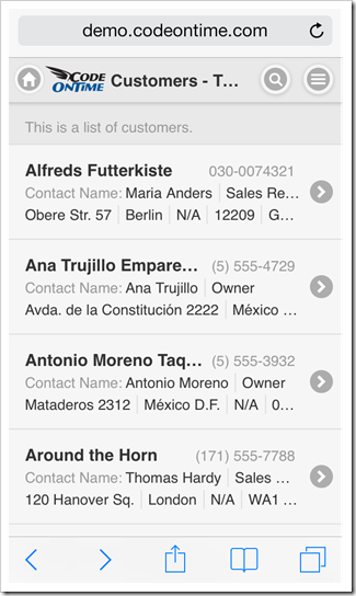
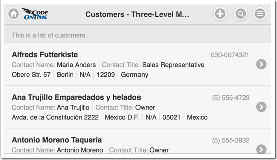
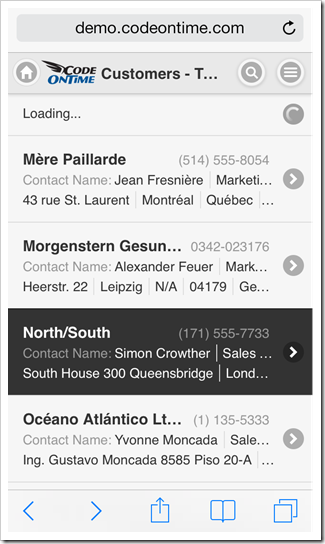
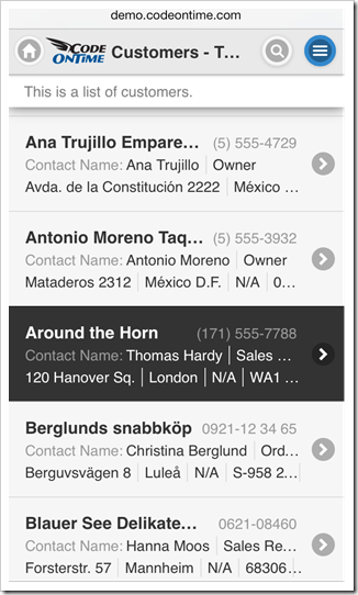
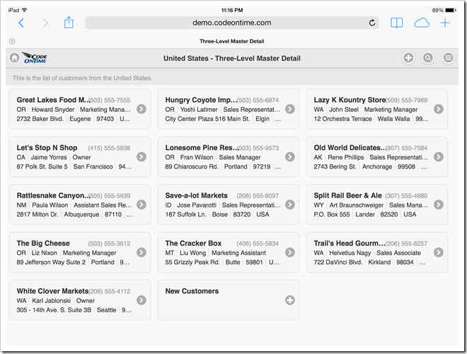
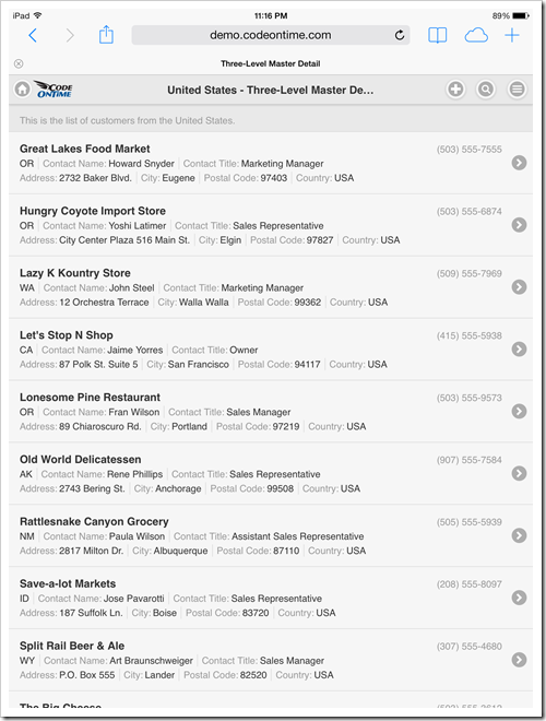
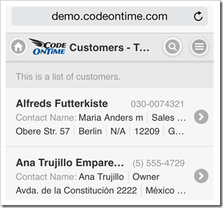
List is a common presentation style of data on mobile devices. Limited screen size calls for a stacked enumeration of data fields. Some fields may be provided with descriptive labels.
Applications produced with Code On Time have a responsive user interface design. Predefined and dynamic breakpoints will ensure that a list displays more fields with optional labels on a larger screen whenever possible. A simple change of a mobile device orientation will reveal additional information in list items.
Scrolling Items
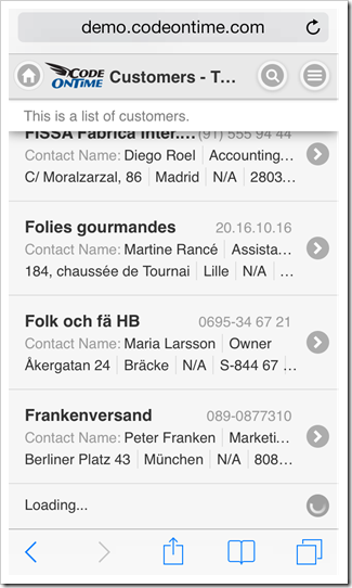
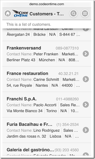
User can scroll down to see items that are not visible on screen. Only a limited set of available data items is included in the initial rendering of a list. A special item labeled “Loading…” will become visible for a brief moment upon reaching the bottom of a list. Application detects that a user has reached the last visible list item and loads additional set of items from the server if they exist.
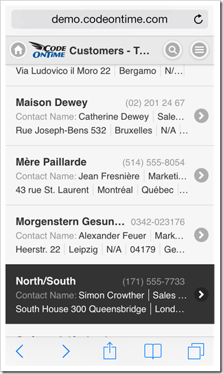
If a data item is edited or inserted by a user, then the application will retrieve a set of items containing the change. That item will be displayed with an alternative background to indicated that it has been selected.
It is possible that the set of items with the selection is located somewhere in the middle of the entire data set. Scrolling up will reveal “Loading…” item at the top of the list in this case. Additional items will become available shortly after an automatic interaction with the server.
Selecting an Item
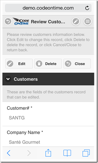
There are two main methods of selecting an item in a list. The user can either tap an item or tap and hold an item for brief period of time. A tap on an item will cause an-application defined action to execute. Typically another view of data is displayed in response.
Tapping and holding an item for three quarters of a second will cause an item to be selected but no action will be executed. This will result in item-specific actions to become available in the user interface of the list.
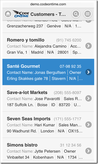
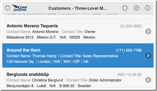
For example, the list without a selection offers “New” and “Search” actions on the toolbar of a mobile app just before an item is tapped by a user. The tapped item will be illuminated for a moment with a highlighted background.
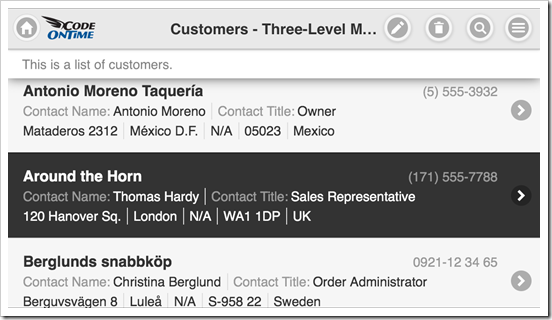
Selection of an item with “tap and hold” will cause “Edit”, “Delete”, and “Search” actions to show up. The selected item will have an alternative background.
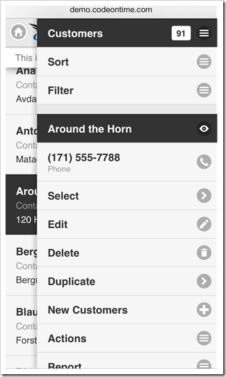
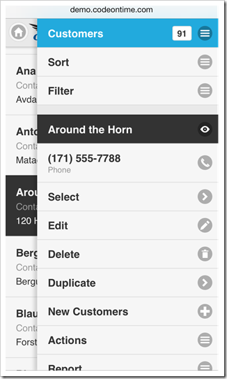
Additional actions and presentation options can be accessed from the context menu of a list. The context menu will slide out after a user taps on the “Context Menu” button on the application toolbar.
View Configuration
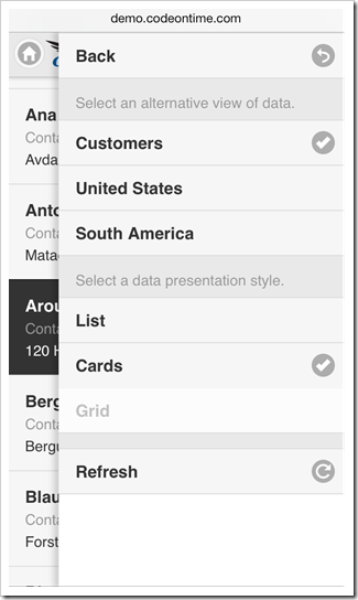
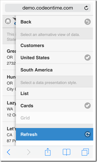
The first item in the context menu shows the name of the view and the total number of items available. Tap this item to display the view configuration options.
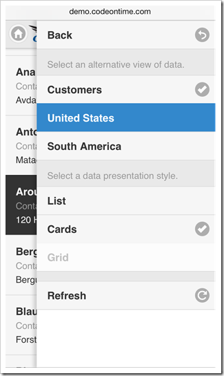
A list may have a few application-defined alternative views of data with custom fields, sort order, and filter. Tap an alternative view of data to have it activated.
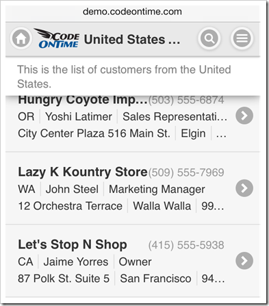
The list will display the selected view of data.
Presentation styles “List” and “Cards” are available in the view configuration of any list. The default presentation style of a list is “Cards”. This presentation style allows a list to be displayed in multiple columns if the screen size of a mobile device makes it possible.
Presentation style “List” will force the list to be displayed in a single column regardless of the screen resolution. This will result in more details to be visible in each item of a list on a larger screen.
Note that additional presentation styles of data such as “Grid”, “Chart”, “Map”, and “Calendar” may be visible in the view configuration options as defined by application.
The selection of alternative view or presentation style will be “memorized” on the mobile device and remain specific to the user identity and list instance on the application page.
User can refresh the list items by choosing “Refresh” option in the view configuration menu. Any changes to the list data by other users will become visible on the mobile device.
Adding an Item
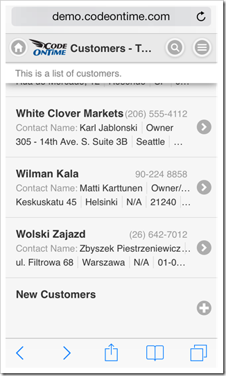
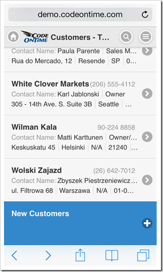
If a user swipes to the end of a list, then an additional item that allows executing “New” action is displayed at the bottom. This action is application-defined and may not be accessible to all users.
User can tap on the item to start entering a new data record.
Empty Lists
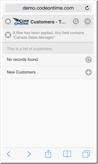
An empty list may be displayed to a user if the database table is empty or if the current list filter has produced no matches. Action shortcut “Refresh” and optional shortcut “New” will be displayed in the list.
List Heading
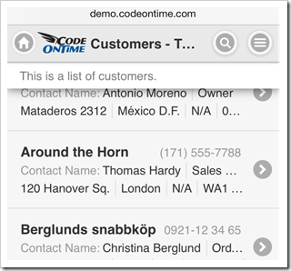
A list may display a heading item with a brief description of the list contents. If a list is scrolled down, then the heading will “stick” to the toolbar.
User can tap on the heading to dismiss it.
