Features

Labels
AJAX(112) App Studio(9) Apple(1) Application Builder(245) Application Factory(207) ASP.NET(95) ASP.NET 3.5(45) ASP.NET Code Generator(72) ASP.NET Membership(28) Azure(18) Barcode(2) Barcodes(3) BLOB(18) Business Rules(1) Business Rules/Logic(140) BYOD(13) Caching(2) Calendar(5) Charts(29) Cloud(14) Cloud On Time(2) Cloud On Time for Windows 7(2) Code Generator(54) Collaboration(11) command line(1) Conflict Detection(1) Content Management System(12) COT Tools for Excel(26) CRUD(1) Custom Actions(1) Data Aquarium Framework(122) Data Sheet(9) Data Sources(22) Database Lookups(50) Deployment(22) Designer(178) Device(1) DotNetNuke(12) EASE(20) Email(6) Features(101) Firebird(1) Form Builder(14) Globalization and Localization(6) How To(1) Hypermedia(2) Inline Editing(1) Installation(5) JavaScript(20) Kiosk(1) Low Code(3) Mac(1) Many-To-Many(4) Maps(6) Master/Detail(36) Microservices(4) Mobile(63) Mode Builder(3) Model Builder(3) MySQL(10) Native Apps(5) News(18) OAuth(9) OAuth Scopes(1) OAuth2(13) Offline(20) Offline Apps(4) Offline Sync(5) Oracle(11) PKCE(2) Postgre SQL(1) PostgreSQL(2) PWA(2) QR codes(2) Rapid Application Development(5) Reading Pane(2) Release Notes(184) Reports(48) REST(29) RESTful(29) RESTful Workshop(15) RFID tags(1) SaaS(7) Security(81) SharePoint(12) SPA(6) SQL Anywhere(3) SQL Server(26) SSO(1) Stored Procedure(4) Teamwork(15) Tips and Tricks(87) Tools for Excel(3) Touch UI(93) Transactions(5) Tutorials(183) Universal Windows Platform(3) User Interface(338) Video Tutorial(37) Web 2.0(100) Web App Generator(101) Web Application Generator(607) Web Form Builder(40) Web.Config(9) Workflow(28)
Archive
Blog
Features
Tuesday, March 10, 2015PrintSubscribe
Maximizing Charts

Several sample charts are displayed below. Note that the axis values, legend, title, and any labels are placed outside of the chart. The chart itself floats in the center of the cell in the view.

Several example charts from Orders which have all elements outside the graph area with the chart floating in the center of the cell.

It is possible to expand each chart so that they fill the entire available area. All elements of the chart will be place inside the axes in order to full utilize all available screen size. The legend will be placed at the top of the graph, axis labels are placed inside the axes, and the title is also located inside the graph area.

In order to specify a chart to use this expanded mode, add the keyword “maximize” for every pivot defined in the view.

Data Field Tag
CustomerID pivot3-col1-top5-sortdescbyvalue pivot3-maximize
EmployeeID pivot2-row1-bar pivot2-maximize
OrderDate pivot1-row1-date-line pivot3-row1-date-all-columnstacked pivot4-row1-date pivot1-maximize
ShipVia pivot4-col1-areastacked pivot4-maximize

The charts will now maximize the available space.

The new charts have maximized the available space, and all elements are placed inside the chart.

Tuesday, March 10, 2015PrintSubscribe
Specifying Titles and Axis Labels on Charts

Every chart that has been automatically or manually defined will display a title. This title will be composed using the row, column, and value fields and their properties that have been specified for the chart. For example, suppose we create a curved line chart on Orders page of the Northwind sample app that uses OrderDate for rows, EmployeeID for columns, and the sum of Freight for values.

Data Field Tag
EmployeeID pivot1-col1-top3
OrderDate pivot1-row1-line-curve-date
Freight pivot1-val1-sum

A line chart showing sum of freight by employee over Order Date that shows the default title.

The data for the chart can be seen below.

The data for a line chart showing sum of freight by employee over Order Date that shows the default title.

The title states that the chart shows top three “Employee Last Name”. The value is the sum of “Freight” and the rows are grouped by “Order Date”. While the title may reveal all the necessary information, the title can be better. Let’s manually specify the title by adding the following tag. Note that the tags do not need to be on any particular data field, as long as the correct pivot ID is specified. Open the Project Designer. In the Project Explorer, switch to the Controllers tab and double-click on Orders / Views / grid1 / EmployeeID data field node.

The EmployeeID data field of the Orders controller in the Project Explorer of Code On Time app generator.

Add the highlighted tag:

Data Field Tag
EmployeeID pivot1-col1-top3 pivot1-title:"Sum of Freight By Employee"
OrderDate pivot1-row1-line-curve-date
Freight pivot1-val1-sum

Save the data field and regenerate the app. When the page comes up in your browser, navigate to the Orders page. Note that the new title has been applied.

The line chart now displays the new, custom defined title.

The new title will also be displayed above the chart data.

The data for the chart shows the new, custom defined title.

By default, the axes do not have a title applied. One can use the “haxistitle” or “vaxistitle” properties to manually specify a title for the horizontal or vertical axis, respectively. Let’s specify the following axis titles:

Data Field Tag
EmployeeID pivot1-col1-top3 pivot1-title:"Sum of Freight By Employee"
OrderDate pivot1-row1-line-curve-date pivot1-haxistitle:"Order Date"
Freight pivot1-val1-sum pivot1-vaxistitle:"Freight"

The new chart will display the specified labels on each axis.

The chart also displays custom axis labels.

The chart data will not be changed.

Sunday, March 8, 2015PrintSubscribe
Line Chart Type

The “line” chart type shows a line that plots a value as it changes over the horizontal axis. A typical use case might be plotting a value over time.

To use “line” chart type, add the keyword “line” to any “pivot-” tag, and make sure that it is separated with hyphens (-).

Data Field Tag
OrderDate pivot1-row1-date-line

The chart is using the “date” keyword, which directs the server to attempt several combinations of date groupings. The best fit group is selected and displayed to the user. An equivalent tag combination on OrderDate data field would be “pivot1-row1-year-line pivot1-row2-month”.
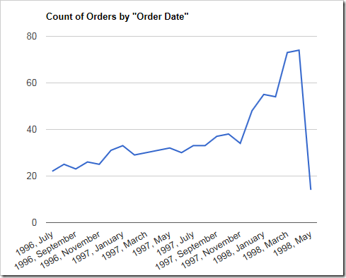
Simple line chart using count of orders by order date.

The data for the chart can be seen here.
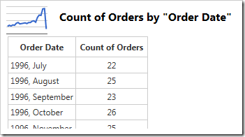
Data for a simple line chart using count of orders by order date.

Clicking or hovering over a data point will reveal the value.
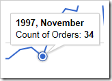
Clicking on a data point in the line will reveal the value.

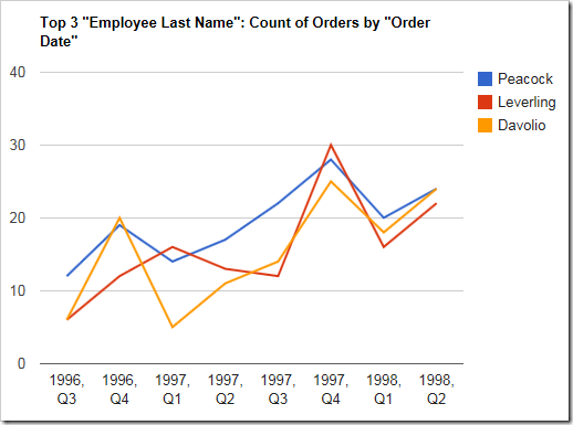
When multiple columns or values are specified, more than one line will be drawn with a different color. It is clear that Davolio’s performance in Q1 of 1997 had declined.

Data Field Tag
OrderDate pivot1-row1-year-line pivot1-row2-quarter
EmployeeID pivot1-col1

Multiple values or columns will render as different colored lines in a line chart.

The data displays the multiple columns of data below.
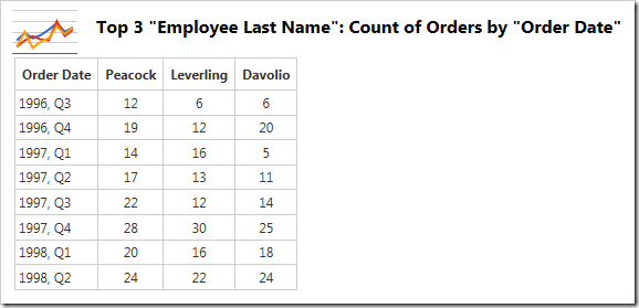
The multiple columns are visible in the data .

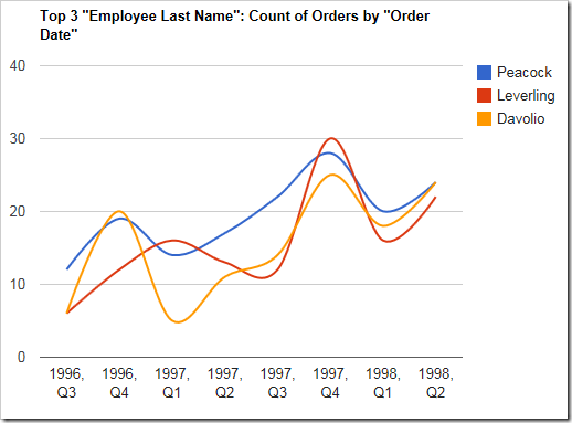
By default, lines will be drawn straight. The lines can be curved by specifying the keyword “curve”.

Data Field Tag
OrderDate pivot1-row1-year-line pivot1-row2-quarter pivot1-curve
EmployeeID pivot1-col1

A line chart with "curve" enabled.

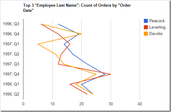
The line chart can also be drawn vertically. Specify “vertical” for the orientation property and the chart axes will be flipped.

Data Field Tag
OrderDate pivot1-row1-year-line pivot1-row2-quarter pivot1-orientation:"vertical"
EmployeeID pivot1-col1

A line chart that is drawn vertically.

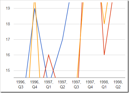
One can enable zooming and panning on the chart by specifying the “explorer” keyword.

Data Field Tag
OrderDate pivot1-row1-year-line pivot1-row2-quarter pivot1-explorer
EmployeeID pivot1-col1

Using the scroll wheel will change the scale of the vertical axis.
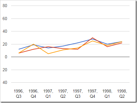
The chart has a very small scale.

The chart has been zoomed in.

Clicking and dragging will pan the chart.
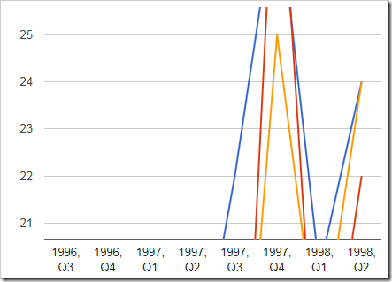
The chart has been panned.

Right-clicking on the chart area will reset the chart. Note that the “explorer” functionality may cause interference with the user scrolling through the page – use only when necessary.

Continue to Pie Chart Type