ASP.NET

Labels
AJAX(112) App Studio(7) Apple(1) Application Builder(245) Application Factory(207) ASP.NET(95) ASP.NET 3.5(45) ASP.NET Code Generator(72) ASP.NET Membership(28) Azure(18) Barcode(2) Barcodes(3) BLOB(18) Business Rules(1) Business Rules/Logic(140) BYOD(13) Caching(2) Calendar(5) Charts(29) Cloud(14) Cloud On Time(2) Cloud On Time for Windows 7(2) Code Generator(54) Collaboration(11) command line(1) Conflict Detection(1) Content Management System(12) COT Tools for Excel(26) CRUD(1) Custom Actions(1) Data Aquarium Framework(122) Data Sheet(9) Data Sources(22) Database Lookups(50) Deployment(22) Designer(177) Device(1) DotNetNuke(12) EASE(20) Email(6) Features(101) Firebird(1) Form Builder(14) Globalization and Localization(6) How To(1) Hypermedia(2) Inline Editing(1) Installation(5) JavaScript(20) Kiosk(1) Low Code(3) Mac(1) Many-To-Many(4) Maps(6) Master/Detail(36) Microservices(4) Mobile(63) Mode Builder(3) Model Builder(3) MySQL(10) Native Apps(5) News(18) OAuth(9) OAuth Scopes(1) OAuth2(13) Offline(20) Offline Apps(4) Offline Sync(5) Oracle(11) PKCE(2) Postgre SQL(1) PostgreSQL(2) PWA(2) QR codes(2) Rapid Application Development(5) Reading Pane(2) Release Notes(183) Reports(48) REST(29) RESTful(29) RESTful Workshop(15) RFID tags(1) SaaS(7) Security(81) SharePoint(12) SPA(6) SQL Anywhere(3) SQL Server(26) SSO(1) Stored Procedure(4) Teamwork(15) Tips and Tricks(87) Tools for Excel(2) Touch UI(93) Transactions(5) Tutorials(183) Universal Windows Platform(3) User Interface(338) Video Tutorial(37) Web 2.0(100) Web App Generator(101) Web Application Generator(607) Web Form Builder(40) Web.Config(9) Workflow(28)
Archive
Blog
ASP.NET
Saturday, March 7, 2015PrintSubscribe
Geo Chart Type

The “geo” chart type will render a map of the Earth. Each value will be a country, region, or city with a number associated with it. Countries with larger numbers will be a darker shade. The scale for the values is shown in the bottom right corner. The example below shows the location of customers by country in the Northwind sample app.

To use “geo” chart type, add the keyword “geo” to any “pivot-” tag, and make sure that it is separated with hyphens (-).

Data Field Tag
Country pivot1-row1-geo

Geo chart showing customers in each country.

The data for the chart can be seen below.

Data for the geo chart of customers in each country.

Hovering over a data point will reveal the data. An arrow will be rendered on the scale in the bottom right corner.

Hovering over a country or region will reveal the value.

The label for each row is attempted to be resolved by Google Maps. Please see the Google Maps Terms of Service for more information on their data policy.

Display Mode

The “displaymode” property determines the rendering of data points on the chart. By default, the mode is determined automatically. When using countries, such as in the example above, it will render using “regions”. One alternative mode is to place markers that are relative to the size of the value by specifying “markers”.

To define the display mode, add the keyword “displaymode”, followed by a colon and the value in quotation marks. This keyword must be the last in the tag.

Data Field Tag
Country pivot1-row1-geo pivot1-displaymode:"markers"

The geo chart also supports displaying values as marker.

Hovering over densely packed data points will magnify the region.

Hovering over dense data points will magnify the area.

Using a display mode of “text” will render the value as a string over the correct location. The size and boldness of the text reflects the size of the value.

The 'text' display mode will render data points as text.

Region

The “region” property allows setting the zoom level of the map. By default, the property is set to “world”, to display the full map. The value can be set to a continent using its 3-digit code, a country with the ISO 3166-1 alpha-2 code, or a state in the United States with the ISO 3166-2:US code. If using a state, the resolution property must be set to “provinces” or “metros”.

The example below is set to zoom into the continent of Europe with code “150”.

Data Field Tag
Country pivot1-row1-geo pivot1-region:"150"

The geo chart is set to only render the region of Europe.

Resolution

The “resolution” property determines the display of data points on the geo chart. By default, it is set to “countries”. The “provinces” value is supported for some country regions and US state regions. The “metros” value is supported for US country region and US state regions only.

Data Field Tag
Region pivot1-row1-geo pivot1-region:"US" pivot1-resolution:"provinces"

The geo chart shows a map of the US and has resolution of 'provinces'.

An example of the “metros” resolution mode can be seen below. The chart uses “markers” display mode.

Data Field Tag
City pivot1-row1-geo pivot1-region:"US" pivot1-displaymode:"markers' pivot1-resolution:"metros"

The geo chart shows a resolution of 'metros' in the United States.

Tuesday, March 3, 2015PrintSubscribe
Introduction to Charts

Every Code On Time web app comes with multiple ways of displaying your data. One way to visualize your data is with charts. See an example of charts on the Orders page of Northwind sample below.

Default data insight charts displayed for orders page of a Northwind sample app.

When a user activates the Charts presentation style, any developer-defined charts will be displayed. If none have been defined, then the application will automatically construct charts based on the data fields present in that view.

Activating Charts Presentation

Charts can be activated by clicking on the “Charts” presentation style option in the sidebar on the left hand side of the screen.

Selecting the Charts data presentation style from the sidebar.

If the device you are using is narrow or the sidebar has been disabled, you can click on the context menu button “…” in the top right corner of the screen to bring up the context menu.

Selecting the three dot context menu button in the top right corner of the screen.

Then, click on the name of the view to bring up view options.

Activating the view settings by clicking on the view name from the context menu.

Select the “Charts” data presentation style, and the view will refresh and display charts to the user.

Selecting the charts data presentation style from the view options menu.

Responsive Design

Charts offer a responsive design that will scale to fit any device, regardless of the device’s screen size. You can get a comprehensive snapshot of your data from your phone, tablet, or desktop computer. The largest screen sizes will display three columns of charts.

The largest screens and devices will show three columns of charts.

If the window is shrunk to a moderate size or the device is a tablet, two columns of charts will be shown instead.

Only two columns of charts will be shown when the device is of medium size.

Smaller devices will display one chart at a time.

Smaller devices show one chart at a a time.

If the device or window has a short height (or if your phone is rotated horizontally), then the charts will be shrunk vertically in order to fit at least one chart at a time on the screen.

Charts will shrink vertically to fit the screen size.

Sizing Charts

Charts can also be individually resized. Each chart is set to “Small” by default. This will render three columns on large screens, two columns on medium screens, and one column on small screens. If only one chart is present for the view, then that chart will always be maximum size available for the device.

The user can change the size of each chart by clicking on the three dot context menu “…” in the top right corner of the chart. Large devices will have access to “Small”, “Medium” and “Large” sizes.

User can define the size for the chart from the context menu

Select “Large” to display a chart at full width and height of the screen. “Large” charts will scale down to “Medium” size on moderately sized devices, and to “Small” if the device cannot fit medium charts.

Large charts take the full height and width of the screen.

“Medium” chart size uses two thirds of the width and height a large screen, leaving space for one small chart in each dimension.

Medium size charts will take 2/3s of the height and width of the screen.

Medium charts on a medium size device will take the full width and two thirds of the height, leaving room for one chart above or below.

Medium size charts on a medium size device will take the full width and 2/3s of the height.

Default chart sizes can also be specified by the developer at design time.

Filtering with Charts

Any filters applied to the data view will be used by the charts. Quick filter options are available for the relevant fields in the context menu of each chart.

Quick filtering options are available based on the fields that are present in the chart.

Clicking on the name of a field will open the filter panel for that field.

The filter panel for Customer Company Name has been opened.

Select several options from the panel and press “Apply” to filter. The charts will refresh with the new, filtered data.

An Orders chart that is filtered by the customer.

Child data views also derive the filter from the selected master record. The screen below shows charts giving insight to the orders from the customer “Save-a-lot Market” – Davolio seems to be the preferred employee.

Charts for orders that are specific to a customer that has been selected as the master record.

Viewing the Data Behind the Chart

Users also have the option to view the pivoted data that the chart is based on in a table. Click on the three dot context menu “…” in the top right corner of a chart. Select “Show Data” option.

The 'Show Data' option in the context menu of a chart.

The chart will be replaced by a table that shows the data. A miniature chart preview will be shown in the top left corner.

The data for the chart is displayed in a table.

Clicking on the mini chart in the top left hand corner will restore the chart. The user can also use the “Show Chart” option in the context menu.

The 'Show Chart' option will restore the chart.

Monday, March 2, 2015PrintSubscribe
Automatic Construction of Charts in Touch UI

Data views in an app created with Code On Time may present users with the view style called “Charts”. This view style is either enabled automatically by application at runtime or by developers at design time. The purpose of the view style is to provide instant insight into data.

If the definitions of charts are not a part of application design, then the application framework will compose up to nine charts based on the properties of fields in the data view if possible.  The app will attempt to define charts after examining the presence of lookup, date, or numeric fields in the view. First, it will try creating charts with dates as the rows, and lookups as the values. Then, it will pair a few numeric fields with a lookup.

The picture shown below displays the charts automatically created for the Orders controller of the Northwind sample application.
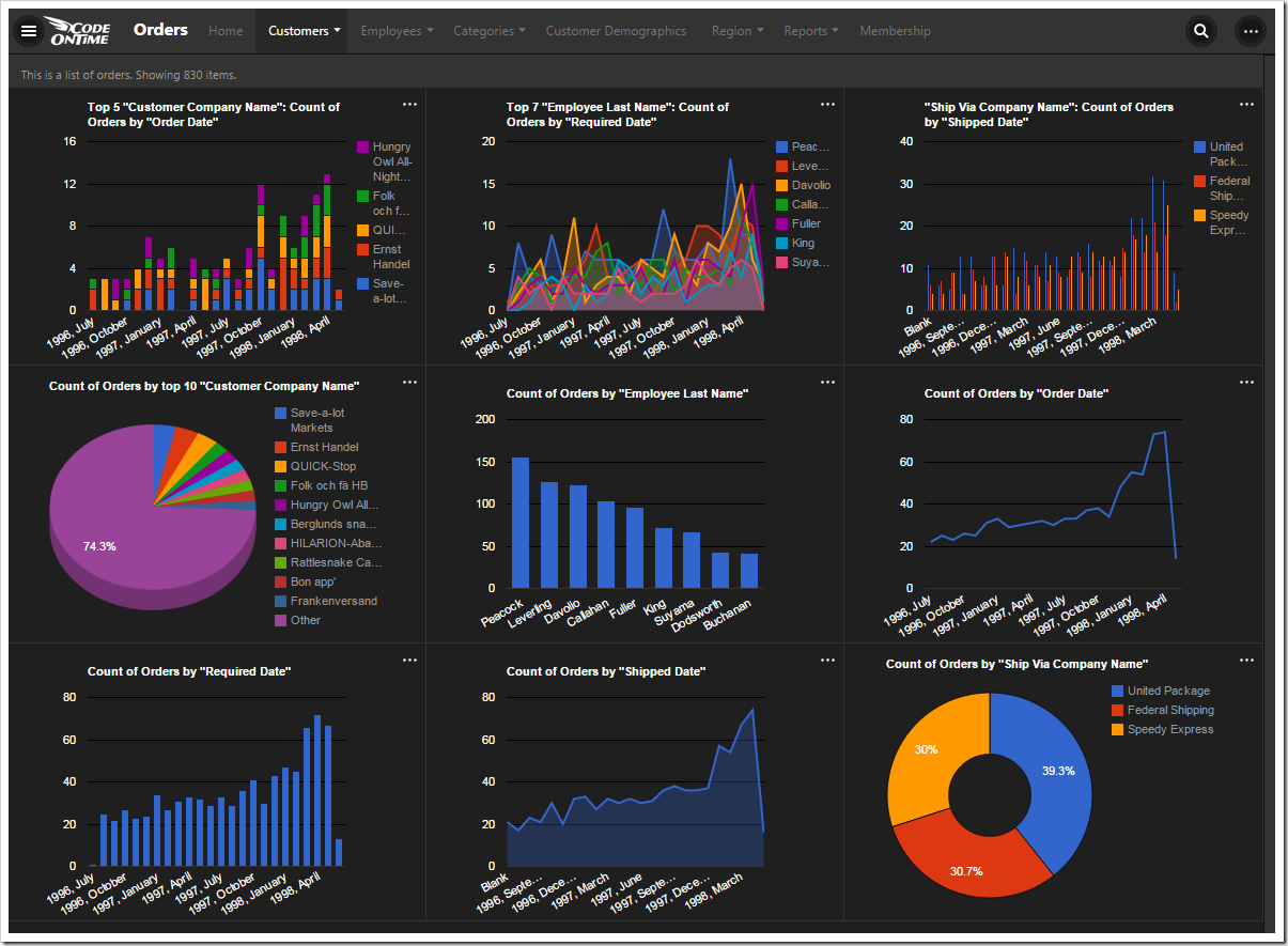
All nine charts that were automatically composed for Orders page of Northwind sample database.

The automatically created definitions for all of the nine charts are shown below. Each chart is described with one or two tags that start with “pivot-“ keyword followed by properties.  The elegant simplicity of the tag language makes possible sophisticated collections of charts defined both by developers and end users.

The chart definitions generated by the client library.

Application framework performs efficient server-side data pivots following the tag specification. Data pivots for all charts are performed on the server simultaneously. Data pivots take into account application-level and user-defined filters.

Let’s see how each chart works.

Chart 1 – Stacked Column + Dates
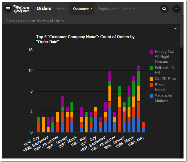
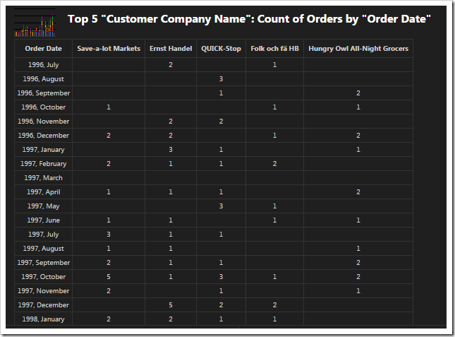
The first chart pivots customers by the order date in a stacked column chart.

Pivoted data of the 'stacked column + dates' chart.

This chart uses the first date field, OrderDate, as the rows. The “pivot1” property assigns the field to the pivot with ID of “1”. The “row” property sets the field as a row in the pivot, and assigns it index “1”.

The property “date” instructs the application to try several date bucket groups and choose the best one available based on the number of rows in the output. Application framework tries not to have too many or too few “date” rows in a pivot. For the dataset in the picture, the framework has produced the pivoted data as if tags “pivot1-row1-year pivot1-row2-month” were specified.

The “all” property ensures that any empty gaps in the data will be included in the pivot dimension.

The first lookup field, CustomerID, is used for the columns. The columns are sorted in descending order by the value of each column. Then, only the top five customers are kept, and the rest of them are dropped from the output. The “columnstacked” property defines the type of chart.

When a value field is not defined for the chart, a count of the first available field is used.

Field Name Tag
OrderDate pivot1-row1-date-all
CustomerID pivot1-col1-sortdescbyvalue-columnstacked-top5

Chart 2 – Area + Dates

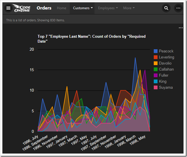
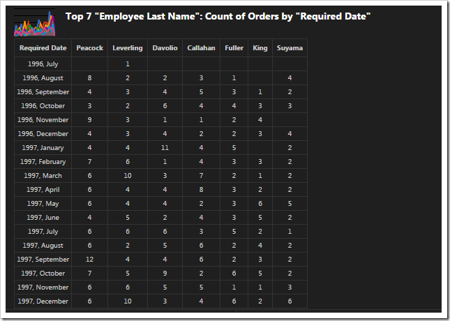
The second chart pivots employees by required date in an area chart.

Pivoted data of the 'area + dates' chart.

This chart uses the second date field, RequiredDate, as the rows.

The second lookup field, EmployeeID, is used for the columns, and the top seven employees sorted in descending order are used. The “area” property specifies the chart type.

Field Name Tag
RequiredDate pivot2-row1-date-all
EmployeeID pivot2-col1-sortdescbyvalue-area-top7

Chart 3 – Column + Dates

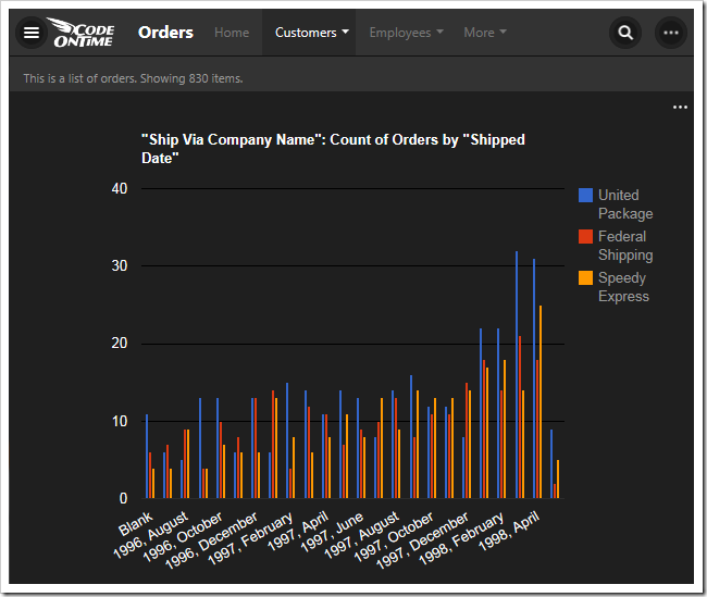
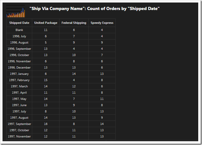
This chart pivots shipper companies by the shipped date in a column chart.

Pivoted data of 'column + dates' chart.

This chart uses the third date field, ShippedDate, as the rows of the output.

The ShipVia lookup field is used, and only the top five values are kept. The type of the chart is defined as “column”.

Field Name Tag
ShipVia pivot3-col1-sortdescbyvalue-column-top5
ShippedDate pivot3-row1-date-all

Chart 4 – 3d Pie

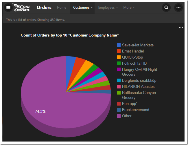
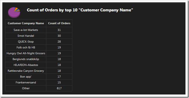
This chart shows the top ten orders by customer in a 3d pie chart.

Pivoted data of 3d pie chart.

The fourth chart uses CustomerID as the row values. The top ten values are displayed. The “other” property commands the server to sum up the rest of the values in an “Other” row. The type of chart is “pie3d”.

When no column field is defined, there will be only one column to display the value.

Field Name Tag
CustomerID pivot4-row1-top10-other-sortdescbyvalue-pie3d

Chart 5 – Columns

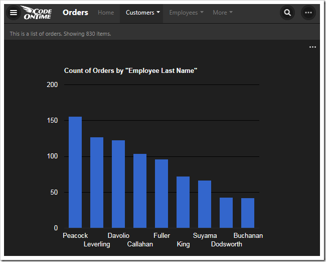
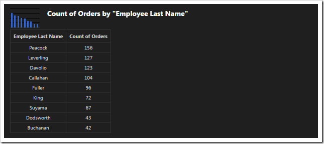
This chart shows the top 10 employees that made orders in a column chart.

Pivoted data of 'column' chart.

The fifth chart uses EmployeeID lookup field for the rows. The top ten values are displayed, and the rest are summed up into an “Other” row. The type of chart is “column”.

Field Name Tag
EmployeeID pivot5-row1-top10-other-sortdescbyvalue-column

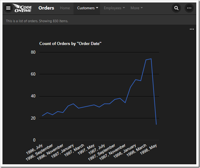
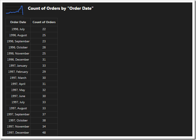
Chart 6 – Line

This chart shows the count of orders made by order date in a line chart.

Pivoted data of 'line' chart.

The next chart uses the OrderDate field as the rows. The “date” property will generate multiple sets of data, differentiated by bucket size, and use the best result for the chart. The property “all” will ensure that there are no missing values in the date range. The type of chart is “line”.

Field Name Tag
OrderDate pivot6-row1-line-date-all

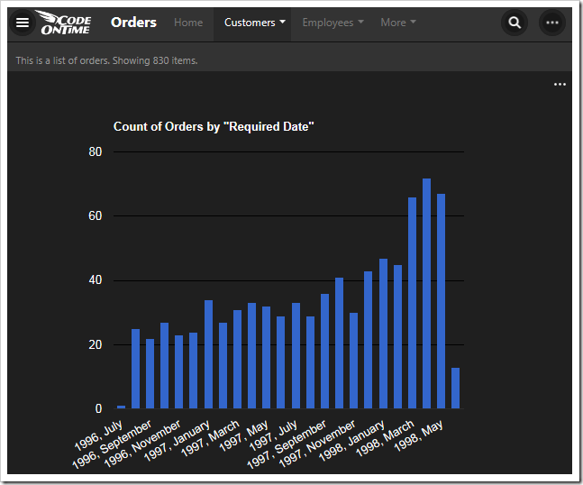
Chart 7 – Columns

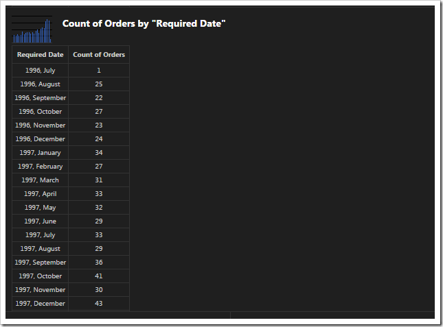
This chart shows a count of orders made by required date in a column chart.

Pivoted data of 'column' chart.

This chart uses the RequiredDate field for the row values. The type of chart is “column”. The server will compose multiple results and pick the best one that fits in the graph when “date” is used. The chart will not miss any gaps in dates with the “all” keyword.

Field Name Tag
RequiredDate pivot7-row1-column-date-all

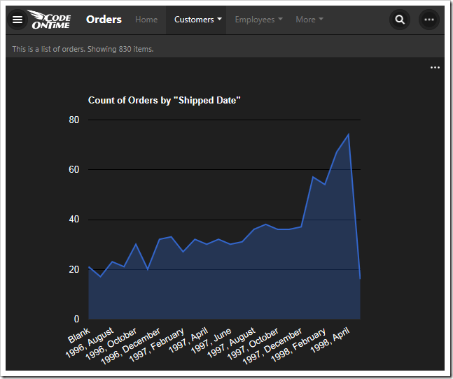
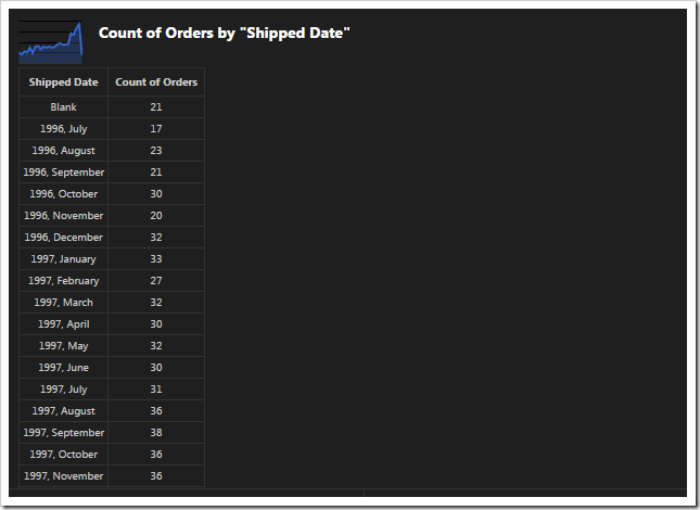
Chart 8 - Area

This chart shows the count of orders made by shipped date.

Pivoted data of 'area' chart.

This chart shows values grouped into rows by the ShippedDate field.

Field Name Tag
ShippedDate pivot8-row1-area-date-all

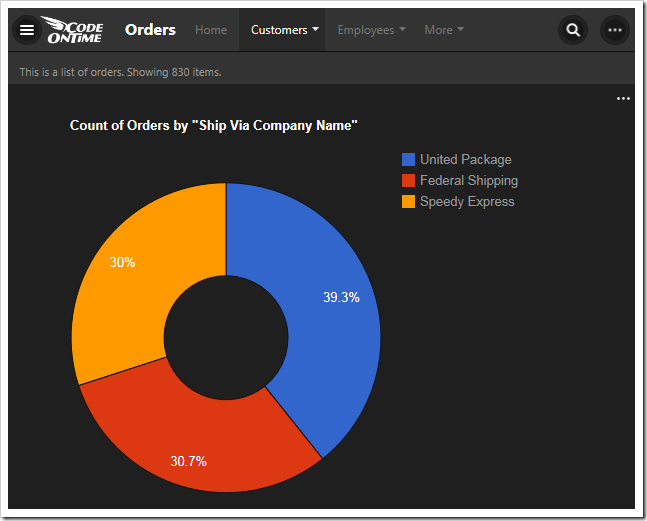
Chart 9- Donut

This chart shows the count of orders made, grouped by shipper company, in a donut chart.

Pivoted data of 'donut' chart.

This chart uses the ShipVia lookup field for the rows of the result. The “top10” tag is disregarded as there are less than ten values in the result.

Field Name Tag
ShipVia pivot9-row1-top10-other-sortdescbyvalue-donut