Blog: Posts from May, 2014

Labels
AJAX(112) App Studio(7) Apple(1) Application Builder(245) Application Factory(207) ASP.NET(95) ASP.NET 3.5(45) ASP.NET Code Generator(72) ASP.NET Membership(28) Azure(18) Barcode(2) Barcodes(3) BLOB(18) Business Rules(1) Business Rules/Logic(140) BYOD(13) Caching(2) Calendar(5) Charts(29) Cloud(14) Cloud On Time(2) Cloud On Time for Windows 7(2) Code Generator(54) Collaboration(11) command line(1) Conflict Detection(1) Content Management System(12) COT Tools for Excel(26) CRUD(1) Custom Actions(1) Data Aquarium Framework(122) Data Sheet(9) Data Sources(22) Database Lookups(50) Deployment(22) Designer(177) Device(1) DotNetNuke(12) EASE(20) Email(6) Features(101) Firebird(1) Form Builder(14) Globalization and Localization(6) How To(1) Hypermedia(2) Inline Editing(1) Installation(5) JavaScript(20) Kiosk(1) Low Code(3) Mac(1) Many-To-Many(4) Maps(6) Master/Detail(36) Microservices(4) Mobile(63) Mode Builder(3) Model Builder(3) MySQL(10) Native Apps(5) News(18) OAuth(9) OAuth Scopes(1) OAuth2(13) Offline(20) Offline Apps(4) Offline Sync(5) Oracle(11) PKCE(2) Postgre SQL(1) PostgreSQL(2) PWA(2) QR codes(2) Rapid Application Development(5) Reading Pane(2) Release Notes(183) Reports(48) REST(29) RESTful(29) RESTful Workshop(15) RFID tags(1) SaaS(7) Security(81) SharePoint(12) SPA(6) SQL Anywhere(3) SQL Server(26) SSO(1) Stored Procedure(4) Teamwork(15) Tips and Tricks(87) Tools for Excel(2) Touch UI(93) Transactions(5) Tutorials(183) Universal Windows Platform(3) User Interface(338) Video Tutorial(37) Web 2.0(100) Web App Generator(101) Web Application Generator(607) Web Form Builder(40) Web.Config(9) Workflow(28)
Archive
Blog
Posts from May, 2014
Tuesday, May 6, 2014PrintSubscribe
Full Screen Mobile Apps, Responsive Grid, etc.

Code On Time release 8.0.5.0 introduces numerous enhancements in Touch UI that brings closer our goal of delivering a new generation of a responsive user interface that works great on both mobile and desktop devices. Your line-of-business web apps will look great, now with an option to display a full screen presentation on mobile devices delivering close-to-native performance.

A web app displayed in full screen mode on iPad Air. The app has been created with Code On Time app generator.

A responsive grid view is now also available providing a responsive “table” presentation of data on any device. Application intelligently hides and reveals grid columns depending on the available screen width. Developers control the logic of field selection by configuring the list presentation of data.

A repsonsive grid in a web app with Touch UI shows a context menu of actions that can be applied to the selected row and entire data set. Application has been created with Code On Time app generator.

End users can switch between grid and list presentation by selecting a corresponding option on the sidebar on in the “view menu” item. Open the context menu of grid or list view to select “view menu” item when sidebar is not visible. It will be the first option displaying the name of the data set and number of records.

Note that future releases will also offer a data sheet view. This type of view will allow viewing all fields defined in the application with ability to scroll data horizontally and modify data in-place.

The following features and enhancements were introduces in this release:

  • Folder “Mobile” has been replace with “touch” in the source code of Web Site Factory, Mobile Factory, Azure Factory, and Web App Factory projects. We recommend deleting “Mobile” folder from the source code of existing apps.
     
  • TimeStamp fields support client-side formatting in the client library. For example, setting Data Format String of a TimeStamp field to hh:mm tt will format time as '03:17 PM'. Auto-complete options are also having a matching format.
     
  • A label of a checkbox field is displayed in a form when editing data, if a "CheckBox" field is marked as read-only or static. Previously only a value was rendered by Desktop UI.
     
  • New colorful themes are now available in Touch UI. The definitions can be found in ~/touch/app-themes.css. End users can select a theme in Settings menu of Touch UI. We are developing additional themes for the next release. 
     
  • Standard logo and icon are created for Touch UI. Follow instructions to replace the standard logo with your own images.
     
  • CSS class app-selected indicates a selected item in list and grid views of Touch UI.
     
  • Web apps can be displayed in full screen on mobile devices after being added to a home screen.
     
  • Items with lookup style “Checkbox” are rendered as “flip switch” in Touch UI.
     
  • Touch UI now supports three display density options: Comfortable, Compact, and Condensed. “Comfortable” display density is selected automatically on mobile devices. “Compact” option is selected automatically on desktop devices. “Condensed” option has been introduced for presentation similar to the current Desktop UI. End users can choose a preferred display density in Settings menu of Touch UI.
     
  • Users can activate Touch UI with “_touch=true” URL parameter. This parameter replaces “_mobile” option, which will be phased out in the future. Note that applications automatically switch to Touch UI on mobile devices. Future releases will likely allow configuring a default UI for generated applications. Legacy apps will default to Desktop UI. New apps will default to Touch UI on all types of devices. Only apps created with Unlimited edition will support simultaneously Touch and Desktop user interface.

We are developing brand new tutorials that explain configuration of Touch UI in details. Several tutorials will be published weekly. Please be patient.

The next release is expected to include simultaneous display of multiple data sets in Touch UI on a single screen. Tabbed data views will be supported to replicate functionality available in Desktop UI.

We are also planning to release all-new Advanced Search and Filter for Touch UI.  End users will be able to save their own filters for future use. Client-side data caching will be supported shortly after advanced search becomes available. Developers will specify caching conditions for improved performance. A set of filtering options will be reduced when client-side caching of data is activated.

Upload/Download will be enabled in Touch UI in the next few weeks. The feature will also be enhanced to allow signature capturing on touch-enabled devices.

Tuesday, May 6, 2014PrintSubscribe
Configuring a Custom Logo in Touch UI Apps

A web app with Touch UI displays a small logo on the left side of the tool bar next to the Home button. The logo is also displayed in the same spot on tablets and desktop devices.The color of the logo depends on the user interface theme. A separate “icon” logo is displayed by mobile devices on the home screen if a web app has been installed to run in a full screen mode.

The screenshot shows a standard colorful logo of a web app displayed on full screen of iPod Touch.
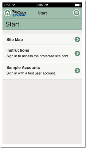
A standard logo is displayed on the left side of the tool bar next to the Home button in web apps with Touch UI.

Next screenshot shows a black logo in a web app displayed on full screen of iPad Air.
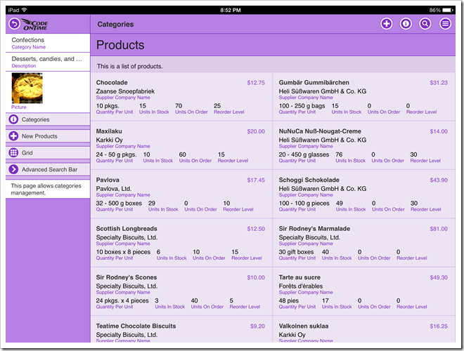
A standard logo is displayed on the left side of the tool bar next to the Home button in web apps with Touch UI on iPad Air.

This screenshot shows an application with Touch UI on a desktop computer. The logo is white.
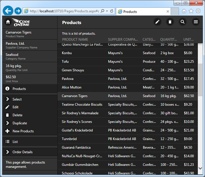
A standard logo is displayed on the left side of the tool bar next to the Home button in web apps with Touch UI in a desktop browser.

This is an icon of installed web app as displayed by iPad Air.

A standard shortcut icon of web app with Touch UI on iPad Air.

The standard logo files can be found in the ~/touch folder of Web Site Factory and Mobile Factory applications.

The same files are found in ~/WebApp/touch folder of Web App Factory projects.

Azure Factory applications keep the logo files in ~/WebRole1/touch folder.
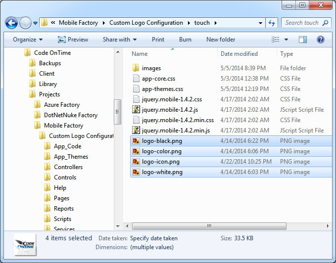
The standard logo files in a Mobile Factory web app with Touch UI created by Code On time app generator.

Replace the files with your own images for a customized look.

Create logo-black.png, logo-color.png, and logo-white.png images with the size 120 x 54 and copy them over the standard files to replace the logo on the toolbar.

Create logo-icon.png with the size 196 x 196 and replace the corresponding file for a custom application icon.

Here is an example of a custom logo that we are using to modify the standard toolbar images. Our file has a transparent background. We have used exactly the same image for all three logos displayed on the toolbar.

An example of a custom application logo for a web app with Touch UI created by Code On Time app generator.

This is how the new logo looks in a live application.
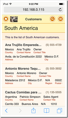
An example of a custom application logo in a live web app with Touch UI created by Code On Time app generator.

If the the standard size of the logo is tool small, then consider creating a custom CSS stylesheet in the ~/touch folder and placing a CSS rule that will replace the standard positioning and sizing of the logo.

Custom file StyleSheet.css is placed in the touch folder of a Mobile Factory app in this screen shot.
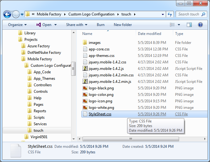
Custom stylesheet placed in the 'touch' folder of Mobile Factory project.

This is the rule that changes the position of the background and its size. We recommend experimenting with actual values to accomplish the best fit for you needs.

@media (min-width: 20em) {
    .ui-header.ui-header-fixed:not(.app-tabs) {
        background-position:1.75em 0;
        background-size:100px;
    }
}

The logo in the next screen shot takes the entire height of the toolbar.
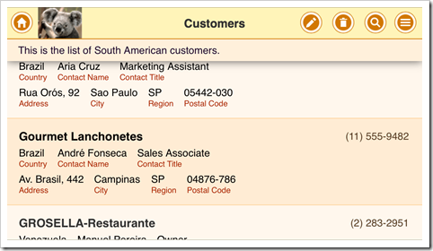
An example of an enlarged custom application logo in a live web app with Touch UI created by Code On Time app generator.

The larger file logo-icon.png provides a custom application icon on a home screen of iOS device.
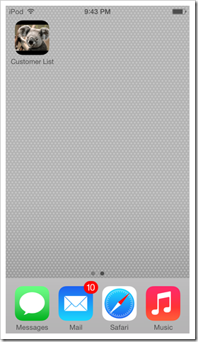
Custom shortcut icon in a full screen web app with Touch UI created by Code On Time line-of-business app generator.

Saturday, May 3, 2014PrintSubscribe
Full Screen Mobile Web Apps with Native Performance

Web Apps created with Code On Time have a fluid, native-like performance on both desktop and mobile devices. Mobile end users are accessing web apps through a web browser integrated into operating system of their device. Modern mobile browsers allow adding a web app shortcut to home screen of the device. If a web app is started from home screen, then the browser will hide the address bar and navigation controls taking advantage of the entire real estate of the screen.

Compare the screen shots of a web app created with Code On Time displayed on iPhone 5. Both screen shots show exactly the same web app. The former was started from the home screen of the phone. The latter was started directly in mobile Safari. Web app “installed” to home screen clearly provides access to more information and has a “native” look and feel. A thin black bar at the top of the screen provides a user with vital device status information when interacting with “installed” web app.

Full screen web app created with Code On Time on iPhone 5.  Web app created with Code On Time displayed in Safari web browser on iPhone 5.

The same benefits are obvious if device orientation is changed to landscape.

Full screen web app created with Code On Time on iPhone 5 with landscape orientation.

Web app created with Code On Time displayed in Safari web browser on iPhone 5 with landscape orientation.

It is very easy to install a web app to home screen of a mobile operating system.

Consider the process of installing a web app created with Code On Time on iPad Air.

First, open mobile Safari and navigate to http://demo.codeontime.com.

Tap “Share” button and select “Add to Home Screen” option in the popup window.

Select 'Share|Add to Home Screen' option to add web app created with Code On Time to home screen of iOS device.

Change the name of the link as needed and tap “Add”.

Adjust the icon title and web address of Web App created with Code On Time when installing a home screen shotcut on iOS device such as iPad Air.

An icon with a chosen title will be added to the home screen. This concludes the installation process.

A shortcut icon for a mobile app created with Code On Time on iPad Air home screen.

Note that it is easy to provide a custom application icon and logo for a web app created with Code On Time.

Start your web app to enjoy the full screen experience on iPad Air.

A web app created with Code On Time is displayed full screen on iPad Air.

Here is the installation process for Google Nexus 7.

Enter the address of the web app created with Code On Time and tap “menu” button on the browser toolbar. Select “Add to homescreen” option, change the title as necessary, and tap “Add” .

Context menu in Google Chome provides access to 'Add to homescreen' option on Android devices.Changing the icon title of a web app created with Code On Time when added the app to the homescreen of Android device.

The web app is now installed.

Tap the icon to access the web app created with Code On Time for a full screen experience.

Tap the icon to access the web app for a full screen experience.

Web app with Touch UI on Google Nexus 7 displayed in full screen mode when started from the homescreen.

Web apps created with Code On Time allow changing various settings such as theme and page transition effects. Note that those settings will not be inherited by installed app. Web apps added to home screen maintain their own settings on the device.