Web Form Builder

Labels
AJAX(112) App Studio(8) Apple(1) Application Builder(245) Application Factory(207) ASP.NET(95) ASP.NET 3.5(45) ASP.NET Code Generator(72) ASP.NET Membership(28) Azure(18) Barcode(2) Barcodes(3) BLOB(18) Business Rules(1) Business Rules/Logic(140) BYOD(13) Caching(2) Calendar(5) Charts(29) Cloud(14) Cloud On Time(2) Cloud On Time for Windows 7(2) Code Generator(54) Collaboration(11) command line(1) Conflict Detection(1) Content Management System(12) COT Tools for Excel(26) CRUD(1) Custom Actions(1) Data Aquarium Framework(122) Data Sheet(9) Data Sources(22) Database Lookups(50) Deployment(22) Designer(177) Device(1) DotNetNuke(12) EASE(20) Email(6) Features(101) Firebird(1) Form Builder(14) Globalization and Localization(6) How To(1) Hypermedia(2) Inline Editing(1) Installation(5) JavaScript(20) Kiosk(1) Low Code(3) Mac(1) Many-To-Many(4) Maps(6) Master/Detail(36) Microservices(4) Mobile(63) Mode Builder(3) Model Builder(3) MySQL(10) Native Apps(5) News(18) OAuth(9) OAuth Scopes(1) OAuth2(13) Offline(20) Offline Apps(4) Offline Sync(5) Oracle(11) PKCE(2) Postgre SQL(1) PostgreSQL(2) PWA(2) QR codes(2) Rapid Application Development(5) Reading Pane(2) Release Notes(184) Reports(48) REST(29) RESTful(29) RESTful Workshop(15) RFID tags(1) SaaS(7) Security(81) SharePoint(12) SPA(6) SQL Anywhere(3) SQL Server(26) SSO(1) Stored Procedure(4) Teamwork(15) Tips and Tricks(87) Tools for Excel(2) Touch UI(93) Transactions(5) Tutorials(183) Universal Windows Platform(3) User Interface(338) Video Tutorial(37) Web 2.0(100) Web App Generator(101) Web Application Generator(607) Web Form Builder(40) Web.Config(9) Workflow(28)
Archive
Blog
Web Form Builder
Monday, January 8, 2018PrintSubscribe
Dynamic Form Builder

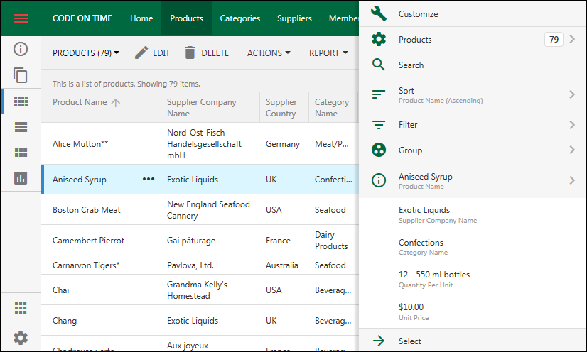
Powerful custom data input forms with responsive design is the higlight of our product.

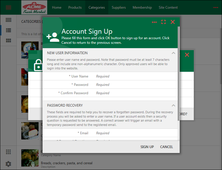
A modal master-detail form in the app with Touch UI.

A modal master-detail form in the app with Touch UI.

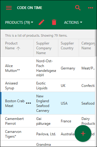
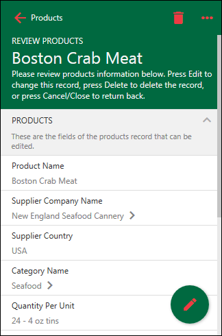
A fullscreen presentation of the same master-detail form in the app with Touch UI.

A fullscreen presentation of the same master-detail form in the app with Touch UI.

Developers can design forms with drag & drop operations.

Our team is working on further enhancing form development and making it possible creating forms at runtime. Our strategy is multi-pronged.

Assumptions:

Forms must allow collecting master-detail data that can be manipulated as a single complex entity. This requires enhancements in the Application Framework.

Form Builder must allow live preview of design changes in forms.

Form Builder can be a part of both design and runtime environment.

The Big Plan

1) Offline Data Processor (ODP) will make possible creating controllers that allow collecting data without posting records to the server. This enables createForm1 with visible child DataView fields in "New" mode. The new record with the child data is submitted to the server as single entity and saved to the database in the context of a database transaction. ODP will go live by the end of Junuary 2018.

2) Survey is a JavaScript definition of a data controller not based on a database entity. The framework reads definition and converts it into the data controller structures. Application Framework heavily utilizes surveys in Batch Edit, Quick Find, Advanced Search, Import, and OAuth registration forms.

3) ODP will make possible creating surveys with master-detail data collection.
Expected availability is February 2018.

4) ODP makes possible creating surveys and data controller forms collecting child data along with the master record.

5) ODP makes possible confirmation controllers with master-detail data. Child data will be accessible in business rules in JSON format. Expected availability is February 2018.

6) The framework will be extended with Data Driven Surveys. This is a simple but prominent feature on our Roadmap. In the nutshell, the purpose of Data Driven Surveys is to allow using surveys stored in the database to collect master-detail data at runtime. We already have prototypes of the technology and will have it integrated in the code generation library in the February 2018 when ODP is completed.

7) Next iteration of Code On Time is called "v9".  We are moving the design environment directly into the apps! The new Project Explorer is written in JavaScript and loads in live apps on-demand. Drag & Drop between the Project Explorer and live pages/forms will simplify development. Live inspection of pages will synchronize the selection in the Project Explorer. Build-in Object Inspector will make it easy learning about properties of selected objects. See our roadmap for details about Code On Time v9.

8) The forms of a Data Driven Surveys are stored in JSON format in the long text column of a dedicated table in the app. Application framework displays DDS as a textarea when the record is opened in an app. Developers can edit the definition of the survey directly or come up with their own "form builder" to do so.

Developers mark the corresponding data field with the tag "survey-form". The framework will activate the survey available in the same row when another field in a data controller marked with the tag "survey-data" is activated.

A new product called Form Builder Add-On will become available with the introduction of "v9". It includes the packaged design environment of "v9" activated at runtime in a live app. The add-on will cause the data field marked as "survey-form" to be rendered as “Design” button. Form Builder is displayed when the button is pressed.

Friday, February 3, 2017PrintSubscribe
Custom Logo and Theme

Universal Business Apps (UBA) created with Code On Time are designed to run on desktop and mobile devices.  UBAs may be packaged as native applications and also work in the web browser in online and offline modes. Each app store dictates certain user interface requirements. The new theme framework of Touch UI 2017 makes it easy to fulfill them.

Native applications are distributed through app stores of the operating system verndors. These app stores have a common requirement not to place your logo directly in the user interface, making it visible at all times. The focus must be on application functionality rather than on company branding.

At the same time, it is important to keep the user aware of your brand. Touch UI makes this easy.

Consider the following logo of a fictitious company:

image

Let’s incorporate this logo into an application created with Code On Time or Cloud On Time.

Creating a Theme Accent

The default theme of the application is Light with Aquarium accent.
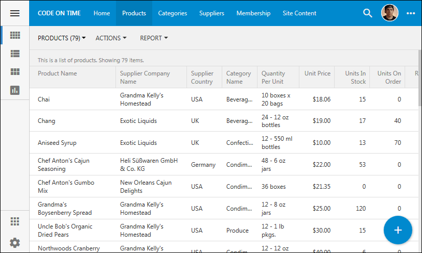
image

We will choose Social accent as a basis for the customization.
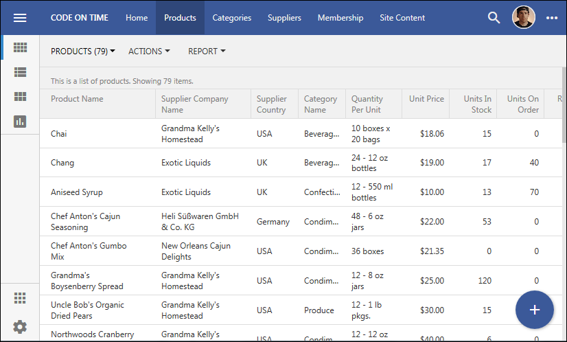
image

Create a copy of the file ~/touch/touch-accent.social.json and name it touch-accent.acme.json. Open the new file in your favorite text editor.
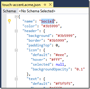
image

Change the “name” to “Acme”. Find and replace the color #3b5999 with #006940 everywhere in the file. Change header.icon.default from #eee to #ee3a43.  Also change the value of properties button.promo.icon.default and buttons.menu.icon.default to #ee3a43.

Both #006940 and #ee3a43 represent the codes of the main colors used in the log. You can use the standard CSS color names, such as “green” and “red”.

Save the file, switch back to your application, proceed to Themes section under Settings, and select the new theme “Acme”.
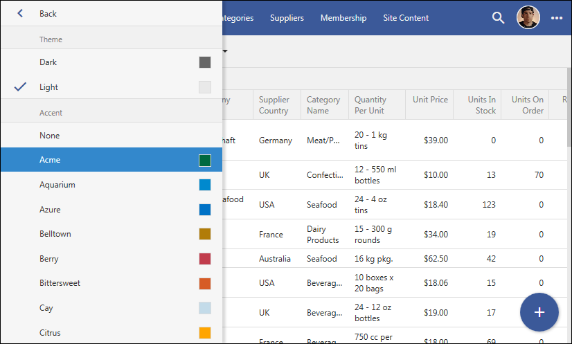
image

The application colors will change to match the branding of our fictitious company. It only took a few minutes to give your app a branded look-and-feel.
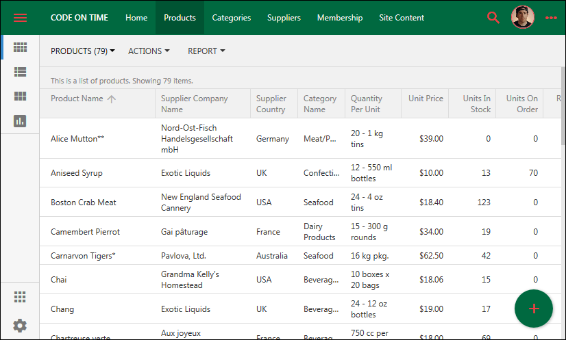
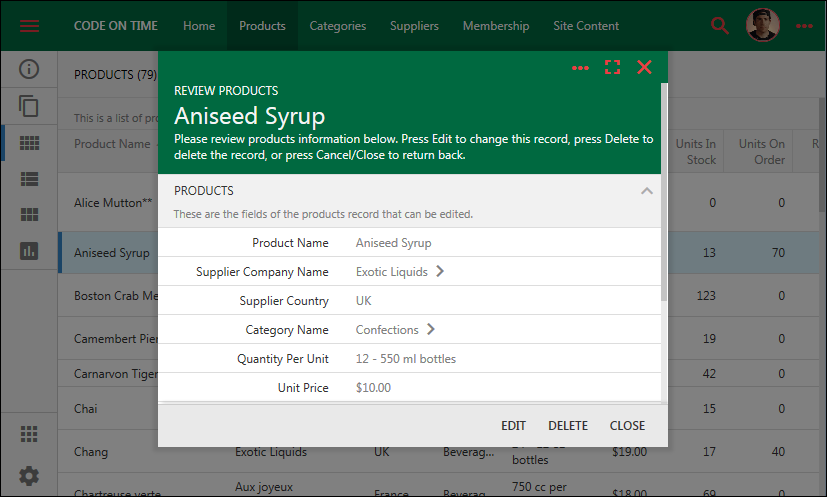
image

image

image

image    image

Changing Application Name

The name of the app needs to be changed as well. By default, the name will be derived from the page header text specified in the project settings. If the project’s settings for the header is blank, then the name will read as “Code on Time” or “Cloud On Time”.
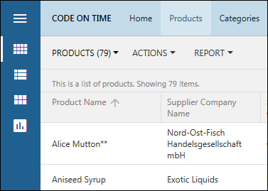
image

There is configuration file in the root of your project, called ~/touch-settings.json. It controls the application behavior and appearance. Open the file and specify appName property to provide a name for the app.
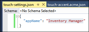
image

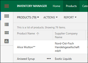
Do not use the brand name there. Instead specify the name that reflects the purpose of the app. Let’s use Inventory Manager for this example. Save the file and refresh the page. The new app name will be visible in the top left corner of the toolbar.
image

Explicit Branding

The best place to display your branding is the Splash Screen and Account Manager.

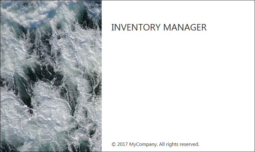
The splash screen is displayed briefly when the user starts the app.
image

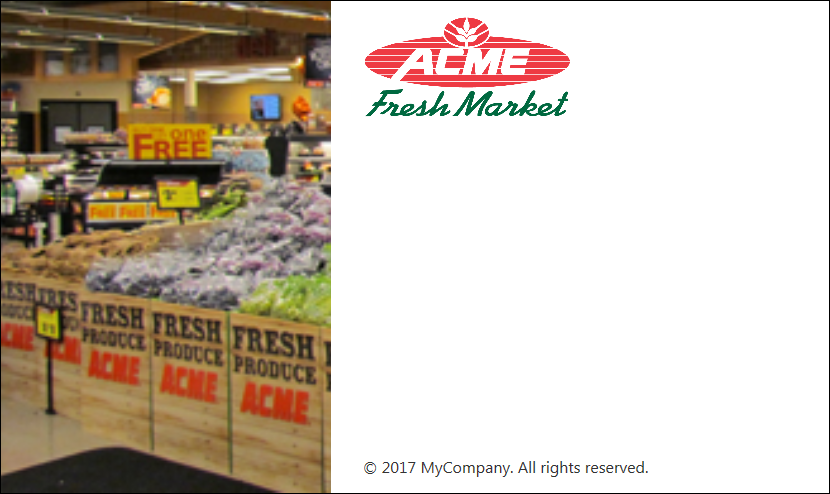
The picture on the left side of the screen and the application name can be replaced with alternative images.

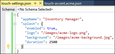
Add a new configuration element splash to the file ~/touch-settings.json, as shown in the screenshot below.
image

Properties logo and background must reference the high-resolution images for the branding of your app. You will need to keep the balance between the quality of the images and their size.

The duration property controls the duration that the splash screen is displayed to users in milliseconds.

Restart the app and see the splash screen displayed.
image

Your branding is also displayed when the user is automatically logged into the app, or when account manager is activated.
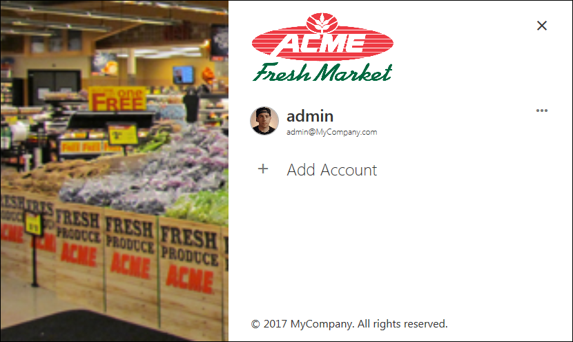
image

Disabling Themes in Settings

If you do not wish the theme and accent to be changed by the application users, then add settings section to the ~/touch-settings.json with theme option disabled.
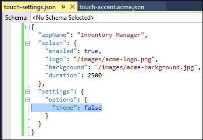
image

Additional settings options can be disabled as needed. The property settings.disabled will prevent the user from modifying any settings.
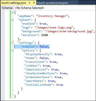
image

Further Customization

If your projects requirements call for a prominient display of branding, then you can add a logo to the application toolbar with the help of CSS. Create a file under ~/touch folder with the following rule:
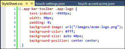
image

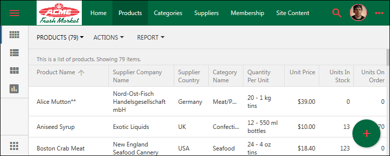
This result of customization is shown next.
image

image

Wednesday, February 1, 2017PrintSubscribe
New Theme Engine in Touch UI 2017

A new theme engine in Touch UI is included with the release 8.5.12.0. The brand new themes provide a modern look-and-feel for your line-of-business universal apps. Designed to work with both Desktop and Mobile devices, Touch UI offers a universal solution to application developers. Your end users can point with a mouse or a stylus and click or touch the responsive user interface elements.

The user inteface is customized with themes and accents. A theme provides the main color scheme. An accent provides additional color adjustments. The themes are CSS-based. The new release will ship with a single Light theme.  Additonal core schemes are expected to become available in the future. Accents are JSON files describing particular colors and other properties that will customize the theme. Release 8.5.12.0. ships with 35 accents. Developers can make a copy of any existing *.json accent under ~/touch folder and replace the colors with those that are matching the application requirements. Developers can standardize on a particular theme and accent for their app by deleting the standard themes and accents that are not needed.  The upcoming CoT v9 will also include an interactive theme builder that will allow producing custom accents within the live app.

The screenshots of the new Light theme with Citrus accent are below.

image

image

image

image

image

This is the new Azure accent for the Light theme:

image

The new Grapello accent in Light theme in the screenshot showing a modal form:

image

The new Plastic accent demonstrates interactive filtering in Light theme:

image

The new Berry accent demonstrates the view selector in Light theme:

image

This is the Light theme with Dark Knight accent on a small screen:

image

The user interface theme is constructed at runtime by applying properties defined in the JSON configuration of the accent to the chosen color scheme of the theme.

This is the actual configuration file for the Citrus theme.  You can create a new accent by making a copy of an existing one and replacing it’s colors.

JSON:

{
  "name": "Citrus",
  "color": "#FFA500",
  "header": {
    "background": "orange",
    "backgroundTransparent": "transparent",
    "border": "#FFA500",
    "paddingTop": 0,
    "icon": {
      "default": "#000",
      "hover": null,
      "selected": null,
      "backgroundOpacity": null
    },
    "text": {
      "default": "#000",
      "hover": null,
      "logo": null,
      "hoverBackground": "rgba(0,0,0,0.05)",
      "selectedBackground": "rgba(0,0,0,0.08)"
    },
    "split": {
      "background": null,
      "icon": { "default": null }
    }
  },
  "panel": {
    "icon": {
      "default": "#0a6332",
      "hover": "#003D00",
      "selected": null
    }
  },
  "buttons": {
    "promo": {
      "background": "#FFA500",
      "icon": {
        "default": "#000"
      },
      "menu": {
        "icon": {
          "default": null,
          "hover": null
        }
      }
    }
  },
  "sidebar": {
    "full": {
      "background": "#0a6332",
      "border": "#0a6332",
      "selectedColor": "#fff",
      "text": {
        "default": "#eee",
        "hover": "#fff",
        "active": null,
        "static": "#80ba99"
      },
      "icon": {
        "default": "#fff",
        "hover": "#FFA500",
        "active": null
      },
      "toolbar": {
        "background": "#0a6332",
        "border": "#0a6332",
        "selectedColor": "#fff",
        "icon": {
          "default": "#fff",
          "hover": "#FFA500",
          "active": null
        }
      }
    },
    "mini": {
      "background": "#0a6332",
      "border": "#0a6332",
      "selectedColor": "#fff",
      "icon": {
        "default": "#fff",
        "hover": "#FFA500",
        "active": null
      },
      "toolbar": {
        "background": "#0a6332",
        "border": "#0a6332",
        "selectedColor": "#fff",
        "icon": {
          "default": "#fff",
          "hover": "#FFA500",
          "active": null
        }
      }
    }
  }
}


The user interface elements and behavior are customized via the new ~/touch-settings.json configuration file in apps created with Code on Time 8.5.12.0.

JSON:

{
  "defaultUI": "TouchUI",
  "appName": "Inventory Manager",
  "map": {
    "apiKey": null
  },
  "charts": {
    "maxPivotRowCount": 100
  },
  "ui": {
    "theme": {
      "name": "Light",
      "accent": "Aquarium",
      "preview": null
    },
    "displayDensity": {
      "mobile": "Auto",
      "desktop": "Condensed"
    },
    "list": {
      "labels": {
        "display": "DisplayedBelow"
      },
      "initialMode": "SeeAll"
    },
    "menu": {
      "location": "toolbar",
      "tiles": null
    },
    "actions": {
      "promote": true
    },
    "transitions": {
      "style": "slide"
    },
    "sidebar": {
      "when": "Landscape",
      "mini": true,
      "apps": true,
      "toolbar": true,
      "icons": true
    },
    "toolbar": {
      "apps": true
    },
    "apps": {
      "location": "toolbar"
    },
    "showSystemButtons": null,
    "smartDates": true
  },
  "settings": {
    "enabled": true,
    "options": {
      "displayDensity": true,
      "theme": true,
      "transitions": true,
      "sidebar": true,
      "labelsInList": true,
      "showSystemButtons": true,
      "promoteActions": true,
      "smartDates": true,
      "initialListMode": true
    }
  },
  "membership": {
    "enabled": null,
    "profile": "view switch login logout",
    "help": true,
    "accountManager": {
      "enabled": true
    }
  },
  "help": true
}