Web Application Generator

Labels
AJAX(112) App Studio(7) Apple(1) Application Builder(245) Application Factory(207) ASP.NET(95) ASP.NET 3.5(45) ASP.NET Code Generator(72) ASP.NET Membership(28) Azure(18) Barcode(2) Barcodes(3) BLOB(18) Business Rules(1) Business Rules/Logic(140) BYOD(13) Caching(2) Calendar(5) Charts(29) Cloud(14) Cloud On Time(2) Cloud On Time for Windows 7(2) Code Generator(54) Collaboration(11) command line(1) Conflict Detection(1) Content Management System(12) COT Tools for Excel(26) CRUD(1) Custom Actions(1) Data Aquarium Framework(122) Data Sheet(9) Data Sources(22) Database Lookups(50) Deployment(22) Designer(177) Device(1) DotNetNuke(12) EASE(20) Email(6) Features(101) Firebird(1) Form Builder(14) Globalization and Localization(6) How To(1) Hypermedia(2) Inline Editing(1) Installation(5) JavaScript(20) Kiosk(1) Low Code(3) Mac(1) Many-To-Many(4) Maps(6) Master/Detail(36) Microservices(4) Mobile(63) Mode Builder(3) Model Builder(3) MySQL(10) Native Apps(5) News(18) OAuth(9) OAuth Scopes(1) OAuth2(13) Offline(20) Offline Apps(4) Offline Sync(5) Oracle(11) PKCE(2) Postgre SQL(1) PostgreSQL(2) PWA(2) QR codes(2) Rapid Application Development(5) Reading Pane(2) Release Notes(183) Reports(48) REST(29) RESTful(29) RESTful Workshop(15) RFID tags(1) SaaS(7) Security(81) SharePoint(12) SPA(6) SQL Anywhere(3) SQL Server(26) SSO(1) Stored Procedure(4) Teamwork(15) Tips and Tricks(87) Tools for Excel(2) Touch UI(93) Transactions(5) Tutorials(183) Universal Windows Platform(3) User Interface(338) Video Tutorial(37) Web 2.0(100) Web App Generator(101) Web Application Generator(607) Web Form Builder(40) Web.Config(9) Workflow(28)
Archive
Blog
Web Application Generator
Wednesday, May 23, 2012PrintSubscribe
Configuring a Radio Button List

The Radio Button List items style is useful when there is a need to select a single option from a short list.

For example, the Ship Via Company Name field on the Orders edit form uses Lookup item style by default. A lookup may be useful with a large number of records to choose from. However, there are only three shipping companies in the Northwind database, making a lookup redundant. Let’s change this lookup into a radio button list.

Ship Via Company Name field rendered as a lookup on the Orders edit form.

Start the Project Designer. In the Explorer, switch to the Controllers tab and double-click on Orders / Fields / ShipVia field node.

ShipVia field in the Orders controller in Code On Time Project Explorer.

Change the following properties:

Property New Value
Items Style Radio Button List
Data Value Field ShipperID
Data Text Field CompanyName

Press OK to save the field, and press Browse on the tool bar. Navigate to Orders page and edit a record.

Ship Via Company Name field is now rendered as a radio button list. The “N/A” option appears because the field is not mandatory. If more shippers are added to the Shippers table, then more options will be available in the list.

Ship Via Company Name field rendered as a Radio Button List on the Orders edit form.

The radio button list can be rendered in multiple columns. Switch back to the Project Explorer and double-click on Orders / Views / editForm1 / c1 – Orders / ShipVia data field node.

ShipVia field in Orders controller presented in Project Explorer.

Make the following changes:

Property New Value
Columns 2

Press OK to save the data field, and click Browse on the tool bar.

When the web application opens in your default web browser, navigate to Orders page and edit a record. There are now two columns of radio buttons for the Ship Via Company Name field.

Ship Via Company Name field rendered as a Radio Button List in two columns.

Wednesday, May 23, 2012PrintSubscribe
Show Page Size

Grid and data sheet views show the number of items per page, as well as allow the user to change the number of items displayed and refresh the view, using the controls in the bottom right corner of the pager.

Employee Territories data view with Page Size controls enabled.

The page size information takes up a significant amount of space in the pager. You may wish to have a more compact presentation of the pager.

Start the Project Designer. In the Explorer, double-click on Employees / Employee Territories / container1 / view1 node.

Employee Territories 'view1' data view on the Employee Territories page.

Change the following property:

Property New Value
Show Page Size False

Press OK to save the data view. On the tool bar, click on Browse to generate the application.

When the web app opens in your default web browser, navigate to the Employee Territories page. The data view is now compact — it no longer displays the page size information.

Employee Territories data view without the Page Size controls.

Wednesday, May 23, 2012PrintSubscribe
Show Pager

The pager is an area that displays paging controls on Grid and Data Sheet views. It allows the user to change the number of items per page, shows a subset of available records, and allows the user to refresh the contents from the server. By default, the pager is located at the bottom of the grid.
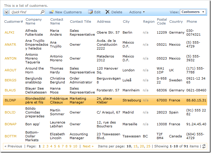
Customers grid view with Pager visible at the bottom.

Top and Bottom

The pager can be displayed at the top of the view if the page of data requires scrolling.

Start the Project Designer. In the Project Explorer, double-click on Customers / container1 / view1 data view node.
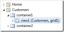
Customers view1 on the Customers page.

Change the following properties:

Property New Value
Page Size 25
Show Pager Top and Bottom

Press OK to save the data view. On the toolbar, press Browse.

When the web app loads, navigate to Customers page. The pager will be available at the top of the page.

Pager displayed at the top of customers list.

Scroll to the bottom of the page. The top pager may no longer be visible. However, the bottom pager is readily available.

Pager also present at the bottom of Customers list.

Top

It is also possible to display the pager only at the top of the grid.

In the Project Explorer, double-click on Customers / container1 / view1 data view node.

Customers view1 on the Customers page.

Change the following properties:

Property New Value
Page Size 5
Show Pager Top

On the toolbar, press Browse. The pager will only be displayed at the top of the grid.
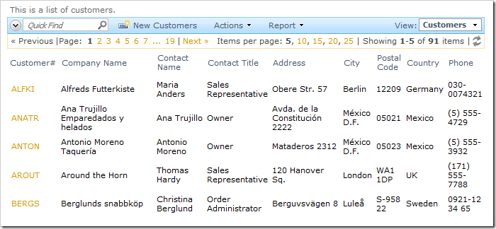
List of customers with pager only displayed at the top.

None

In some situations, you may want to hide the pager. For example, let’s make a list of the five most recent orders. In that situation, the pager will only take up space, so we’ll hide it.

Start the Project Designer. In the Project Explorer, switch to Controllers tab. Right-click on Orders / Views node, and select New View option.
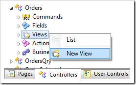
Create a New View for Orders controller in Project Explorer.

Give this view the following properties:

Property Value
Id RecentOrders
Command command1
Label Five Most Recent Orders
Sort Expression OrderDate desc

Press OK to save the view. In the Project Explorer, right-click on Orders / Views / Recent Orders view node, and select New Data Field.
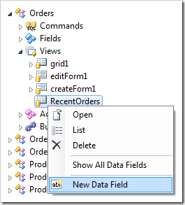
Create New Data Field for 'RecentOrders' view of Orders controller.

Give the data field the following properties:

Property Value
Field Name CustomerID
Alias CustomerCompanyName

Press OK to save the data field. Using the same method, add two more data fields:

Property Value
Field Name EmployeeID
Alias EmployeeLastName

Property Value
Field Name RequiredDate

In the Project Explorer, switch back to Pages tab. Right-click on Home / container2 node, and select New Data View.
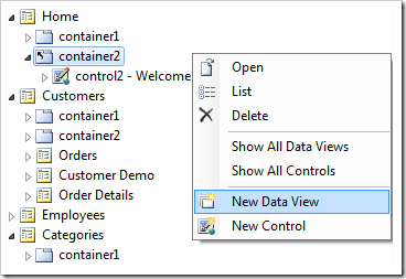
Add a Data View to container2 of Home page.

Use the following properties:

Property Value
Controller Orders
View RecentOrders
PageSize 5
Show Pager None

Press OK to save the data view. On the tool bar, press Browse.

When the web application opens in your default browser, you will see the data view located underneath the Instructions user control. Without the pager, the data view is more compact.
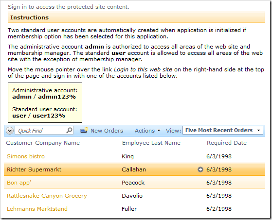
'Five Most Recent Orders' data view without a Pager.

You can make this data view even more compact by hiding the View Selector, Quick Find, removing the New Orders action or Action menu, or even the whole Action Bar.

Continue to Show Action Buttons