User Interface

Labels
AJAX(112) App Studio(7) Apple(1) Application Builder(245) Application Factory(207) ASP.NET(95) ASP.NET 3.5(45) ASP.NET Code Generator(72) ASP.NET Membership(28) Azure(18) Barcode(2) Barcodes(3) BLOB(18) Business Rules(1) Business Rules/Logic(140) BYOD(13) Caching(2) Calendar(5) Charts(29) Cloud(14) Cloud On Time(2) Cloud On Time for Windows 7(2) Code Generator(54) Collaboration(11) command line(1) Conflict Detection(1) Content Management System(12) COT Tools for Excel(26) CRUD(1) Custom Actions(1) Data Aquarium Framework(122) Data Sheet(9) Data Sources(22) Database Lookups(50) Deployment(22) Designer(177) Device(1) DotNetNuke(12) EASE(20) Email(6) Features(101) Firebird(1) Form Builder(14) Globalization and Localization(6) How To(1) Hypermedia(2) Inline Editing(1) Installation(5) JavaScript(20) Kiosk(1) Low Code(3) Mac(1) Many-To-Many(4) Maps(6) Master/Detail(36) Microservices(4) Mobile(63) Mode Builder(3) Model Builder(3) MySQL(10) Native Apps(5) News(18) OAuth(9) OAuth Scopes(1) OAuth2(13) Offline(20) Offline Apps(4) Offline Sync(5) Oracle(11) PKCE(2) Postgre SQL(1) PostgreSQL(2) PWA(2) QR codes(2) Rapid Application Development(5) Reading Pane(2) Release Notes(183) Reports(48) REST(29) RESTful(29) RESTful Workshop(15) RFID tags(1) SaaS(7) Security(81) SharePoint(12) SPA(6) SQL Anywhere(3) SQL Server(26) SSO(1) Stored Procedure(4) Teamwork(15) Tips and Tricks(87) Tools for Excel(2) Touch UI(93) Transactions(5) Tutorials(183) Universal Windows Platform(3) User Interface(338) Video Tutorial(37) Web 2.0(100) Web App Generator(101) Web Application Generator(607) Web Form Builder(40) Web.Config(9) Workflow(28)
Archive
Blog
User Interface
Monday, January 8, 2018PrintSubscribe
Dynamic Form Builder

Powerful custom data input forms with responsive design is the higlight of our product.

A modal master-detail form in the app with Touch UI.
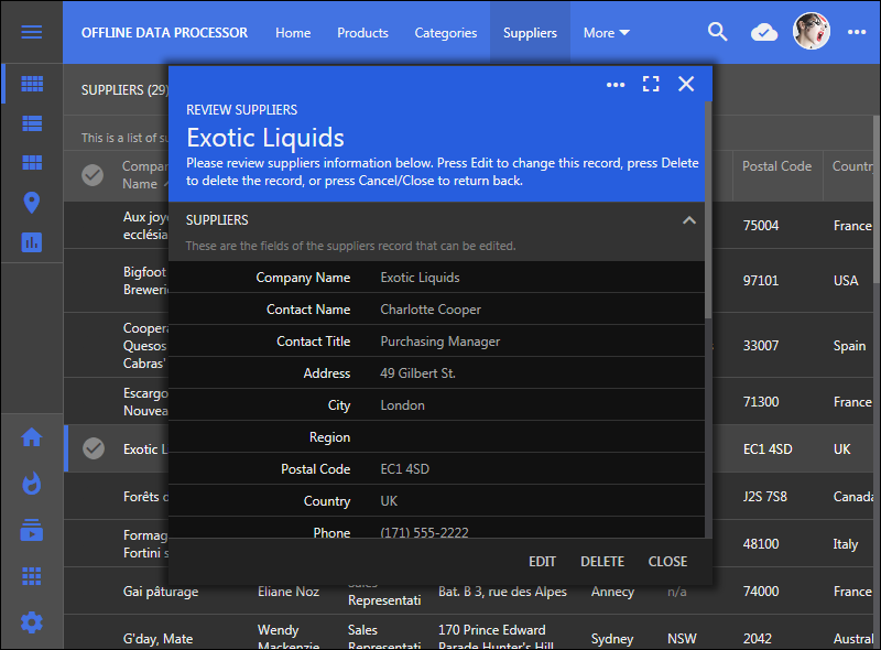
A modal master-detail form in the app with Touch UI.

A fullscreen presentation of the same master-detail form in the app with Touch UI.
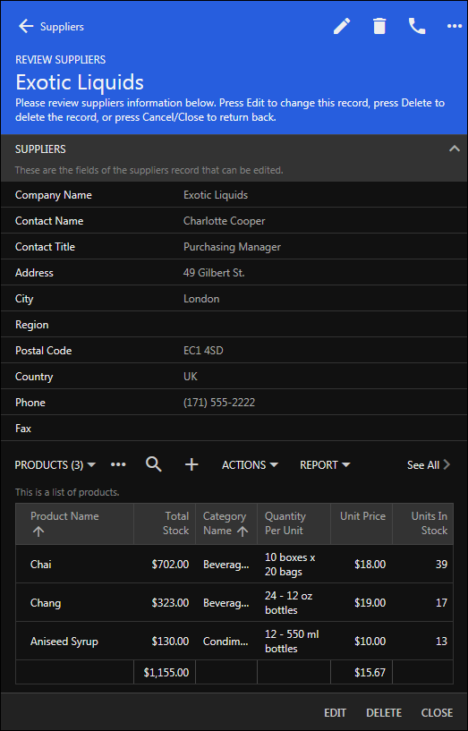
A fullscreen presentation of the same master-detail form in the app with Touch UI.

Developers can design forms with drag & drop operations.

Our team is working on further enhancing form development and making it possible creating forms at runtime. Our strategy is multi-pronged.

Assumptions:

Forms must allow collecting master-detail data that can be manipulated as a single complex entity. This requires enhancements in the Application Framework.

Form Builder must allow live preview of design changes in forms.

Form Builder can be a part of both design and runtime environment.

The Big Plan

1) Offline Data Processor (ODP) will make possible creating controllers that allow collecting data without posting records to the server. This enables createForm1 with visible child DataView fields in "New" mode. The new record with the child data is submitted to the server as single entity and saved to the database in the context of a database transaction. ODP will go live by the end of Junuary 2018.

2) Survey is a JavaScript definition of a data controller not based on a database entity. The framework reads definition and converts it into the data controller structures. Application Framework heavily utilizes surveys in Batch Edit, Quick Find, Advanced Search, Import, and OAuth registration forms.

3) ODP will make possible creating surveys with master-detail data collection.
Expected availability is February 2018.

4) ODP makes possible creating surveys and data controller forms collecting child data along with the master record.

5) ODP makes possible confirmation controllers with master-detail data. Child data will be accessible in business rules in JSON format. Expected availability is February 2018.

6) The framework will be extended with Data Driven Surveys. This is a simple but prominent feature on our Roadmap. In the nutshell, the purpose of Data Driven Surveys is to allow using surveys stored in the database to collect master-detail data at runtime. We already have prototypes of the technology and will have it integrated in the code generation library in the February 2018 when ODP is completed.

7) Next iteration of Code On Time is called "v9".  We are moving the design environment directly into the apps! The new Project Explorer is written in JavaScript and loads in live apps on-demand. Drag & Drop between the Project Explorer and live pages/forms will simplify development. Live inspection of pages will synchronize the selection in the Project Explorer. Build-in Object Inspector will make it easy learning about properties of selected objects. See our roadmap for details about Code On Time v9.

8) The forms of a Data Driven Surveys are stored in JSON format in the long text column of a dedicated table in the app. Application framework displays DDS as a textarea when the record is opened in an app. Developers can edit the definition of the survey directly or come up with their own "form builder" to do so.

Developers mark the corresponding data field with the tag "survey-form". The framework will activate the survey available in the same row when another field in a data controller marked with the tag "survey-data" is activated.

A new product called Form Builder Add-On will become available with the introduction of "v9". It includes the packaged design environment of "v9" activated at runtime in a live app. The add-on will cause the data field marked as "survey-form" to be rendered as “Design” button. Form Builder is displayed when the button is pressed.

Wednesday, December 27, 2017PrintSubscribe
Light and Dark

Long dark winter nights are calling for a different kind of GUI. Here comes the “Dark” theme.

New 'Dark' theme in an app build with Touch UI and Code On Time app generator.

Place the following in ~/touch-settings.json to lock-in the Dark theme with the Bitter Sweet accent.  This configuration will also disable “Settings” option in the GUI.

{
  "ui": {
    "theme": {
      "name": "Dark",
      "accent": "BitterSweet"
    },
    "transitions": { "style": "slide" }
  },
  "settings": { "enabled": true }
}

This is the “Light” version of the same app. It works best if you use the device in the bright light.

The 'Light' theme in an app build with Touch UI and Code On Time app generator.

Light and Dark theme are provided to give developers more options to express themselves and to allow upcoming native apps to have day and night time versions of the GUI, while still enabling rich customization with accents.

Accents do look more dramatic with the “Dark” theme. Try building your own theme accent now!

Dark theme with Construct accent in the app created with Code On Time.

Dark theme with Construct accent in the app created with Code On Time.

Dark theme with Construct accent in the app created with Code On Time. The context menu is open.

Dark theme with Construct accent in the app created with Code On Time. The context menu is open.

Dark theme with Construct accent in the app created with Code On Time. The sidebar is hidden and the tab bar is displays icons for frequently used app pages.

Dark theme with Construct accent in the app created with Code On Time. The sidebar is hidden and the tab bar is displays icons for frequently used app pages.

Dark theme with Aquarium accent in the app created with Code On Time.

Dark theme with Aquarium accent in the app created with Code On Time.  The form is open and context menu of the form is also visible.

Dark theme with Aquarium accent in the app created with Code On Time.  The form is open and context menu of the form is also visible.

Dark theme with Aquarium accent in the app created with Code On Time.  The form view is open and the "Data View" field is visible in the form.

Dark theme with Aquarium accent in the app created with Code On Time.  The form view is open and the Data View field is visible in the form.

Dark theme with Verdant accent in the app created with Code On Time.  The sidebar is expanded.

Dark theme with Verdant accent in the app created with Code On Time.  The sidebar is expanded.

Dark theme with Modern Rose accent in the app created with Code On Time.  The app is displayed in a small form factor.

Dark theme with Modern Rose accent in the app created with Code On Time.  The app is displayed in a small form factor. 

Dark theme with Modern Rose accent in the app created with Code On Time.  The navigation menu is open.

Dark theme with Modern Rose accent in the app created with Code On Time.  The navigation menu is open.

If Settings option is enabled, then users can access the themes and accents at runtime.

Settings panel of app built with Touch UI and Code On Time.

Theme and accent selection panel of app built with Touch UI and Code On Time.

Tuesday, December 5, 2017PrintSubscribe
Tab Bar

Page of an application built with Touch UI represents an individual mini-app, also known as Single Page App or SPA. Shared navigation system of application links together multiple SPAs.

Developers can assign icons to individual pages to signify their purpose. Icons are displays at the bottom of the sidebar on the left side of the page and in the drop down menus at the top of the page.

Sidebar displays page icons when specified in apps created with Touch UI.   Page icons are visible in the dropdown navigation menus in apps created with Touch UI and Code On Time app generator.

The sidebar provides easy access to the first three or four pages with icons, which works great on larger screens. The sidebar is not visible on the smaller devices. Touch UI introduces a new method of providing quick access to important pages called Tab Bar.

Tab Bar is automatically displayed at the bottom of the screen whenever the sidebar is not visible

Tab Bar is displayed at the bottom of the screen if at least two icons are defined in the menu of the app created with Code On Time.

Tab Bar disappears as soon as the sidebar becomes visible, which may happen if device orientation has changed or when the app window is resized.

Tab Bar is hidden when the sidebar is visible to the user in apps based on Touch UI.

The width of tabs will automatically increase on large screens.

Tab Bar appears as soon as the sidebar stops being visible in the app based on Touch UI.

Tabs automatically expand and collapse. Some tabs may be shifted off-screen when the minimal tab width is reached. The invisible tabs are replaced with “More” button if there is not enough space to fit all of them at the bottom of the screen. Invisible tab icons are displayed when “More” button is activated on the Tab Bar.

'More' button is displayed when some of the tabs are not able to fit on screen in application based on Touch UI.  Invisible tab icons are displayed when 'More' button is activated on the Tab Bar in app created with Code On Time.

If you do prefer not to have the Tab Bar then turn if “off” by entering the following configuration property in ~/touch-settings.json file:

{
  "ui": {
    "menu": {
      "tabbar": false
    }
  }
}

If you love the Tab Bar, then consider enabling this feature on any screen size by settings ui.menu.tabbar to true.

{
  "ui": {
    "menu": {
      "tabbar": true
    }
  }
}

This setting will remove icons from the sidebar and transfer them to the permanently visible Tab Bar at the bottom of the screen.

Set 'ui.menu.tabbar' property in touch-settings.json to 'true' to permanently enable the Tab Bar in app created with Code On Time.

Page icons will be visible on a screen of any size.

Tab Bar displays icons of important pages in app based on Touch UI.

Notifications displayed in the app will move the Tab Bar and the “promo” button upwards.

Notifications displayed in the app will move the Tab Bar and the “promo” button upwards in apps based on Touch UI, created with Code On Time.

The tab bar will slide down to the bottom of the screen when the notification is dismissed.

Continue to Notifications